Sunset Color Palette — Coral Dusk & Moss
A warm five-color sunset scheme that runs from coral and tangerine through gold into dusky purple and deep sky, grounded by soft moss — every color matched to real paint you can buy.
By Emily Roberts · DIY Editor & First-Timer's Guide
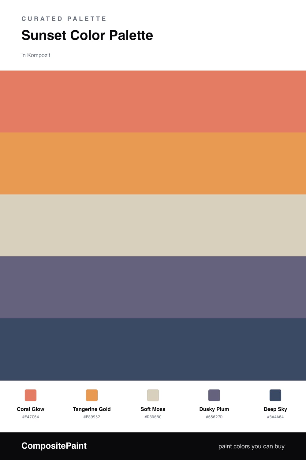
There is a single minute at the end of a clear evening when the sky holds every one of these colors at once, and that is exactly the feeling I wanted here. Coral Glow leads the way with that soft, lit-from-within warmth, and Tangerine Gold sits right beside it like the last of the sun.
To keep the whole thing from running hot, Soft Moss steps in as the base. It is a gentle, slightly grayed green that reads almost neutral on a wall, so it lets the warm tones do the talking. This is where the palette feels current for 2026 — warm colors are back, but we are pairing them with quiet, earthy neutrals rather than stark white.
Then Dusky Plum and Deep Sky are your cooler, deeper notes — the part of the sunset that has already turned to evening. Use them in small doses, on a single piece of furniture or a door, and they will make the corals and golds glow even brighter.
Buy These Colors
Each color matched to the closest real paint in every brand, by ΔE2000. Kompozit first; take any SKU to the store — these mix on demand.
Questions
They follow the natural order of a sunset, so your eye reads them as one warm gradient instead of five separate picks. The coral and gold glow, the plum and deep sky cool things down, and the moss keeps it all calm.
Let the coral lead and the tangerine back it up, roughly a 60/20 split. The moss base does the quiet work, and you tuck in the plum and deep sky as small grounding moments.
Similar Palettes
Closest schemes by color — not by label.