PROFESSIONAL-GRADE PAINT
ONE COAT COVERAGE
MADE FOR REAL RESULTS
CompositePaint

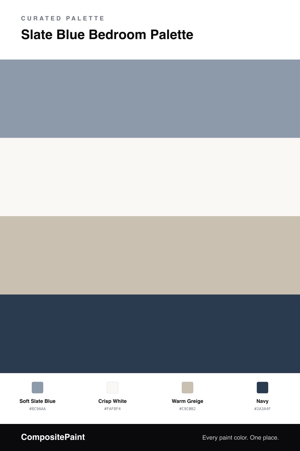
Slate Blue Bedroom Palette — Soft Slate & Warm Greige

A calm 4-color bedroom scheme built on soft slate blue walls, crisp white trim, a warm greige bridge, and a navy accent for a restful, grown-up room. Every color matched to real paint you can buy.

By Jessica Williams · Color Stylist & Interior Editor

Soft Slate Blue
Walls
Kompozit In Good Taste · 0505
#8999A4
LRV 31
Crisp White
Trim & Ceiling
Kompozit Sugar Dust · 0011
#F8F6ED
LRV 92
Warm Greige
Secondary Walls
Kompozit Hearthstone · 0567
#C7BEB2
LRV 52
Navy
Accent
Kompozit Star-Studded · 0620
#32425A
LRV 5
View palette in

Slate blue is the grown-up blue — soft, dusty, and quiet — which makes it a natural fit for a bedroom built around rest. Soft slate blue on the walls sits halfway between blue and gray, calm in any light and never demanding attention. It feels settled and a little sophisticated, the kind of color you do not tire of.

A crisp white on the trim and ceiling keeps the edges clean and bright so the slate reads clearly without going flat. A warm greige offers a gentle middle tone for an adjoining wall or built-in, and just as importantly it bridges the cool slate to any warm wood furniture in the room. A navy accent then turns up in small touches — bedding, a lamp, or a frame — adding depth that echoes the slate without overpowering it. The whole palette stays low-contrast and easy, exactly the mood a bedroom should have.

Buy These Colors

Each color matched to the closest real paint in every brand, by ΔE2000. Kompozit first; take any SKU to the store — these mix on demand.

Soft Slate Blue
#8C9AAA · LRV 32 · Walls
Kompozit In Good Taste · 0505 ΔE 2.93
Backdrop Polly Wants · BD-PW ΔE 6.21
Behr China Silk · PPU15-10 ΔE 2.68
Benjamin Moore Coastline · AF-570 ΔE 2.37
Clare Cosmic Vibes · PNT100-LT-32 ΔE 6.39
Dunn-Edwards Hamilton Blue · DE6333 ΔE 2.68
Farrow & Ball Oval Room Blue · No. 85 ΔE 9.69
Magnolia Home Display · JG-84 ΔE 7.03
PPG / Glidden Lost At Sea · 1040-5 ΔE 2.67
Sherwin-Williams Daphne · SW 9151 ΔE 2.57
Valspar Gorgeous Graphite · M359 ΔE 1
Crisp White
#FAF8F4 · LRV 94 · Trim & Ceiling
Kompozit Sugar Dust · 0011 ΔE 2.43
Backdrop Tabula Rasa · BD-TR ΔE 3.54
Behr Ultra Pure White® · PPU18-06 ΔE 1.01
Benjamin Moore Snowfall White · 2144-70 ΔE 3.11
Clare Whipped · PNT100-LT-02 ΔE 1.23
Dunn-Edwards Milk Glass · DEW358 ΔE 1.41
Farrow & Ball All White · No. 2005 ΔE 0.5
Magnolia Home True White · JG-21 ΔE 1.78
PPG / Glidden Delicate White · 1001-1 ΔE 2.02
Sherwin-Williams High Reflective White · SW 7757 ΔE 1.61
Valspar Ultra White · 7006-24 ΔE 1.23
Warm Greige
#C9C0B2 · LRV 53 · Secondary Walls
Kompozit Hearthstone · 0567 ΔE 1.03
Backdrop Boy Meets Girl · BD-BG ΔE 12.13
Behr Washed Khaki · UL170-8 ΔE 1.31
Benjamin Moore Ashen Tan · 996 ΔE 1.01
Clare Motor City · PNT100-LT-09 ΔE 6.45
Dunn-Edwards Birchwood · DEC752 ΔE 2.37
Farrow & Ball Elephant's Breath · No. 229 ΔE 2.51
Magnolia Home Anatolian · JG-127 ΔE 3.2
PPG / Glidden Ashen · 1023-3 ΔE 0.83
Sherwin-Williams Skyline Steel · SW 1015 ΔE 1.11
Valspar Feathers of a Dove · M111 ΔE 2.07
Navy
#2A3A4F · LRV 4 · Accent
Kompozit Star-Studded · 0620 ΔE 2.93
Backdrop Last Call · BD-LC ΔE 6.01
Behr Limo-scene · N560-7 ΔE 3.78
Benjamin Moore North Sea · CC-932 ΔE 2.16
Clare Blackish · PNT100-DP-54 ΔE 13.54
Dunn-Edwards Old Mill · DEA185 ΔE 3.64
Farrow & Ball Pitch Black · No. 256 ΔE 12.13
Magnolia Home Blackboard · JG-05 ΔE 7.64
PPG / Glidden Victory Blue · 1165-7 ΔE 6.07
Sherwin-Williams In the Navy · SW 9178 ΔE 2.2
Valspar Nightfall · 8003-46G ΔE 2.99

Questions

Is slate blue more blue or more gray?

Slate blue is a balanced mix of both, which is what makes it so calming. It reads as a soft, dusty blue in good light and leans gray on overcast days, so it stays restful and never loud in a bedroom.

Does slate blue work with warm wood furniture?

It does. The warm greige in this palette is the bridge that ties cool slate blue to warm wood tones, so wood furniture looks intentional rather than clashing. Keep some warm neutrals present and the room stays balanced.

Similar Palettes

Closest schemes by color — not by label.