CP

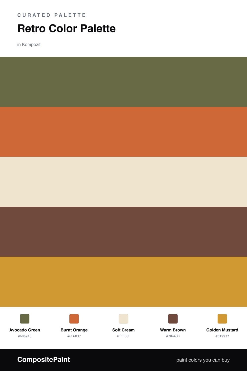
Retro Color Palette — Avocado Meadow

A warm five-color 1970s revival pairing burnt orange and avocado green with mustard, warm brown, and cream — every color matched to real paint you can buy.

By David Chen · Formulation Lead & Resident Chemist

Avocado Green
Dominant
Kompozit Old School · 0410
#686945
LRV 13
Burnt Orange
Secondary
Kompozit Casa De Oro · 1026
#CF6837
LRV 23
Soft Cream
Base
Kompozit Petticoat · 0010
#EFE5CE
LRV 79
Warm Brown
Support
Kompozit Evolution · 0130
#704A3D
LRV 9
Golden Mustard
Accent
Kompozit Yellow Shout · 0935
#D19932
LRV 37
View palette in

The 1970s gets a bad rap, but the palette underneath all that shag carpet was genuinely smart. These colors all sit in the warm, muted half of the wheel, which is why Avocado Green and Burnt Orange can share a room without shouting. They are like two spices from the same drawer.

Let the Soft Cream do most of the heavy lifting on your big walls. It keeps the whole scheme from feeling heavy and gives the richer tones room to breathe. Then bring in Avocado Green as your real color statement, with Warm Brown grounding the lower half of the space.

Save Golden Mustard for the smallest moments — a single chair, a door, a band of trim. In a 2026 home this palette reads less like a flashback and more like a quiet, earthy warmth, especially against clean white ceilings and natural wood.

Buy These Colors

Each color matched to the closest real paint in every brand, by ΔE2000. Kompozit first; take any SKU to the store — these mix on demand.

Avocado Green
#6B6B3A · LRV 14 · Dominant
Kompozit Old School · 0410 ΔE 3.55
Backdrop Buenos Aires · BD-BA ΔE 16.35
Behr Portsmouth Olive · HDC-CL-20 ΔE 2.6
Benjamin Moore Guacamole · 2144-10 ΔE 3.77
Clare Daily Greens · PNT100-DP-61 ΔE 10.08
Dunn-Edwards Dill Pickle · DE5573 ΔE 5.84
Farrow & Ball Bancha · No. 298 ΔE 3.92
Magnolia Home Landscape · JG-49 ΔE 4.8
PPG / Glidden Globe Artichoke · 1121-7 ΔE 4.58
Sherwin-Williams Relentless Olive · SW 6425 ΔE 2.3
Valspar Crocodile Style · V095-5 ΔE 2.12
Burnt Orange
#C25E2A · LRV 20 · Secondary
Kompozit Casa De Oro · 1026 ΔE 4.07
Backdrop Bahaus · BD-BH ΔE 18.27
Behr Jack O Lantern · M220-7 ΔE 2.98
Benjamin Moore Racing Orange · 2169-10 ΔE 4.11
Clare Sriracha · PNT100-DP-29 ΔE 12.92
Dunn-Edwards Clay Pot · DE5174 ΔE 3.76
Farrow & Ball Charlotte's Locks · No. 268 ΔE 6.72
Magnolia Home Work Worn Wood · JG-35 ΔE 6.84
PPG / Glidden Tabasco · 1192-7 ΔE 5.45
Sherwin-Williams Robust Orange · SW 6628 ΔE 4
Valspar Storybook Sundown · V010-3 ΔE 2.45
Soft Cream
#EFE6D2 · LRV 80 · Base
Kompozit Petticoat · 0010 ΔE 1.08
Backdrop Don't Eat the Yellow Snow · BD-DS ΔE 1.85
Behr Scroll · N280-1 ΔE 1.64
Benjamin Moore Cappuccino Froth · CSP-1055 ΔE 0.48
Clare Like Buttah · PNT100-LT-62 ΔE 1.48
Dunn-Edwards Rice Bowl · DE6170 ΔE 1.12
Farrow & Ball Dimity · No. 2008 ΔE 2.25
Magnolia Home Carter Crème · JG-16 ΔE 1.02
PPG / Glidden Instant Relief · 1096-1 ΔE 1.6
Sherwin-Williams Décor White · SW 7559 ΔE 1.74
Valspar Ivory Lace · 7003-6 ΔE 1.33
Warm Brown
#6E4A2F · LRV 8 · Support
Kompozit Evolution · 0130 ΔE 6.25
Backdrop It's a Date · BD-IT ΔE 6.13
Behr Bricktone · BXC-42 ΔE 4.52
Benjamin Moore Mocha Madness · 2100-10 ΔE 4.73
Clare Vintage · PNT100-DP-67 ΔE 12.87
Dunn-Edwards Chaps · DE6049 ΔE 7.31
Farrow & Ball Preference Red · No. 297 ΔE 15.08
Magnolia Home Mountain Currant · JG-171 ΔE 8.17
PPG / Glidden Bird House Brown · 1072-7 ΔE 5.55
Sherwin-Williams Sturdy Brown · SW 6097 ΔE 1.57
Valspar Cowboy Hat · 3010-8 ΔE 2.41
Golden Mustard
#C99A2E · LRV 36 · Accent
Kompozit Yellow Shout · 0935 ΔE 2.83
Backdrop Carry the Two · BD-CT ΔE 18.61
Behr Ginger Jar · M300-5 ΔE 3.77
Benjamin Moore Fields of Gold · 203 ΔE 2.45
Clare Good as Gold · PNT100-DP-59 ΔE 8.56
Dunn-Edwards Roman Gold · DE5356 ΔE 2.09
Farrow & Ball India Yellow · No. 66 ΔE 6.03
Magnolia Home Bright Days · JG-45 ΔE 9.73
PPG / Glidden Golden Field · 1107-7 ΔE 3.24
Sherwin-Williams Crispy Gold · SW 6699 ΔE 1.2
Valspar Ripe Banana · 8001-22G ΔE 1.2

Questions

Why do these retro colors work together?

They all share a warm, earthy undertone, so the avocado green and burnt orange feel like they grew from the same soil rather than fighting each other. The cream gives your eye a place to rest between the richer tones.

How do I keep a 70s palette from feeling dated?

Use the cream as your largest surface and let the avocado lead the color, then add burnt orange and mustard in small doses. A modern matte finish and clean trim keep it reading as fresh rather than a throwback.

Similar Palettes

Closest schemes by color — not by label.