Pastel Blue Color Palette — Pastel Blue Cloud
A soft four-color scheme led by a pale pastel blue and warmed with gentle cloud-soft companions — every color matched to real paint you can buy.
By Maya Patel · Reviews Editor & Product Tester
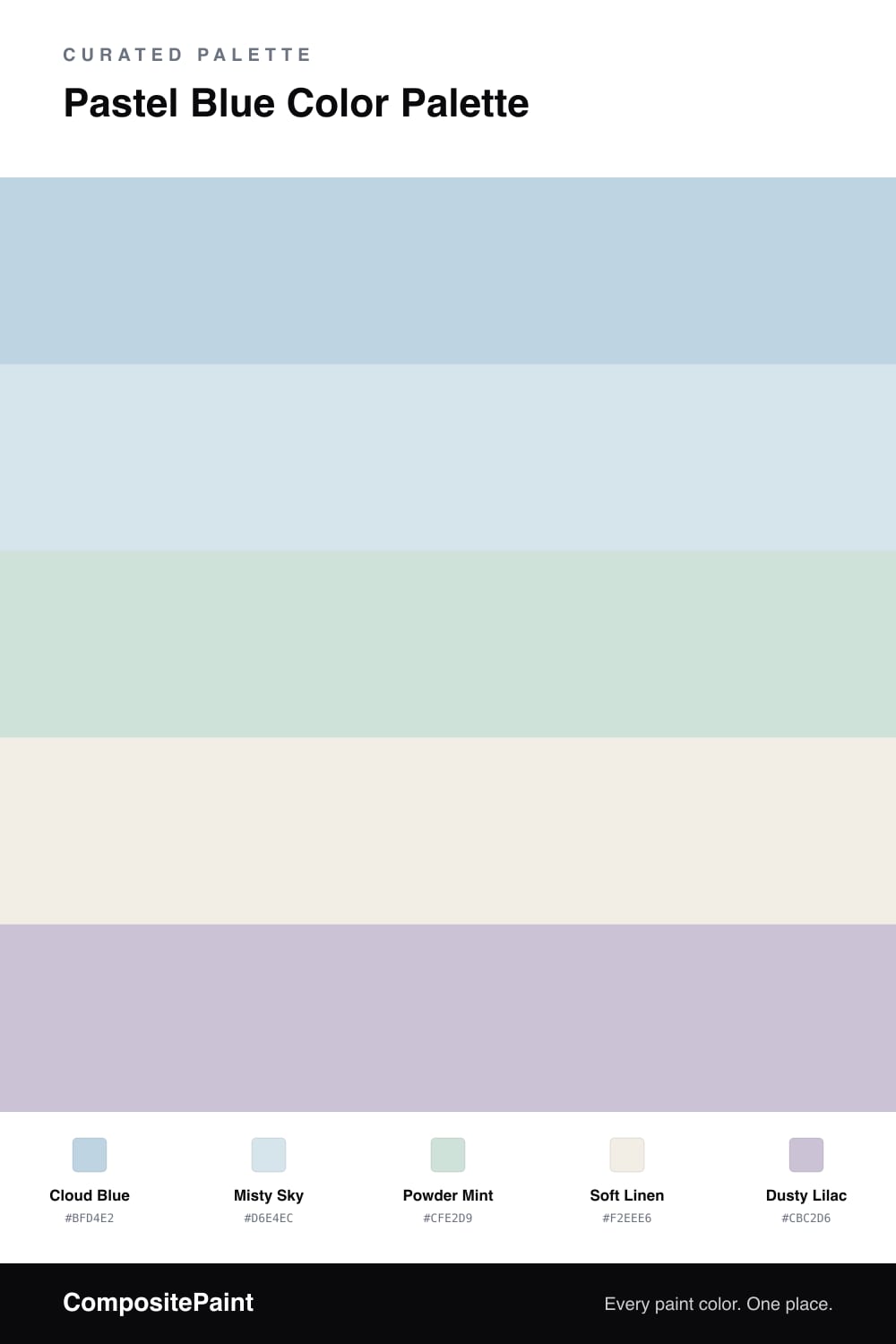
Pastel blue is having a quiet moment in 2026, and Cloud Blue is exactly the shade designers keep reaching for — light enough to feel like air, blue enough to actually commit. It leads this scheme as the dominant color, with Misty Sky layered just a step paler so the two never compete; they blend like a sky going hazy at the edges.
Powder Mint brings the faintest green-leaning cool to keep things from getting too sweet, while Soft Linen does the grounding work as a warm near-white base — the breathing room that stops four soft tones from blurring together. A whisper of Dusty Lilac is the accent that earns its keep in small doses, a tiny lift of warmth against all that cool.
Use Cloud Blue on your biggest surface, treat Misty Sky and Powder Mint as gentle seconds, and save the lilac for the smallest moments. It is soft without being precious, which is the whole trick with pastels.
Buy These Colors
Each color matched to the closest real paint in every brand, by ΔE2000. Tap a swatch for its full guide or + to save it — take any SKU to the store, they mix on demand.
Questions
It can if you stop at one coat or skimp on light. Cloud Blue holds its tint best on a wall that gets soft, indirect daylight. In a north-facing space, sample it first because cool light can flatten it toward gray, and pair it with the warmer Soft Linen to keep the blue reading as a real color.
Lean on contrast in finish and proportion, not in color. Let Cloud Blue lead on the largest surface, keep Misty Sky and Powder Mint as quiet seconds, and use Dusty Lilac only in small doses. A matte or eggshell sheen plus a few black or brass touches grounds the softness and reads grown-up, not baby-room.
Similar Palettes
Closest schemes by color — not by label.