Pastel Blue Color Palette — Soft Sky Morning
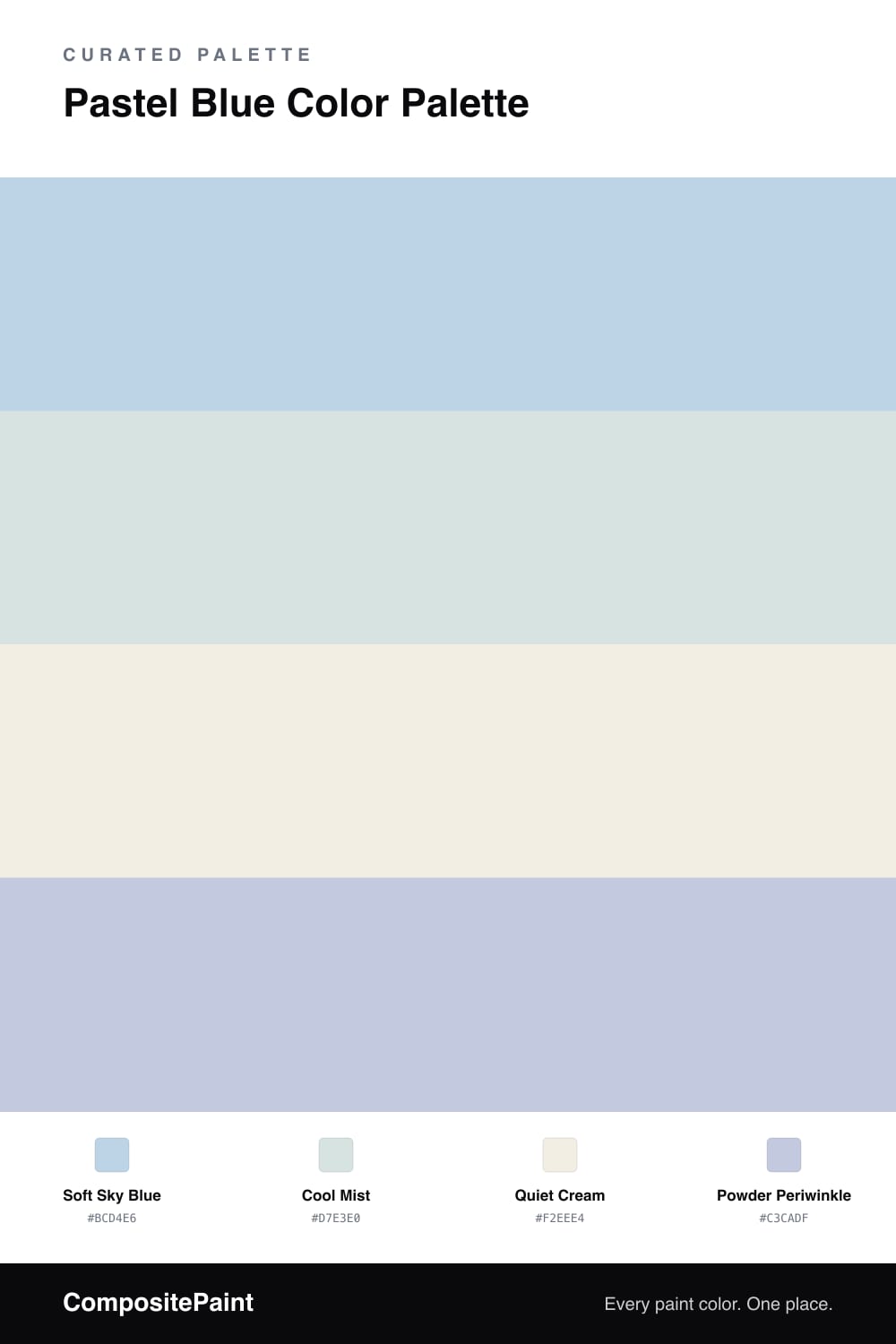
A gentle four-color scheme led by a soft pastel sky blue, layered with cool mist, warm cream, and a quiet powder accent — every color matched to real paint you can buy.
By Jessica Williams · Color Stylist & Interior Editor
There is a particular blue you see for about twenty minutes after sunrise, before the sky deepens into day — pale, clean, almost weightless. That is the feeling behind this scheme. Soft Sky Blue leads, light enough to breathe but with just enough pigment to stay clearly blue, not a washed-out white.
Around it, Cool Mist and Quiet Cream soften everything. The mist is a barely-there blue-green that keeps the palette cool and calm, while the cream warms the edges so the whole thing never tips chilly. Together they make the kind of quiet, low-contrast backdrop that feels very of-the-moment right now.
The spark is Powder Periwinkle — that gentle blue-violet that has been quietly everywhere lately. Use it sparingly, on a single piece or a length of trim, and it gives this soft sky scheme a little lift without ever raising its voice.
Buy These Colors
Each color matched to the closest real paint in every brand, by ΔE2000. Tap a swatch for its full guide or + to save it — take any SKU to the store, they mix on demand.
Questions
It can if the room faces north, because cool daylight pulls the blue toward gray. To keep the soft sky feeling, sample a board and lean a touch warmer with the cream, or add a pinch more of the periwinkle for color you can actually see.
Give it one clear lead and a little contrast. Let the soft sky blue dominate, keep the cream as the quiet base, and use the periwinkle in small doses on a chair or trim so the eye has somewhere to land.
Similar Palettes
Closest schemes by color — not by label.