PROFESSIONAL-GRADE PAINT
ONE COAT COVERAGE
MADE FOR REAL RESULTS
CompositePaint

Cream Kitchen Palette — Soft Cream & White Cabinets

A warm, timeless 4-color scheme for kitchens: cream walls, crisp white cabinets, natural wood tan, and a soft sage accent. Every color matched to real paint you can buy.

By Jessica Williams · Color Stylist & Interior Editor

Soft Cream
Walls
Kompozit Pale Quartz · 0362
#EFEADA
LRV 82
Crisp White
Cabinets
Kompozit Sugar Dust · 0011
#F8F6ED
LRV 92
Wood Tan
Wood & Counters
Kompozit Apple Crisp · 0247
#BB8E5E
LRV 31
Soft Sage
Accent
Kompozit Hidden Glade · 0744
#98AD8E
LRV 39
View palette in

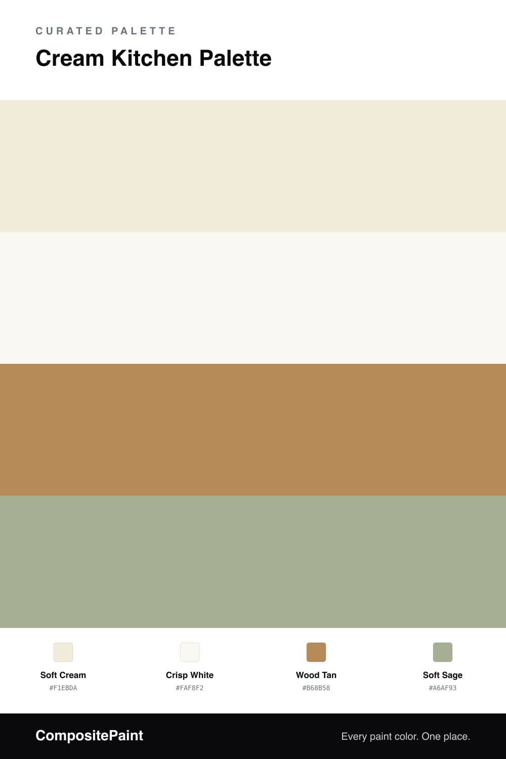
A cream kitchen is warm where pure white can feel clinical — softer, cozier, and more forgiving in changing light. This palette pairs soft cream walls with crisp white cabinets, so the two whites play off each other and the room feels layered instead of flat, while staying light and bright.

Wood tan comes in through floors, open shelving, or a butcher-block counter, adding the natural warmth that makes a cream kitchen feel lived-in and welcoming. A soft sage accent — on an island, a runner, or simply herbs and plants — keeps the warm tones honest with a cool, fresh counterpoint.

Use the cream on the walls, the cleaner white on cabinets and trim, and let the wood and sage do the rest. The result is a timeless, sunlit kitchen that works as well in a cottage as in a modern home, and never feels dated.

Buy These Colors

Each color matched to the closest real paint in every brand, by ΔE2000. Kompozit first; take any SKU to the store — these mix on demand.

Soft Cream
#F1EBDA · LRV 83 · Walls
Kompozit Pale Quartz · 0362 ΔE 0.57
Backdrop Don't Eat the Yellow Snow · BD-DS ΔE 2.5
Behr Original White · N290-1 ΔE 0.77
Benjamin Moore Linen White · 912 ΔE 0.49
Clare Like Buttah · PNT100-LT-62 ΔE 2.46
Dunn-Edwards White Sand · DEW336 ΔE 1.81
Farrow & Ball White Tie · No. 2002 ΔE 1.42
Magnolia Home Pearly Cotton · JG-33 ΔE 0.93
PPG / Glidden Ivory Tower · 1103-1 ΔE 0.45
Sherwin-Williams Classic Light Buff · SW 50 ΔE 1.24
Valspar Statuesque · 7002-5 ΔE 1.18
Crisp White
#FAF8F2 · LRV 94 · Cabinets
Kompozit Sugar Dust · 0011 ΔE 1.47
Backdrop Tabula Rasa · BD-TR ΔE 2.64
Behr Polar Bear · 75 ΔE 1.47
Benjamin Moore Snowfall White · 2144-70 ΔE 2.28
Clare Whipped · PNT100-LT-02 ΔE 1.98
Dunn-Edwards Milk Glass · DEW358 ΔE 0.6
Farrow & Ball All White · No. 2005 ΔE 1.24
Magnolia Home True White · JG-21 ΔE 1.52
PPG / Glidden Delicate White · 1001-1 ΔE 2.04
Sherwin-Williams High Reflective White · SW 7757 ΔE 1.03
Valspar Ultra White · 7006-24 ΔE 0.98
Wood Tan
#B68B58 · LRV 29 · Wood & Counters
Kompozit Apple Crisp · 0247 ΔE 1.66
Backdrop Anita · BD-AN ΔE 11.6
Behr Almond Roca · S260-5 ΔE 0.96
Benjamin Moore Bryan Ochre · CW-390 ΔE 1.01
Clare Good as Gold · PNT100-DP-59 ΔE 6.44
Dunn-Edwards Ghost Town · DE5327 ΔE 1.71
Farrow & Ball Red Earth · No. 64 ΔE 14.96
Magnolia Home Vintage Crown · JG-152 ΔE 3.94
PPG / Glidden Allegro · 1090-6 ΔE 1.09
Sherwin-Williams Tatami Tan · SW 6116 ΔE 3.68
Valspar Sand Mountain · 8003-21E ΔE 2.3
Soft Sage
#A6AF93 · LRV 41 · Accent
Kompozit Hidden Glade · 0744 ΔE 4.35
Backdrop Le Freak · BD-LF ΔE 2.38
Behr Garden Wall · 730D-4 ΔE 1.72
Benjamin Moore Estate Sale · CSP-795 ΔE 2.81
Clare Matcha Latte · PNT100-DP-50 ΔE 7.81
Dunn-Edwards Shaggy Barked · DEC771 ΔE 8.78
Farrow & Ball French Gray · No. 18 ΔE 6.18
Magnolia Home Seasonal · JG-51 ΔE 3.02
PPG / Glidden Olive Sprig · 1125-4 ΔE 2.55
Sherwin-Williams Clary Sage · SW 6178 ΔE 4
Valspar Green Garlands · 5007-3C ΔE 1.11

Questions

What is the difference between cream and white in a kitchen?

Cream is white with a touch of yellow, so it feels warmer and softer. Using cream on the walls and a cleaner white on the cabinets gives gentle contrast, so the room feels layered rather than flat while staying light and bright.

How do I keep a cream kitchen from looking yellow?

Balance it. Pair the cream with a crisp white on cabinets and add a cool accent like soft sage through an island or plants. The touch of green keeps the warm tones honest, so the kitchen reads creamy rather than yellow.

Similar Palettes

Closest schemes by color — not by label.