CP

Butter Yellow Kitchen Palette — Soft Yellow & White Cabinets

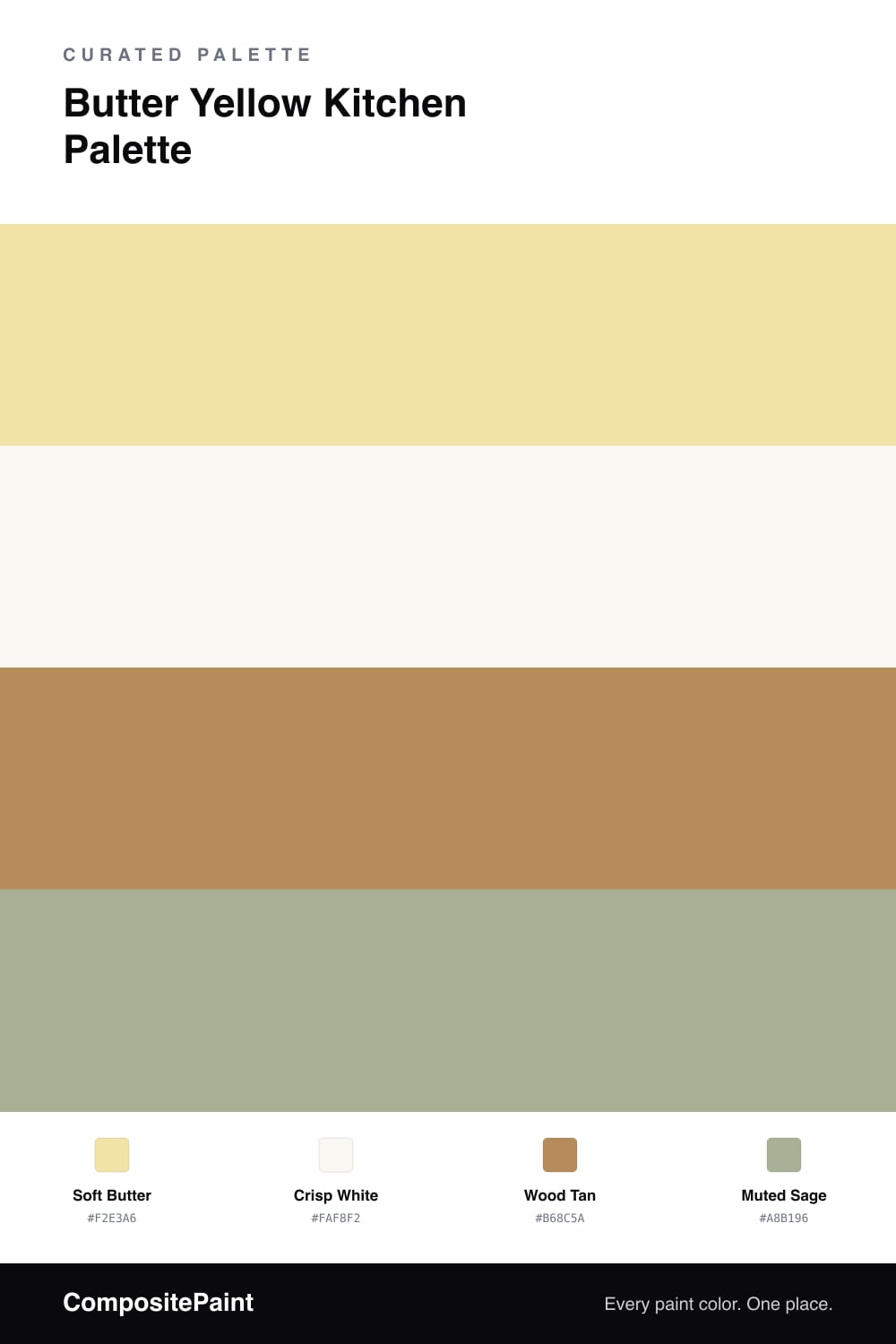
A cheerful, sunlit 4-color scheme for kitchens: soft butter yellow walls, crisp white cabinets, warm wood tan, and a muted sage accent. Every color matched to real paint you can buy.

By Jessica Williams · Color Stylist & Interior Editor

A butter yellow kitchen is hard not to smile in. This palette pairs soft butter walls with crisp white cabinets, so the yellow reads like morning sunshine while the cabinets keep everything clean and bright. The white stops the yellow from feeling heavy and bounces light around the room.

Wood tan comes in through floors, open shelving, or a butcher-block counter, adding warmth and a natural, lived-in feel. A muted sage accent — on an island, a runner, or simply plants and ceramics — gives the eye a calm, fresh counterpoint to all that warmth.

Keep the yellow soft and let the white do the heavy lifting on cabinets and trim. The result is a happy, sunlit kitchen that feels welcoming any time of day, never garish, and easy to live with for years.

View palette in
Soft Butter
Walls
Glidden Butterfly Bush · PPG1214-4
#F3E4A7
LRV 77
Crisp White
Cabinets
Dunn-Edwards Milk Glass · DEW358
#FAF7F0
LRV 86
Wood Tan
Wood & Counters
Behr Almond Roca · S260-5
#B48C5C
LRV 29
Muted Sage
Accent
Dutch Boy Refuge Green · 327-3DB
#ADB69A
LRV 45

Buy These Colors

Each color matched to the closest real paint in every brand, by ΔE2000. Tap a swatch for its full guide or + to save it — take any SKU to the store, they mix on demand.

Soft Butter
#F2E3A6 · LRV 77 · Walls
Sherwin-Williams · SW 6900 · ΔE 1.7
Behr · 390E-3 · ΔE 4.12
Benjamin Moore · HC-4 · ΔE 1.57
Valspar · V018-1 · ΔE 1.25
PPG / Glidden · PPG1214-4 · ΔE 0.32
Glidden · PPG1214-4 · ΔE 0.22
Dutch Boy · 122-4DB · ΔE 1.21
HGTV Home by Sherwin-Williams · HGSW 1185 · ΔE 1.7
Dunn-Edwards · DE5450 · ΔE 0.4
Magnolia Home · JG-38 · ΔE 5.74
Farrow & Ball · NO. 233 · ΔE 1.12
Diamond Vogel · 0812 · ΔE 1.8
Hirshfield's · 0798 · ΔE 1.87
Rodda · CA127 · ΔE 8.81
C2 Paint · C2-592 · ΔE 2.78
Clare · PNT100-MD-22 · ΔE 5.02
Portola Paints · PATISSERIE · ΔE 5.11
Annie Sloan · OLD OCHRE · ΔE 10.01
Backdrop · BD-CC · ΔE 9.65
Rust-Oleum · 398641 · ΔE 5.76
Kompozit · 0798 · ΔE 1.87
Crisp White
#FAF8F2 · LRV 94 · Cabinets
Sherwin-Williams · SW 7757 · ΔE 1.03
Behr · PR-W15 · ΔE 0.99
Benjamin Moore · 2144-70 · ΔE 2.28
Valspar · 7006-24 · ΔE 0.98
PPG / Glidden · PPG1001-1 · ΔE 2.18
Glidden · 61YY 89/040 · ΔE 2.01
Dutch Boy · 001W · ΔE 1.47
HGTV Home by Sherwin-Williams · HGSW 4001 · ΔE 1.03
Dunn-Edwards · DEW358 · ΔE 0.6
Magnolia Home · JG-21 · ΔE 1.52
Farrow & Ball · NO. 2005 · ΔE 1.28
Diamond Vogel · 0011 · ΔE 2.05
Hirshfield's · 0011 · ΔE 1.47
Rodda · R007 · ΔE 1.64
C2 Paint · C2-756 · ΔE 2.02
Clare · PNT100-LT-02 · ΔE 1.98
Portola Paints · TABLE LINEN · ΔE 1.64
Annie Sloan · OLD OCHRE · ΔE 14.75
Backdrop · BD-TR · ΔE 2.64
Rust-Oleum · 285140 · ΔE 4.05
Kompozit · 0011 · ΔE 1.47
Wood Tan
#B68C5A · LRV 29 · Wood & Counters
Sherwin-Williams · SW 6116 · ΔE 3.58
Behr · S260-5 · ΔE 0.65
Benjamin Moore · 1105 · ΔE 1.6
Valspar · 8003-21E · ΔE 2.31
PPG / Glidden · PPG1090-6 · ΔE 0.97
Glidden · PPG1091-6 · ΔE 2.38
Dutch Boy · 315-5DB · ΔE 2.27
HGTV Home by Sherwin-Williams · HGSW 2153 · ΔE 3.58
Dunn-Edwards · DET685 · ΔE 1.71
Magnolia Home · JG-152 · ΔE 3.82
Farrow & Ball · NO. 46 · ΔE 3.03
Diamond Vogel · 0248 · ΔE 2.59
Hirshfield's · 0247 · ΔE 1.53
Rodda · CA101 · ΔE 4.57
C2 Paint · C2-602 · ΔE 1.99
Clare · PNT100-DP-59 · ΔE 6.15
Portola Paints · BANDELIER · ΔE 4.03
Annie Sloan · CHATEAU GREY · ΔE 12.15
Backdrop · BD-AN · ΔE 11.26
Rust-Oleum · 398640 · ΔE 8.36
Kompozit · 0247 · ΔE 1.53
Muted Sage
#A8B196 · LRV 42 · Accent
Sherwin-Williams · SW 13 · ΔE 3.31
Behr · PPU10-06 · ΔE 2
Benjamin Moore · CSP-795 · ΔE 2.86
Valspar · 5006-3C · ΔE 2.65
PPG / Glidden · PPG1125-4 · ΔE 2.54
Glidden · PPG1125-4 · ΔE 2.45
Dutch Boy · 327-3DB · ΔE 1.41
HGTV Home by Sherwin-Williams · HGSW 3245 · ΔE 3.87
Dunn-Edwards · DET503 · ΔE 1.64
Magnolia Home · JG-51 · ΔE 2.85
Farrow & Ball · NO. 18 · ΔE 5.1
Diamond Vogel · 0744 · ΔE 3.99
Hirshfield's · 0456 · ΔE 5.08
Rodda · CA170 · ΔE 4.39
C2 Paint · C2-700 · ΔE 4.78
Clare · PNT100-DP-50 · ΔE 7.86
Portola Paints · ABERDEEN · ΔE 7.59
Annie Sloan · DUCK EGG BLUE · ΔE 6.03
Backdrop · BD-LF · ΔE 2.41
Rust-Oleum · 371674 · ΔE 3.9
Kompozit · 0456 · ΔE 5.08

Questions

Will butter yellow walls look too bright?

A soft, buttery yellow stays gentle rather than neon, especially next to white cabinets. It reads as warm light more than as color, so the kitchen feels sunny even on gray days without feeling loud.

Can I add a second color to a yellow kitchen?

Yes, a muted sage is a natural partner. Use it on an island, a bench, or pottery and plants. Green and yellow sit beside each other in nature, so the pairing feels fresh and easy rather than forced.

KEEP EXPLORING

Similar Palettes

Closest schemes by color — not by label.