CP

Coastal Color Palette — Sage Field by the Sea

A breezy five-color coastal scheme layering soft sea blue and sage with warm sand, crisp white, and a deep navy anchor — every color matched to real paint you can buy.

By Jessica Williams · Color Stylist & Interior Editor

Sea Blue
Dominant
Kompozit Trisha's Eyes · 0666
#8EB9C4
LRV 44
Soft Sage
Secondary
Kompozit Green Glass · 0751
#AAB892
LRV 45
Crisp White
Base
Kompozit Cyprus Spring · 0411
#F2F2EA
LRV 88
Warm Sand
Support
Kompozit Golden Buff · 0288
#DEC8A3
LRV 59
Deep Navy
Accent
Kompozit Octavius · 0522
#38393F
LRV 4
View palette in

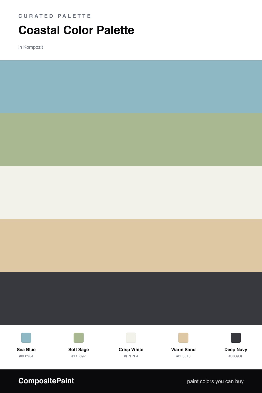
This is the palette I reach for when I want a space to breathe. Sea Blue sets the tone — soft, hazy, the color of early morning over calm water — and it leads the whole scheme without ever feeling heavy.

Soft Sage comes in beside it like a stretch of dune grass, picking up the muted green you see in weathered driftwood. Crisp White and Warm Sand keep everything light and sun-bleached, so the room stays open and easy on the eye.

Then there is Deep Navy, the anchor. A little goes a long way here — one painted door or an island front is enough to give the soft colors something to lean on. It is the touch that keeps this 2026-fresh coastal look from drifting too pale, and it makes the whole field feel intentional.

Buy These Colors

Each color matched to the closest real paint in every brand, by ΔE2000. Kompozit first; take any SKU to the store — these mix on demand.

Sea Blue
#8FB3C4 · LRV 42 · Dominant
Kompozit Trisha's Eyes · 0666 ΔE 3.99
Backdrop Underdog · BD-UD ΔE 6.03
Behr Cloudless Day · ECC-32-1 ΔE 3.48
Benjamin Moore New Born's Eyes · 1663 ΔE 1.37
C2 Paint Linus · C2-749 ΔE 4.28
Clare Vacay · PNT100-LT-44 ΔE 8.77
Diamond Vogel Calm Tint · 0645 ΔE 4.75
Dunn-Edwards Country Air · DET581 ΔE 4.02
Dutch Boy Skippered Blue · 235-5DB ΔE 2.21
Farrow & Ball Lulworth Blue · No. 89 ΔE 4.65
Magnolia Home Morning Calm · JG-77 ΔE 8.78
PPG / Glidden Crystal Lake · PPG1151-4 ΔE 2.56
Sherwin-Williams Respite · SW 6514 ΔE 1.85
Valspar Aster · 8002-41C ΔE 3.32
Soft Sage
#AFB79C · LRV 45 · Secondary
Kompozit Green Glass · 0751 ΔE 3.87
Backdrop Le Freak · BD-LF ΔE 3.66
Behr Moss Print · PPU11-08 ΔE 1.59
Benjamin Moore Croquet · AF-455 ΔE 2.16
C2 Paint Ming · C2-686 ΔE 1.34
Clare Avocado Toast · PNT100-MD-49 ΔE 3.72
Diamond Vogel Green Glass · 0751 ΔE 3.78
Dunn-Edwards Pistachio Shell · DE6263 ΔE 3.13
Dutch Boy Refuge Green · 327-3DB ΔE 0.62
Farrow & Ball Ball Green · No. 75 ΔE 5.03
Magnolia Home Early Riser · JG-59 ΔE 3.97
PPG / Glidden Mellow Mood · PPG1030-3 ΔE 2.6
Sherwin-Williams Plymouth Green · SW 2852 ΔE 2.22
Valspar Green Trellis · 5006-3C ΔE 2.94
Crisp White
#F4F1EA · LRV 88 · Base
Kompozit Cyprus Spring · 0411 ΔE 1.67
Backdrop Tabula Rasa · BD-TR ΔE 2.02
Behr Silk Pillow · PWN-15 ΔE 0.52
Benjamin Moore Gardenia · AF-10 ΔE 0.21
C2 Paint Cocoon · C2-820 ΔE 0.6
Clare Wing It · PNT100-LT-24 ΔE 2.46
Diamond Vogel Cyprus Spring · 0411 ΔE 1.25
Dunn-Edwards Fossil · DE6225 ΔE 0.48
Dutch Boy Birched White · 004W ΔE 0.51
Farrow & Ball Wimborne White · No. 239 ΔE 2.02
Magnolia Home Silos White · JG-107 ΔE 0.68
PPG / Glidden Cotton Tail · PPG0998-1 ΔE 1.25
Sherwin-Williams Cheviot · SW 9503 ΔE 1.33
Valspar Santa's Beard · 8007-6E ΔE 1.18
Warm Sand
#DBC9A8 · LRV 60 · Support
Kompozit Golden Buff · 0288 ΔE 1.62
Backdrop August · BD-AU ΔE 9.39
Behr Pita Bread · PWL-82 ΔE 1.57
Benjamin Moore Monroe Bisque · HC-26 ΔE 0.81
C2 Paint Final Straw · C2-862 ΔE 2.24
Clare High Vibe · PNT100-MD-63 ΔE 7.91
Diamond Vogel Golden Buff · 0288 ΔE 0.91
Dunn-Edwards Light Aspiration · DE6185 ΔE 1.87
Dutch Boy Hazelwood · 415-2DB ΔE 1.34
Farrow & Ball Double Cream · No. 9907 ΔE 1.99
Magnolia Home Tapestry Thread · JG-105 ΔE 4.18
PPG / Glidden Cookie Dough · PPG1096-3 ΔE 0
Sherwin-Williams Believable Buff · SW 6120 ΔE 1.34
Valspar Dakota Trail · 6008-3B ΔE 1.03
Deep Navy
#243648 · LRV 3 · Accent
Kompozit Octavius · 0522 ΔE 7.95
Backdrop After Hours · BD-AH ΔE 13.01
Behr Sorcerer · 760F-7 ΔE 2.36
Benjamin Moore Winding Waterway · 2063-10 ΔE 5.45
C2 Paint Brigand · C2-757 ΔE 6.05
Clare Blackish · PNT100-DP-54 ΔE 13.42
Diamond Vogel Grantsburg Gray · H101 ΔE 9.81
Dunn-Edwards Old Mill · DEA185 ΔE 5.48
Dutch Boy Wishing On A Star · 338-7DB ΔE 1.09
Farrow & Ball Pitch Black · No. 256 ΔE 11.68
Magnolia Home Blackboard · JG-05 ΔE 6.92
PPG / Glidden Starless Sky · PPG0995-7 ΔE 10.55
Sherwin-Williams In the Navy · SW 9178 ΔE 0.93
Valspar Indigo Streamer · 4010-4 ΔE 2.31

Questions

Why do these coastal colors work together?

They borrow the same light you find at the shore — a soft blue sky, sun-warmed sand, weathered driftwood greens, and the deep water on the horizon. Because they all share that gentle, washed-out quality, they feel calm rather than busy when you put them side by side.

How do I balance them in a room?

Let the sea blue lead and keep the white and sand as your quiet backdrop, then bring in soft sage on cabinets or trim. Save the deep navy for one grounding moment — a door, an island, or a single wall.

Similar Palettes

Closest schemes by color — not by label.