Blush Color Palette — Opal Glow
A soft five-color scheme led by warm blush, layered with gentle neutrals and one quiet plum accent — every color matched to real paint you can buy.
By Emily Roberts · DIY Editor & First-Timer's Guide
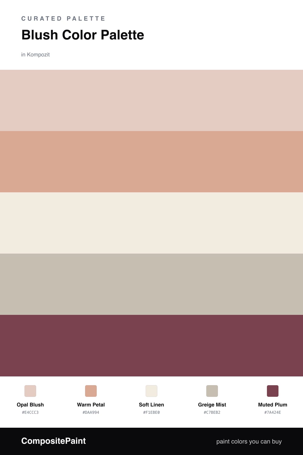
Blush is having a real moment in 2026, and this scheme shows why it works so well. The star here is Opal Blush, a warm, slightly clay-toned pink that feels cozy instead of candy-sweet. It sets the whole mood.
To keep it from tipping too soft, I layered in Warm Petal for a touch more color and let Soft Linen and Greige Mist do the quiet, steadying work in the background. Those two neutrals are what make blush read as calm and modern rather than frilly.
The little secret is Muted Plum. Used in small doses — a chair, a stack of books, a single frame — it adds just enough contrast to make everything else feel intentional. Let the blush dominate, lean on the neutrals, and save the plum for the spark.
Buy These Colors
Each color matched to the closest real paint in every brand, by ΔE2000. Kompozit first; take any SKU to the store — these mix on demand.
Questions
It comes down to the neutrals you pair it with. Warm linen and a soft greige pull blush toward a calm, earthy mood, and the muted plum gives it just enough depth to feel current rather than sweet.
Let blush lead — think most of your walls and big soft pieces, roughly two-thirds of the room. The neutrals carry the rest, and you only need a small touch of the plum on something like a pillow or a frame.
Similar Palettes
Closest schemes by color — not by label.