CP

Blue & Yellow Color Palette — Seaside Morning

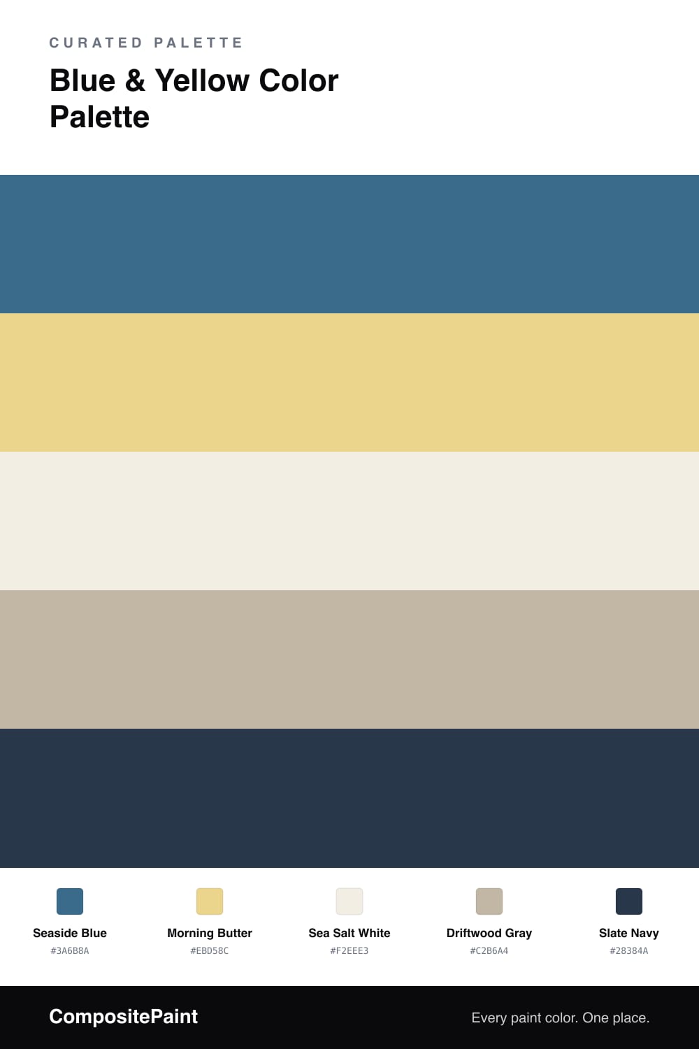
A fresh five-color scheme pairing a deep coastal blue with a soft buttery yellow, balanced by warm white and driftwood gray — every color matched to real paint you can buy.

By David Chen · Formulation Lead & Resident Chemist

Think of blue and yellow the way you’d think of the sea and the early light on it. Seaside Blue is the deep, settled water — cool, calm, and easy to live with — while Morning Butter is the warm glow that keeps the whole thing from feeling cold. They sit far enough apart on the wheel to stay interesting, but they share a softness that makes them read as friendly rather than loud.

The neutrals do the patient work here. Sea Salt White opens up the space and lets the blue breathe, and Driftwood Gray adds a weathered, sandy middle tone so the jump from blue to yellow never feels abrupt. A little Slate Navy at the edges acts like the dark line where the horizon meets the sky — small, but it sharpens everything around it.

For a slightly more 2026 feel, lean the yellow soft and chalky rather than bright. Use the blue as your dominant color, the butter yellow as a measured accent, and let the warm white and gray carry the rest. The result is fresh and coastal without tipping into nautical cliche.

View palette in
Seaside Blue
Dominant
Benjamin Moore Bellbottom Blues · CSP-655
#386B8C
LRV 15
Morning Butter
Secondary
Benjamin Moore Laguna Yellow · 291
#EBD689
LRV 64
Sea Salt White
Base
Farrow & Ball Pointing · No. 2003
#F3EFE3
LRV 86
Driftwood Gray
Support
Valspar Counterpoint · 8005-5C
#C1B6A5
LRV 47
Slate Navy
Accent
Sherwin-Williams In the Navy · SW 9178
#283849
LRV 4

Buy These Colors

Each color matched to the closest real paint in every brand, by ΔE2000. Tap a swatch for its full guide or + to save it — take any SKU to the store, they mix on demand.

Seaside Blue
#3A6B8A · LRV 13 · Dominant
Sherwin-Williams · SW 7607 · ΔE 3.33
Behr · MQ5-61 · ΔE 1.99
Benjamin Moore · CSP-655 · ΔE 0.58
Valspar · V069-5 · ΔE 3.2
PPG / Glidden · PPG1158-6 · ΔE 2.41
Glidden · PPG1158-6 · ΔE 2.3
Dutch Boy · 236-6DB · ΔE 3.33
HGTV Home by Sherwin-Williams · HGSW 1382 · ΔE 4.27
Dunn-Edwards · DE5852 · ΔE 2.07
Magnolia Home · JG-163 · ΔE 3.99
Farrow & Ball · NO. 9820 · ΔE 9.57
Diamond Vogel · H056 · ΔE 2.42
Hirshfield's · 0619 · ΔE 3.4
Rodda · R076 · ΔE 9.39
C2 Paint · BD26 · ΔE 5.92
Clare · PNT100-DP-45 · ΔE 6.67
Portola Paints · NEWBURY PORT · ΔE 8.63
Annie Sloan · RODMELL · ΔE 24.18
Backdrop · BD-MJ · ΔE 6.88
Rust-Oleum · 329207 · ΔE 4.09
Kompozit · 0619 · ΔE 3.4
Morning Butter
#EBD58C · LRV 67 · Secondary
Sherwin-Williams · SW 6702 · ΔE 2.43
Behr · M320-4 · ΔE 1.66
Benjamin Moore · 291 · ΔE 0.84
Valspar · 8001-26D · ΔE 2.3
PPG / Glidden · PPG11-02 · ΔE 1.73
Glidden · PPG11-02 · ΔE 1.57
Dutch Boy · 222-3DB · ΔE 2.43
HGTV Home by Sherwin-Williams · HGSW 1236 · ΔE 2.43
Dunn-Edwards · DE5430 · ΔE 1.86
Magnolia Home · JG-39 · ΔE 1.81
Farrow & Ball · NO. 74 · ΔE 2.93
Diamond Vogel · 0813 · ΔE 0.96
Hirshfield's · 0813 · ΔE 1.82
Rodda · CA129 · ΔE 8.71
C2 Paint · C2-607 · ΔE 2.37
Clare · PNT100-MD-23 · ΔE 6.21
Portola Paints · PATISSERIE · ΔE 7.75
Annie Sloan · OLD OCHRE · ΔE 10.14
Backdrop · BD-EA · ΔE 4.69
Rust-Oleum · 398641 · ΔE 7.84
Kompozit · 0813 · ΔE 1.82
Sea Salt White
#F2EEE3 · LRV 86 · Base
Sherwin-Williams · SW 7566 · ΔE 0.5
Behr · ECC-61-2 · ΔE 1.23
Benjamin Moore · 2143-60 · ΔE 1.48
Valspar · V153 · ΔE 0.55
PPG / Glidden · PPG1100-1 · ΔE 1.11
Glidden · PPG1020-1 · ΔE 0.56
Dutch Boy · 020W · ΔE 1.3
HGTV Home by Sherwin-Williams · HGSW 4003 · ΔE 0.5
Dunn-Edwards · DE6204 · ΔE 0.94
Magnolia Home · JG-107 · ΔE 1.81
Farrow & Ball · NO. 2003 · ΔE 0.48
Diamond Vogel · 0012 · ΔE 0.59
Hirshfield's · 0012 · ΔE 1.11
Rodda · CA007 · ΔE 0.95
C2 Paint · C2-708 · ΔE 0.59
Clare · PNT100-LT-24 · ΔE 3.26
Portola Paints · ORIGAMI · ΔE 2.7
Annie Sloan · OLD OCHRE · ΔE 12
Backdrop · BD-JA · ΔE 1
Rust-Oleum · 329598 · ΔE 4.48
Kompozit · 0012 · ΔE 1.11
Driftwood Gray
#C2B6A4 · LRV 48 · Support
Sherwin-Williams · SW 7506 · ΔE 0.59
Behr · QE-28 · ΔE 2.26
Benjamin Moore · CSP-225 · ΔE 1.07
Valspar · 8005-5C · ΔE 0.5
PPG / Glidden · PPG14-14 · ΔE 1.08
Glidden · PPG14-14 · ΔE 1.48
Dutch Boy · 404-2DB · ΔE 2.85
HGTV Home by Sherwin-Williams · HGSW 3446 · ΔE 0.59
Dunn-Edwards · DEC766 · ΔE 2.18
Magnolia Home · JG-19 · ΔE 3.39
Farrow & Ball · NO. 293 · ΔE 2.2
Diamond Vogel · 0225 · ΔE 2.22
Hirshfield's · 0197 · ΔE 1.62
Rodda · CA045 · ΔE 2.01
C2 Paint · C2-909 · ΔE 1.59
Clare · PNT100-LT-13 · ΔE 5.46
Portola Paints · SEVILLA · ΔE 2.95
Annie Sloan · PALOMA · ΔE 7.63
Backdrop · BD-UD · ΔE 15.02
Rust-Oleum · 285143 · ΔE 11.52
Kompozit · 0197 · ΔE 1.62
Slate Navy
#28384A · LRV 4 · Accent
Sherwin-Williams · SW 9178 · ΔE 0.55
Behr · 760F-7 · ΔE 1.85
Benjamin Moore · CC-932 · ΔE 1.13
Valspar · 4010-4 · ΔE 2.88
PPG / Glidden · PPG0995-7 · ΔE 10.19
Glidden · 00NN 05/000 · ΔE 10.21
Dutch Boy · 336-7DB · ΔE 2.12
HGTV Home by Sherwin-Williams · HGSW 3351 · ΔE 2.19
Dunn-Edwards · DEA185 · ΔE 4.54
Magnolia Home · JG-05 · ΔE 6.65
Farrow & Ball · NO. W24 · ΔE 8.27
Diamond Vogel · H101 · ΔE 9.49
Hirshfield's · 0522 · ΔE 7.41
Rodda · CA210 · ΔE 5.87
C2 Paint · C2-757 · ΔE 5.31
Clare · PNT100-DP-54 · ΔE 12.9
Portola Paints · GHOST TREE · ΔE 6.21
Annie Sloan · NAPOLEONIC BLUE · ΔE 7.4
Backdrop · BD-AH · ΔE 12.76
Rust-Oleum · 285144 · ΔE 7.93
Kompozit · 0522 · ΔE 7.41

Questions

Will a soft yellow read as too dull next to a strong blue?

No, and that is the point. A pale buttery yellow like Morning Butter holds its own without shouting. Place it in smaller amounts against the deep Seaside Blue and it warms the whole scheme up, almost like sunlight landing on water.

How much of each color should I actually use?

Let Seaside Blue lead at roughly half the space, give the yellow about one-fifth as the spark, and fill the rest with Sea Salt White and Driftwood Gray. Save Slate Navy for thin edges and trim so it grounds everything without crowding it.

KEEP EXPLORING

Similar Palettes

Closest schemes by color — not by label.