Blue & Orange Color Palette — Copper Bay
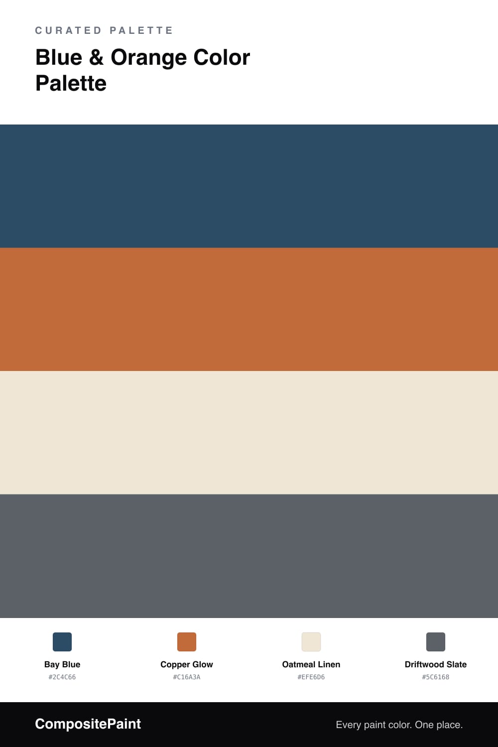
A four-color scheme pairing a deep bay blue with a glowing copper orange, softened by oatmeal and slate — every color matched to real paint you can buy.
By Jessica Williams · Color Stylist & Interior Editor
Blue and orange are true opposites, which is exactly why they flatter each other so easily. This scheme takes the warmest, most lived-in version of that pairing: a deep, slightly grayed Bay Blue as the anchor and a glowing Copper Glow as the spark. Nothing here is loud or primary; both colors feel like they have spent a season near the water.
Oatmeal Linen does the quiet work in between, a soft warm cream that gives the two stronger colors room to breathe so the copper reads as a glow rather than a clash. It is the field you build everything else on.
A touch of Driftwood Slate rounds the whole thing out, bridging the cool blue and the warm copper with a gentle gray. Let the blue dominate, keep the copper to smaller accents, and lean on the neutrals to hold the calm — a grounded, contemporary take on classic contrast.
Buy These Colors
Each color matched to the closest real paint in every brand, by ΔE2000. Tap a swatch for its full guide or + to save it — take any SKU to the store, they mix on demand.
Questions
Lean on the oatmeal between them. A wide field of warm cream lets the copper read as a glow rather than a stain, and it keeps the deep blue from feeling heavy. Use the copper in small, deliberate doses so it stays a highlight.
Not if you let the blue lead. Bay Blue is muted and a little grayed, so it settles rather than shouts, and Driftwood Slate softens the edges between every color. The result feels grounded and current, more weathered coastline than primary contrast.
Similar Palettes
Closest schemes by color — not by label.