Moth Wing
A warm gray-brown taupe with almost no online reputation, reviewed honestly: the exterior siding jobs it quietly wins, the trim mistake that ruins it, and what to pick instead.

Jessica has spec'd whites and neutrals for more than 300 rooms and keeps a sample wall of painted drawdowns in her studio. Every color review is checked against real reader rooms in the comments and re-tested when a formula changes. About the testing process →
- 1Roycroft Brass15
- 2Anonymous20
- 3Moth Wing29
- 4Light French Gray53
- 5Accessible Beige58
The Fast Verdict
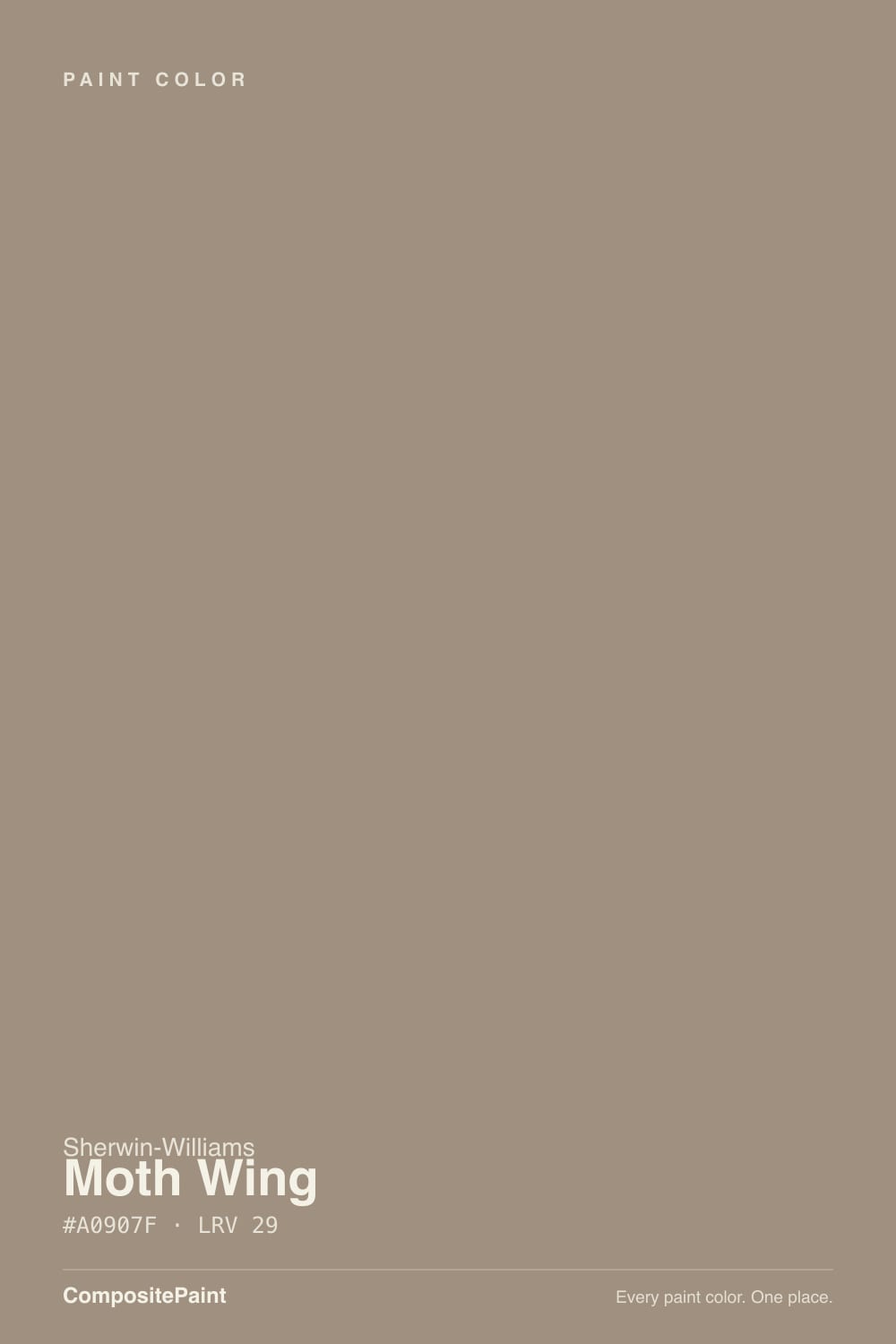
Moth Wing is a mid-depth gray-brown taupe that has done more real work on real houses than its near-total absence from design blogs suggests. Search for it and you mostly get auto-generated color-database pages, not designer praise or a Color of the Year plaque — this is an honest, unglamorous neutral, not a famous one. At LRV 29 it sits well below the safe-greige workhorses like Agreeable Gray, closer to an earth tone than a light neutral, and it shows up most often on Hardie-board exteriors and kitchen islands rather than whole-house walls.
Modern-farmhouse or mid-century exteriors (Hardie siding, stucco, board-and-batten) · kitchen islands and cabinets that want depth without going black · dens and home offices with real daylight · anyone who wants a gray-brown that reads as neither beige nor charcoal
You want a color with a real track record and lots of real-room photos to check against · your trim is already dark (test the contrast direction first) · the room is small, dim, and north-facing · you want a light, airy, whole-house neutral
- A genuinely grounded gray-brown, not a beige and not a flat charcoal
- Reads as a deliberate, modern choice on exteriors most builders skip
- Adds real depth to an island or cabinet run without going full black
- Close in family to well-liked colors (Stone Hearth, Dorian Gray) without the same over-exposure
- Undertone is clean gray-plus-brown — no pink or green surprise to manage
- Almost no real-room track record to check your room against before buying
- Dark trim on the exterior can make the whole scheme read heavy — test the contrast direction first
- LRV 29 is too deep for a default whole-house wall color in most homes
- Goes flat and cave-like in small, dim, north-facing rooms
What Color Is Moth Wing, Really?
A muted taupe built on two undertones working together: gray leads, a quieter warm brown sits underneath it. Sherwin-Williams simply files it under Neutral, with no collection story, no design-team quote, and no famous room attached to it — the closest thing to a documented history is homeowners on renovation forums using it for exterior siding. That obscurity is the honest headline here: it is a genuinely well-built color that never got marketed, not a hidden masterpiece and not a dud.
At LRV 29 it is a real mid-depth tone, closer in weight to an earth tone than to the popular greiges that sit in the LRV 50s and 60s. It reflects less than a third of the light that hits it, so it reads substantial and grounded rather than airy — good for adding weight to a large plain surface like siding or an island, risky for a small room that already runs dim. Its closest sibling in this deck is Benjamin Moore's Stone Hearth, a near-identical hex value one LRV point lighter, which tells you Moth Wing is sitting in well-trodden gray-brown territory even if its own name never got the spotlight.
Undertone in one line: gray first, muted brown underneath, no red or pink to speak of. If a sample reads flat charcoal, the light is cool and dim; if it reads sandier and warmer, that is direct sun or a warm bulb doing exactly what warm light does to a brown-based neutral.
Where It Shines
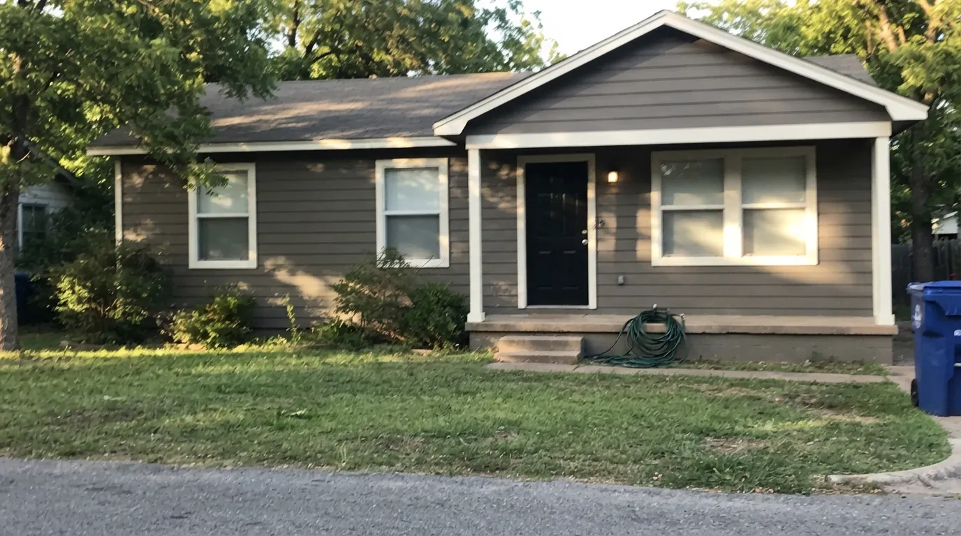
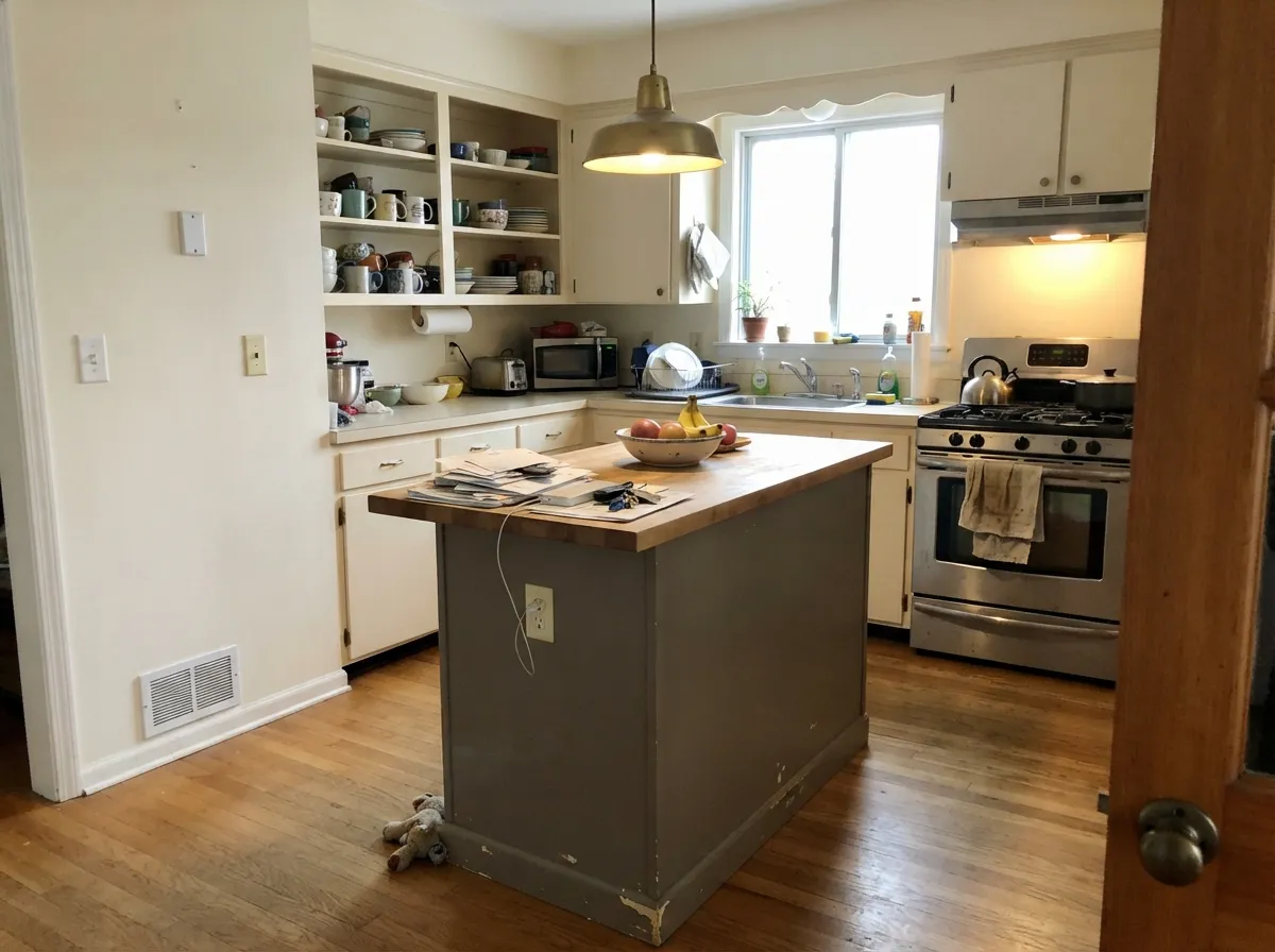
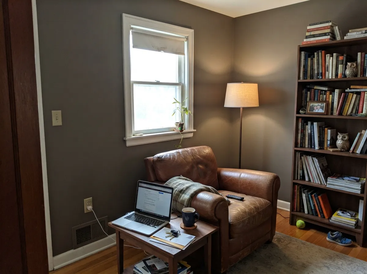
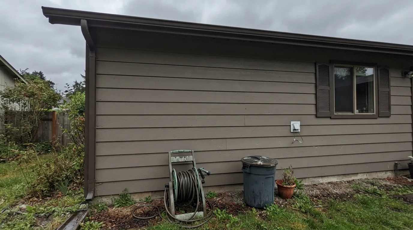
Its best-documented job by far is exterior siding — homeowners planning Hardie-board or stucco exteriors reach for it specifically because it reads as a grounded, modern gray-brown instead of the flat gray or tan that dominates new-build streets. It also earns its keep on a kitchen island or a run of cabinets, where a whole wall of it would feel heavy but a single furniture-scale piece gets real depth without committing to black. In a den or office with honest daylight, it settles into a quiet, grounded backdrop for leather and walnut.
Where It Fails
Moth Wing does not have a long public record of complaints, because it does not have a long public record, period — but the two failure patterns that do turn up are specific and worth taking seriously before you commit a whole exterior or island to it.
The one real documented case: a homeowner planned Moth Wing siding with darker trim and a near-black door and shutters, and a professional color consultant flagged it immediately — the scheme read heavy and confused with dark-on-dark-adjacent. The fix was to reverse it: lighter trim carrying the contrast, Moth Wing doing the color work on the siding, dark reserved for the door alone. Test your actual trim pairing on a large sample before ordering paint for a whole house.
LRV 29 already absorbs most of the light that reaches it. Add a small window and cool north exposure and the room goes flat and cave-like, the brown underneath disappearing into plain dark gray. This is not a color for a windowless powder room or a north bedroom with no supplemental warm lighting.
Next to a true, blue-leaning white — cool white quartz, a stark white trim — the gray-brown mid-tone can read muddy or dingy by contrast, the way any warm mid-depth neutral does next to a cold bright white. Pair it with a warm off-white (Dover White, Eider White) instead of a builder-grade cool white.
Room by Room
Hardie board, stucco, board-and-batten: this is where Moth Wing actually shows up in the wild. It reads as a deliberate modern gray-brown rather than the generic tan or gray on every third new-build. Pair it with a light trim color, not a dark one — see the fails section above.
A satin Moth Wing island or a full run of lower cabinets under a light warm-white wall gets real depth without the maintenance and commitment of black. Pairs comfortably with butcher block, brass, and white quartz that leans warm rather than icy.
In a room with a real window it settles into a grounded, unfussy backdrop for leather, walnut and matte-black hardware. Skip it in a windowless interior office.
Used as a single accent behind the headboard with warm 2700K lamps it reads calm and earthy. As all four walls in a small, poorly lit bedroom it can feel heavy — sample big before committing the whole room.
With a real window or strong sconce lighting, a small room in Moth Wing feels intentional and jewel-box-ish. Windowless powder rooms need warm supplemental light or the color goes flat and dark.
At LRV 29 it is too deep to run as a default whole-house wall color the way Agreeable Gray or Accessible Beige do — it will read heavy across large open square footage unless the space has unusually generous daylight.
Your Light Is the Risk
Direct sun warms the brown underneath and keeps the color feeling grounded rather than flat — the light where its two undertones balance best.
Cool, weak daylight strips the warmth and leaves a flat, cave-like charcoal-brown. Test big in the actual room before committing walls.
Softer and warmer at the sun hours, steadier and more neutral-gray the rest of the day — a gentle shift, not a different color.
Warm 2700K bulbs bring the brown forward and it feels cozy at night; cool white LEDs push it toward flat gray-charcoal — pick warm bulbs for any room using it.
Most complaints about Moth Wing are a light mismatch. Upload a photo of your actual room and see it on your walls — then ask for the same wall in north light or evening lamps before you buy a single sample.
Need It From Another Brand?
Any paint counter can custom-tint Sherwin-Williams SW 9174 directly. If you would rather stay in one brand's own deck, these are the closest stock matches, measured as ΔE2000. Under 2 is a difference you will not see on the wall.
| Brand | Closest color | ΔE | LRV | |
|---|---|---|---|---|
| Behr | Cozy CocoaBNC-13 · Behr | 1.3 | 29 | Color page → |
| Benjamin Moore | WeimaranerAF-155 · Benjamin Moore | 1.4 | 31 | Color page → |
| Valspar | Stone Terrace8005-5E · Valspar | 1.7 | 28 | Color page → |
| PPG / Glidden | Oyster ShellPPG14-13 · PPG / Glidden | 1.2 | 29 | Color page → |
| Glidden | Oyster ShellPPG14-13 · Glidden | 1.2 | 29 | Color page → |
| Dutch Boy | Mission Brown405-4DB · Dutch Boy | 1.9 | 29 | Color page → |
Similar Sherwin-Williams Colors
The nearest shades to Moth Wing within Sherwin-Williams's own range, ranked by perceptual color distance — useful when you want the same look a touch lighter, darker, or warmer.
WCAG 2.1: AA is 4.5 : 1 for normal text, 3 : 1 for large text, AAA is 7 : 1.
Moth Wing vs the Colors You're Also Considering
Every Moth Wing sample board has the same rivals on it. The numbers show the real lightness gap — then it comes down to which risk you would rather live with.
Pick this if you want the Sherwin-Williams version, or want to avoid Stone Hearth's occasional green cast.
Benjamin Moore 984 · LRV 30Stone HearthPick this if you work in Benjamin Moore — it is nearly the same hex, one LRV point lighter, with its own green-flip risk to watch.
Pick this when you want more brown and more depth than Dorian Gray's cooler gray lean gives you.
Sherwin-Williams SW 7017 · LRV 39Dorian GrayPick this for a lighter, cooler greige in the same family that still needs a well-lit room to look its best.
Cocoa Whip (SW 9084), hex #A08E7E at LRV 28, is the closest relative in the line. It is a point darker and a shade browner, and on a wall the two are hard to separate unless they sit side by side. Keystone Gray (SW 7504), hex #9E9284 at LRV 29, is the more useful comparison: identical lightness, but more green in the mix, so it reads as a proper greige while Moth Wing reads as a warm taupe.
Across brands, Behr's Cozy Cocoa (BNC-13) at LRV 29 has a color difference of 1.31 from Moth Wing, which makes it visually identical in normal room light. Benjamin Moore's Weimaraner (AF-155) at LRV 31 is 1.45 away, also visually identical in a room and only slightly lighter on paper.
Farrow and Ball's Charleston Gray (No. 243), hex #9A9087 at LRV 29, is a different story. At 3.76 it is close but visibly different side by side, clearly grayer and less warm.
Moth Wing Coordinating Colors
The rule with Moth Wing is contrast direction: pair it with something meaningfully lighter to carry the trim or ceiling, and reserve true dark for a single accent rather than spreading dark across trim and shutters both. It also plays well with its own lighter siblings when you want a tonal, layered scheme instead of a high-contrast one.
Why Moth Wing Has Almost No Track Record
Search this color and the results are dominated by automated color-database sites — pages generated to list every SKU in a brand's deck with templated undertone and lighting language, not real reviews from real rooms. There is no Color of the Year moment, no viral kitchen, no design-team backstory attached to the name. The one specific, real documentation that does exist is a homeowner's exterior renovation thread, where a professional color consultant weighed in on the trim pairing.
None of that makes the color bad. It means anyone using it is doing more of their own homework than they would with Agreeable Gray or White Dove, where a decade of real rooms already exists to check against. Sample big, in your own light, before committing an exterior or a whole room to it.
Moth Wing With Wood Tones and Exteriors
On siding, Moth Wing pairs comfortably with warm window frames (Terratone-style vinyl or wood-tone composite) and a weathered-wood roof — the palette that shows up in the one documented real-world project. Indoors, it sits well with walnut and other mid-to-dark woods, which share its warm-gray-brown register; very orange honey oak will fight it slightly less than it fights a true gray, but a mid-tone wood is still the safer match.
Metals lean the same direction as most warm-gray neutrals: matte black and aged brass both work; bright chrome is the one finish that reads cold against it.
Three Ready Palettes Built on Moth Wing
A color is never alone on the wall. These are complete combinations in the 60-30-10 pattern, with the reason each one holds together. Every one opens in the visualizer.
This is the reversed version of the pairing that goes wrong: light trim carries the contrast, Moth Wing does the color work across the siding, and the near-black is rationed to the door alone instead of spread across trim and shutters.
Try this palette in your roomA warm off-white perimeter keeps the room bright while Moth Wing carries real weight on the island; the near-black accent stops the two mid-tones from blurring into a single gray blob.
Try this palette in your roomDover White keeps the trim from disappearing into the walls; Cracked Pepper on built-ins gives the room one genuinely dark note so the Moth Wing walls read grounded rather than simply dim.
Try this palette in your roomMoth Wing FAQ
Is Moth Wing a popular color?
No, and that is the honest story here. It has almost no real designer coverage or Color of the Year history — most of what turns up online is auto-generated color-database content, not real-room reviews. What documentation exists is mostly homeowners planning exterior siding jobs. It is a solid, well-built neutral that simply never got marketed.
Is Moth Wing warm or cool?
Gray leads, with a muted brown warmth underneath — it is not a cool color, but it is not a cozy beige either. In direct sun the brown comes forward; in cool, dim light it can read close to flat charcoal-gray.
What trim goes with Moth Wing on an exterior?
Light, not dark. The one documented real-world case paired it with dark trim and a color consultant flagged the scheme as too heavy — reversing it to a light trim with Moth Wing carrying the siding color, and saving any near-black for the front door only, reads far better.
Is it too dark for walls?
At LRV 29 it is too deep for a default whole-house wall color in most homes — it will read heavy across large open square footage. It works best on a single accent wall, an island, cabinets, or an exterior, where its depth is an asset rather than a liability.
How does it compare to Dorian Gray or Fawn Brindle?
All three are Sherwin-Williams gray-browns in the same neighborhood. Dorian Gray (LRV 39) is lighter and cooler; Fawn Brindle (LRV 36) is lighter and leans more brown; Moth Wing (LRV 29) is the deepest and most gray-forward of the three. Pick based on how much depth and how much brown you want.
Does it work with white or black windows?
Both, with a caveat. Black windows on Moth Wing siding read modern and crisp as long as the trim stays light — see the exterior question above. White windows are the safer, more traditional pairing and carry less risk of the scheme reading too dark overall.
Have you painted with Moth Wing?
Rate it — one tap helps the next reader decide.
Ask a Question