Escape Gray
A quiet green-gray reviewed honestly: the light where it reads sage, the light where it goes flat, and the near-twin already in Sherwin-Williams' own deck.

Jessica has spec'd whites and neutrals for more than 300 rooms and keeps a sample wall of painted drawdowns in her studio. Every color review is checked against real reader rooms in the comments and re-tested when a formula changes. About the testing process →
- 1Sage Green22
- 2Evergreen Fog30
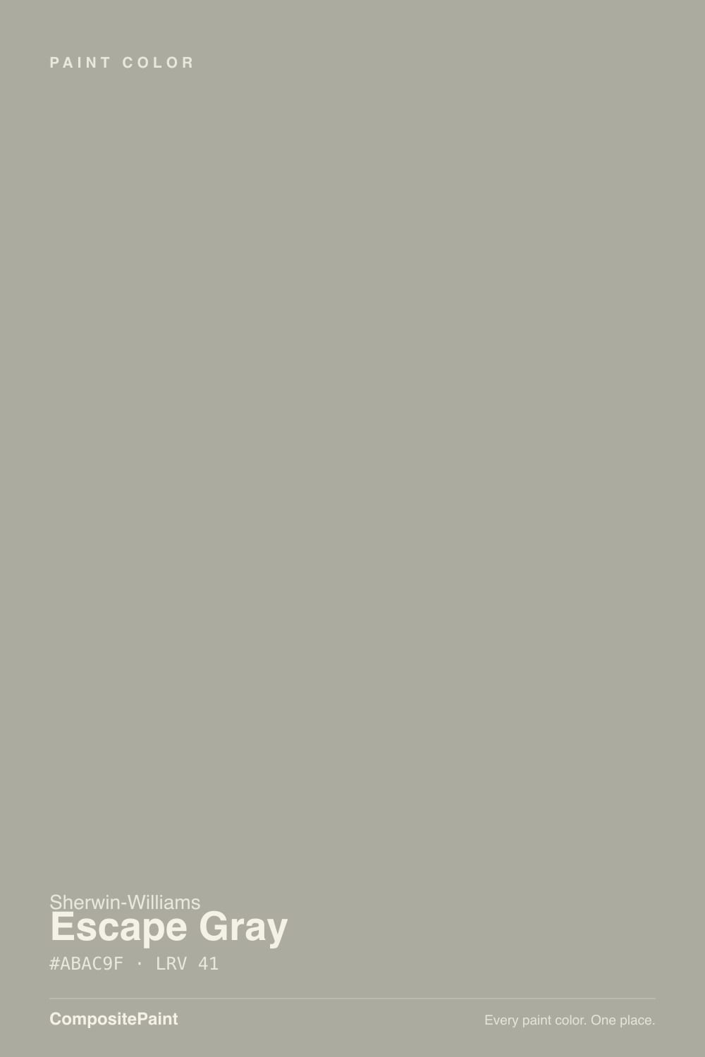
- 3Escape Gray41
- 4October Mist47
- 5Soft Fern57
The Fast Verdict
Escape Gray has never had a Color of the Year moment and probably never will — it is a workhorse, not a headline. Sherwin-Williams files it under green; on most walls it reads gray first, with a green whisper that only shows up when the light lets it. That flexibility is also the catch: paint it in two rooms with different exposures and you can end up with two different-looking colors from the same can.
A soft green without full commitment · cabinets and built-ins in a daylight-heavy kitchen · exteriors and shutters with white trim · anyone who wants a change from true gray or true greige and can live with it moving a little
You need one fixed, unchanging color across rooms with different light · your fixtures are all cool LED · you want the gray to stay gray, full stop · you've already tested Clary Sage and want something meaningfully different
- A genuine green-gray alternative to the usual true-gray and greige choices
- Mid-depth LRV 41 holds real color without going dark
- Excellent on cabinets and exteriors with real daylight
- Warms up nicely under 2700K bulbs at night
- Honest workhorse — no trend hype, no premium for a famous name
- Cool LED bulbs flatten the green out entirely
- Visibly shifts color between rooms with different light exposures
- Nearly indistinguishable from Clary Sage on the wall
- North-facing rooms lose the green identity that likely sold you on it
What Color Is Escape Gray, Really?
A soft green-gray built on a base Sherwin-Williams itself classifies as green — but on the wall, in most rooms, gray is what registers first, with the green surfacing as a whisper rather than a statement. It has none of the marketing behind Evergreen Fog or Sea Salt; no viral kitchen, no Color of the Year press release. It is the kind of color a painter mixes for a client who says "not gray, not beige, something calm" and it quietly does the job.
At LRV 41 it sits at a genuine mid-depth — light enough to work as a whole-house neutral, dark enough to hold real color instead of washing out. That mid-depth is exactly why it moves so much: pale colors barely show undertone, and Escape Gray has enough body to let its green-blue base respond to whatever light hits it. Warm afternoon sun pulls the green forward; cool overcast daylight or a cool LED bulb flattens it back toward a plain, slightly blue-leaning gray.
Undertone in one line: green first, a touch of blue-gray second — never yellow, never beige. If a sample reads distinctly teal or turquoise, that's a strong colored light source (a green lampshade, a sunlit lawn through the window) exaggerating it, not the paint being unpredictable on its own.
Where It Shines
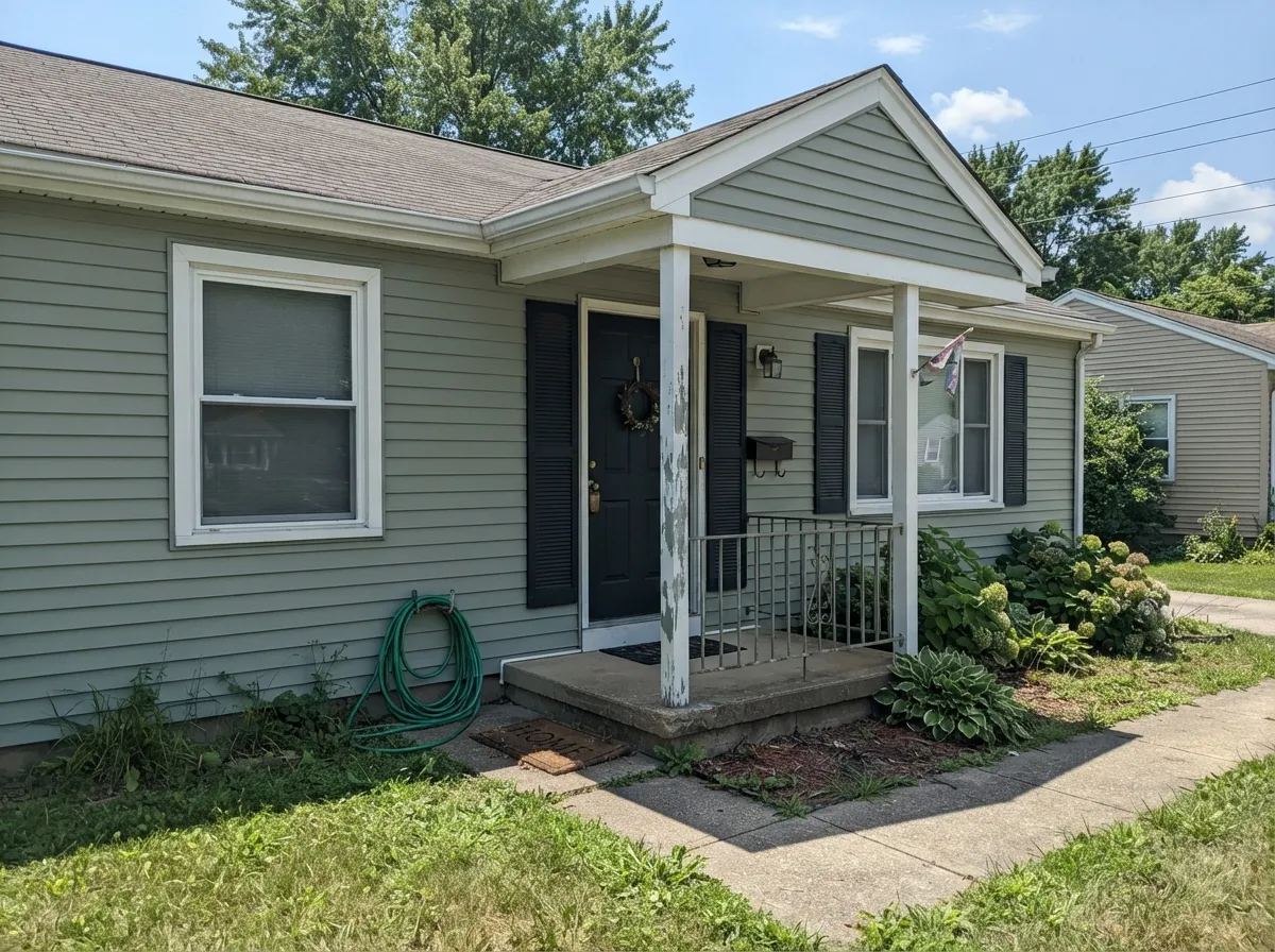
Give it real daylight, warm wood, and brass, and the green comes forward just enough to feel deliberate — a hushed, unnamed color that reads as "interesting neutral" rather than "paint chip." It is at its best doing a job most colors can't: a whole exterior body color that isn't beige, isn't blue, and isn't a full commitment to green, paired with crisp white trim and a darker door.
Where It Fails
Almost every regret story with a chameleon color like this comes from one of three situations, and all three are predictable before the first coat goes on. None of them are the paint failing — but if your project matches one, plan around it instead of hoping the can behaves.
Cool white LEDs strip the green out and leave a flat, slightly blue-gray wall after dark — disappointing if you bought Escape Gray for the sage look you saw in daylight photos. The fix is a bulb swap to 2700K warm LEDs, not a repaint.
Paint a north bedroom and a south kitchen the same Escape Gray and they will not match on a walk-through — the north room goes cooler and grayer, the south room warms up and shows more green. This is the honest cost of a mid-depth chameleon color used whole-house; test a large sample in each room's own light before assuming one gallon covers every wall.
Sherwin-Williams' own deck holds Escape Gray (SW 6185, #ABAC9F) and Clary Sage (SW 6178, #ACAD97) at the same LRV 41, a hair's width apart in hue — Escape Gray runs very slightly cooler and bluer, Clary Sage very slightly warmer. If you already sampled one on your wall, you have effectively sampled both; picking between them by name alone, without a side-by-side swatch, is a coin flip.
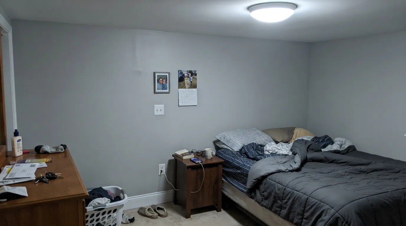
Room by Room
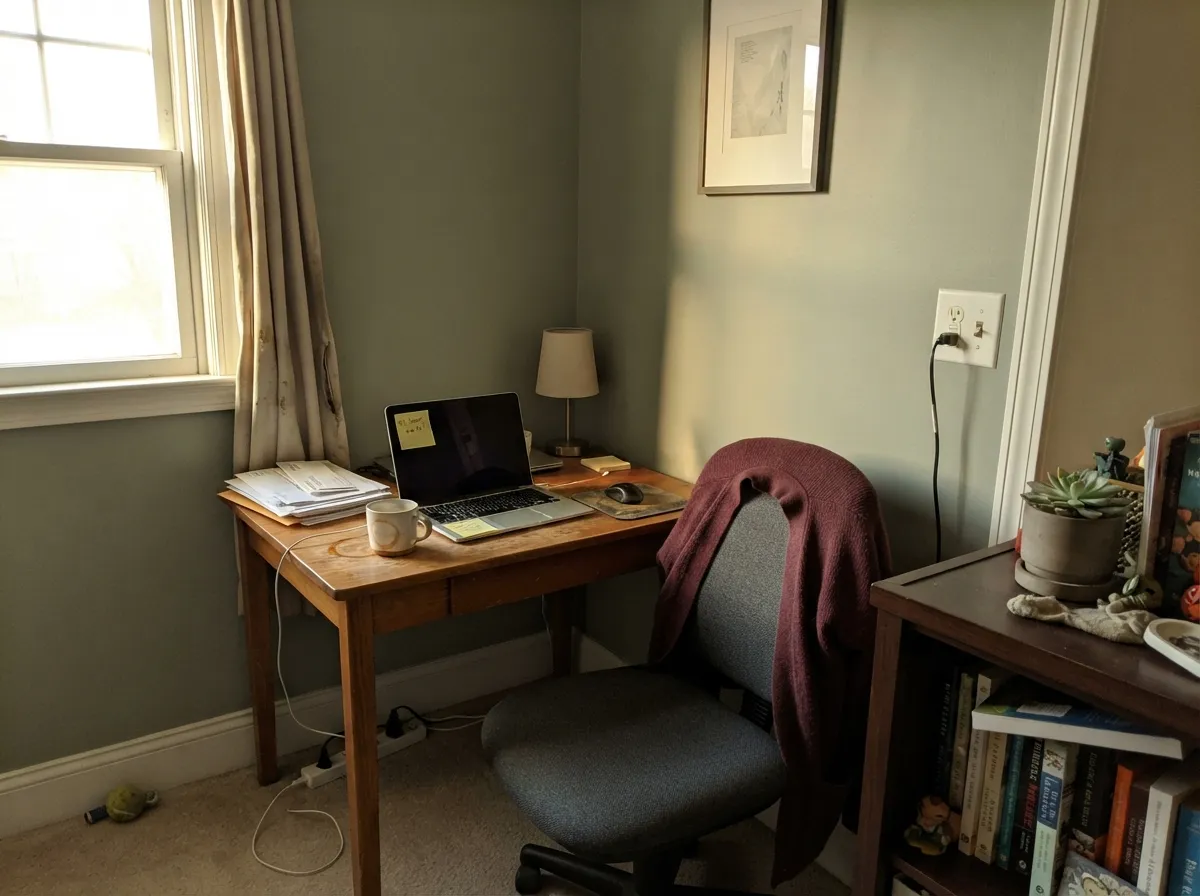
In a room with a real window exposure it reads as a calm, slightly green neutral that flatters wood furniture without going full sage. Eggshell finish; keep artificial lighting warm.
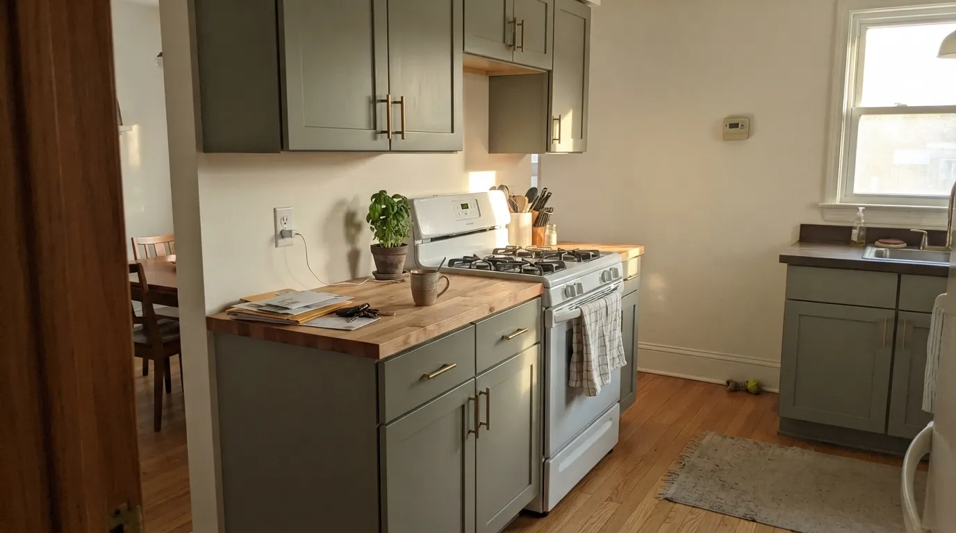
On cabinets under natural light it earns comparisons to Evergreen Fog and Clary Sage — soft, green-leaning, and forgiving of brass and butcher block. Satin cabinet enamel; expect it to look slightly cooler under undercabinet LED strip lights than in daylight photos.
Under warm 2700K lamps at night it stays soft and restful. Under cool LEDs it goes flat and gray-blue — an easy fix, but decide on bulb temperature before you paint, not after.
A north-facing bathroom with no natural warmth will read as a plain cool gray, losing the green identity that likely sold you on the color. A south or west bathroom keeps the green whisper alive.
Full sun brings the green forward and keeps the body from reading beige or plain gray — a genuine third option next to the usual greige-or-blue exterior choices. Pairs cleanly with white trim and a darker door or shutters.
The color's flexibility is also its whole-house risk: it will not look identical from a north hallway to a south great room. Treat each exposure as its own test rather than trusting one sample chip to predict the whole house.
Your Light Is the Risk
Warm afternoon sun pulls the green forward and the color reads as a deliberate soft sage-gray, not a plain neutral.
Cool, indirect daylight combined with cool-white bulbs strips the green out almost entirely, leaving a flat blue-gray. Test in the actual room before committing.
Unlike most neutrals, this one visibly changes character by exposure — not just by time of day within one room. Sample each room separately.
2700K warm bulbs bring the green back after dark. Cool white LEDs push it toward plain gray — swap the bulb before you consider repainting.
Most complaints about Escape Gray are a light mismatch. Upload a photo of your actual room and see it on your walls — then ask for the same wall in north light or evening lamps before you buy a single sample.
Need It From Another Brand?
Any paint counter can custom-tint Sherwin-Williams SW 6185 directly. If you would rather stay in one brand's own deck, these are the closest stock matches, measured as ΔE2000. Under 2 is a difference you will not see on the wall.
| Brand | Closest color | ΔE | LRV | |
|---|---|---|---|---|
| Behr | MeditationICC-67 · Behr | 1.4 | 40 | Color page → |
| Benjamin Moore | Sea Gull GrayES-72 · Benjamin Moore | 2.6 | 40 | Color page → |
| Valspar | Rigani8004-29D · Valspar | 0.7 | 40 | Color page → |
| PPG / Glidden | Olive ItPPG1032-3 · PPG / Glidden | 2.2 | 40 | Color page → |
| Glidden | Olive ItPPG1032-3 · Glidden | 2.3 | 40 | Color page → |
| Dutch Boy | Promenade Gray422-4DB · Dutch Boy | 3.0 | 41 | Color page → |
Similar Sherwin-Williams Colors
The nearest shades to Escape Gray within Sherwin-Williams's own range, ranked by perceptual color distance — useful when you want the same look a touch lighter, darker, or warmer.
WCAG 2.1: AA is 4.5 : 1 for normal text, 3 : 1 for large text, AAA is 7 : 1.
Escape Gray vs the Colors You're Also Considering
Every Escape Gray sample board has the same rivals on it. The numbers show the real lightness gap — then it comes down to which risk you would rather live with.
Pick this for the cooler, bluer-leaning twin — the difference is subtle enough that either one satisfies the same craving.
Sherwin-Williams SW 6178 · LRV 41Clary SagePick this for the very slightly warmer, more olive version of nearly the same color — the two sit a hair apart in hue at the same LRV.
Pick this for the lighter, easier-to-place version at LRV 41 instead of 35.
Sherwin-Williams SW 6206 · LRV 35Oyster BayPick this for a deeper, moodier green-gray that moves with light just as much, one notch darker.
Pick this for a lighter wall color that reads gray-first with green as the accent, not the headline.
Sherwin-Williams SW 9130 · LRV 30Evergreen FogPick this for cabinets when you want the green to fully commit instead of staying a whisper.
Pick this when a plain greige feels too safe and you want the green whisper Worldly Gray doesn't have.
Sherwin-Williams SW 7043 · LRV 57Worldly GrayPick this if you tested Escape Gray and decided you want zero green risk — Worldly Gray is a warm greige with no green undertone at all.
Within Sherwin-Williams the whole group sits around LRV 40 to 41, so the differences are all about hue. Willow Tree SW 7741 at #AAAD9C is slightly greener, and Clary Sage SW 6178 at #ACAD97 is the clearest sage of the set. Chatroom SW 6171 at #B0AB9C and Gateway Gray SW 7644 at #B2AC9C both add warmth and read as greige. Ellie Gray SW 7650 at #AAA9A4 drops the green almost entirely.
Across brands, the HGTV Home by Sherwin-Williams line lists Escape Gray as HGSW 3265 at a deltaE of 0. Diamond Vogel Silverado Ranch 0421 at 0.29, Valspar Rigani 8004-29D at 0.74, and C2 Paint Russian Olive C2-941 at 0.8 are all the same color in practice.
Behr Meditation ICC-67 at 1.37 and Farrow and Ball Vitty Green No. G3 at 1.48 are visually identical in normal room light. Benjamin Moore Sea Gull Gray ES-72 at 2.56 is very close but worth sampling, and Dunn-Edwards Heart of Stone DEGR17 at 3.88 is close but visibly different side by side, reading grayer with less green.
Escape Gray Coordinating Colors
The rule for coordinating with Escape Gray: keep whites warm-to-neutral rather than stark, and let it sit next to darker greens or true darks for contrast rather than fighting another chameleon color. These are the partners that keep it looking deliberate:
Escape Gray, Clary Sage, Oyster Bay: One Family, Three Names
Sherwin-Williams' deck holds several green-grays clustered within a few LRV points and a handful of hex values of each other — Escape Gray at LRV 41, Clary Sage at the same LRV 41 with a near-identical hex, and Oyster Bay one notch deeper at LRV 35. None of the three has ever been a Color of the Year or a viral design moment; they exist because the same soft, hard-to-name green-gray sells reliably enough that a paint company keeps several close variations in circulation for different regional fan decks and collections.
For a shopper, that clustering is more useful than it sounds: if a sample of any one of the three reads right on your wall, the others are worth a look before you commit, since the practical difference between them often comes down to which exposure they've been photographed in rather than a meaningfully different color. The honest answer to "which one should I buy" is: whichever one your paint store has in stock as a sample, tested in your own room.
Escape Gray With Wood Tones and Floors
Because the undertone leans green-blue rather than yellow, Escape Gray is genuinely comfortable next to both warm and cool wood — it doesn't fight honey oak the way a true blue-gray would, and it doesn't wash out next to walnut or espresso the way some pale greens do. Mid-tone oak and white oak floors are the easiest pairing; they neither amplify the green nor cancel it.
The one floor to sample carefully is a cool gray-washed or gray LVP floor: two cool-leaning surfaces in the same room can read a little clinical without a warm accent to break it up — brass hardware, a walnut table, or a warm rug does the job. Metals split evenly: brass and matte black both work well against it; polished chrome is the coolest-reading option and the one to test first if you're unsure.
Three Ready Palettes Built on Escape Gray
A color is never alone on the wall. These are complete combinations in the 60-30-10 pattern, with the reason each one holds together. Every one opens in the visualizer.
Alabaster gives the room a soft, warm-white anchor that never fights the green, and Naval on the island supplies the one dark, saturated note the scheme needs without competing with the wall color's quiet personality.
Try this palette in your roomExtra White trim keeps the body from reading muddy in full sun, and Iron Ore on the door and shutters gives the facade its one dark accent — a classic modern combination that lets the green whisper show without competing for attention.
Try this palette in your roomTwo depths of the same green-gray family read as intentional layering instead of a mismatch, and Alabaster trim keeps the plane light so the room doesn't tip into a full green statement.
Try this palette in your roomEscape Gray FAQ
Is Escape Gray more green or more gray?
Gray first, on most walls in most light. Sherwin-Williams files it as a green, and the green does show — especially in warm daylight and under warm bulbs — but it is not a color anyone would call "the green room" at a glance. It reads as a quiet, slightly unusual gray.
What's the real difference between Escape Gray and Clary Sage?
Almost nothing on paper: both sit at LRV 41 and the hex codes differ by a handful of points. Escape Gray runs a touch cooler and bluer, Clary Sage a touch warmer and more olive. In most rooms the difference will not be visible without a side-by-side swatch — pick either one, or better, sample both on the same wall and let your light decide.
Does it work on exteriors?
Yes — it's one of its strongest jobs. Full sun keeps the green whisper alive and gives a facade a genuine third option beyond the usual greige or blue-gray. Use a real exterior-grade satin and pair it with white trim and a dark door for the classic look.
What trim white goes best with Escape Gray?
A soft warm white like Alabaster keeps the pairing gentle; a brighter, cooler white like Extra White gives more contrast, especially outdoors. Avoid a stark cool white on interior trim if the walls are already reading cool — it can push the room further from the green you wanted.
Will it look different in every room of my house?
It can, more than most neutrals. Because it sits at a mid-depth LRV with a real green-blue undertone, exposure matters a lot: a north room will read cooler and grayer, a south or west room will show more green. Sample each room's own light rather than trusting one chip to predict the whole house.
Is Escape Gray a trending or Color of the Year pick?
No — and that's part of its honest appeal. It has never had a Color of the Year moment or a viral design-blog feature. It is a dependable, slightly unusual neutral that painters reach for when a client wants something other than the obvious gray or greige, not a color chasing a trend.
Have you painted with Escape Gray?
Rate it — one tap helps the next reader decide.
Ask a Question