Silver Lining
P&L's bestselling warm off-white, reviewed honestly: it is not silver, it sits next to White Dove, and the exact light that turns it dingy.

Jessica has spec'd whites and neutrals for more than 300 rooms and keeps a sample wall of painted drawdowns in her studio. Every color review is checked against real reader rooms in the comments and re-tested when a formula changes. About the testing process →
- 1Agreeable Gray60
- 2Pale Oak69
- 3Silver Lining80
- 4Moonlit Beach88
- 5Crème Fraiche93
The Fast Verdict
Silver Lining is Pratt & Lambert's quiet White Dove: a grayed warm off-white that reads finished, not painted. Ignore the name. There is no silver here — a drop of gray mutes a yellow-beige so it stays calm instead of cream. Designers have used it as a whole-house wall color for years; buyers who came for gray walk away confused. If you want a light, warm, low-chroma backdrop and you already buy P&L, this is the one.
Whole-house walls in decent daylight · kitchens and satin cabinets · living rooms with oak, brass, and dark window frames · anyone already in Pratt & Lambert who wants the White Dove job done
You actually wanted gray or silver · the room faces north and stays dim · trim stays a brighter white · your counters are cool grey marble
- Soft, finished off-white — warm but grayed enough to skip yellow
- One-color rooms (walls + trim + ceiling) work cleanly
- Flatters oak, walnut, brass — every warm wood tone
- Cabinets hide scuffs better than brighter whites
- In-family partners (Tundra, Cinder) make a ready whole-house strip
- The name promises gray; the wall delivers beige
- Goes dingy khaki in dim north light
- Reads dirty next to a brighter white
- Too soft and creamy for a crisp gallery look
What Color Is Silver Lining, Really?
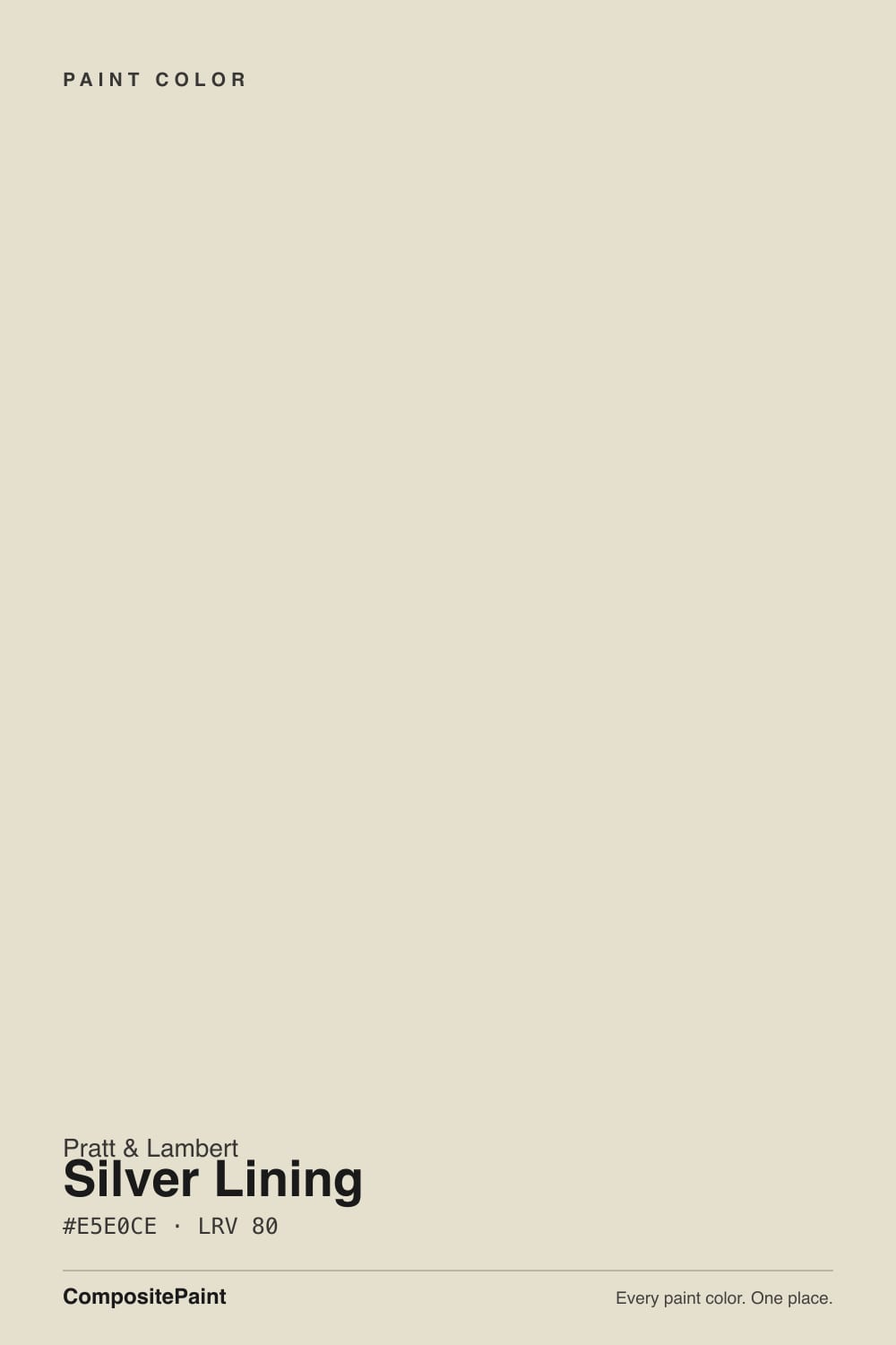
A very light warm off-white with a beige-yellow base and a gray mute — not silver, not greige, not a true white. Pratt & Lambert files it in the whites-and-neutrals strip next to Designer White and Ancestral, which tells you how the brand thinks of it: a clean backdrop, not a statement. Designers have said the quiet part out loud for years: Silver Lining is not in any way silver. The gray is a teensy brake on the yellow, the same trick White Dove uses, and the result sits so close to that color that people cross-shop them on purpose.
At LRV 80 it is a step deeper than White Dove (LRV 85) and Alabaster (LRV 82), which is the useful part. Put it next to Designer White (LRV 89) and Silver Lining suddenly shows its body — a soft khaki-cream rather than a blank wall. That body is why it works as a whole-house color: it holds just enough warmth to flatter oak and brass, and just enough gray to keep afternoon sun from tipping butter. It is a white that behaves like a very quiet beige.
Undertone in one line: warm yellow-beige, grayed — never pink, never cool gray, never metallic. If your sample looks green-khaki, the light is cold or the floor is reflecting; if it looks creamy-yellow, that is west sun or 2700K bulbs doing it. Both versions are the same paint being honest about the room.
Where It Shines
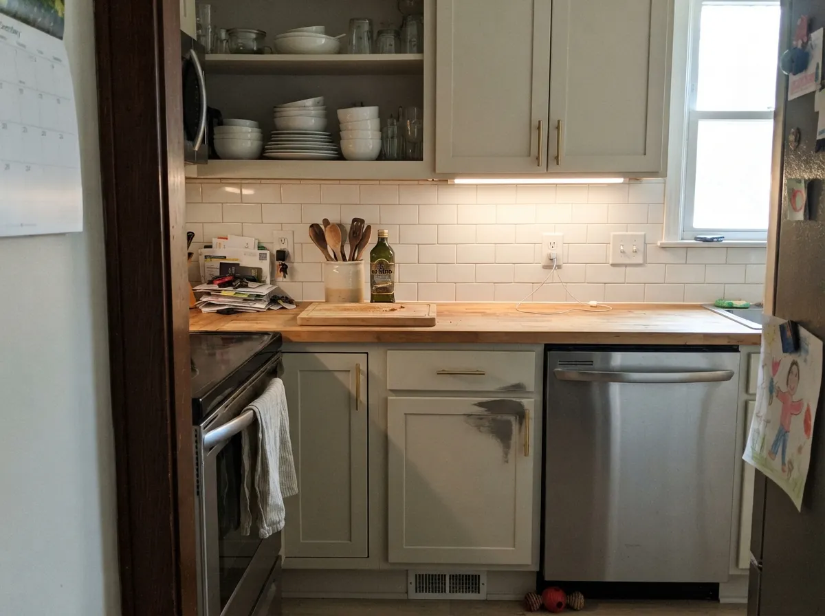
Give it real daylight and warm wood and it disappears in the way a good off-white should: the room feels finished, the furniture looks deliberate, and nobody can name the color. Living rooms and whole-house runs are its real job — Heather Scott Home put it on walls with black Pratt & Lambert window frames and the room read modern, not creamy-grandma. Kitchens are the second home: satin on cabinets hides knuckle marks the way Alabaster does, and at LRV 80 it still reflects enough light to keep a galley from closing in.
Where It Fails
Almost every regret story about Silver Lining follows one of three scripts, and all three are predictable before the first coat. None of them are the paint's fault — but if your room matches one, this is not your color, and sampling bigger will only confirm it.
The name is a trap. On the chip, in a store's cool fluorescents, it can flash a grayish off-white. On four walls in daylight it is beige. Buyers who came for a light gray get a warm cream and feel bait-and-switched. If gray is the goal, look at Classic Gray (LRV 74) and let Silver Lining go.
The most common bad pairing: Silver Lining walls, Designer White or any gallery white on trim. The brighter white wins and Silver Lining looks unwashed, slightly yellow, slightly dirty. The fix is the one-color rule — walls, trim, and ceiling all Silver Lining; the sheen change separates them plenty.
North light is cool and grey — it strips the yellow and leaves the gray mute exposed as dingy khaki-beige. Readers of every color in this family call that 'blah.' The color did not fail; the light did. Go creamier (Antique White) or commit to warm lamps. Cool LEDs make it worse.
Room by Room
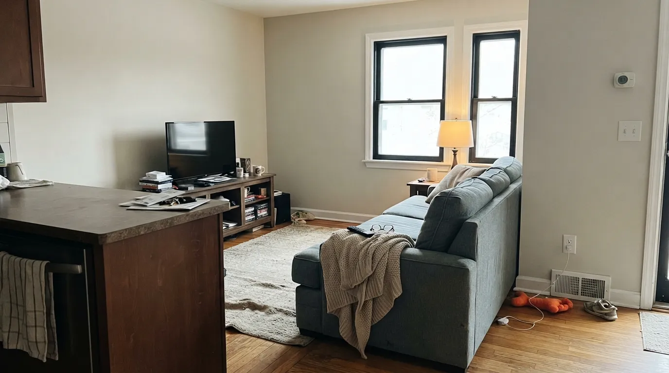
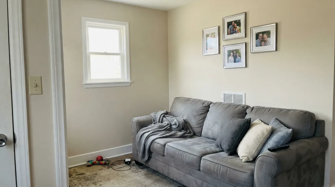
With any real daylight it is the calm backdrop that makes wood furniture and art look deliberate. Eggshell finish; same color on trim in semi-gloss. Black or charcoal window frames — the move Heather Scott used — keep it from reading as builder beige.
Warm counters, brass, butcher block, oak — all of it loves this color. Satin on cabinets wipes clean and hides handprints a brighter white would broadcast. A Hale Navy island is the single dark note the scheme wants. Cool grey quartz argues; sample over the actual slab.
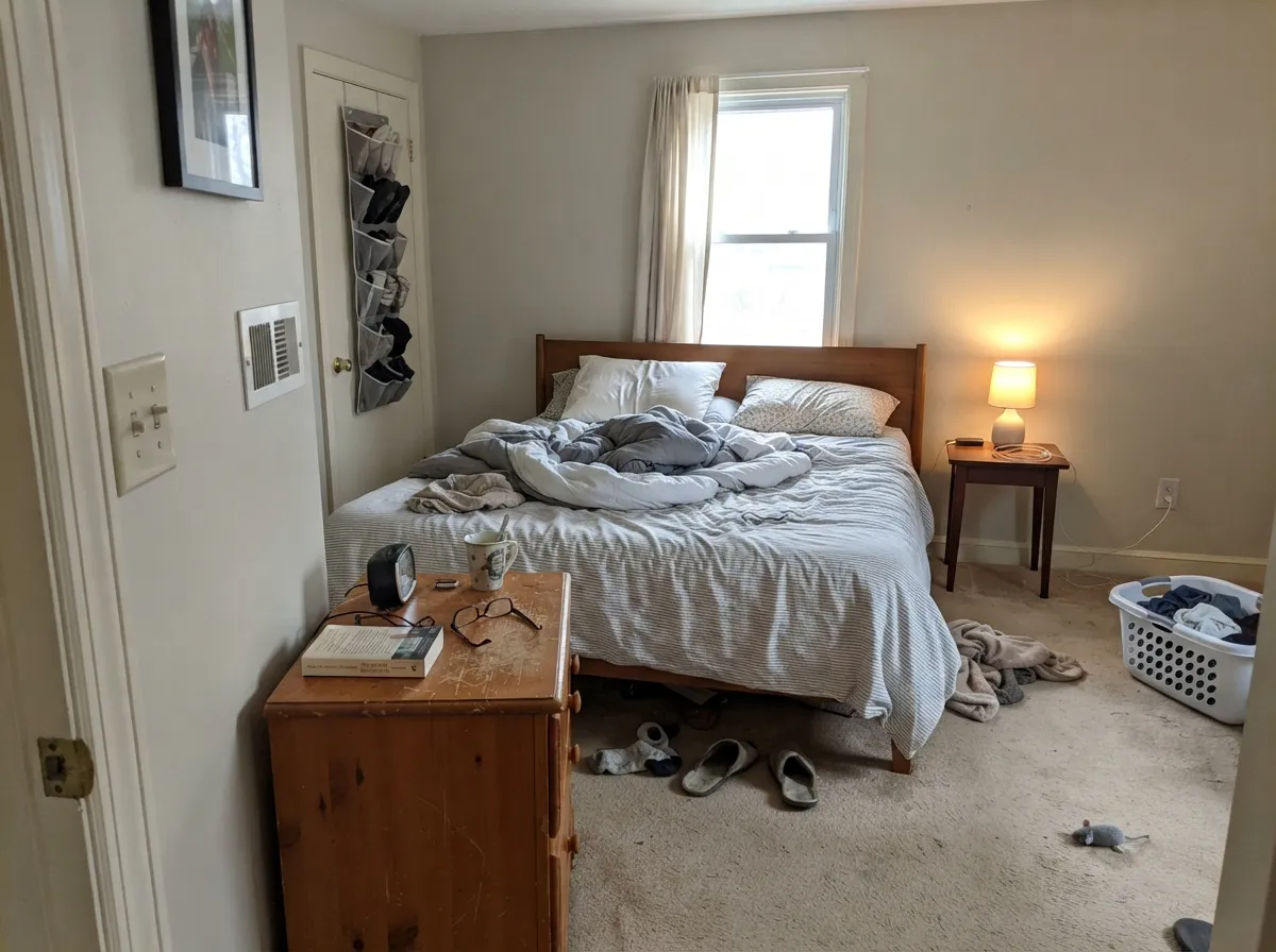
Under 2700K bulbs it turns gently creamy at night without going yellow. If the bedroom faces north and stays dim, skip it for Antique White or add lamps before you blame the paint.
This is why P&L sells it. At LRV 80 it carries room to room without the hallway going dingy, and it hands off to mid greiges (Edgecomb Gray, Tundra) without a temperature fight. Paint the ceiling the same color in flat — a stark ceiling white will make the walls look dirty.
With warm stone, wood vanities and brass: perfect. With cool grey marble or blue-grey tile: it argues and the walls flash yellow. Chantilly Lace is the white for that stone; Silver Lining is not.
Full sun reads it brighter and crisper than indoors, and with Cinder, Kendall Charcoal, or Hale Navy trim it is a quiet traditional facade. Walk the north elevation: that side will read a full step creamier. Do not pair it with cool blue-grey accents.
Your Light Is the Risk
The beige glows softly all day without tipping yellow. The gray mute does its job. Whole-house safe.
Cool grey daylight exposes the mute; the color goes dingy khaki-beige. Test a big sample on an overcast morning before you commit.
Warm at the sun hours — west afternoon can flash a clear yellow-cream for an hour — then it quiets back to beige-white. Sample at 6pm if yellow is your dealbreaker.
2700K lamps: creamier, cozier, still not yellow. Cool white LEDs: dull khaki — swap the bulbs, not the paint.
Most complaints about Silver Lining are a light mismatch. Upload a photo of your actual room and see it on your walls — then ask for the same wall in north light or evening lamps before you buy a single sample.
Need It From Another Brand?
Any paint counter can custom-tint Pratt & Lambert 32-1 directly. If you would rather stay in one brand's own deck, these are the closest stock matches, measured as ΔE2000. Under 2 is a difference you will not see on the wall.
| Brand | Closest color | ΔE | LRV | |
|---|---|---|---|---|
| Sherwin-Williams | Polar BearSW 7564 · Sherwin-Williams | 1.9 | 74 | Color page → |
| Behr | Confident WhiteGR-W12 · Behr | 0.4 | 74 | Color page → |
| Benjamin Moore | Feather Down953 · Benjamin Moore | 0.7 | 73 | Color page → |
| Valspar | Dream Grass8003-27A · Valspar | 1.3 | 74 | Color page → |
| PPG / Glidden | Wright Oyster ShellFLLW999 · PPG / Glidden | 0.8 | 74 | Color page → |
| Glidden | Vanilla LovePPG1099-2 · Glidden | 0.8 | 74 | Color page → |
Contrast and Legibility
WCAG 2.1: AA is 4.5 : 1 for normal text, 3 : 1 for large text, AAA is 7 : 1.
Silver Lining vs the Colors You're Also Considering
Every Silver Lining sample board has the same rivals on it. The numbers show the real lightness gap — then it comes down to which risk you would rather live with.
Pick this when you already buy Pratt & Lambert and want a touch more beige body on the wall.
Benjamin Moore PM-19 · LRV 85White DovePick this if you want the slightly brighter, more widely stocked version of the same calm — the safest warm white in the BM deck.
Pick this when you want the light wall to stay quiet and neutral instead of reading as a cream.
Pratt & Lambert 1-1 · LRV 78Antique WhitePick this if you want the gold, traditional P&L cream — it commits to warmth in a way Silver Lining will not.
Silver Lining is one of several soft P&L neutrals, and small LRV and undertone differences change how each behaves. Off-White (11-1) shares nearly the same lightness at LRV 80 but carries a more golden cast, so it reads warmer and a touch more yellow on the wall. Choose Silver Lining when you want the warmth to stay softer and less buttery.
Antique White (1-1), LRV 78, is close in lightness but deeper and warmer in tone, better when you want a hint more coziness. Ancestral (32-29), LRV 73, steps down further and reads as a fuller warm neutral rather than an off-white, useful when Silver Lining looks too pale for a large sunny room.
If you want a genuinely clean, bright white instead of a warm one, Designer White (33-1) at LRV 89 is the crisper choice.
Silver Lining Coordinating Colors
Stay on the warm side of the fence. Silver Lining flatters warm greiges, warm woods, deep navies, and dark charcoals — and it argues with icy whites, cool greys, and blue-grey stone. Same-strip partners from the 32 family are the lazy-smart path. These are the colors that actually sit next to it:
The Name, the 32 Strip, and a Houzz Living Room
Pratt & Lambert has never made this a Color of the Year, and it does not need to. It lives in the whites-and-neutrals group — Designer White, Ancestral, Silver Lining, Seed Pearl — as a clean backdrop meant to complement richer colors, not compete with them. The 32 family is the practical story: 32-1 is the light end, Tundra 32-6 is the mid greige, Sterling 32-13 sits in the middle, and Cinder 32-20 is the dark. Paint a main floor in Silver Lining and a den in Tundra and you have not changed brands or temperatures.
The name is the liability. Designers comparing whites have noted for years that Silver Lining is not silver — a whisper of gray, very close to White Dove. The verified public room is a 2020 Heather Scott Home living room: Silver Lining on the walls, black Pratt & Lambert on the window frames, later listed among Houzz's most-popular living rooms that year. That pairing is the color at its best — warm off-white, dark frame, no one asking if it was supposed to be gray.
Silver Lining With Wood Tones and Floors
Warm wood loves it. Oak — red, white, and most honey — walnut, butcher block, and cedar all sit comfortably against Silver Lining because the yellow-beige meets theirs halfway and the gray mute keeps the pairing from going orange-on-cream. If your floors are orange-leaning builder oak, this is one of the few off-whites that softens the orange instead of amplifying it — but sample a big board at the baseboard. Some honey oak still pulls a yellow flash in west light.
The flooring that needs a sample first is cool grey LVP or grey-washed wood. Grey floors pull the warmth into relief, and the wall can read slightly yellow against them. It is not always a dealbreaker — a warm rug and brass usually fix it — but test a large sample above the actual floor before painting the whole room. Cool grey marble does the same trick, harder.
Three Ready Palettes Built on Silver Lining
A color is never alone on the wall. These are complete combinations in the 60-30-10 pattern, with the reason each one holds together. Every one opens in the visualizer.
One color at two sheens gives depth without contrast lines, so small houses read bigger and hallways flow. The navy door supplies the single dark note the scheme needs.
Try this palette in your roomEdgecomb Gray is the easy warm greige Silver Lining was built to sit under; the cabinets stay light without going blank, and the navy island loves brass. Keep the kitchen in real daylight — Edgecomb Gray is not for a dark room.
Try this palette in your roomAll three live on Pratt & Lambert's 32 strip, so the temperature does not fight as you walk from the light main floor into a deeper den. Cinder on doors and frames is the black-trim look without leaving the brand.
Try this palette in your roomSilver Lining FAQ
Is Silver Lining gray or silver?
Neither. It is a grayed warm off-white — beige-yellow with a mute, not a light gray and not metallic. The name is the number-one source of bad reviews. If you want gray, Classic Gray is the honest alternative.
Is it warm or cool?
Warm — the quiet kind. A drop of gray keeps the yellow from reading cream, which is why it works as a whole-house color. In cold north light it drifts toward khaki-beige; it never reads icy.
What trim color goes with Silver Lining walls?
Silver Lining itself, in semi-gloss. A brighter trim white (Designer White, any gallery white) makes the walls look dirty — the most common mistake with this color. If you want contrast, go darker (Cinder, Kendall Charcoal), never brighter.
Is it good for kitchen cabinets?
Yes. Satin hides scuffs better than brighter whites, and it flatters brass and wood the way Alabaster does. Only cool grey marble or blue-grey quartz argues with it. Use a urethane-fortified cabinet enamel.
How does it compare to White Dove?
Same job, slightly more beige, a few LRV points deeper (80 vs 85). Designers have called them close for years. Pick White Dove if you want the BM default and wider stock; pick Silver Lining if you already paint in Pratt & Lambert.
Should I paint the ceiling Silver Lining too?
If the walls are Silver Lining — yes, in flat sheen. A stark ceiling white will make the walls look dingy by comparison, the same trap as brighter trim. One color overhead keeps the plane soft.
Have you painted with Silver Lining?
Rate it — one tap helps the next reader decide.
Ask a Question