Cinder
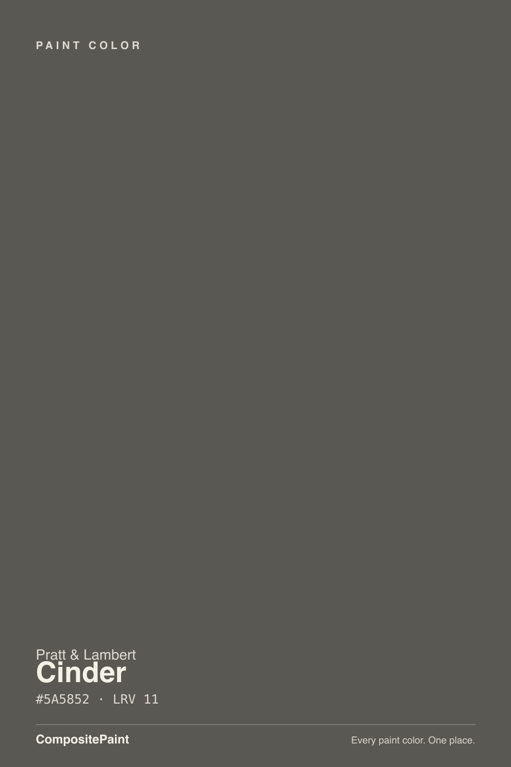
Pratt & Lambert's LRV-11 charcoal — darker and slightly browner than Kendall Charcoal, useful when you want stone-gray drama without going black.

Jessica has spec'd whites and neutrals for more than 300 rooms and keeps a sample wall of painted drawdowns in her studio. Every color review is checked against real reader rooms in the comments and re-tested when a formula changes. About the testing process →
- 1Cyberspace6
- 2Cinder11
- 3Retreat21
- 4Dovetail26
The Fast Verdict
Sample it on the actual wall, not a 3-inch chip. In a south dining room or on kitchen cabinets Cinder is a handsome, quiet charcoal. In a north bedroom with one window it drops into a brown cave. This is not a whole-house wall color.
Dining rooms with real windows · Kitchen islands and cabinets · Powder rooms · Accent walls · Front doors
North-facing rooms with one window · Whole-house walls · You want a cool blue-gray · Low-light basements with no lamp plan
- Near-neutral charcoal that still shows as gray in daylight, not a costume black.
- Same depth band as Peppercorn and Iron Mountain if you are already in Pratt & Lambert.
- Strong on cabinets, islands, powder rooms, and doors — surfaces you choose on purpose.
- Low chroma plays well with cream trim, wood, brass, and stone when the light is decent.
- Quieter, slightly browner alternative to Kendall Charcoal without the fame tax.
- LRV 11 eats light; north rooms and basements go cave-brown by mid-afternoon.
- The brown-stone lean shows next to cool grays and crisp blue-grays.
- Harder to find and sample than Benjamin Moore or Sherwin-Williams charcoals.
- Large matte walls scuff, flash, and photograph darker than the chip.
What Color Is Cinder, Really?
Cinder is Pratt & Lambert 32-20, a dark gray at LRV 11 — only about 11 percent of the light that hits it comes back, so it behaves like a mid-charcoal, not a greige and not a black. The reading (#5A5852) is almost chroma-free: stone-gray with a faint brown in it, the color of wet river rock or cold fireplace ash. Park it next to a true blue-gray and that brown shows. Park it next to a cream trim and it looks like a clean, architectural charcoal. It is Pratt & Lambert's answer to the Kendall Charcoal impulse — dark, serious, not quite black — without the household name or the green-gray talk that follows Benjamin Moore HC-166.
Depth is the whole game. Kendall Charcoal sits at LRV 15; Cinder is four points darker, which is enough to change how a room feels after 4 p.m. Sherwin-Williams Peppercorn (SW 7674) shares the same LRV 11 and a nearly identical hex, and Benjamin Moore Iron Mountain (2134-30) is even closer on the chip. Cinder is not doing something unique on the color wheel. It is doing this depth inside the Pratt & Lambert system, with a slightly earthy, stone-brown lean that surfaces in strong daylight and next to cooler grays. In north light the brown-taupe takes over and the corners go dead. A fan-deck chip will not tell you which version you are getting.
You pick Cinder when you already want this darkness and you are already shopping Pratt & Lambert — a dealer, a spec, Accolade on the can. You do not pick it as a whole-house wall color unless the house is full of sun and you are committed to lamps at night. It earns its keep on a dining-room envelope, a kitchen island, a powder room you want to feel finished, a bedroom you are willing to cave on purpose, or a front door. It is not famous. There is no Color of the Year sticker and no pile of owner threads. Sample all four walls, live with it at night, and only then commit the gallons.
Where It Shines
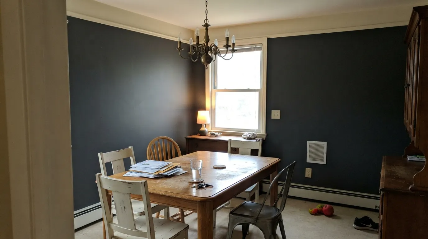
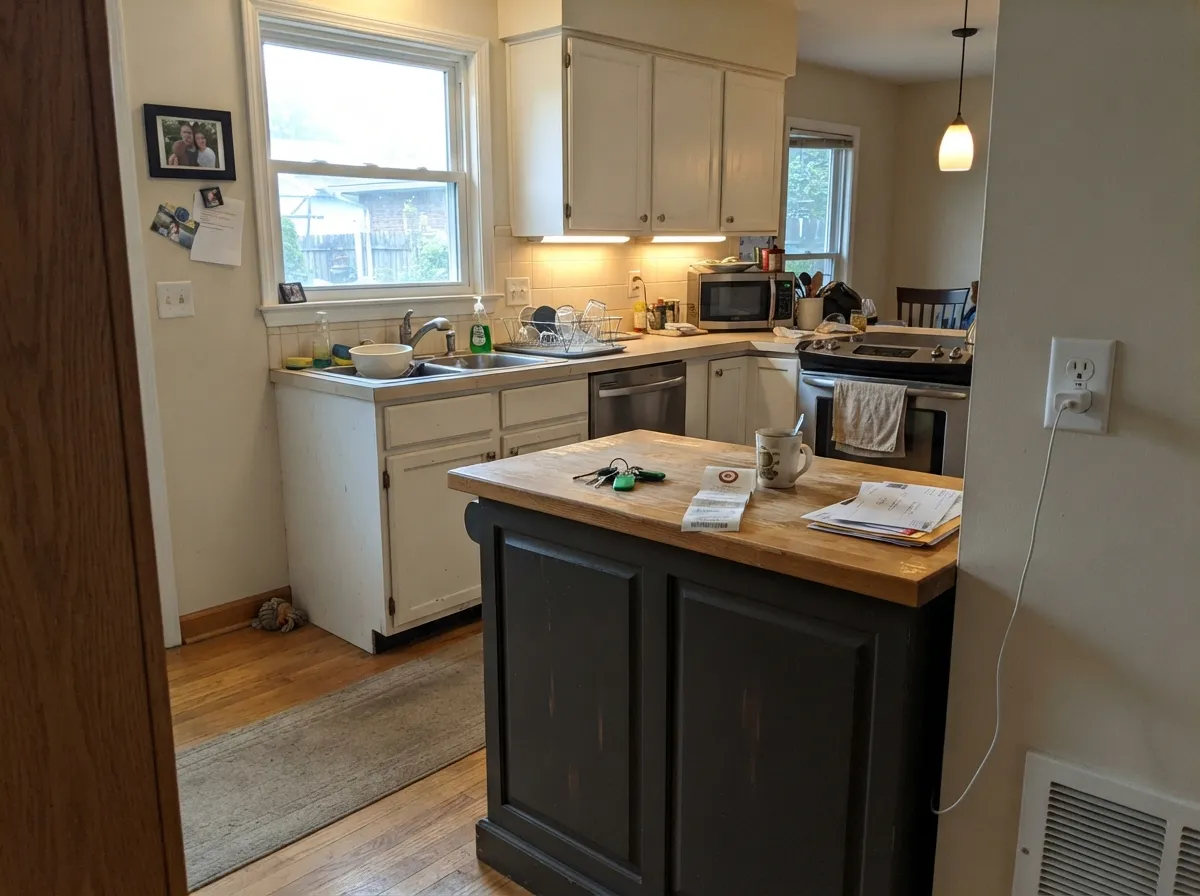
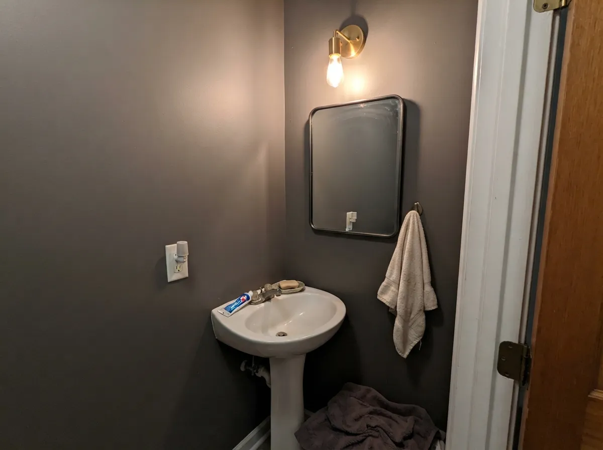
Cinder looks expensive when the room still has daylight to give it, and when the surface is something you walk up to — an island, a door, a powder-room envelope — not a dim wall you live against.
Where It Fails
At LRV 11 this color has no spare light. The failures are predictable: the cave, the brown shift, and every scuff on a large matte wall.
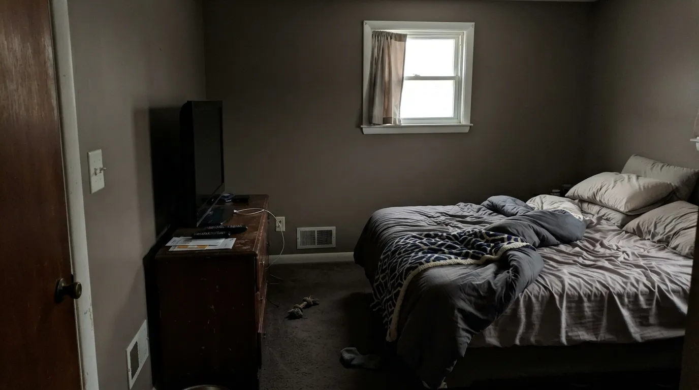
LRV 11 is not a moody gray in a north bedroom with one window. It is a light sink. Overcast days flatten it to a dull taupe-charcoal, corners go black, and you will reach for lamps at 3 p.m. If you wanted Kendall Charcoal's softer darkness, this is a step too far. Keep Cinder in rooms that already have daylight, or put it on a surface that does not wrap you — an island, a door, one accent wall — and light the rest of the room on purpose.
On its own Cinder reads as a near-neutral charcoal. Set it beside a true blue-gray or a crisp cool white and the stone-brown comes forward. People who sampled it next to a cleaner gray often say the chip looked gray in the store and taupe at home. That is not a defect in the formula so much as low chroma telling on itself. If your trim, tile, or neighboring room is a cool gray, sample Cinder on the shared wall before you roll a gallon. A cream or off-white trim hides the brown; a blue-gray neighbor advertises it.
Charcoal at this depth is a fingerprint and scuff magnet, especially in eggshell on a hallway or kids' zone. Flat hides less than you think and burnishes where chairs and backpacks hit. Satin on cabinets and doors is the honest sheen; on walls, eggshell plus a washable formula and a real primer is the minimum. If you need a dark that disappears on a busy family wall, go darker toward a true black-adjacent (Iron Ore at LRV 6) or keep Cinder on the island and leave the walls light.
Room by Room
This is the room Cinder was built for if the windows are real. Wrap the walls, keep trim in a creamy off-white, and let evening lamps do the rest. The charcoal makes a wood table and simple white dishes look deliberate instead of leftover. On a north dining room with one window, skip the full envelope and put Cinder on the buffet wall only. You want the stone, not the cave.
Do not paint every kitchen wall Cinder unless the room is a glass box. Use it on the island, the perimeter cabinets, or the range wall and keep the field walls light. Satin hides the grease better than eggshell and still reads as paint, not plastic. Next to warm wood and unlacquered brass it stays charcoal; next to cool white quartz and blue-gray tile it can look a little dirty-brown, so sample on the actual box, not the wall behind the stove.
A south or west bedroom can wear Cinder as a full envelope if you like sleeping in a dark room and you have lamps on both nightstands. A north bedroom will feel smaller and slightly muddy by late afternoon. If you only want the drama, paint the headboard wall and leave the other three in a light off-white. This is a grown-up bedroom color, not a nursery, and not a room you also use as a daytime office unless the window is large.
Small, no windows, all lamps — powder rooms are where LRV 11 stops being a problem and starts being the point. Eggshell or satin, a simple white trim, a decent mirror, and 2700K bulbs. Cinder here reads like stone, not like you ran out of light. Skip it in a family bath with a tiny window and beige tile; the brown will pick up the beige and the room will look dingy instead of intentional.
On a screen-facing wall Cinder cuts glare and looks serious on video. That only works if the room has a window at your side or back and a lamp you actually switch on. In a basement office with LEDs and no daylight it goes dead and slightly brown, which reads as unfinished rather than moody. Paint the wall behind the desk, leave the rest lighter, and do not pair it with a cool gray bookshelf wall unless you have sampled them together.
Satin or semi-gloss on a front door is one of the safest uses. In daylight Cinder stays a readable charcoal instead of reading as a faded black, and it sits comfortably with cream trim, brick, and stone. It will look browner on a south door at 4 p.m. than on a north porch — that is the same shift as inside, just honest. Prime, two coats, and do not expect it to hide chips the way a true black-adjacent enamel does.
Your Light Is the Risk
Late-morning through mid-afternoon sun keeps Cinder in the charcoal-stone range: gray first, brown only if you look for it. A dining room or living space with a real window wall is where the color looks expensive. Keep a warm lamp in the plan for the moment the sun leaves, because this depth does not self-light.
On an overcast north wall the gray drains and you are left with a flat taupe-charcoal. Corners die, the ceiling line looks heavier, and any cool flooring or gray tile pushes it dirtier. A powder room can survive this with dedicated lamps. A bedroom or living room cannot. If this is your only orientation, do not use Cinder on all four walls.
East light is cooler in the morning and Cinder looks closer to a true gray then. West light at 4 to 6 p.m. warms it and the stone-brown comes up, especially on a wall that also sees direct sun. The shift is a few degrees of temperature, not a different color, but it is enough to surprise anyone who only sampled at noon. Check the same patch at 8 a.m. and at dusk.
Warm 2700K bulbs are the honest night light: Cinder stays a soft charcoal with a hint of brown, which is the color you actually bought. 3000K is usable. Cool 4000K and up pull a dusty, slightly olive-brown cast that looks like leftover primer. If the room is lamps-only after sunset, dimmable 2700K and a shade that throws light at the walls, not just at the floor.
Most complaints about Cinder are a light mismatch. Upload a photo of your actual room and see it on your walls — then ask for the same wall in north light or evening lamps before you buy a single sample.
Need It From Another Brand?
Any paint counter can custom-tint Pratt & Lambert 32-20 directly. If you would rather stay in one brand's own deck, these are the closest stock matches, measured as ΔE2000. Under 2 is a difference you will not see on the wall.
| Brand | Closest color | ΔE | LRV | |
|---|---|---|---|---|
| Sherwin-Williams | PreludeSW 9620 · Sherwin-Williams | 1.8 | 9 | Color page → |
| Behr | PepperyMQ2-62 · Behr | 1.5 | 10 | Color page → |
| Benjamin Moore | Ashwood Moss1484 · Benjamin Moore | 2.6 | 10 | Color page → |
| Valspar | Sable Evening5006-2C · Valspar | 1.8 | 9.9 | Color page → |
| PPG / Glidden | UndercoverPPG0998-7 · PPG / Glidden | 3.9 | 10 | Color page → |
| Glidden | Forest Black30YY 10/038 · Glidden | 1.5 | 10 | Color page → |
Contrast and Legibility
WCAG 2.1: AA is 4.5 : 1 for normal text, 3 : 1 for large text, AAA is 7 : 1.
Cinder vs the Colors You're Also Considering
Every Cinder sample board has the same rivals on it. The numbers show the real lightness gap — then it comes down to which risk you would rather live with.
Pick this You want the same dark-neutral idea four LRV points deeper, a quieter stone-brown charcoal, and you are already in Pratt & Lambert.
Benjamin Moore HC-166 · LRV 15Kendall CharcoalPick this You want the famous, slightly lighter charcoal (LRV 15) that still leaves a bit of air in the room, and you are shopping Benjamin Moore.
Pick this The hex is nearly the same (#5A5852 vs #5C5852) and the LRV is identical — pick Cinder only if the job is already specified in Pratt & Lambert.
Sherwin-Williams SW 7674 · LRV 11PeppercornPick this You want this exact depth with Sherwin-Williams availability, SuperPaint, and a chip you can grab at any big-box dealer.
Pick this Stay with Cinder when the rest of the house is Pratt & Lambert and you do not want a second brand on the remaining gallons.
Benjamin Moore 2134-30 · LRV 11Iron MountainPick this You want Benjamin Moore at this same LRV 11, with a reading so close (#5A5851) that most rooms will not tell them apart.
Pick this You still want to see gray in the sun — Cinder at LRV 11 is dark, but it will not pass as black next to a true black-adjacent.
Sherwin-Williams SW 7069 · LRV 6Iron OrePick this You want the wall or cabinet to read near-black (LRV 6), not charcoal-gray, and you are fine losing the stone-gray in daylight.
Because Cinder is a specific point on the dark-neutral scale, it helps to see it against Pratt & Lambert's other deep grays. Granite (32-19, LRV 21) is roughly twice as reflective, so it reads as a clear mid gray you could use across a whole room, while Cinder at LRV 11 is markedly darker and moodier. If Granite feels too safe, Cinder adds the drama.
Go the other direction and Chalkboard (32-5, LRV 6) is noticeably darker and greener-leaning, close to a near-black, while Black Lacquer (32-2, LRV 3) is a true near-black. Cinder sits between a usable dark gray and those blacks, giving you depth that still reads as gray in daylight.
Cinder is also Pratt & Lambert's stand-in for the popular Kendall Charcoal mid-charcoal look, offering similar depth with its own faintly warm neutral cast.
Coordinating Colors
Cinder wants a cream or soft off-white next to it, not a blue-white. White Dove and Alabaster both leave enough warmth that the charcoal stays gray instead of dirty. If you need a lighter gray in the next room, Chelsea Gray at LRV 23 is a charcoal-greige step, not a match — it keeps the family without repeating the cave.
For a darker neighbor on metal, a hood, or a door next to Cinder cabinets, Iron Ore at LRV 6 reads near-black and will not fight the brown. Do not run Cinder and a cool blue-gray on the same sightline without a large sample. The low chroma is honest: it will take on whatever sits beside it.
Not Kendall Charcoal, and Not Benjamin Moore's Cinder
The useful comparison is Kendall Charcoal, not because Cinder is a copy, but because that is the job people are hiring a mid-charcoal to do. Kendall is lighter (LRV 15), more sampled, and more likely to pick up a green-gray conversation in north light. Cinder is darker, quieter, and slightly more like stone. If you already love a Kendall room, do not assume Cinder is the Pratt & Lambert SKU for the same look — it is a step deeper and a hair browner.
Two other collisions matter. Sherwin-Williams Peppercorn and Benjamin Moore Iron Mountain both sit at LRV 11 with hex readings within a couple of digits of Cinder. In most daylight they will read as the same depth. Pick Cinder because the rest of the spec is Pratt & Lambert, not because you think it will behave differently on the wall. And Benjamin Moore sells its own color named Cinder, which is a different paint. Order by brand and SKU (Pratt & Lambert 32-20), not by the word Cinder on a leftover stick.
Wood Floors, Stone, and Metal
Oak with a medium or honey stain is comfortable next to Cinder because the brown in the paint is already there; the floor and the wall agree. Cool gray-washed oak or ashy wide plank will pull the charcoal toward taupe and can make the whole room look dusty. Walnut and darker stained floors recede, which is fine in a dining room and risky in a small bedroom — the envelope closes.
Unlacquered brass, aged bronze, and black hardware all work. Chrome and cool nickel will emphasize the brown, the same way a cool gray tile does. For stone, a cream or taupe marble is easier than a blue-gray quartz. If the kitchen is already cool-toned, keep Cinder on the island only and let a lighter wall take the daylight.
Three Ready Palettes Built on Cinder
A color is never alone on the wall. These are complete combinations in the 60-30-10 pattern, with the reason each one holds together. Every one opens in the visualizer.
Cinder wraps a dining room that already has windows; White Dove keeps the envelope from closing in; Chelsea Gray (LRV 23) is the charcoal-greige step-down for the hall so you are not walking from a cave into a white box.
Try this palette in your roomPut the LRV 11 on the boxes you chose, not on every wall. Alabaster keeps the kitchen from dropping a stop; Iron Ore is the near-black accent if the island needs a darker neighbor that will not brown out.
Try this palette in your roomA satin Cinder door reads charcoal in daylight instead of faded black. White Dove is the cream surround. Kendall Charcoal at LRV 15 is the lighter sibling if you want shutters that do not match the door exactly.
Try this palette in your roomCinder FAQ
is Cinder a true gray or a greige?
It is a dark near-neutral charcoal with a faint brown-stone lean, not a greige and not a blue-gray. Next to a cooler gray the brown shows; next to cream trim it reads as gray. Sample it against your actual neighbors before you decide.
how dark is LRV 11 on walls?
Dark enough that a full-room envelope needs real windows and a lamp plan. About 11 percent of light bounces back, so north rooms and basements go cave-like. Cabinets, islands, powder rooms, and one accent wall are the safer uses.
how does Cinder compare to Kendall Charcoal?
Kendall Charcoal (HC-166) sits at LRV 15 and is the household-name charcoal. Cinder is four LRV points darker and a bit more stone-brown. If you love Kendall on a sample board but wanted more drama, Cinder is the deeper P&L version — not a match, a step down.
what sheen should I use?
Eggshell on interior walls. Satin on cabinets, islands, and doors. Skip flat: at this depth it burnishes and every scuff flashes. Semi-gloss only where you need wipe-down, such as a front door or trim.
can I paint a whole bedroom Cinder?
Yes if the room is south or west, you like sleeping in the dark, and both nightstands get lamps. No if it is a north room with one window, or a bedroom that doubles as a daytime office. A headboard wall is the reversible test.
what white trim works with Cinder?
A creamy off-white such as Benjamin Moore White Dove (PM-19, LRV 85) or Sherwin-Williams Alabaster (SW 7008, LRV 82) keeps the brown in Cinder from looking dirty. A crisp cool white will make Cinder look browner. Sample the trim on the same board.
Have you painted with Cinder?
Rate it — one tap helps the next reader decide.
Ask a Question