Off-White
A yellow-beige ivory at LRV 80, reviewed honestly: the traditional trim rooms where it belongs, the light that turns it dingy, and the whites to pick instead.

Jessica has spec'd whites and neutrals for more than 300 rooms and keeps a sample wall of painted drawdowns in her studio. Every color review is checked against real reader rooms in the comments and re-tested when a formula changes. About the testing process →
- 1Agreeable Gray60
- 2Pale Oak69
- 3Off-White80
- 4Moonlit Beach88
- 5Crème Fraiche93
The Fast Verdict
Off-White is not a white. It is a yellow-beige ivory with enough body (LRV 80) to read as cream the moment you put it next to anything truly white — which is exactly why Pratt & Lambert kept 11-1 in the deck as a traditional-home trim default. On millwork against greige or sage it looks finished and old-house correct. On four walls in a north room it looks like you meant to paint cream and then lost your nerve. Buy it for ivory. Do not buy it hoping it will behave like White Dove.
Traditional-home trim and ceilings · cream kitchen cabinets with brass and oak · south-facing living and dining rooms that should read ivory · colonial and craftsman interiors
You actually wanted white · the trim stays a brighter builder white · cool gray marble or gray LVP · a dim north room on cool LEDs · a crisp modern gallery look
- True ivory — cream on purpose, not a white pretending
- Excellent traditional trim against greige, sage, and navy
- Flatters oak, walnut, brass, and cream stone
- Cabinets hide scuffs better than brighter whites
- Same-deck partners: Sage, Brick Red, and Antique White
- Not white — the yellow-beige shows on four walls
- Looks dirty next to any brighter or cooler white
- Dingy in north light and under cool LEDs
- Fights cool gray marble, gray LVP, and blue-gray tile
What Color Is Off-White, Really?
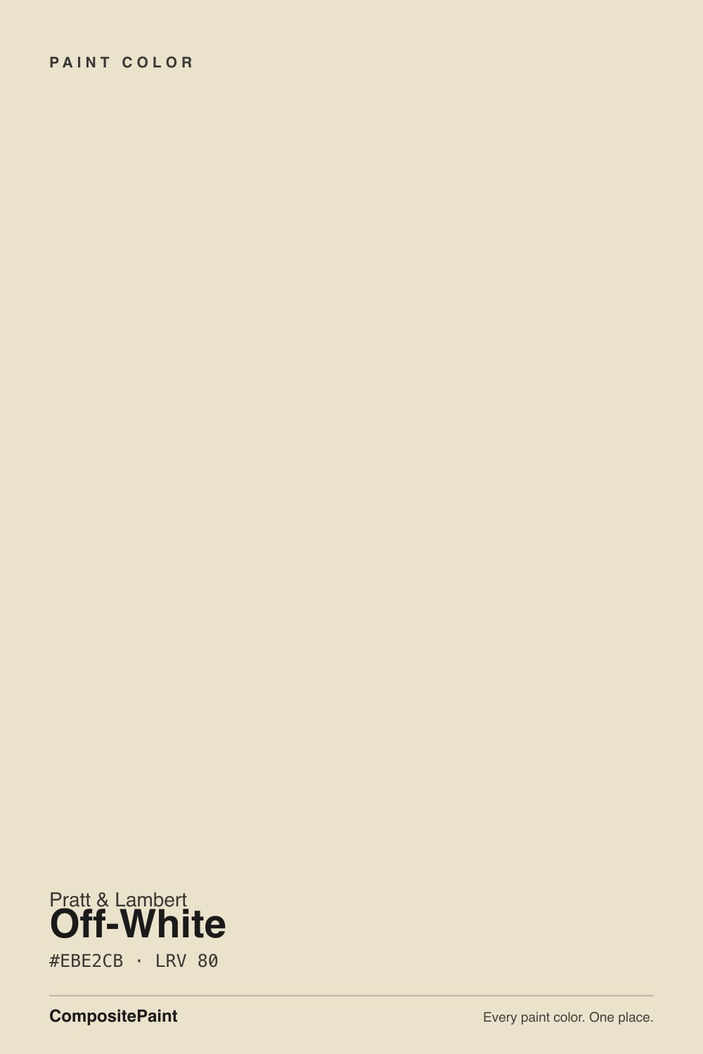
A true ivory, not a grayed warm white. The hex is yellow-beige on purpose — more straw than linen — so the wall never passes for white the way White Dove does. Pratt & Lambert filed 11-1 as Off-White, which tells you the era this color comes from: traditional houses that wanted cream woodwork, not a 2010s gallery wall. It is not a Color of the Year, not a Houzz-famous room, and not a viral match for Swiss Coffee. It is a working cream in a heritage deck, and that is the honest pitch.
At LRV 80 it reflects less light than White Dove (LRV 85) and Swiss Coffee (LRV 82), so it carries more body than those names imply. That gap is useful on trim: against Revere Pewter or sage walls the millwork still reads as painted wood, not plastic-bright. It is a trap on walls if you sampled it as "just a soft white." Put a big card next to Chantilly Lace (LRV 90) and Off-White suddenly looks like vanilla ice cream. That comparison is the whole review.
Undertone in one line: yellow-beige first — never gray, never pink, never green. If your sample looks dingy, that is cool north light stripping the cream and leaving a dirty-ivory cast. If it looks like butter, that is west sun or 2700K bulbs doing their job. Neither is a tinting error. Both are the same paint being honest about the room.
Where It Shines
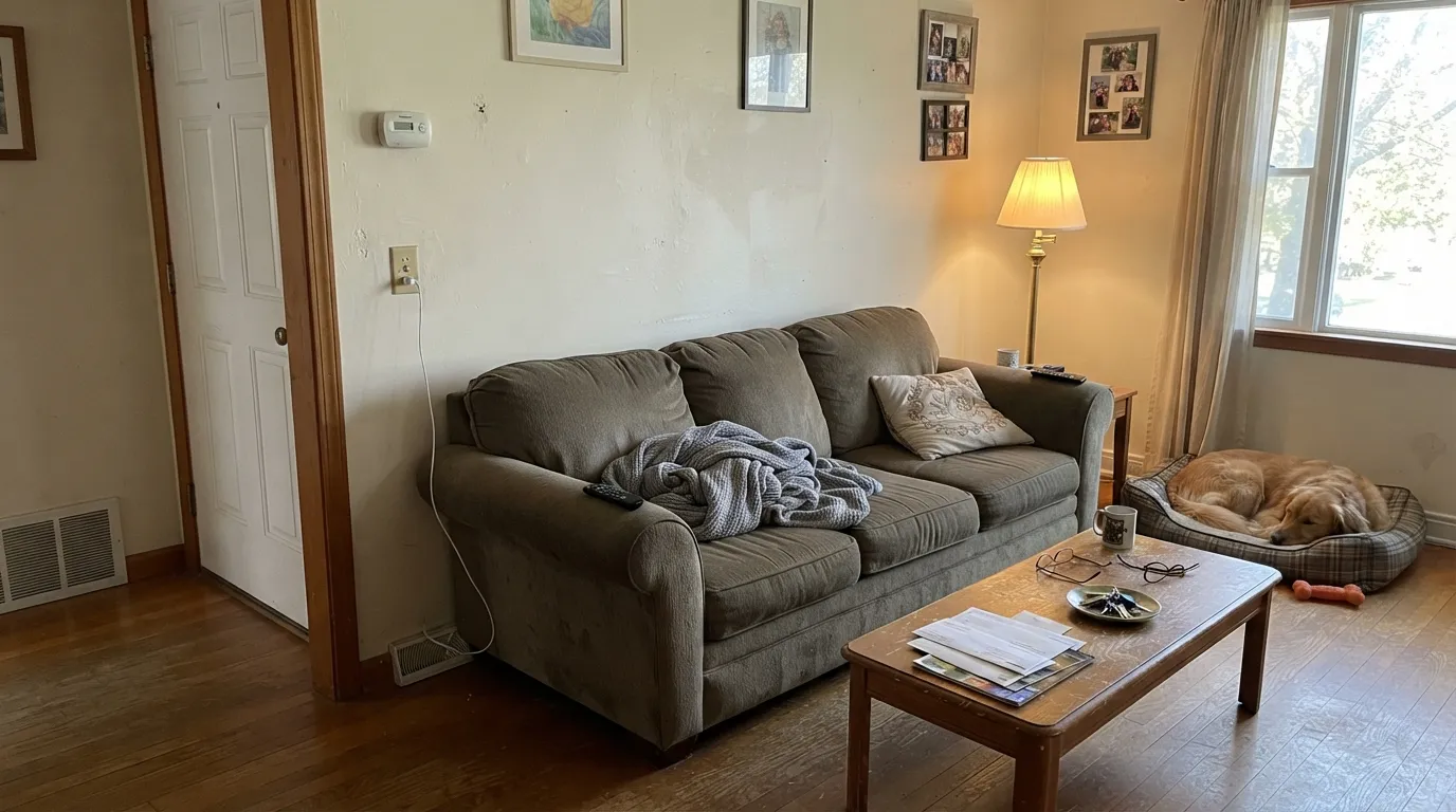
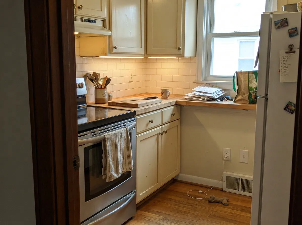
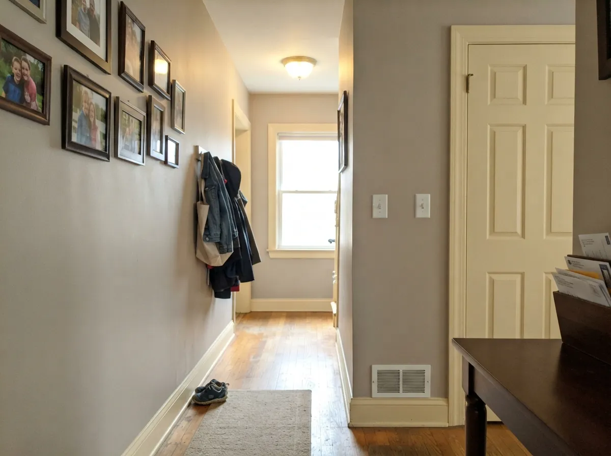
Give it wood, brass, and a job as trim and it is quietly excellent. Semi-gloss Off-White on casing, crown, and a six-panel door against a warm greige wall is the traditional-home look Pratt & Lambert has been selling for decades — cream woodwork that flattens the contrast a stark white would cut. Its second home is the kitchen: satin on cabinets next to oak, butcher block, and unlacquered brass, where LRV 80 hides knuckle marks a brighter white would broadcast. South daylight keeps the ivory clean; evening lamps make it cozier without tipping cartoon-yellow if the rest of the room is already warm.
Where It Fails
Almost every regret story about a cream this yellow follows one of three scripts, and all three are visible on the sample before anyone opens a gallon. None of them are the paint's fault — but if your room matches one, this is not your white, and a bigger sample will only confirm it.
On the chip it can pass as a soft white. On four walls the yellow-beige is the whole color. Readers who hung it next to a cooler ceiling or a true-white appliance call it creamy, dingy, even nicotine. If the brief was "a nice white, nothing yellow," this is the wrong 11-1. White Dove is the grayed warm white that stays quiet; Off-White is ivory, and it will not hide that.
The most common pairing mistake: Off-White walls, leftover builder-white trim or a bright ceiling. The brighter white wins and 11-1 looks unwashed. The fix is the one-color rule — walls, trim, and ceiling all Off-White, sheen change only — or keep this cream on the millwork and put a deeper greige on the walls. Never let a cooler, lighter white sit on the same plane.
Cool daylight and 4000K bulbs strip the warmth and leave a dirty-ivory that photographs yellow-gray. Cool gray marble and gray LVP do the same by contrast: they push the yellow-beige forward until the wall looks buttery next to the stone. Warm 2700K lamps and oak or walnut save it. Cool light and cool floors do not.
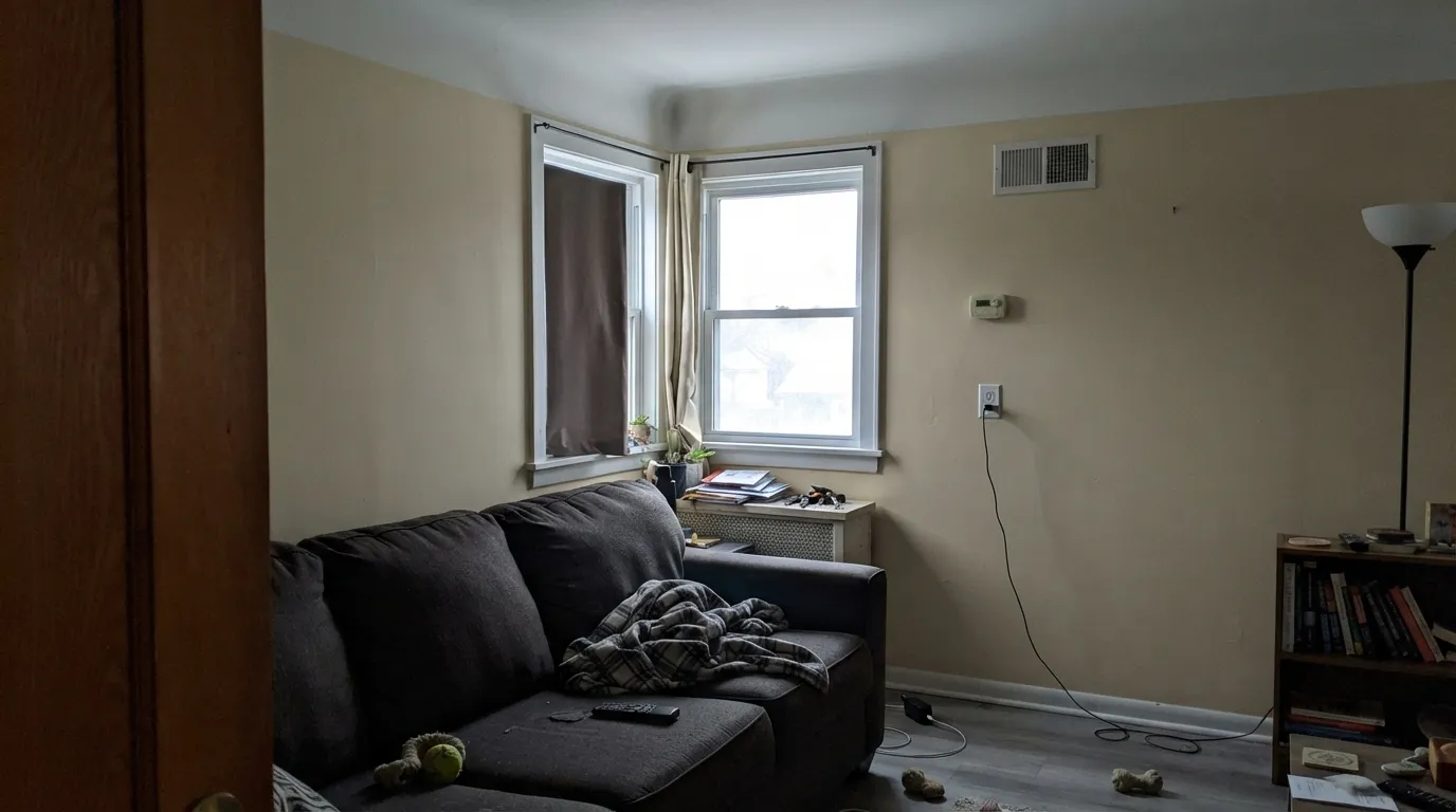
Room by Room
This is why 11-1 still exists. Semi-gloss Off-White on casing, doors, and crown against a warm greige or sage wall reads as classic painted woodwork, not a white stripe. Flat on the ceiling in the same color keeps the plane soft. Do not pair it with a brighter trim white — that is the dirty-wall trick in reverse.
Satin Off-White cabinets next to oak, butcher block, cream stone, and brass are a traditional kitchen that still looks current. LRV 80 hides scuffs better than Simply White (LRV 90). Cool gray quartz or blue-gray tile will make the doors look yellow; sample against the actual slab. Urethane-fortified satin is non-negotiable on doors.
In real daylight with oak or walnut floors it is a calm ivory backdrop, not a statement. Eggshell on the walls, same color on trim in semi-gloss. Open to a cooler kitchen or a gray-floor dining room and the cream will argue at the doorway — test the handoff.
Cream walls, wood table, brass chandelier: this is the room the color was mixed for. It holds just enough yellow-beige to feel dressed without going butter-yellow in the evening if you keep bulbs at 2700K. A Hale Navy or Brick Red door off the dining room gives it one dark note.
Under 2700K bulbs it turns gently cozy, more linen than lemon. Matte or eggshell; Off-White trim, not a cooler white. If the bedroom faces north and stays dim, the ivory goes dingy — step to White Dove or add lamps before you commit four walls.
Full sun reads it yellower and a step brighter than indoors; the north elevation will look creamier than the south. It can work on clapboard with Kendall Charcoal shutters and a Brick Red door, the traditional P&L house. It is the wrong cream for a modern-farmhouse white box — from the street it will look yellowed next to every true-white neighbor.
Your Light Is the Risk
The ivory reads clean and intentional — yellow-beige without going butter. This is the light that makes 11-1 look like a finished cream, not a dirty white.
Cool gray daylight strips the warmth and leaves a dingy, nicotine-ivory. Test a big sample on the actual north wall before you buy gallons.
Low warm sun golds it up for an hour — more straw, more cream. Most traditional rooms like the shift; if yellow is your dealbreaker, stand in the room at 6pm.
2700K bulbs keep it cozy and linen-like. Cool 4000K LEDs push a dirty-yellow cast that no extra coat will fix — swap the bulbs, not the paint.
Most complaints about Off-White are a light mismatch. Upload a photo of your actual room and see it on your walls — then ask for the same wall in north light or evening lamps before you buy a single sample.
Need It From Another Brand?
Any paint counter can custom-tint Pratt & Lambert 11-1 directly. If you would rather stay in one brand's own deck, these are the closest stock matches, measured as ΔE2000. Under 2 is a difference you will not see on the wall.
| Brand | Closest color | ΔE | LRV | |
|---|---|---|---|---|
| Sherwin-Williams | Classical WhiteSW 2829 · Sherwin-Williams | 1.1 | 76 | Color page → |
| Behr | Dry CreekECC-17-2 · Behr | 0.5 | 76 | Color page → |
| Benjamin Moore | Oatmeal268 · Benjamin Moore | 0.7 | 77 | Color page → |
| Valspar | Ivory Essence3006-8C · Valspar | 1.1 | 75.9 | Color page → |
| PPG / Glidden | Morocco SandPPG1096-2 · PPG / Glidden | 0.0 | 76 | Color page → |
| Glidden | Morocco SandPPG1096-2 · Glidden | 0.2 | 77 | Color page → |
Contrast and Legibility
WCAG 2.1: AA is 4.5 : 1 for normal text, 3 : 1 for large text, AAA is 7 : 1.
Off-White vs the Colors You're Also Considering
Every Off-White sample board has the same rivals on it. The numbers show the real lightness gap — then it comes down to which risk you would rather live with.
Pick this when the ivory is the point and you want traditional cream woodwork, not a soft white.
Benjamin Moore PM-19 · LRV 85White DovePick this if you want the safest warm white — grayed enough to stay quiet instead of creamy.
Pick this if you are staying in Pratt & Lambert and want the slightly more straw-ivory version of that cream.
Sherwin-Williams SW 7012 · LRV 81CreamyPick this if your painter is already in Sherwin-Williams — it is the same idea, a real cream that shows, for better and worse.
Pratt & Lambert does not list a close in-family sibling for Off-White, so the useful comparisons are the brand's other near-whites.
Designer White (33-1) at LRV 89 is the cleaner, brighter option with far less yellow. Choose it when you actually want white; choose Off-White when you want a color that reads as cream. Antique White (1-1) at LRV 78 is a near-twin, with hex #E8E0CB against Off-White's #EBE2CB. It is a touch deeper and marginally less bright, so pick between the two off physical chips in your own light rather than the numbers.
Silver Lining (32-1) shares the exact LRV of 80 but goes the other direction. Its hex #E5E0CE leans cooler and slightly gray-green, giving a more neutral, less buttery result. Use Silver Lining when the room already has plenty of warmth and Off-White when you want to add some.
Off-White Coordinating Colors
The rule for coordinating with Off-White is stay warm and stay deeper: greiges, sage, navy, oxide red — and keep true whites and cool grays off the same plane. It is a cream partner, not a white partner. These are the colors that keep showing up in rooms that work:
Ivory, Not White: Where 11-1 Sits in the Cream Family
Pratt & Lambert has no Color of the Year and 11-1 has no famous room attached to it. That is useful. Off-White is a working cream from a heritage deck, kept because traditional millwork still needs an ivory that does not go gallery-bright. It sits lighter and less gold than the same brand's Antique White (LRV 78) — the most-searched P&L cream, and a deeper, goldier cousin — and it sits yellower and more bodied than White Dove (LRV 85) or Swiss Coffee (LRV 82).
If you came here because a painter said "we'll just do an off-white," make them put 11-1 next to White Dove and next to Antique White on the actual wall. One of those three is your color. 11-1 is the middle ivory: cream enough to finish a colonial, light enough to still function as trim. It is not a substitute for a grayed warm white, and it will not become one in a different sheen.
Off-White With Wood Tones and Floors
Warm wood is the pairing that makes this color look expensive instead of builder-cream. Oak — red, white, or honey — walnut, cherry, and butcher block all sit comfortably against the yellow-beige because the paint meets them halfway. Unlacquered brass, antique bronze, and oil-rubbed bronze agree with it; polished chrome is the metal that leans cold and makes the walls look yellower.
The flooring that needs a sample first is cool gray LVP, gray-washed oak, and blue-gray stone. Those surfaces pull the yellow-beige into relief, and the wall can read buttery against them. A large wool rug in cream or taupe often settles a mixed-floor open plan; it will not settle a whole floor of cool gray. If the gray floor is staying, consider White Dove on the walls and keep Off-White off that room.
Three Ready Palettes Built on Off-White
A color is never alone on the wall. These are complete combinations in the 60-30-10 pattern, with the reason each one holds together. Every one opens in the visualizer.
Revere Pewter is the greige this cream was built to trim: warm enough that 11-1 looks like painted woodwork, not a yellow stripe. Hale Navy on the door is the one dark note the scheme needs — as long as the entry has light.
Try this palette in your roomAccessible Beige stays on the warm side of greige so the cream cabinets do not go yellow by contrast. Sage on the island is the same-deck gray-green — it still wants warm light, which a kitchen with under-cabinet lamps can actually provide. Brass hardware finishes the argument.
Try this palette in your roomCharcoal shutters keep the ivory from reading yellow from the street, and Brick Red is a door color, not a wall color — oxide red on the entry is the period-correct punctuation. Walk the shady north side with a sample; that elevation will read a full step creamier.
Try this palette in your roomOff-White FAQ
Is Pratt & Lambert Off-White actually white?
No. It is an ivory with a yellow-beige undertone at LRV 80. On the chip it can pass as a soft white; on walls, next to any true white, it reads cream. If you wanted white, look at White Dove. If you wanted cream woodwork, you are in the right 11-1.
What trim color goes with Off-White walls?
Off-White itself, in semi-gloss. A brighter or cooler trim white makes the walls look dirty — the most common mistake with this color. If you want contrast, go darker on the walls (Revere Pewter, Accessible Beige) and keep 11-1 on the millwork, never the other way around.
Off-White or White Dove?
White Dove is the safest warm white in the Benjamin Moore deck — grayed, quiet, LRV 85. Off-White is ivory and a full step more yellow-beige. Pick White Dove when you want the room to feel finished and white. Pick 11-1 when you want traditional cream trim and you are willing to commit to cream.
Does it work with oak floors?
Warm oak, walnut, and butcher block are its best friends — the yellow-beige meets the wood halfway. Orange builder oak can push it a little more yellow; a large rug and brass usually settle it. Cool gray LVP and gray-washed floors are the pairing to sample: they make 11-1 look buttery.
Is it good for kitchen cabinets?
Yes, in a warm kitchen. Satin hides scuffs better than brighter whites, and it loves brass and wood. Cool gray quartz or blue-gray tile will yellow the doors by contrast — tape a big sample to the slab. Use a urethane-fortified cabinet enamel.
Will Off-White look yellow in a north-facing room?
It will look dingy — a dirty ivory rather than a clean cream — because north light is cool and gray. Warm 2700K lamps help. If the room stays dim and you refuse lamps, pick White Dove or skip the cream family.
Have you painted with Off-White?
Rate it — one tap helps the next reader decide.
Ask a Question