Chalkboard
Pratt & Lambert's deep charcoal-black, reviewed honestly: the green hush that shows up next to true black, the rooms it caves, and when it belongs on cabinets instead of walls.

Jessica has spec'd whites and neutrals for more than 300 rooms and keeps a sample wall of painted drawdowns in her studio. Every color review is checked against real reader rooms in the comments and re-tested when a formula changes. About the testing process →
- 1Cordovan Brown0
- 2Chalkboard6
The Fast Verdict
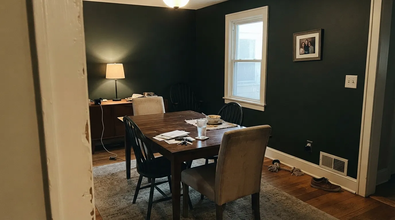
Chalkboard is not school-board green and it is not chalkboard coating. It is a near-black with a mineral green-gray hush — slate after the dust settles — dark enough at LRV 6 to swallow a dim room whole. Next to Tricorn Black it looks softer and slightly greener; in a lamplit powder room or on kitchen cabinets it looks expensive and finished. If you wanted a true, dead black, or if you planned four walls in a north bedroom, this is the wrong chip.
Powder rooms and lamplit dining rooms · kitchen cabinets and islands · one accent wall in a bright room · front doors and shutters
You need the walls to bounce light · you wanted a true, green-free black · the room faces north and stays dim · you planned four walls of a small bedroom
- Near-black with a mineral green-gray hush — more slate than ink
- Powder rooms and cabinets look finished without a whole-house bet
- Same depth as Iron Ore (LRV 6) if you already paint in Pratt & Lambert
- Front doors and shutters read intentional in full sun
- Soft white trim and walnut make the green look expensive, not dirty
- LRV 6 caves dim rooms — four walls need real light or real lamps
- Not true black: the green-gray shows next to Tricorn Black
- Cool LEDs and north light pull an olive film
- Obscure: almost no owner photos, so you are sampling without a crowd
What Color Is Chalkboard, Really?
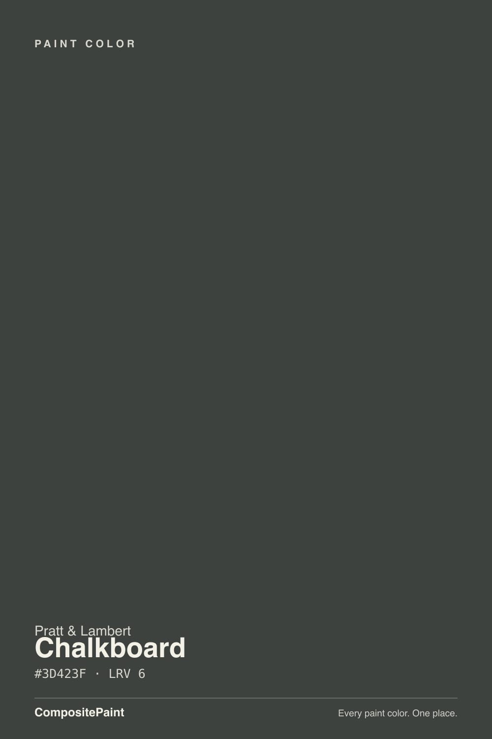
A charcoal so deep it passes for black until you set it beside a true one. Then a green-gray hush shows up — not forest green, not olive on the chip, just the mineral cast of worn slate. Pratt & Lambert files it at 32-5, in the same gray-and-black strip as Cinder and Light Grey, which tells you how the company thinks of it: a near-black, not a color moment. There is no Color of the Year sticker, no viral living room, and almost no owner thread with this name on it. People find it because a painter is already in the Pratt & Lambert deck.
At LRV 6 it reflects almost nothing. That is the entire specification. Iron Ore sits at the same number and has a whole-house following if you respect the darkness; Chalkboard is the quieter, greener sibling with none of that fame. On a sunny wall it reads as expensive charcoal. On four walls of a small, under-lit room it reads as a cave with a faint olive film. Plan for the wall to go a step darker than the chip — every near-black does this — and sample it next to a true black so the green does not surprise you after the second coat.
Undertone in one line: green-gray charcoal first, black second — never blue, never brown. If your sample looks olive, the light is cool or the room is dim; if it looks like straight black, you are seeing it at night or against a white so bright the green disappears. Both reads are the same paint.
Where It Shines
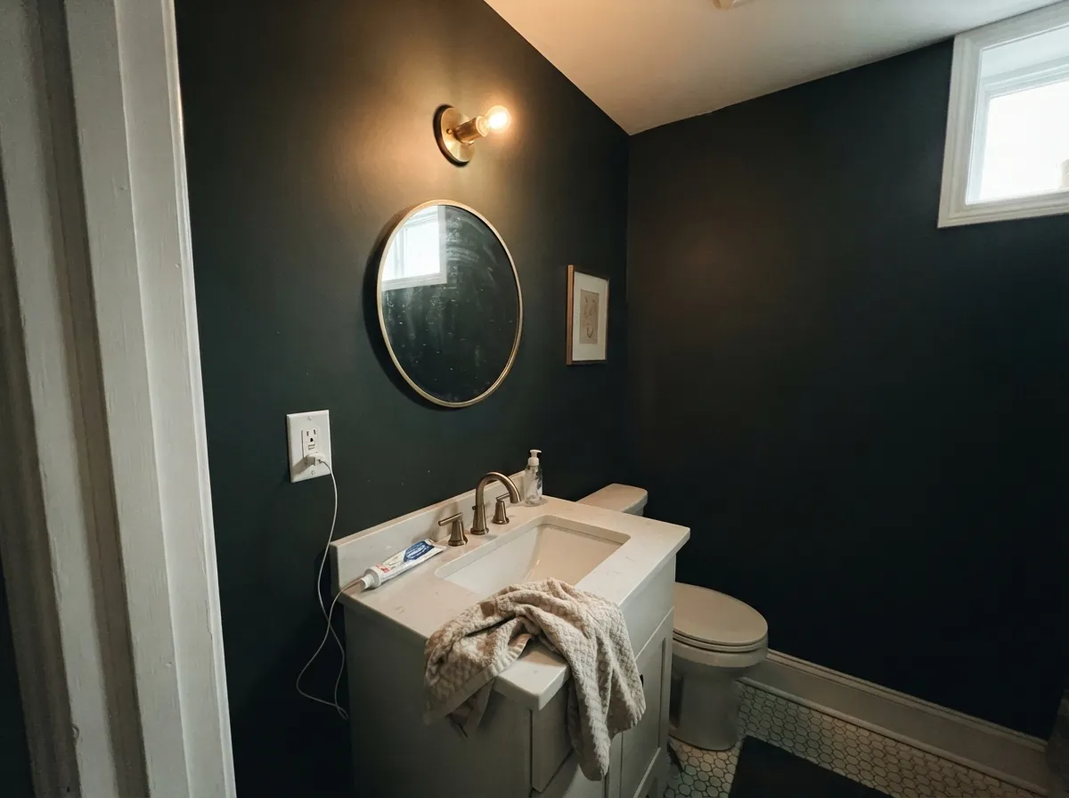
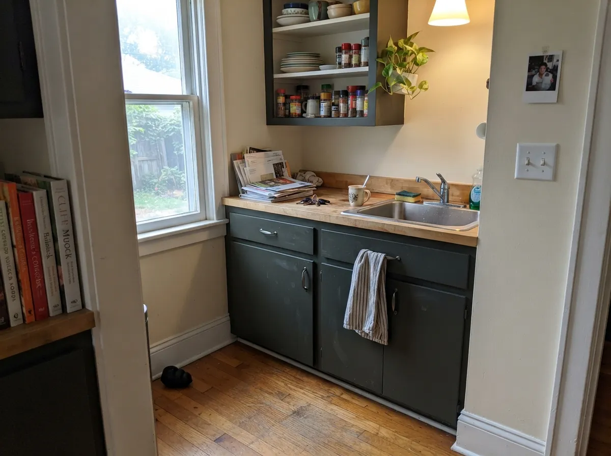
Give it a small room, real lamps, and a job other than 'paint the whole house dark.' A powder room drenched in matte Chalkboard, a dining room that only needs to look good after 6pm, kitchen cabinets in satin under cream walls — those are the rooms where LRV 6 is a feature. It also earns its keep outside on a front door or shutters, where full sun keeps the green-gray honest and the name finally makes sense: dark slate, not a hole. Pair it with a soft white, walnut or pale oak, unlacquered brass, and it looks like it came with the house.
Where It Fails
Almost every regret story about a color this dark follows one of three scripts, and all three are visible on the chip if you know what to look for. None of them are the paint's fault — but if your room matches one, this is not your black, and a bigger sample will only confirm it.
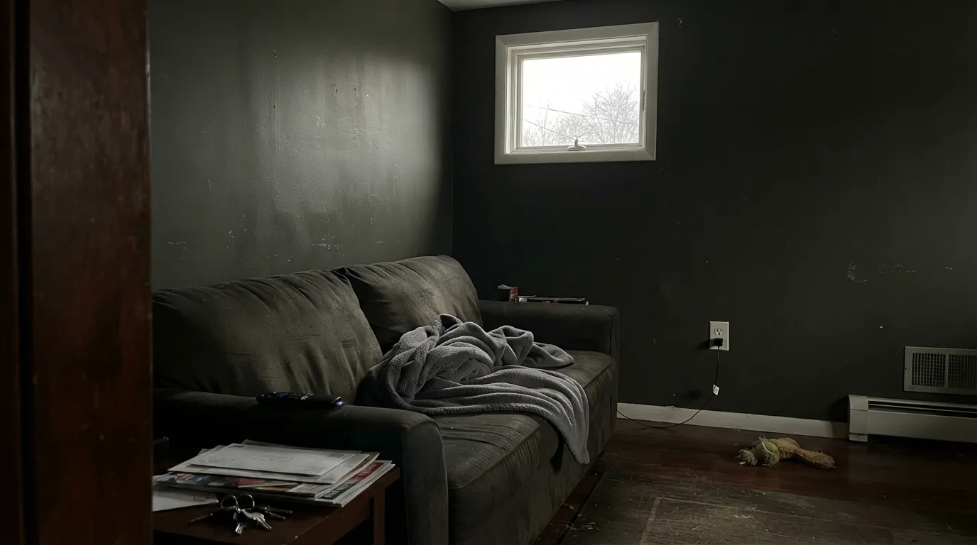
LRV 6 is a cave number. In a dim north living room or a small bedroom with one window, Chalkboard does not go moody — it goes missing, then throws a faint olive film in the corners. Iron Ore has the same number and the same warning. Use this on one wall, on cabinets, or in a room you actually light at night. Do not bet a whole floor plan on it.
On the chip it passes for black. Next to Tricorn Black (LRV 3) the green-gray is obvious, and in daylight it reads charcoal-slate rather than ink. If you want a reference black for windows, railing, or a high-contrast modern envelope, Tricorn is the color. Chalkboard is for people who want near-black with a little mineral life still in it.
Cool daylight and 4000K LEDs pull the green forward until the wall looks like black with a dirty olive wash — the opposite of the expensive slate you sampled at the store. Warm 2700K lamps are part of this paint job. If the room stays cool and you will not change the bulbs, pick a truer black or a brown-black instead.
Room by Room
Small, lamplit, no expectation of bounce: this is the room LRV 6 was built for. Drench all four walls in matte, keep Designer White or White Dove on the trim and ceiling, and the green-gray reads custom instead of cave. Satin on a vanity under stone and brass is the weekend version of the same idea.
A closed dining room or a library that runs on 2700K light is Chalkboard's second home. The walls drop away after dark and the table, books, and wood come forward. Eggshell if chairs scuff; matte if you want the color even deeper. Skip it if this is also the homework room at noon with no overhead fixtures on.
Satin Chalkboard on kitchen cabinets or an island, cream or soft-white walls, is the highest-confidence use in the house. You get the near-black look without betting every wall at LRV 6, and the green hush is quieter on a door panel than it is on a 12-foot run of drywall. Urethane-fortified enamel; it will show grease and fingerprints in gloss, so stay at satin.
A large, south-facing bedroom with lamps on both nightstands can take one Chalkboard accent wall behind the bed. Four walls in a small or north bedroom is how people end up repainting. If you want dark and restful without the cave, look at a higher-LRV charcoal and save this for the headboard wall.
Beautiful in a closed, well-lamped living room with cream upholstery and walnut. Risky in an open plan, where the dark wall has to hand off to the kitchen and the hallway and will make every adjacent white look brighter — sometimes too bright. One fireplace wall, yes. The whole main floor, no.
Full sun is the one place this color gets more honest, not darker: the green-gray slate reads clearly from the street, which is what you want on a front door or shutters against Light Grey or a cream body. Full-house siding at LRV 6 soaks heat and turns the elevation into a void. Satin exterior; test the door in afternoon sun so you see the green before you commit.
Your Light Is the Risk
Daylight keeps it charcoal-slate instead of a hole; 2700K lamps at night drop it toward black and hide the green. This is the light the color can actually handle.
Cool gray daylight plus LRV 6 is a cave with an olive wash. The expensive slate disappears. Do not sample this color in a dim north room and call it moody — it is just dark.
Morning and midday show the green-gray most clearly. Late-day sun warms it slightly; after dusk it collapses toward black. Sample at 2pm and at 8pm or you are only seeing half of it.
2700K incandescent or warm LED: brown-black, softer, the version people mean to buy. 3500K–4000K cool LEDs: the green comes forward and the wall looks dusty. Swap the bulbs before you swap the paint.
Most complaints about Chalkboard are a light mismatch. Upload a photo of your actual room and see it on your walls — then ask for the same wall in north light or evening lamps before you buy a single sample.
Need It From Another Brand?
Any paint counter can custom-tint Pratt & Lambert 32-5 directly. If you would rather stay in one brand's own deck, these are the closest stock matches, measured as ΔE2000. Under 2 is a difference you will not see on the wall.
| Brand | Closest color | ΔE | LRV | |
|---|---|---|---|---|
| Sherwin-Williams | Iron OreSW 7069 · Sherwin-Williams | 3.2 | 6 | Color page → |
| Behr | Dark Cavern790F-7 · Behr | 1.0 | 6 | Color page → |
| Benjamin Moore | Notre DameCSP-570 · Benjamin Moore | 2.5 | 6 | Color page → |
| PPG / Glidden | Black MagicPPG1001-7 · PPG / Glidden | 3.9 | 5 | Color page → |
| Glidden | Black MagicPPG1001-7 · Glidden | 4.6 | 5 | Color page → |
| Dutch Boy | Cauldron437-7DB · Dutch Boy | 3.8 | 5 | Color page → |
Contrast and Legibility
WCAG 2.1: AA is 4.5 : 1 for normal text, 3 : 1 for large text, AAA is 7 : 1.
Chalkboard vs the Colors You're Also Considering
Every Chalkboard sample board has the same rivals on it. The numbers show the real lightness gap — then it comes down to which risk you would rather live with.
Pick this if you paint in Pratt & Lambert and want the greener, slatier version of the same depth.
Sherwin-Williams SW 7069 · LRV 6Iron OrePick this if you want the same LRV 6 with a whole-house following and less green — the charcoal people actually have photos of.
Pick this when near-black should still look like stone, not ink.
Sherwin-Williams SW 6258 · LRV 3Tricorn BlackPick this when you want the reference true black — windows, railings, a high-contrast envelope with no green in it.
Pick this for a slightly softer charcoal that can still do a powder room or a front door without going fully green.
Sherwin-Williams SW 6994 · LRV 4GreenblackPick this if the green is the point and the job is cabinets — darker, more clearly green-tinted, and built for doors not rooms.
Pratt & Lambert's own dark colors help place Chalkboard. Black Lacquer (32-2) sits much deeper at LRV 3 and leans cool and blue, so it reads as a truer, harder jet black. Choose Black Lacquer when you want maximum drama and a modern edge; choose Chalkboard when you want a black that stays a little softer and more neutral in the light.
Forest (27-9) shares Chalkboard's LRV of 7 but is an openly green-black. Side by side, Forest clearly shows its color while Chalkboard stays neutral. If you specifically want a dark green room, pick Forest; if you want black that only hints at green, Chalkboard is the safer call.
In practice, sample both against Chalkboard on the actual wall. At these low LRVs the differences are subtle in photos but obvious in person, and lighting can swing which one looks right.
Chalkboard Coordinating Colors
The rule for coordinating with Chalkboard: soft whites, stone grays from the same 32 strip, and cream — and keep icy gallery whites at arm's length, because they make the green look dirty. It likes walnut, pale oak, unlacquered brass and matte black metal. These are the partners that keep the near-black from turning into a void:
Not a Viral Black — and Not Chalkboard Paint
Pratt & Lambert does not run a Color of the Year program, and Chalkboard has no famous-room trail to borrow. It lives in the 32 strip as the near-black: Light Grey above it, Granite in the middle, Cinder as the dark gray, Chalkboard at LRV 6. The people who specify it are usually already buying Accolade because a painter likes how it levels, not because they saw it on a feed.
The name causes the other confusion. This is not a writable chalkboard coating and it is not school-board green. It is a mineral near-black that happens to look like a real slate board after the chalk dust is wiped off. If you came here for a kids' wall you can write on, you want a chalkboard finish, not 32-5.
Chalkboard With Wood Tones and Floors
Walnut and espresso are the easy yes — the red-brown depth makes the green-gray read as slate instead of dirt. Pale white oak and gray-washed floors are also safe; they keep the room from going cave-dark at the floor line. Natural white oak with a clear finish is the modern version of the same pairing, especially under Chalkboard cabinets.
The honest caution is golden honey oak. Yellow-orange wood against a green-cast near-black pushes both sides: the floor goes more orange, the cabinets go more olive. A large rug helps in a dining room; in a kitchen where the oak stays, sample a door on the floor before you spray. Cool gray marble and white quartz are fine — near-blacks do not fight stone the way creamy whites do.
Metals are straightforward: unlacquered brass and antique bronze pick up the warmth the green needs; matte black hardware disappears into the paint, which is the point on cabinets. Polished chrome is the one that leans cold and makes the olive easier to see.
Three Ready Palettes Built on Chalkboard
A color is never alone on the wall. These are complete combinations in the 60-30-10 pattern, with the reason each one holds together. Every one opens in the visualizer.
Chalkboard on the walls, White Dove on the woodwork, and Granite on the hall or cabinet backs so the house steps down in the same stone family instead of slamming from cream to cave. Granite is a true mid-gray, not a blue one, so it does not fight the green in 32-5. Keep the lamps at 2700K or the study just looks unlit.
Try this palette in your roomAntique White is P&L's gold-leaning traditional cream — the right temperature against a green-cast near-black, where a cool white would make the cabinets look dirty. Designer White on trim and ceiling keeps the cream from going yellow-beige. Satin enamel on the doors; this is the use that does not require you to live inside LRV 6.
Try this palette in your roomLight Grey is P&L's warm, quiet light gray — not a cool gray — so the body stays friendly while Chalkboard does the slate-door job. Designer White trim is bright enough at LRV 89 to cut the door cleanly without the sterile gallery look of a cooler white. Same 32-strip family for body and door, which is why this elevation looks intentional from the curb.
Try this palette in your roomChalkboard FAQ
Is Chalkboard actually black?
Near-black, not true black. At LRV 6 it reads as black in a dim room and at night, but in daylight — especially next to Tricorn Black — a green-gray slate cast is visible. If you need ink-black windows or a high-contrast modern envelope, this is not that color.
What trim white goes with Chalkboard?
A soft white, not a gallery white. White Dove (LRV 85) is the easy cross-brand default; Designer White (LRV 89) if you want to stay in Pratt & Lambert and a slightly cleaner edge. Chantilly Lace is a crisp, cool-neutral white and will make the green in Chalkboard look dingy. Semi-gloss on the trim, matte or eggshell on the walls.
Can I paint a whole room Chalkboard?
Only a small, lamplit one — powder room, dining room, study — where you do not need the walls to bounce light. Four walls in a north bedroom or a dim living room is how LRV 6 turns into a cave with an olive film. Cabinets, one accent wall, or a front door are the lower-regret versions of the same color.
Is this chalkboard paint I can write on?
No. Chalkboard is a Pratt & Lambert color name, 32-5, not a chalkboard coating. If you want a writable surface you need a separate chalkboard or blackboard finish, which is a different product and usually a different, more obviously green color.
Does Chalkboard work on kitchen cabinets?
Yes — it is one of the best places for it. Satin enamel on an island or a full cabinet run under Antique White or Designer White walls gives you the near-black look without painting the room into a cave. It will show fingerprints in anything glossier than satin, and it is not a true black, so sample a door next to your countertop before you spray the kitchen.
How does it compare to Iron Ore?
Same depth: both sit at LRV 6. Iron Ore is the charcoal people have actually photographed, and it has a whole-house following if you respect how dark that is. Chalkboard is greener and slatier, with almost no public photo trail, and it makes more sense if your painter is already in Pratt & Lambert. If you want less green and more proof, Iron Ore is the safer chip.
Have you painted with Chalkboard?
Rate it — one tap helps the next reader decide.
Ask a Question