Battleship Gray
Dunn-Edwards' most-searched mid-gray for exteriors, reviewed honestly: the stucco it was built for, the interior cave it becomes, and the whites that keep it steel instead of dingy.

Jessica has spec'd whites and neutrals for more than 300 rooms and keeps a sample wall of painted drawdowns in her studio. Every color review is checked against real reader rooms in the comments and re-tested when a formula changes. About the testing process →
- 1Urbane Bronze8
- 2Battleship Gray16
- 3Retreat21
- 4Stardew43
The Fast Verdict
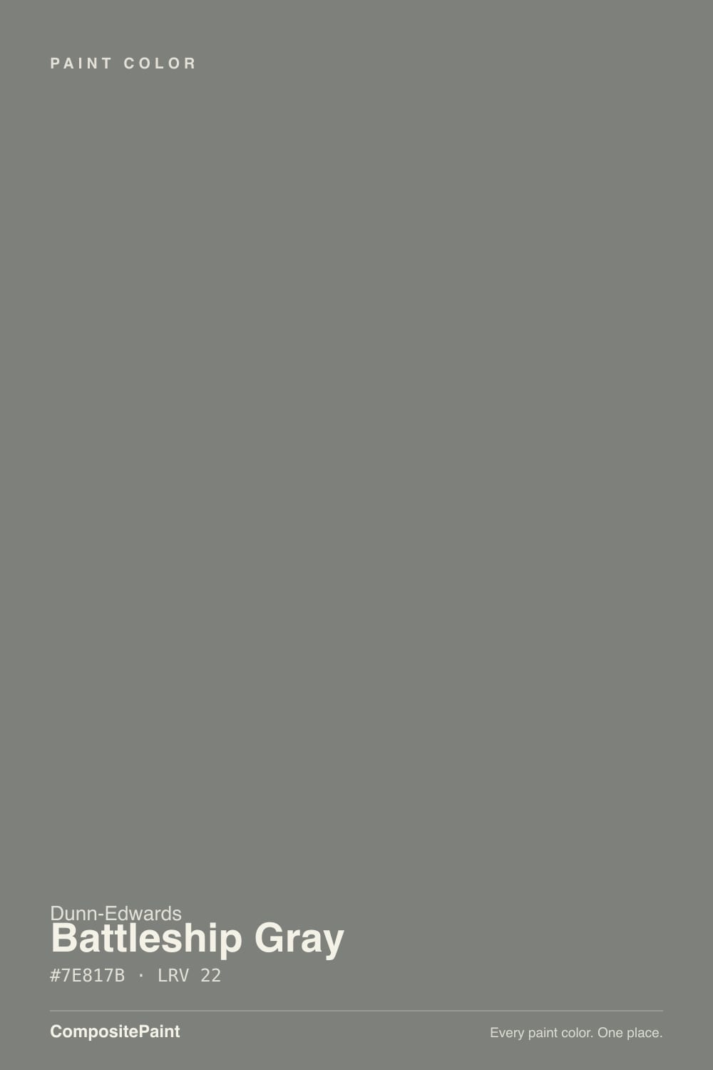
Battleship Gray is a true cool steel gray at LRV 16 — not greige, not navy, not charcoal-black. On a Western stucco box with white trim it does the job Dunn-Edwards sells it for: dirt-hiding, HOA-safe, crisp against metal and stone. On four interior walls the same paint goes cave-dark and a little industrial, with a blue-green flash in north light. Sample it on the elevation you actually have. The chip is midtone; the house is not.
Stucco and siding exteriors · garage doors, shutters, and steel-gray front doors · metal, stone, and white-trim modern boxes · Southwest HOA body-gray lists
You want a warm greige house · the brick or stucco is terracotta or honey · you need this as interior walls in a dim room · you were hoping for blue-gray navy
- True cool steel gray — not greige, not violet, not navy
- LRV 16 hides dirt on stucco and still reads gray from the street
- Crisp against white trim, metal, and pale stone
- Workhorse on doors, garages, and shutters, not only whole-house body
- Sits on real Southwest HOA body-gray lists, so it is a known quantity
- Too dark and industrial for most interior walls
- Blue-green flash on north and overcast elevations
- Fights terracotta, honey brick, and yellow-cream stucco
- West-facing desert stucco at this depth soaks heat
What Color Is Battleship Gray, Really?
A cool steel gray with a faint blue-green in the undertone — metal, not greige. Dunn-Edwards files it in the DEC historic range, sitting next to Gray Pearl and Taliesin Blue, which tells you the name is the old naval color, not a 2010s marketing gray. On the chip it can pass for a polite midtone. On a wall, and especially on a two-story stucco face, the steel and the depth both come forward.
LRV 16 is the whole argument. That is Kendall Charcoal territory, not Repose Gray territory: deep enough to hide dust and rain-splash on an exterior, light enough to still read as gray from the street instead of a black box. It is also why the interior version fails. Four walls at 16 bounce almost no light. Plan for the painted house to read a step darker and cooler than the strip in your hand.
Undertone in one line: steel first, a whisper of blue-green second — never beige, never violet. If the sample goes greige, your light is warm and the color is being polite. If it goes teal-gray or dead metal, you are in shade or under cool LEDs. Both reads are the same paint telling the truth about the elevation.
Where It Shines
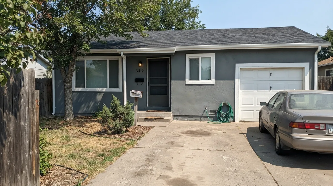
This color earns its search volume outside. On stucco, fiber-cement, and smooth modern boxes, south and west daylight keep it a true steel gray — the crisp, slightly industrial read DE pairs with white trim, metal, and stone. Its second job is the darker piece on a lighter house: a front door, a garage door, shutters, where LRV 16 looks intentional instead of gloomy. Give it Extra White or a similar sharp trim, raw metal, and pale stone, and it looks like a specification, not a trend.

Where It Fails
Almost every miss with Battleship Gray is someone taking an exterior gray indoors, or putting cool steel against warm masonry. None of these are mysterious. If your house matches one of the three below, a bigger sample will only confirm it.
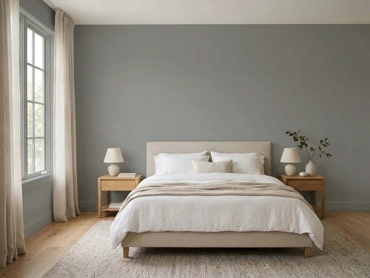
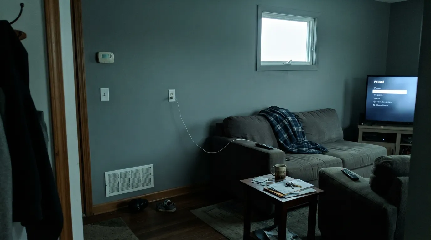
LRV 16 on four interior walls is a cave with a steel cast. It can work on a powder-room drench or a set of cabinets under a near-white like Foggy Day. As a living-room or bedroom wall color it swallows light and reads industrial, not calm. If you need gray inside, go much lighter — this one was named for a hull, not a sofa.
Cool steel sits opposite warm orange-red on the wheel. Clay-tile roofs, honey brick, and yellow-cream stucco all push Battleship toward blue-green while the masonry goes more pumpkin. Both sides lose. Pale stone, gray stone, raw concrete, and cool metal are its company. If the masonry is staying warm, pick a greiger charcoal — Chelsea Gray is the usual swap — or leave the gray off the body.
The blue-green in the undertone is quiet in sun and loud in shade. A north elevation, a deep porch overhang, or a week of marine layer can turn the body color into dull metal with a teal cast that reads like faded paint from the street. Sample the shadiest wall, not the sunny one. If that wall is most of the house, this is the wrong gray.
Room by Room
This is the room. On stucco and siding in real daylight it reads as a solid, slightly industrial gray that hides dirt and still photographs as gray, not black. Extra White trim is the crisp pairing; DE's own Swiss Coffee is the Southwest habit, though the cream will look yellower against the steel. Satin or low-luster, not flat — flat exterior gray chalks and looks tired by year three.
LRV 16 is an excellent door-and-garage depth on a cream or near-white house. Semi-gloss on the door, satin on the garage. It sits with both modern black hardware and traditional white trim, which is why DE puts it on front-door boards. Keep the body lighter than the door or you lose the contrast.
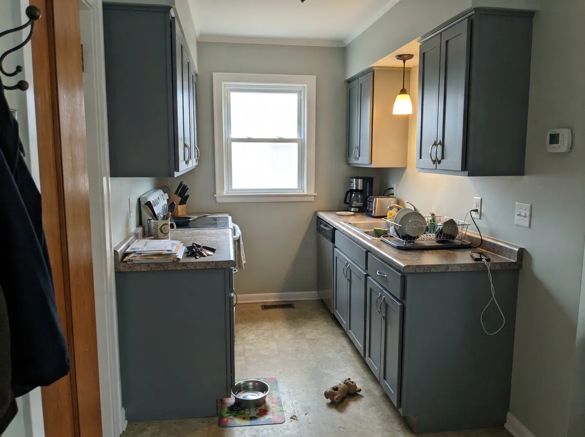
Steel-gray cabinets under Foggy Day or Extra White walls are the one interior use that does not fight the LRV. Satin enamel, not wall paint. Full-height Battleship walls in a kitchen will make the room feel smaller and cooler than the chip; keep the gray on the boxes and let the walls bounce light.
A small, lamplit powder room can take the drench: the industrial steel reads as a choice, not a basement. A home office with a window can too, if you want the studio-gray look. Eggshell, warm 2700K bulbs, and a sharp white on the trim. Skip it in a windowless bath.
Too dark and too cool for a main floor unless the architecture is already industrial — concrete, black metal, huge glass. In a typical drywall box it goes gloomy by late afternoon. If you want gray in the living room, you want a color with twice this LRV.
Cool steel at 16 is the opposite of restful for most people: it reads like a filing cabinet after dark. North bedrooms are worse. If you want a dark bedroom, pick a warmer charcoal and keep the bulbs dimmable and warm.
Your Light Is the Risk
Hard sun keeps it honest: a true steel gray with the blue-green quiet. This is the light the exterior was specified for, and the reason the chip looks midtone in the store.
Cool, indirect light wakes the blue-green and the body goes dull metal. A north wall under an overhang is the sample that should decide the job — not the sunny gable.
Cooler and slightly bluer before noon; the most neutral read at midday; dusk drops it toward charcoal so the house looks a step darker from the street. The shift is real but it stays gray, not a new color.
Warm 2700K bulbs pull it toward a softer greige-steel, which is the only way an interior dose looks livable. Cool white LEDs lock in the industrial blue-green. If you paint any of this inside, the bulb temperature is part of the spec.
Most complaints about Battleship Gray are a light mismatch. Upload a photo of your actual room and see it on your walls — then ask for the same wall in north light or evening lamps before you buy a single sample.
Need It From Another Brand?
Any paint counter can custom-tint Dunn-Edwards DEC797 directly. If you would rather stay in one brand's own deck, these are the closest stock matches, measured as ΔE2000. Under 2 is a difference you will not see on the wall.
| Brand | Closest color | ΔE | LRV | |
|---|---|---|---|---|
| Sherwin-Williams | Before the StormSW 9564 · Sherwin-Williams | 1.9 | 18 | Color page → |
| Behr | Rich PewterQE-61 · Behr | 1.4 | 16 | Color page → |
| Benjamin Moore | Gray Shower2125-30 · Benjamin Moore | 1.7 | 18 | Color page → |
| Valspar | Gotham CityV117-3 · Valspar | 1.6 | 18 | Color page → |
| PPG / Glidden | ImprobablePPG1011-5 · PPG / Glidden | 0.6 | 17 | Color page → |
| Glidden | ImprobablePPG1011-5 · Glidden | 0.7 | 17 | Color page → |
Similar Dunn-Edwards Colors
The nearest shades to Battleship Gray within Dunn-Edwards's own range, ranked by perceptual color distance — useful when you want the same look a touch lighter, darker, or warmer.
WCAG 2.1: AA is 4.5 : 1 for normal text, 3 : 1 for large text, AAA is 7 : 1.
Battleship Gray vs the Colors You're Also Considering
Every Battleship Gray sample board has the same rivals on it. The numbers show the real lightness gap — then it comes down to which risk you would rather live with.
Pick this when you want a cooler, truer gray that still has body-color depth.
Benjamin Moore HC-168 · LRV 23Chelsea GrayPick this if you want the go-to charcoal-greige for exteriors, islands, and accent walls — warmer, a step lighter, less steel.
Pick this when the steel-metal read is the point, not a soft charcoal.
Benjamin Moore HC-166 · LRV 15Kendall CharcoalPick this for the best-behaved dark gray in the BM deck at almost the same depth — slightly browner, less blue-green.
Preserved Pewter (DESS39) shares the same LRV of 22 but leans noticeably warmer, with a soft greige cast. If your fixed elements are cream, tan, or warm wood, Preserved Pewter blends in more easily, while Battleship Gray stays cooler and reads more purely as gray.
Storm Cloud (DE6362) at LRV 21 goes the other way, pulling slightly bluer and cooler. In a north-facing room Storm Cloud can feel a touch steely, whereas Battleship Gray's near-neutral green lean keeps it a little softer and more grounded.
Metal Fringe (DET626) at LRV 21 is the warmest of the three, a greige that borders on taupe. Choose Metal Fringe when you want warmth and Battleship Gray when you want a truer, more balanced mid-gray. All three are close enough in depth that the deciding factor is temperature, not lightness, so sample them side by side against your trim.
Battleship Gray Coordinating Colors
The rule is cool company: sharp whites, near-blacks, quiet near-whites, and stone — and keep yellow-cream and terracotta at arm's length. Extra White is the trim that makes the steel look specified. Foggy Day is the interior wall that lets you use Battleship on cabinets. Iron Ore is the darker door on a Battleship body. Chelsea Gray is the warmer swap if the masonry will not cooperate.
Why This Gray Shows Up on Western HOA Lists
Battleship Gray is not a Color of the Year and it does not have a viral living room. It has something more useful in Dunn-Edwards country: it is a named, historic-range gray that HOAs already recognize. Northampton Park, for one, lists DEC797 as a body color. That is how a mid-dark steel gray becomes DE's most-searched exterior gray — not from magazines, from approved-color PDFs and stucco that needs to hide dust.
The name is the old naval gray, and the DEC line sits with other historically tagged colors, but do not treat the can as a military match. What you are buying is DE's cool steel at LRV 16. On a sun-struck stucco face that depth looks midtone. On a shaded north wall it looks like a darker, slightly teal-metal house. Sample both, because the HOA chip in the packet was photographed in sun.
Battleship Gray With Masonry, Metal, and Wood
Pale limestone, gray stone, raw concrete, and galvanized or black metal are the materials this paint was waiting for. White window frames and a metal roof make the steel look deliberate. That is the California-modern spec in one sentence.
Warm masonry is the honest no: terracotta tile, honey brick, ochre stucco, and golden oak garage doors all pull the blue-green forward. A large stone wainscot in a cool gray can buffer a warmer roof; a honey-brick chimney on a Battleship body usually cannot. Cottage White trim — DE's yellow-cream for older Western houses — has the same problem in paint form.
Wood: pale white oak and grayed cedar are fine. Redwood and honey oak fight it. Metals are easy: black, stainless, and raw steel all belong; unlacquered brass is the one that looks slightly out of key against the cool body unless the door is already doing a warmer job.
Three Ready Palettes Built on Battleship Gray
A color is never alone on the wall. These are complete combinations in the 60-30-10 pattern, with the reason each one holds together. Every one opens in the visualizer.
This is the crisp modern spec: steel body, the sharpest trim white in the SW deck, and a near-black door so the gray still reads as the wall color. Extra White belongs on the trim here, not the walls — that is the pairing it was built for.
Try this palette in your roomFoggy Day is the quietest near-white in DE's trio, so the cabinets can carry the steel without the room going cave. Extra White on ceiling and trim keeps the edges sharp. This is the interior use that does not fight LRV 16.
Try this palette in your roomSwiss Coffee is the Southwest's default cream, so this is how a lot of DE houses actually get built: warm body, steel door, sharp white trim. The cream will read a little yellower against Battleship — that contrast is the look, not a mistake. Skip Cottage White here; that yellow-cream pushes the gray toward teal.
Try this palette in your roomBattleship Gray FAQ
Is Battleship Gray warm or cool?
Cool. Steel first, a faint blue-green second. It will not save a house that wanted greige, and warm bulbs only soften it — they do not turn it beige. If you need a warm dark exterior, look at Urbane Bronze or a greiger charcoal like Chelsea Gray.
Can I use Battleship Gray on interior walls?
Not as a main-floor wall color. LRV 16 on four walls is a cave with an industrial cast. The interior uses that work are cabinets, a powder-room drench, or a well-lit office. For living rooms and bedrooms, pick a gray with much more bounce.
What trim white goes with Battleship Gray?
A sharp, clean white — Extra White is the pairing that matches the steel. Pure White is a half-step softer. Dunn-Edwards Swiss Coffee is the local Southwest habit on trim, but it is the warmest Swiss Coffee of the bunch, so it will look creamier — fine if you want that contrast, muddy if you wanted crisp. Cottage White is a yellow-cream for older Western houses and will push this gray blue-green; skip it.
Does Battleship Gray look blue?
Not navy, not a blue-gray like Naval. In shade and on overcast days the blue-green undertone can flash enough that the body looks slightly teal-metal from the street. In south sun it stays a true gray. Sample the shadiest elevation before you buy gallons.
Is it a good exterior color in the desert?
As a color, yes — dirt-hiding, HOA-familiar, honest in hard sun. As a surface temperature, be careful on a long west stucco wall: LRV 16 absorbs more heat than a light body gray. If the west elevation is most of the house, a lighter gray on that face, or Battleship only on doors and garage, is the more livable spec.
Battleship Gray or Chelsea Gray for the house?
Chelsea Gray is the charcoal-greige: warmer, LRV 23, the usual island-and-exterior greige. Battleship Gray is cooler, deeper, and more clearly steel. Pick Chelsea if the brick or wood is warm. Pick Battleship if the house is stucco, metal, and stone and you want it to read gray, not taupe.
Have you painted with Battleship Gray?
Rate it — one tap helps the next reader decide.
Ask a Question