The Best Kitchen Paint Colors
Twelve kitchen paint colors that work in a real kitchen — cabinet colors first, then walls, then the pairings that hold together. White Dove, Pewter Green, Hale Navy, Iron Ore, Accessible Beige, Chantilly Lace and more, grouped by small kitchens, dark kitchens, and resale.

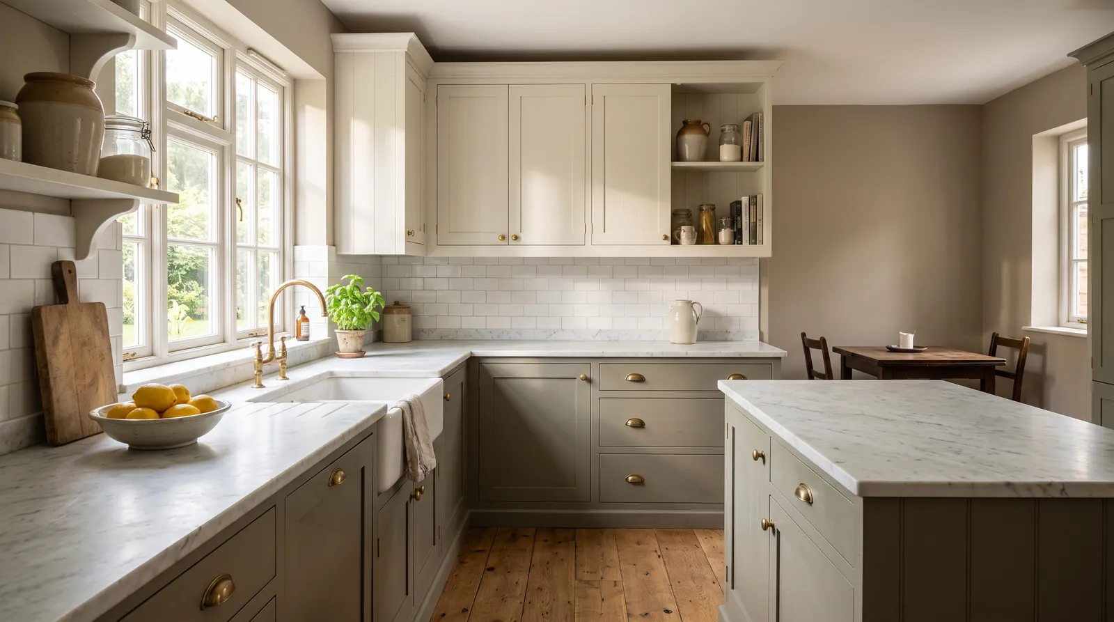
A kitchen is the one room where the paint color you choose is mostly not on the walls. Between the uppers, the lowers, the backsplash, the appliances and the windows, there is often less than a hundred square feet of visible wall left. The cabinets are the color of the room.
Which is why most kitchen color lists get the order wrong. They hand you wall colors, and then the cabinets fight them. Start the other way: pick the cabinet color, let the walls answer it. Below are twelve colors grouped that way — cabinets first, then walls, then the pairings, with a separate group for small kitchens, where the usual advice quietly stops working.
If you want the practical side, the best kitchen cabinet paint covers what actually survives fingers and steam on a door, and the best kitchen wall paint covers the wall product. The kitchen color hub has the wider shortlist if none of these land.
What Color Should I Paint My Kitchen?
Paint the cabinets a warm white — Benjamin Moore White Dove (OC-17) is the one that fits the most kitchens — and the walls a soft greige in the LRV 55 to 65 band, like Sherwin-Williams Accessible Beige (SW 7036). If you want more than that, put the color on the lower cabinets and the island, not on the walls.
The reason that order works is drape. Cabinet doors are vertical, they catch light at a different angle to the walls, and most sit under downlights that are far warmer and more directional than daylight. A color that reads soft on a flat wall can read yellow and slightly plastic on a door six inches under an LED. The cabinet color has to be chosen against cabinet conditions; everything else is chosen to sit against it.
The second reason is money. Repainting a wall is a weekend. Repainting twenty doors properly — degrease, sand, prime, two thin coats, a week of cure — is not something you do again because the greige went pink.
Best Kitchen Cabinet Colors
These five come up again and again in real kitchens, and they earn it. The LRV spread runs from 85 down to 6, because cabinets are where a kitchen is allowed to have weight.
Benjamin Moore White Dove (OC-17)
White Dove is the most-painted cabinet color in America and it deserves the position. It has just enough yellow to look like a chosen white rather than a builder default, and — the part that matters on cabinetry — it stays warm under 2700K downlights instead of going grey the way cooler whites do at night. Against oak floors and brass pulls it looks like it was always there.
Its weakness is a north-facing kitchen with crisp white quartz, where the cream can read faintly dirty. Step to a cleaner white in that case.
Walls and trim: Benjamin Moore Edgecomb Gray (HC-173) on the walls in eggshell, White Dove on the trim. Trim matching the cabinets is what makes a kitchen look built rather than assembled.
Sherwin-Williams Pewter Green (SW 6208)
Pewter Green is the lower-cabinet color I recommend most, and the reason is the grey in it. It is dark enough to weigh the base of the room, but the grey stops it short of any specific decade — never sage, never forest, just a deep green that has been there a while. Under warm kitchen lighting it stays green rather than sliding brown, which is where most olive-based cabinet colors fall apart at dinnertime.
It needs contrast above it. On every cabinet in a small kitchen it is heavy; below the counter with a warm white above, it works almost anywhere.
Walls and trim: Sherwin-Williams Alabaster (SW 7008) on the walls and uppers. The warm white keeps the green from going cold, and the two together are quietly the most requested kitchen in the country right now.
Benjamin Moore Hale Navy (HC-154)
Hale Navy is what you paint an island when you want the kitchen to have a center. Enough grey in it that it never tips into the primary blue that dates a kitchen in five years, and it does something lovely next to brass: the metal reads gold against it instead of yellow. Daylight makes it a proper navy; lamplight settles it almost to charcoal.
It wants a real window. Under ceiling cans alone, a full run of Hale Navy base cabinets flattens into a dark grey-blue and loses the depth you paid for. Island only, in that case.
Walls and trim: Benjamin Moore White Dove (OC-17) on the uppers and trim, Chantilly Lace on the ceiling. A bright white next to Hale Navy goes icy at eye level but is right overhead.
Sherwin-Williams Iron Ore (SW 7069)
Iron Ore is the near-black that does not read as black. Enough warmth to keep a kitchen from feeling like a showroom, enough green-grey to stop it going blue under cool daylight — the failure mode of true blacks on cabinetry. It also hides what dark cabinets are famous for showing: at LRV 6 in satin, fingerprints are far less visible than on a flat charcoal.
Be honest about the room. Iron Ore uppers under about 120 square feet close the space in at eye level. Below the counter, in any size kitchen, it is fine.
Walls and trim: Sherwin-Williams Pure White (SW 7005) on the walls and uppers. The clean white gives Iron Ore its edge; a creamy white makes it look muddy.
Valspar Bistro White (7006-4)
Bistro White is the answer to White Dove’s one problem. It is bright and slightly cool, so next to white quartz, cool marble, or stainless it stays crisp instead of going cream. On shaker doors it is the clean, almost furniture-like white people picture when they say white cabinets, and it comes in Valspar’s cabinet enamel at Lowe’s, which keeps a full kitchen affordable.
In a north-facing kitchen it can go clinical — the one room where warmer whites earn their place.
Walls and trim: Valspar Filtered Shade (4003-1B) on the walls, Bistro White on the trim. A soft neutral wall keeps the cool white from reading like a lab.
Best Kitchen Wall Colors
Wall color in a kitchen has one job: sit behind painted cabinets without competing. All four sit in the range where the backsplash and the countertop can still be the interesting things in the room.
Sherwin-Williams Accessible Beige (SW 7036)
Accessible Beige is the safest kitchen wall here. Warm enough to look intentional next to white cabinets, neutral enough to sit against oak, walnut, and every counter from butcher block to grey quartz, and — the part that matters in a kitchen — it does not go pink when the warm ceiling lights come on at 7pm.
In a bright south-facing kitchen it pushes gold. Pleasant, but if you wanted grey you will not get it here.
Cabinets and trim: Benjamin Moore White Dove (OC-17) on the cabinets — a warm white a half-step lighter, which is exactly the relationship you want.
Benjamin Moore Edgecomb Gray (HC-173)
Edgecomb Gray is the lighter, greener alternative, and the one I reach for in a north-facing kitchen. North light drops a cool cast on everything, and Edgecomb has enough tan in the base to push back without becoming beige. At LRV 63 it bounces more light than Accessible Beige, which matters when the wall you have left is one strip between the counter and the uppers.
In afternoon sun it flattens into plain tan. It is genuinely a north-and-east color.
Cabinets and trim: Benjamin Moore White Dove (OC-17) on the cabinets, Simply White on the ceiling. Dove-and-Edgecomb is the most reliable warm neutral kitchen there is.
PPG Gypsum (PPG1006-1)
Gypsum is the wall color for a kitchen where the cabinets are the color. If you have gone Pewter Green below or Hale Navy on the island, a greige wall gives you two mid-tones arguing; a soft white gives the cabinets the whole stage. Warm enough not to go blue under LEDs, quiet enough that a busy backsplash still reads.
Against very warm oak cabinets it looks cold. Reserve it for painted kitchens.
Cabinets and trim: Any of the deep cabinet colors above. Gypsum on the walls and ceiling with a strong lower run is one of the cleanest kitchens you can build.
Farrow & Ball Skimming Stone (No. 241)
Skimming Stone is the one with texture. The F&B pigment load gives it a chalky depth that shifts through the day — nearly white at midday, warm grey by late afternoon, almost taupe under lamplight. In a kitchen with plaster walls or an old range, it makes the room look older in the good way.
The mushroom base leans pink in strong west light. Sample it on the wall by the window first — in a kitchen you see that wall every morning.
Cabinets and trim: Farrow & Ball Card Room Green (No. 79) below, a warm white above. Skimming Stone was made to sit against F&B’s greens.
Small Kitchen Paint Colors
Small kitchens follow different rules. Every cabinet door is a separate plane catching light differently, and the more colors you add the more the room chops itself up. All three below are high-LRV and meant to be repeated: cabinets, walls, and trim in one color.
Benjamin Moore Chantilly Lace (OC-65)
Chantilly Lace is the brightest useful white here, and in a small kitchen with decent daylight it is the one I would drench. Wrapped over cabinets, walls, trim, and ceiling it removes the lines that tell your eye where the cabinets end and the wall begins, and a galley stops announcing its width. It also keeps white tile and white quartz reading as one kitchen instead of three different whites in a row.
It needs light. With one small window it goes grey and clinical, and the room reads cold. That is what the next two are for.
Everything else: Same color throughout — satin on the cabinets, eggshell on the walls, flat on the ceiling. The monochrome wrap is the whole point.
Sherwin-Williams Pure White (SW 7005)
Pure White is the small-kitchen compromise, and the one most people should actually use. A touch of warm grey in the base keeps it from going clinical the way a true bright white can, and it is still clean enough to read as white next to appliances. It is also forgiving on doors: the slight grey hides brush texture far better than a stark white does.
It works in every orientation, which is most of why it is the default answer here.
Everything else: Same color on cabinets, walls, and ceiling. If you want the doors to have an edge, go one sheen up rather than changing the color.
Behr Blank Canvas (DC-003)
Blank Canvas is for the small kitchen with almost no daylight — an interior galley, or one window over the sink with a wall of uppers blocking it. High reflectance plus real warmth is what a dark kitchen needs, because a cool bright white in a room lit only by bulbs goes grey and dead. It is also the cheapest route to this look, stocked at Home Depot.
Budget two coats on walls, three thin ones on doors. Not the pick for a bright room — in strong sun you get glare off the doors themselves.
Everything else: Same color on cabinets, walls, and ceiling. In a dark small kitchen, contrast is not your friend.
Kitchen Color Schemes That Work
Three pairings I would put in a house without hesitating, and why each holds.
Warm white cabinets, greige walls. White Dove on every door, Accessible Beige or Edgecomb Gray on the walls, White Dove on the trim. Cabinets and trim in the same color is what makes it look built-in. This scheme photographs best for resale and asks the least of your countertop.
Two-tone: white above, green or navy below. Bistro White on the uppers, Pewter Green or Hale Navy on the lowers and island, a soft white wall like Gypsum behind. The dark base weighs the room, the light top keeps it open, and because the color lives on the doors you can change it in a weekend.
Full drench. One warm white — White Dove, Pure White, or Blank Canvas — on cabinets, walls, trim, and ceiling, with the contrast coming from wood: a butcher block island, an oak floor, a walnut shelf. It is the small-kitchen answer and also the most sophisticated large-kitchen answer. It only fails when the wood is a cold grey-brown.
Colors to Avoid in a Kitchen
Cool grey cabinets. The greys that swept kitchens ten years ago aged worse than anything else here, mostly because the blue-based ones sit badly against warm wood floors and brass. If you want grey, use a greige with a tan base, and keep it on the walls.
Two near-miss whites. A cabinet white and a trim white a half-step apart look like a mistake, and in raking window light they are impossible to un-see. Match them exactly or make the difference obvious.
High-chroma yellow, red, or teal on the walls. A kitchen already has color in it — food, wood, tile, whatever is on the counter. A saturated wall competes with all of it and bounces a cast onto every white surface you own, which is why a red kitchen makes white plates look faintly pink.
Flat sheen behind the range or sink. Flat looks beautiful and does not survive grease. Eggshell on walls, satin or semi-gloss on cabinets — the sheen guide has the trade-offs, but in a kitchen wipeability wins.
How to Choose Between Them
Start with the cabinets. Under about 120 square feet, or with one small window, go to the small-kitchen group and drench it — Chantilly Lace if you have daylight, Pure White as the safe middle, Blank Canvas if the room is genuinely dark. If the kitchen has real light and you want it to have a center, keep warm white above and put Pewter Green, Hale Navy, or Iron Ore below. Then pick the wall to answer the cabinets: greige if the cabinets are white, soft white if the cabinets are colored.
Then test on a door, not a wall. Paint two coats on a spare cabinet door or a piece of primed MDF and hang it in the actual kitchen. Look at it at breakfast, at 3pm, and at night with only the under-cabinet lights on — that last one is where most cabinet colors show what they really are.
If you want to see it first, upload a photo of your kitchen to the visualizer and try the shortlist on the cabinets. It catches the obvious misses — the green that goes brown, the white that goes cream — before the sample pots arrive.
Ask a Question