Watery
The blue-green-gray chameleon Behr sells for less than a Sherwin-Williams can — reviewed honestly: the light where it turns a bright coastal teal, the light where it goes near-gray, and what to buy instead.

Jessica has spec'd whites and neutrals for more than 300 rooms and keeps a sample wall of painted drawdowns in her studio. Every color review is checked against real reader rooms in the comments and re-tested when a formula changes. About the testing process →

The Fast Verdict
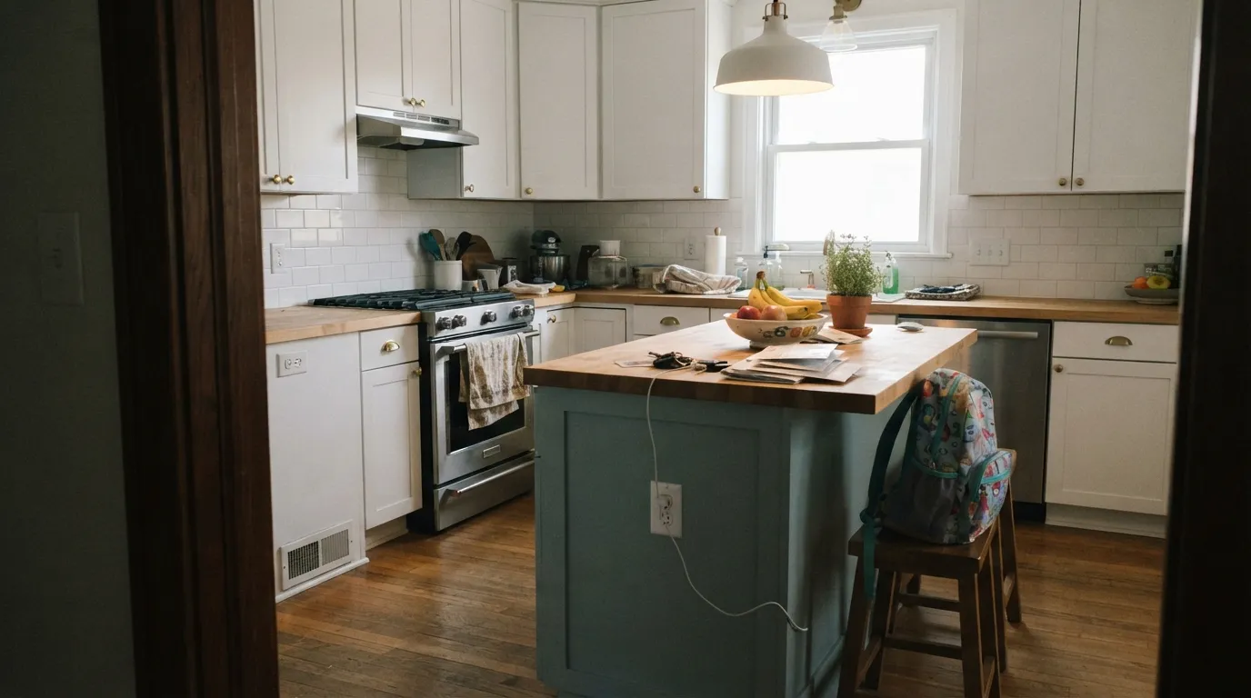
Watery is Behr's mid-depth blue-green-gray — the color that reads bright, distinctly blue in direct sun and settles into a quiet, near-gray version of itself in shade or a north-facing room. At LRV 50 it holds real color instead of washing out, which is why it turns up on kitchen islands and bathroom vanities almost as often as it does on walls. It is not a knockoff of anything specific — it is Behr's own entry in the chameleon gray-green category that Sherwin-Williams Sea Salt made famous, sold at Home Depot prices.
Kitchen islands and bathroom vanities · coastal and modern-farmhouse kitchens · rooms with real daylight and white trim · shoppers who want the Sea Salt look without a Sherwin-Williams can
Your room gets little to no direct sun (north-facing, deep porch, small windows) · you want a color that reads the same in every room · you want a committed green or a committed blue, not a blend · your fixed floors and counters already do a lot of talking
- Genuine chameleon — blue, green, and gray all read true depending on the light
- LRV 50 holds real color without going murky or dark
- Kitchen islands and bathroom vanities look custom, not catalog
- A Home Depot-priced alternative to pricier chameleon colors like Sea Salt
- Pairs cleanly with white trim, brass, and black hardware
- Goes near-gray in north-facing rooms with little direct sun
- Splits the difference on purpose — disappoints anyone wanting a committed blue or a committed green
- Needs daylight to do its best work; windowless rooms go flat
- Harder to predict from a chip than most colors — sample big before committing
What Color Is Watery, Really?
Watery sits in the same family as Sherwin-Williams Sea Salt and Rainwashed: a blue-green-gray built so the green and blue channels tie almost exactly (RGB 175/190/190 in the deck value) — the technical reason it never reads as clearly blue or clearly green. It splits the difference on purpose and lets the room's light and materials decide which way it leans on a given afternoon.
At LRV 50 it is a genuine mid-tone, noticeably deeper than the pale, airy Sea Salt everyone posts online (LRV 63). Its closest twin in weight is Benjamin Moore's Quiet Moments, which lands on the identical LRV 50 with a nearly matching hex. Put Watery next to a true light gray and it holds its ground; it does not wash out the way lighter chameleon colors can in a big, sunny room.
Undertone in one line: blue-green in equal measure, pulled toward gray — never purely one or the other. If it looks distinctly blue, that's direct sun doing it; if it looks quieter and greener, or drifts close to plain gray, that's shade or a north-facing window pulling the color back. Both are the same paint being honest about its surroundings, not a defect.
Where It Shines
Give it a kitchen island under warm pendant lights, or a small bathroom with real daylight and white subway tile, and it turns genuinely three-dimensional — shifting from sage to slate through the course of a day in a way a flat gray never does. It is one of the few mid-priced Behr colors that reads custom instead of catalog, which is exactly why it keeps showing up as the one bold cabinet or vanity in an otherwise-neutral kitchen or bath.

Where It Fails
Almost every disappointed review of Watery comes down to expecting a single, stable color and getting a mood instead. Three situations account for nearly all of it, and none of them are a flaw in the paint — they are the tradeoff that comes with buying a chameleon.
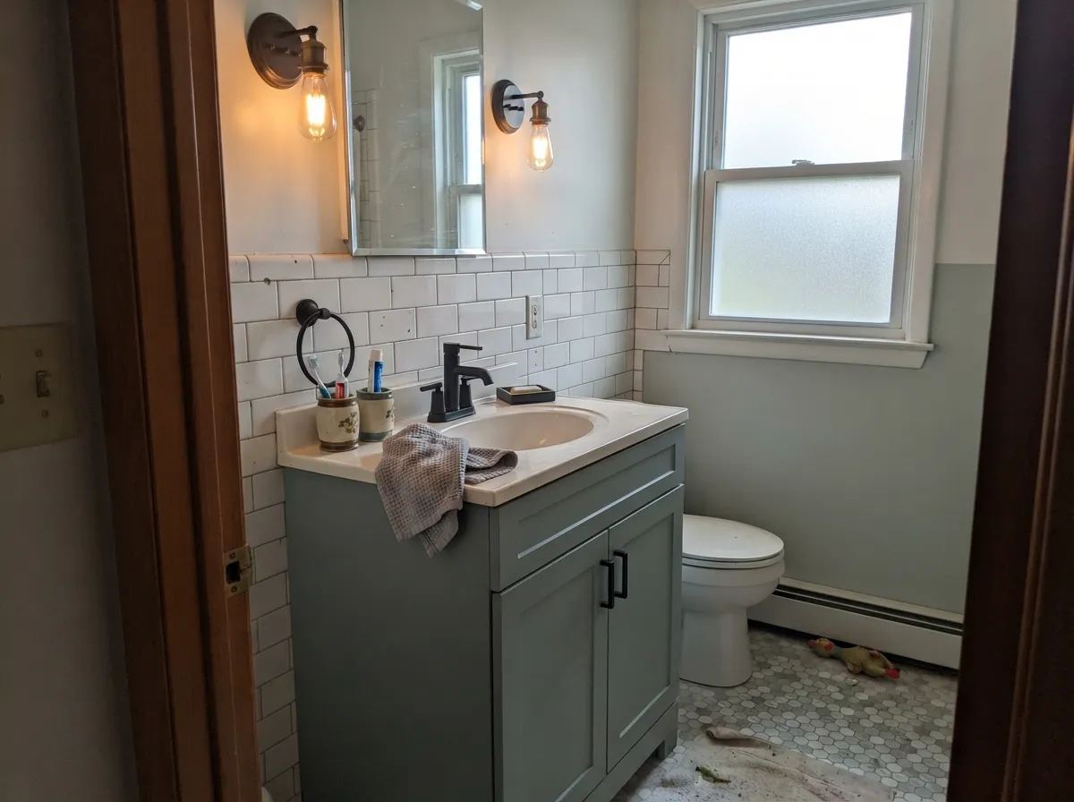
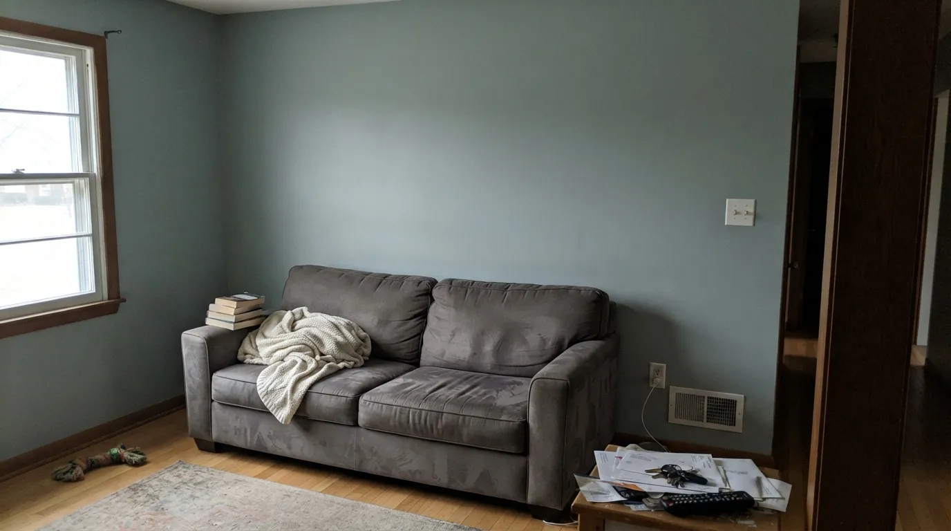
Without direct light to pull the blue forward, Watery settles into a cool, near-gray version of itself — readers who picked it for a clear teal or aqua wall end up with something a lot closer to plain gray. It is still a fine color there, just a quieter one than the chip promised; south- or west-facing rooms show the color it was chosen for.
Watery splits the difference by design — equal parts blue and green, pulled toward gray. If you searched "sage green" or "spa blue" and want a color that just commits, this will look like neither on the wall. Try Behr Bitter Sage for real green or Benjamin Moore Santorini Blue for real blue instead of waiting for Watery to settle down.
Without daylight to shift against, the color has nothing to react to and just sits flat and cool, especially under a single overhead fixture. Add a warm sconce, or pick a color whose good looks don't depend on daylight.
Room by Room
White perimeter cabinets with a Watery island is one of the most-repeated pairings in real kitchen photos. Satin finish; brass or matte black pulls both work with it.
Under warm vanity lighting it goes soft green-teal. With white subway tile and brass or matte black fixtures it reads spa-clean rather than beachy-cute.
Calm, not sleepy. Keep the bulbs warm and it works well as a headboard-wall accent against white trim; under cool white LEDs it turns more distinctly blue and colder than most bedrooms want at night.
South or east daylight keeps it lively across a whole room. A dim, north-facing living room needs lamps working hard, or the color goes flat and loses its point.
Full sun reads it as a soft coastal teal-gray. Pairs well with navy or near-black trim and white window frames for a modern-farmhouse-meets-coastal look.
A whole room in Watery can feel like a held breath if the light is inconsistent. Most people are happier limiting it to one wall or a piece of furniture unless the room gets real daylight most of the day.
Your Light Is the Risk
Full daylight pulls the blue forward and the wall reads bright and open — its best, most photographed state, and the one most sample photos online show.
Without direct sun the color settles into a cool, near-gray version of itself. Fine if you half-wanted a quiet gray; disappointing if you wanted visible teal.
Direct sun brings the blue forward and brightens it; shade, an overcast sky, or a view of greenery lets the green undertone take over and the color turns quieter.
This one runs backward from most colors: warm 2700K bulbs mute it toward a softer, grayer read, while cooler white LEDs actually sharpen the blue-green instead of washing it out.
Most complaints about Watery are a light mismatch. Upload a photo of your actual room and see it on your walls — then ask for the same wall in north light or evening lamps before you buy a single sample.
Need It From Another Brand?
Any paint counter can custom-tint Behr HDC-CT-26 directly. If you would rather stay in one brand's own deck, these are the closest stock matches, measured as ΔE2000. Under 2 is a difference you will not see on the wall.
| Brand | Closest color | ΔE | LRV | |
|---|---|---|---|---|
| Sherwin-Williams | RainSW 6219 · Sherwin-Williams | 1.4 | 49 | Color page → |
| Benjamin Moore | Wedgewood GrayHC-146 · Benjamin Moore | 1.9 | 50 | Color page → |
| Valspar | Jolene8004-35C · Valspar | 0.8 | 48 | Color page → |
| PPG / Glidden | StormyPPG10-14 · PPG / Glidden | 3.7 | 49 | Color page → |
| Glidden | Canadian Sky Blue30BG 49/047 · Glidden | 3.0 | 49 | Color page → |
| Dutch Boy | Rainwash331-3DB · Dutch Boy | 3.6 | 48 | Color page → |
Similar Behr Colors
The nearest shades to Watery within Behr's own range, ranked by perceptual color distance — useful when you want the same look a touch lighter, darker, or warmer.
WCAG 2.1: AA is 4.5 : 1 for normal text, 3 : 1 for large text, AAA is 7 : 1.
Watery vs the Colors You're Also Considering
Every Watery sample board has the same rivals on it. The numbers show the real lightness gap — then it comes down to which risk you would rather live with.
Pick this for a deeper, moodier version at Home Depot prices — Watery sits a full LRV step-and-a-half darker and holds more color on a big wall.
Sherwin-Williams SW 6204 · LRV 63Sea SaltPick this if you're already committed to Sherwin-Williams — it's the pricier, paler cousin everyone means when they say "spa gray-green."
Pick this for the more balanced blue-green read, and one that's a hair lighter and brighter.
Sherwin-Williams SW 6211 · LRV 47RainwashedPick this for a color that leans greener and holds together a little better in flat, cloudy light.
Valspar Jolene 8004-35C is #ACBCBD at LRV 48, with a deltaE of 0.79 against Watery. That is under one, so the two are the same color for practical purposes, with Jolene sitting two points darker on paper.
Sherwin-Williams Rain SW 6219 is #ABBEBF at LRV 49 and Benjamin Moore Wedgewood Gray HC-146 is #ACBFBD at LRV 50, at deltaE 1.43 and 1.95. Both are visually identical to Watery in normal room light, though Wedgewood Gray carries a fractionally greener cast on a large wall.
Rodda Cirrus CA188 at LRV 51 is 2.21 away, very close but worth sampling first. Past that the differences become real. Dutch Boy Rainwash 331-3DB at LRV 48 sits at 3.64 and reads greener, Dunn-Edwards Crestline DE6325 at LRV 46 at 3.69 reads grayer and darker, and Farrow and Ball Parma Gray No. 27 at LRV 50 at 4.26 is the bluest of the set. All three are close but visibly different side by side.
Watery Coordinating Colors
The rule with Watery: cool-clean whites, warm near-blacks, and its own chameleon cousins — never a warm cream or golden beige, which fights its balanced blue-green undertone. These are the partners that keep showing up in rooms that work:
Watery vs. Sea Salt: The Comparison Everyone Makes
Sea Salt is the color most people mean when they say "that spa gray-green everyone has," and Watery is the color Behr shoppers reach for when they want the same idea without switching stores. They are not the same paint — Sea Salt sits at LRV 63, a full notch and a half lighter than Watery's LRV 50 — but they belong to the same family: a balanced, undertone-shifting blue-green-gray built to change with the light instead of fighting it.
The practical difference is depth, not mood. Sea Salt reads pale and airy, closer to an off-white with a green whisper; Watery is a genuine mid-tone that holds its color across a whole wall or a whole kitchen island. If a room already photographed well in Sea Salt somewhere online, expect Watery to look a full step moodier and more saturated in the same space — sample both before assuming they're interchangeable.
Watery With Wood Tones and Floors
Warm wood is the easy pairing: white oak, walnut and butcher block all sit comfortably against Watery because the wood's warmth balances the paint's cool-leaning blue-green. Honey oak works better here than it does with a true cold gray — Watery carries enough green to read as a deliberate coastal choice rather than a clash.
Where it gets pickier is cool-toned flooring: gray-washed wood or a very cool white oak can push Watery further blue and starve it of the green that makes it feel alive. If the floor is already cool, warm the room elsewhere — brass fixtures, a jute rug, unlacquered hardware — so the paint has something warm to react against.
Three Ready Palettes Built on Watery
A color is never alone on the wall. These are complete combinations in the 60-30-10 pattern, with the reason each one holds together. Every one opens in the visualizer.
Ultra Pure White keeps the perimeter crisp and lets the island carry the color; Iron Mountain's warm near-black grounds the cool undertone without going stark cold, and the whole thing comes from one Behr can plus a single accent.
Try this palette in your roomMatte black fixtures against the crisp white keep the chameleon wall color from tipping beachy-kitsch — the small room reads clean and current instead.
Try this palette in your roomNaval's depth keeps the shifting body color from reading pastel or washed-out in strong sun, and crisp white trim outlines the architecture — a facade combination that reads deliberate, not undecided.
Try this palette in your roomWatery FAQ
Is behr watery blue, green, or gray?
All three, depending on the light — that's the point. The deck value splits blue and green almost exactly evenly and pulls both toward gray. Direct sun (south or west exposure) pulls the blue forward and the room feels bright and open; shade or a north-facing window lets the color settle back toward a quieter, sometimes near-gray, green-leaning read. Indoors, cool white LEDs sharpen the blue-green rather than dulling it, while warm 2700K bulbs soften it toward gray. It rarely lands purely on one for long.
What white trim goes with watery?
A clean, near-neutral white like Behr Ultra Pure White or a Sherwin-Williams Extra White-type trim works best. A warm cream white can make Watery look grayer and colder by contrast — keep the trim crisp, not creamy.
Does it work on kitchen cabinets or an island?
Yes — it's one of the most-repeated island and cabinet choices in this color family. Use a satin urethane-fortified cabinet enamel, white perimeter cabinets, and either brass or matte black hardware.
How does watery compare to sherwin-williams sea salt?
Same idea, different weight. Sea Salt (LRV 63) is paler and airier, closer to an off-white with a green whisper; Watery (LRV 50) is a genuine mid-tone that holds its color across a whole wall or island. If a room looked good in Sea Salt online, expect Watery to read a full step moodier and more saturated in the same space — sample both.
Is it good for a small bathroom?
Very good with a window — the shifting light is part of the appeal in a small space. Without one, a windowless powder room has nothing to react against and the color sits flat; add a warm sconce or pick a different color for that specific room.
Does watery work on an exterior?
Yes. Full sun reads it as a soft coastal teal-gray, and it pairs cleanly with navy or near-black trim and white window frames for a modern-farmhouse-meets-coastal look. It is a genuine exterior workhorse, not just an interior accent color.
Have you painted with Watery?
Rate it — one tap helps the next reader decide.
Ask a Question