Vanilla Ice Cream
A pale butter yellow doing its best impression of a neutral, reviewed honestly: the light where it glows, the light where it turns sickly, and what to pick instead.

Jessica has spec'd whites and neutrals for more than 300 rooms and keeps a sample wall of painted drawdowns in her studio. Every color review is checked against real reader rooms in the comments and re-tested when a formula changes. About the testing process →

- 1Honey Tea52
- 2Jackfruit62
- 3Vanilla Ice Cream81
- 4Frittata86
- 5Barely Yellow92
The Fast Verdict
Vanilla Ice Cream is a real yellow wearing an off-white's clothes. At LRV 82 it sits nearly as bright as a builder white, so on a paint chip or in a dim room it can pass for a warm cream. Roll it across a sunlit wall and the yellow shows up honestly — soft, buttery, closer to custard than lemon. It is one of the gentlest ways to bring color into a kitchen or nursery without committing to a bold accent wall, as long as you go in knowing it is genuinely yellow, not just "warm."
Kitchens with warm wood and real daylight · nurseries and kids' rooms · hallways and breakfast nooks that want a hint of sunshine · anyone who wants yellow but is scared of yellow
Your only light is fluorescent tubes or cool white LEDs · your countertops or floor tile are cool gray or blue-gray stone · you want a color nobody will ever notice · you were hoping for a true neutral, not a color
- A real yellow gentle enough to read as "warm and bright," not "a yellow room"
- LRV 82 bounces light beautifully in kitchens and breakfast nooks
- Flatters warm oak, butcher block and brass without looking dated
- Reads cheerful without going saturated or neon
- Behr's own room list backs it for kitchens, hallways and kids' spaces
- Turns flat and slightly sickly under cool fluorescent or blue-white LEDs
- Clashes with cool gray or blue-gray stone and tile
- Yellower on the wall than the swatch or LRV number suggests
- Too much color commitment for a calm, restful primary bedroom
What Color Is Vanilla Ice Cream, Really?
Behr classifies Vanilla Ice Cream as a yellow, and the deck is right to file it there — the hex leans distinctly toward a pale custard, not a grayed-out cream. What makes it read as a soft neutral in photos and paint chips is the LRV: at 82 it reflects almost as much light as a bright white, so in a quick glance or on a small swatch it can look like any other creamy off-white. Roll a full wall and the story changes. Owners who chose it expecting a barely-there warm white often report it is "yellower than expected" once it is up — the color was never hiding, the swatch just made it easy to underestimate.
The undertone is a soft yellow with a whisper of peach, not gold and not green. That keeps it food-warm rather than mustard, which is why Behr's own room recommendations lean toward kitchens and kids' spaces — rooms where a little cheerful color is welcome but a saturated wall would be too much. Against warm oak, butcher block, and brass it looks intentional and sunny; against anything cool it starts to look like an accident.
Light does more work on this color than on most creams, because the base pigment itself is more saturated than a typical grayed-down off-white. In bright, warm daylight it glows soft and buttery. In flat, dim, or cool-toned light — especially fluorescent tubes or blue-leaning LEDs — the same paint can read flat, slightly greenish, and institutional. That swing is the single biggest thing to test before committing a whole kitchen to it.
Where It Shines
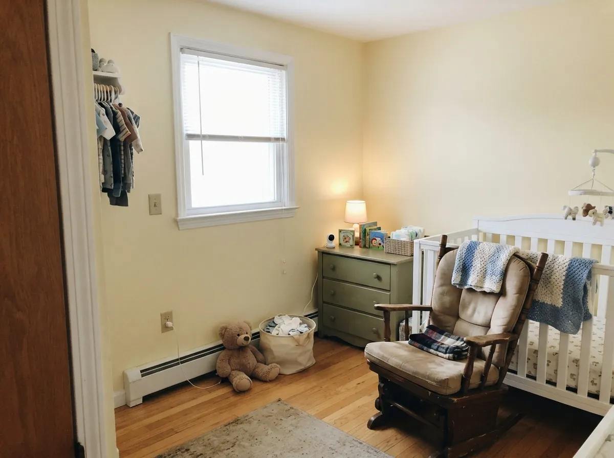
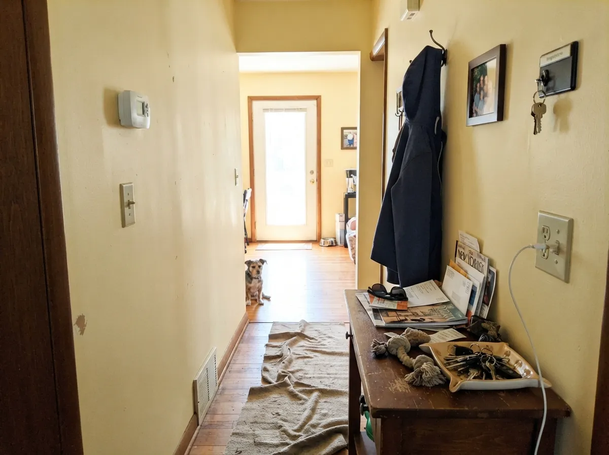
Give it real daylight, warm bulbs, and wood tones, and Vanilla Ice Cream does exactly what its name promises: a soft, cheerful, food-warm color that never tips into a full "yellow kitchen" statement. It is at its best in the rooms Behr itself points buyers toward — kitchens, breakfast nooks, nurseries, hallways — anywhere a little sunshine is welcome but a saturated accent wall would be too much. Pair it with crisp white trim and it reads deliberate rather than dated; pair it with brass hardware and butcher block and it looks like the room was planned around it.
Where It Fails
Almost every disappointed review of Vanilla Ice Cream traces back to one of three situations, and all three are predictable before the first coat goes up. The paint is not misbehaving — it is a genuine yellow at a very high LRV, and that combination has specific, knowable failure modes.
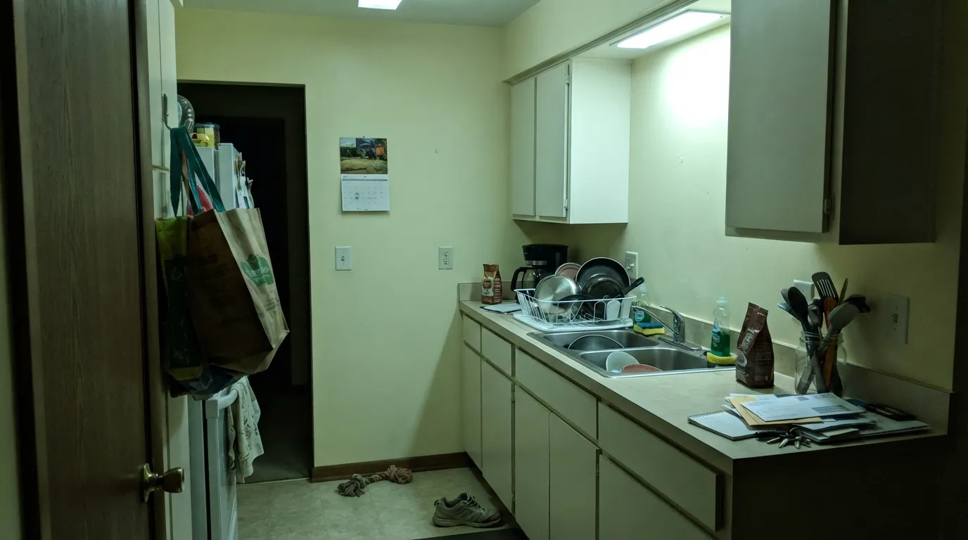
Kitchens are the room this color is built for, and kitchens are also where cool overhead lighting is most common — under-cabinet LEDs, fluorescent shop lights in an older kitchen, cool-white can lights. Under that light the yellow loses its warmth and can read flat, slightly green, even sickly — the "hospital yellow" complaint. Swap to 2700K–3000K bulbs before you blame the paint.
Blue-gray quartz, cool white subway tile with gray grout, or stainless-heavy kitchens sit at the opposite temperature from this color. The yellow pushes the stone toward dingy gray, and the stone pulls the paint toward a washed-out, slightly sour cream. Warm quartz, butcher block, or a warm white tile are the safer partners.
The paint chip and the LRV both make Vanilla Ice Cream look like it could pass for a soft off-white. On four walls in real daylight, it does not — it reads as yellow, plainly. If the goal was a warm neutral with zero color commitment, look at Behr Swiss Coffee or Blank Canvas instead; this color is happy to be noticed.
Room by Room
This is the room Behr built the color for, and the LRV 82 brightness genuinely does what the name promises: light without glare. With warm wood cabinets, butcher block, or brass hardware it looks sunny and intentional. Test a sample directly under your actual overhead lighting before committing — this is the room most likely to have cool LEDs working against it.
Soft enough to be gender-neutral, cheerful enough to avoid feeling clinical. Owners commonly pair it with sage green or terracotta accents rather than leaving it to carry the whole room alone. Matte or eggshell for easy touch-ups over crayon and handprints.
A short run of Vanilla Ice Cream in an entry or a stair hall reads as a warm welcome rather than a full commitment. It works best handed off from a quieter neutral like Swiss Coffee in the adjoining rooms, so the yellow feels like a deliberate accent, not the whole house's undertone.
Morning light plus this color is a genuinely nice combination — it is one of the few yellows that reads appetizing rather than acidic over a breakfast table. Evening entertaining under warm bulbs keeps the glow; skip it if the room's only fixture is a cool overhead LED.
With warm wood vanities and brass fixtures it is charming and cheerful. With cool gray tile, chrome, or a north-facing window with no warm light, it drifts toward the flat, slightly sour look described above. Sample it under the room's actual lighting before painting four walls.
It is a genuine yellow, and a genuine yellow on the walls of a room meant to feel calm and restful is a harder sell than in a kitchen or hallway. It works as an accent — a headboard wall, a closet, trim — better than as the main wall color for a room you sleep in.
Your Light Is the Risk
East-facing morning sun is where this color earns its name — soft, buttery, genuinely appetizing over a breakfast table. This is the light to sample it in.
Common exactly where this color gets used most — kitchen overheads and under-cabinet lighting. The yellow goes flat and slightly institutional. Test under your real fixtures first.
Brightest and most neutral-looking at midday; warms up and deepens toward late afternoon. Most owners like the shift — it never goes cold.
2700K bulbs: buttery and warm, the color at its most flattering. Cool white LEDs: flat and slightly green — swap the bulbs, not the paint.
Most complaints about Vanilla Ice Cream are a light mismatch. Upload a photo of your actual room and see it on your walls — then ask for the same wall in north light or evening lamps before you buy a single sample.
Need It From Another Brand?
Any paint counter can custom-tint Behr P260-3 directly. If you would rather stay in one brand's own deck, these are the closest stock matches, measured as ΔE2000. Under 2 is a difference you will not see on the wall.
| Brand | Closest color | ΔE | LRV | |
|---|---|---|---|---|
| Sherwin-Williams | They call it MellowSW 9015 · Sherwin-Williams | 0.8 | 79 | Color page → |
| Benjamin Moore | Shooting Star304 · Benjamin Moore | 1.4 | 77 | Color page → |
| Valspar | Cuddle3005-4B · Valspar | 1.7 | 82.3 | Color page → |
| PPG / Glidden | SawdustPPG1206-4 · PPG / Glidden | 1.4 | 79 | Color page → |
| Glidden | Frosted Lemon35YY 78/269 · Glidden | 1.1 | 78 | Color page → |
| Dutch Boy | Clearly Citrus116-3DB · Dutch Boy | 1.3 | 82 | Color page → |
Similar Behr Colors
The nearest shades to Vanilla Ice Cream within Behr's own range, ranked by perceptual color distance — useful when you want the same look a touch lighter, darker, or warmer.
WCAG 2.1: AA is 4.5 : 1 for normal text, 3 : 1 for large text, AAA is 7 : 1.
Vanilla Ice Cream vs the Colors You're Also Considering
Every Vanilla Ice Cream sample board has the same rivals on it. The numbers show the real lightness gap — then it comes down to which risk you would rather live with.
Pick this when you want the color to actually show up as sunshine, not just "warm."
Behr 12 · LRV 80Swiss CoffeePick this if you want the warmth without the visible yellow — same brand, quieter commitment.
Pick this if Blank Canvas's peach tell bothers you more than an honest yellow would.
Behr DC-003 · LRV 79Blank CanvasPick this for Behr's most dependable warm white if a genuine yellow feels like too much of a decision.
Vanilla Ice Cream Coordinating Colors
The rule for coordinating with Vanilla Ice Cream: keep the room warm, and use it as the lightest note in the scheme rather than the only note. It pairs cleanly with warm woods, brass, and a grounding dark neutral, and it is happiest next to a quieter cream that can carry the rooms it does not reach.
A Yellow That Reads Like a Neutral — Until You Paint the Wall
Behr picked Vanilla Ice Cream as one of its expert yellows, but on the shelf it does not act like one. At LRV 82 it sits close to the brightness of an ordinary off-white, so on a paint chip, in a dim showroom, or glanced at online it can look like just another warm cream. That is the whole tension with this color: the number says neutral, the pigment says yellow, and the wall always sides with the pigment.
This is worth knowing before you buy the gallon, not after. Owners who treated it like a safe, barely-there warm white — the way they might treat Swiss Coffee — are the ones most likely to be surprised by how much color shows up once four walls are covered. Owners who bought it wanting a gentle, genuine yellow tend to be delighted with exactly the same paint. Same color, opposite expectation.
Vanilla Ice Cream With Wood Tones and Kitchen Lighting
Warm wood is this color's best friend. Oak cabinets, butcher block counters, and rattan or wicker accents all sit comfortably beside it, because the warmth on both sides meets in the middle — this is exactly the combination behind most of the kitchen photos that made the color popular. Brass and unlacquered hardware read as an upgrade next to it; chrome and brushed nickel read a little colder but are not a dealbreaker.
Lighting matters more here than for most colors on this site, because kitchens are both the room this paint is made for and the room most likely to run cool overhead LEDs or leftover fluorescent tubes. Before committing four walls, hold a sample directly under your actual kitchen lighting after dark, not just near a daytime window. If the bulbs are cool white, swap in 2700K–3000K bulbs — it is a five-dollar fix for a problem that otherwise looks like a paint mistake.
Three Ready Palettes Built on Vanilla Ice Cream
A color is never alone on the wall. These are complete combinations in the 60-30-10 pattern, with the reason each one holds together. Every one opens in the visualizer.
A crisp white keeps the yellow from feeling accidental, and the navy island gives the room one dark, grounding note so the whole kitchen reads deliberate — bright and sunny, not builder-beige-yellow.
Try this palette in your roomThe classic gender-neutral nursery pairing: sage keeps the yellow from turning saccharine, and the white trim keeps the small room from feeling closed in.
Try this palette in your roomSwiss Coffee is quiet enough not to compete, so Vanilla Ice Cream reads as a deliberate pop of sunshine in the one room that gets it, and Chelsea Gray at the entry gives the palette a single grounding dark note.
Try this palette in your roomVanilla Ice Cream FAQ
Is Vanilla Ice Cream a yellow or a neutral?
It is a yellow — Behr files it in the yellow family, and on a full wall in daylight it reads that way. Its very high LRV (82) and pale, custardy tone make it easy to mistake for a warm off-white on a small chip, but do not paint a room expecting a true neutral.
Will it look too yellow in my kitchen?
Under warm daylight and warm bulbs, most owners find it soft rather than loud — closer to butter than lemon. Under cool fluorescent tubes or blue-white LEDs, the same paint can read flat and sickly. Sample it under your actual kitchen lighting, not just by a window, before committing.
What trim white goes with Vanilla Ice Cream?
A clean, slightly brighter white — Behr White or Ultra Pure White — gives it a crisp edge that reads intentional. A very warm trim white can make the wall color blur into the trim instead of popping against it.
Is it good for a nursery?
Yes — it is one of the gentler ways to bring yellow into a kids' space without going full sunshine-mural. Most nurseries pair it with sage green, white, or a soft terracotta accent rather than letting the yellow carry the whole room alone.
Does it work with gray quartz or gray tile?
Not well. Cool gray and blue-gray stone sit at the opposite temperature, and the pairing makes both look worse — the stone reads dingy, the paint reads washed out. Warm quartz, butcher block, or a warm white tile are much safer partners.
How many coats does it need?
Two coats over a similar light color. Going over a darker or more saturated existing wall, use a stain-blocking primer first — a pale yellow like this will not fully cover a bold color in two coats without one.
Have you painted with Vanilla Ice Cream?
Rate it — one tap helps the next reader decide.
Ask a Question