Shipwreck
The teal-slate Behr calls green, reviewed honestly: where it earns its keep on islands and doors, the light that turns it near-black, and what to pick instead.

Jessica has spec'd whites and neutrals for more than 300 rooms and keeps a sample wall of painted drawdowns in her studio. Every color review is checked against real reader rooms in the comments and re-tested when a formula changes. About the testing process →
- 1Salamander6
- 2Shipwreck13
- 3Adirondack Blue22
- 4Van Courtland Blue31
The Fast Verdict
Shipwreck is the color homeowners reach for when they want one piece of drama — an island, a front door, a wall of built-ins — without repainting a whole room. At LRV 13 it is a genuinely dark, muted blue-gray teal, and Home Depot's own reviewers describe it swinging between grey, green, beige and even a soft purple-grey depending on the hour. That instability is the whole story: gorgeous with real daylight and brass, close to unreadable in a dim room.
Kitchen islands and lower cabinets · bathroom vanities · front doors with real daylight · built-ins and den bookshelves · anyone who wants color in one dose, not four walls
You need a color that reads the same at every hour · the room only gets weak overhead light · you read "dark green" in the name and want actual green · you need a true navy or a true teal, not a blend of both
- Real depth (LRV 13) that reads as a confident near-black accent, not a wishy-washy mid-tone
- Documented, forgiving coverage — hides old stains and prior color well
- Works in one dose: island, door, or built-ins, without a whole-room gamble
- Flatters brass hardware and warm wood in the light it likes
- Available across Behr's Premium Plus, Dynasty, Marquee and Ultra lines, so the sheen and durability you need is easy to find
- Shifts noticeably with light — owners report it reading green, beige, grey or purple-grey by the hour, so sampling in your own room is not optional
- Behr's own official description calls it green; most real-world photos read blue-gray, a genuine expectation mismatch
- Goes murky and near-black in any room without real daylight
- Too dark and too light-reactive for a full room with only artificial light
What Color Is Shipwreck, Really?
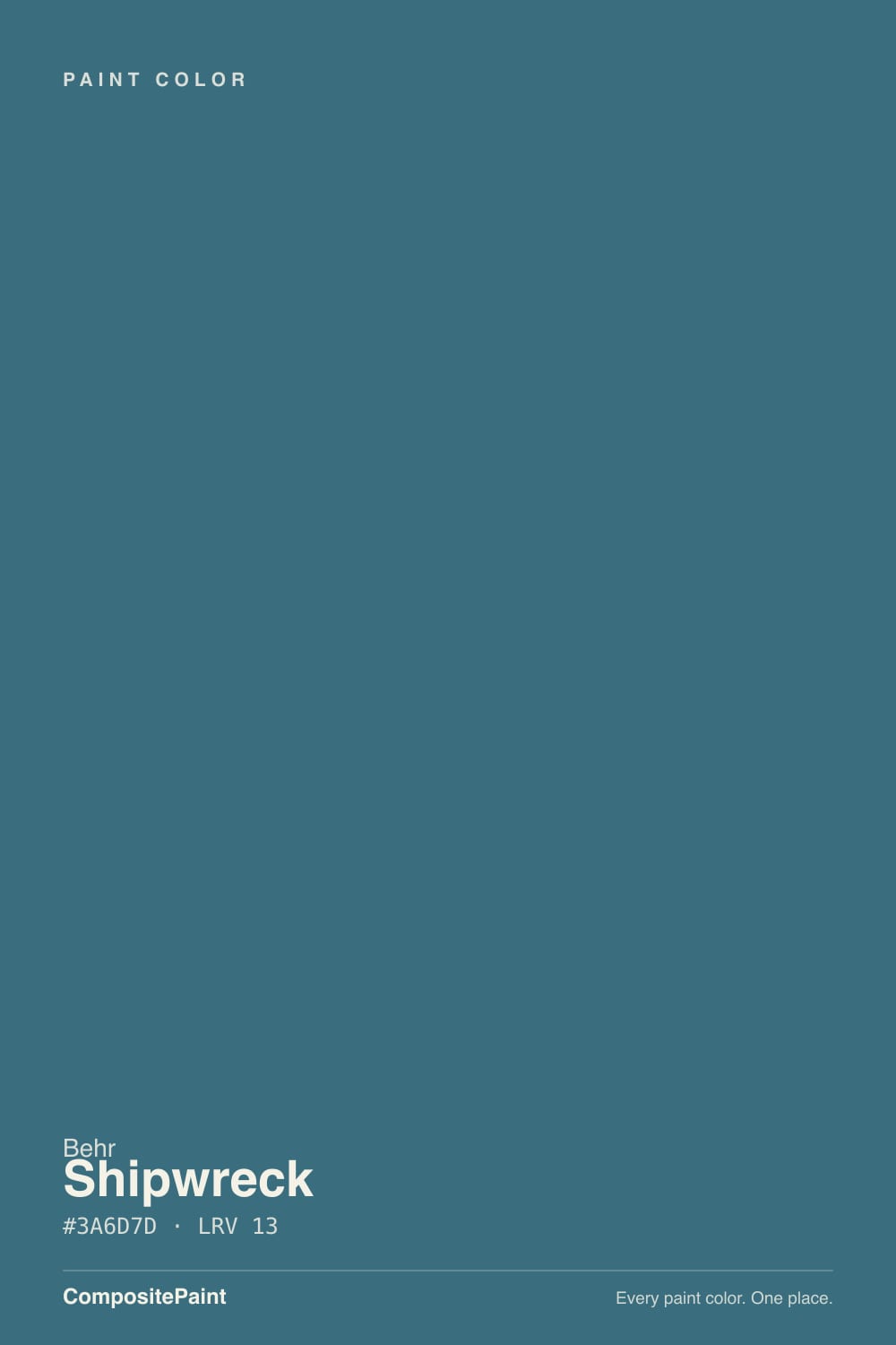
Behr's own listing calls Shipwreck "a dark green accented with brown undertones," but the paint chip and the hex value tell a different story: this is a muted, blue-leaning slate teal, closer to a stormy harbor than a forest. It is a real gap between the marketing copy and the can, and it is worth knowing before you buy a quart expecting green — most owners who photograph it describe blue-gray or teal-gray, not green.
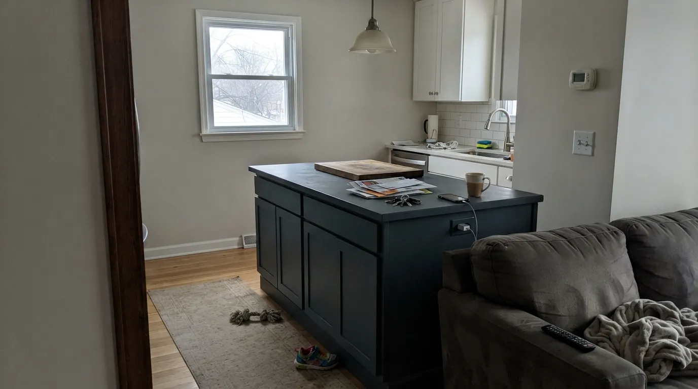
At LRV 13 it sits deep in the dark end of the deck — close to the depth of a near-black rather than a mid-tone color. That depth is exactly why it works in small doses: an island, a door, a run of built-ins reads as a confident, almost-black accent rather than a full commitment, and it holds its shape against white cabinetry and trim instead of disappearing into shadow the way a paler blue-gray would.
Undertone in one line: blue-gray first, with a warm secondary note that only shows up under warm light. Home Depot reviewers describe the color reading grey, green, beige or light purple-grey depending on the hour — that is not an inconsistent batch, that is a genuinely light-reactive color, and the single biggest reason to test a real sample in your own room before committing a whole island to it.
Where It Shines
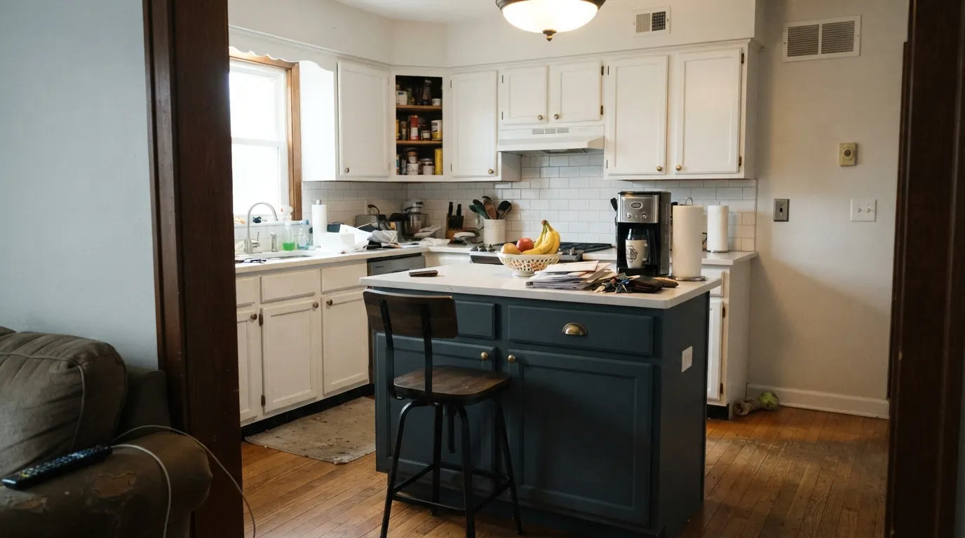
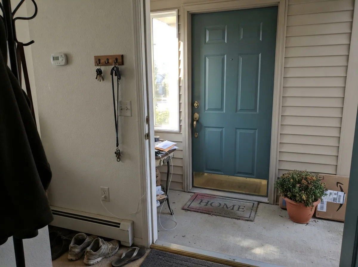
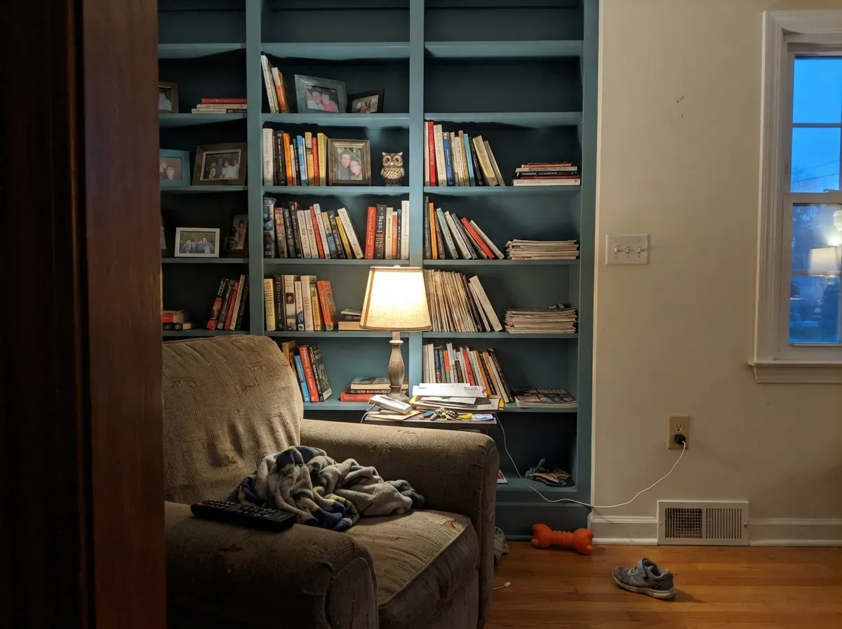
Give it a real window and one job to do and Shipwreck is excellent. It is a documented favorite for kitchen island and cabinet refreshes, where satin enamel is the sheen Behr itself recommends for kitchens, bathrooms, cabinets and trim. On exterior doors it has real fans: one homeowner picked it over Behr's own Deep Breath after taping samples to the door for several days, then reported thick, forgiving coverage that hid old stains and weathering in a single coat. Built-ins and bookshelves are its third home — the same reason it works on an island works on a wall of shelving: enough color to feel intentional, small enough to repaint if you change your mind.
Where It Fails
Almost every regret story about Shipwreck comes down to one of three things, and every one of them is predictable before the first coat goes on.
At LRV 13, weak overcast light or artificial-only light drops Shipwreck toward near-black. Owners who bought it expecting a moody teal accent report an island or a wall of built-ins that just reads "dark," with none of the blue or brown showing through.
The official description calls it a green with brown undertones. Most real photos and the hex value itself read blue-gray teal, not green. If green is specifically what you want, sample it first — the mismatch between the name's promise and the can is a real, documented complaint.
Cool LEDs strip the warm secondary note that gives Shipwreck its brown-ish depth and leave a flatter, colder slate-gray after dark — especially noticeable over a kitchen island under can lights.
Room by Room
Against white perimeter cabinets and brass hardware, Shipwreck reads confident and current without repainting the whole kitchen. Satin enamel for durability against everyday knocks and cleaning.
Behr itself recommends satin enamel for cabinets and vanities, and the color's depth works well in a small room where you only need to commit to one piece of furniture.
One of the color's best-documented uses. Expect thick coverage and forgiving hide over old paint or stains; use an exterior-rated semi-gloss enamel and check the color against your actual entryway light before committing.
The same small-dose logic as the island: a run of built-ins in Shipwreck against a warm white wall reads intentional and layered, especially with a lamp nearby rather than relying on overhead light alone.
Works when the wall gets real daylight for part of the day; in a dim corner it collapses toward near-black and loses its identity as a color at all.
This is a lot of dark, light-reactive color to live with on four walls of a room you mostly use at night. Better as a headboard wall with a lamp nearby than a full four-wall commitment.
Your Light Is the Risk
With a real window feeding the room, even without direct sun, the blue-gray teal holds together and looks sophisticated rather than muddy — the light most island and front-door photos are taken in.
At LRV 13, weak or overcast light drops it toward near-black. The color all but disappears, leaving just a dark shape.
Real owner reviews describe it swinging between grey, green, beige and a light purple-grey depending on the hour — one of the more light-reactive colors in the deck.
2700K lamps coax out the warm secondary note Behr's own description promises. Cool white LEDs strip it back to a flatter, colder blue-gray.
Most complaints about Shipwreck are a light mismatch. Upload a photo of your actual room and see it on your walls — then ask for the same wall in north light or evening lamps before you buy a single sample.
Need It From Another Brand?
Any paint counter can custom-tint Behr S470-6 directly. If you would rather stay in one brand's own deck, these are the closest stock matches, measured as ΔE2000. Under 2 is a difference you will not see on the wall.
| Brand | Closest color | ΔE | LRV | |
|---|---|---|---|---|
| Sherwin-Williams | WaterlooSW 9141 · Sherwin-Williams | 1.7 | 13 | Color page → |
| Benjamin Moore | Spellbound1659 · Benjamin Moore | 2.1 | 13 | Color page → |
| Valspar | Low Tide8003-39F · Valspar | 4.3 | 13 | Color page → |
| PPG / Glidden | Silent NightPPG1153-6 · PPG / Glidden | 1.6 | 13 | Color page → |
| Glidden | Silent NightPPG1153-6 · Glidden | 1.8 | 13 | Color page → |
| Dutch Boy | Grayed Navy431-5DB · Dutch Boy | 1.3 | 13 | Color page → |
Similar Behr Colors
The nearest shades to Shipwreck within Behr's own range, ranked by perceptual color distance — useful when you want the same look a touch lighter, darker, or warmer.
WCAG 2.1: AA is 4.5 : 1 for normal text, 3 : 1 for large text, AAA is 7 : 1.
Shipwreck vs the Colors You're Also Considering
Every Shipwreck sample board has the same rivals on it. The numbers show the real lightness gap — then it comes down to which risk you would rather live with.
Pick this for the more classically nautical, blue-forward read at the same near-black depth.
Behr N430-6A · LRV 14Hidden GemPick this if you want the greener, mossier version of this same depth — Hidden Gem leans green where Shipwreck leans blue.
Pick this when you want the deeper, more dramatic version — Adirondack Blue is a full step paler.
Behr N480-5 · LRV 22Adirondack BluePick this for an easier, lighter slate-blue that still works on cabinets and doors but stays readable in a dimmer room.
Within Behr, Distance 540F-6 at LRV 13 is the same depth but grayer and less colorful, and Lake Stream PMD-24 at #3E6B83 and LRV 13 is clearly bluer. Regatta Bay 550F-6 at #34708A and LRV 14 and Mammoth Mountain S460-6 at #2B7284 and LRV 14 are both brighter and more saturated, so they read as teal from further away.
Across brands, Benjamin Moore Coat of Arms 763 at #3C6C7A and LRV 15 has a deltaE of 0.85, which makes it the same color for practical purposes. Valspar Aristocratic M336 at LRV 13.9 sits at deltaE 1.7, visually identical in normal room light, and Clare Sublime PNT100-DP-45 at LRV 14 at deltaE 2.14 is very close but worth sampling first.
Sherwin-Williams Santorini Blue SW 7607 at LRV 14 and Dunn-Edwards Crashing Waves DE5810 at LRV 13 both land near deltaE 3.8, close but visibly bluer side by side.
Shipwreck Coordinating Colors
Shipwreck wants a light, warm partner to bounce off of and a near-black to echo its own depth — that combination is what keeps island and front-door projects from feeling like one dark blob against a wall. These are the partners that keep showing up in real projects:
The Listing Says Green. The Paint Chip Says Blue-Gray.
This is the single most useful thing to know about Shipwreck before you buy a sample: Behr's own official color description leans on green language, and the hex value plus most owner photos land squarely in blue-gray teal territory instead. It is not a mislabeled can — it is a color with a genuine warm-versus-cool split personality, and different lights pull it in different directions.
Home Depot's own reviewers put this in plain words: the same paint reads grey, green, beige, or a light purple-grey depending on the hour and the bulb. That range is unusually wide for a single color, which is exactly why a sample square taped to your actual wall — checked morning, midday, and after dark under your real bulbs — matters more here than it does for a steadier neutral.
Shipwreck With Wood Tones and Brass
This is a color built to sit next to warm materials. Butcher block, walnut, and warm oak all give it something to push against, and unlacquered or antique brass hardware is close to a default pairing on islands and vanities finished in Shipwreck — the metal picks up the color's warm undertone the way it never quite would against a truer, cooler navy.
Cool materials are the ones to test first: white or grey quartz, chrome or nickel hardware, and cool-toned tile can all pull the color toward its flatter blue-gray side rather than the warmer teal it can be. None of these are dealbreakers, but they change which version of Shipwreck you end up living with, so bring the actual counter or tile sample to the paint aisle rather than guessing from the chip.
Three Ready Palettes Built on Shipwreck
A color is never alone on the wall. These are complete combinations in the 60-30-10 pattern, with the reason each one holds together. Every one opens in the visualizer.
White perimeter cabinets keep the kitchen bright while the island carries all the drama; the warm Swiss Coffee walls soften the contrast instead of turning it stark, and brass hardware ties the whole thing together.
Try this palette in your roomA warm off-white body gives the door somewhere to pop against, and the near-black shutters echo the door's depth so the whole facade reads deliberate rather than one dark spot on a light house.
Try this palette in your roomA warm cream wall keeps the room from feeling cave-like while the built-ins carry all the color; crisp white trim frames the shelving so it reads like custom millwork instead of a paint experiment.
Try this palette in your roomShipwreck FAQ
Is Shipwreck a teal, a blue, or a green?
By the hex value and most real photos, it is a blue-leaning slate teal. Behr's own official description calls it a green with brown undertones, but that is not what most owners see on the wall — expect blue-gray first, with a warm undertone that only shows under warm light.
Is Shipwreck too dark for a small kitchen island?
Not usually — at LRV 13 it reads as a confident near-black accent against white perimeter cabinets, which is exactly the contrast most small-kitchen islands are going for. It gets riskier if the island sits far from any window.
What sheen should I use on a front door?
An exterior-rated semi-gloss enamel. Owners report thick, forgiving coverage that hides old paint and weathering in one coat, which matters most on a door that has seen sun and rain.
Does it work with brass hardware?
Yes — the warm secondary note in the color meets brass halfway, especially under warm lamp or pendant light. Under cool LEDs the pairing goes flatter and more purely blue-gray.
Will Shipwreck feel dated in a few years?
It is not tied to a single viral moment the way some trend teals are — it reads more like a steady, moody neutral-adjacent color than a fad. The bigger risk is buyer's remorse over the light-shift, not the color falling out of style.
Does it hold up on exteriors?
Yes — it is a documented front-door and exterior choice, and exterior-rated Behr lines (Ultra, Marquee) carry it. Expect the color to look a touch more blue-gray in full sun than it does indoors under lamps.
Have you painted with Shipwreck?
Rate it — one tap helps the next reader decide.
Ask a Question