Rosewater
Behr's quiet rose-beige, reviewed honestly: the light where it reads pink, the light where it flattens to beige, and the two Benjamin Moore colors it's nearly impossible to tell apart from.

Jessica has spec'd whites and neutrals for more than 300 rooms and keeps a sample wall of painted drawdowns in her studio. Every color review is checked against real reader rooms in the comments and re-tested when a formula changes. About the testing process →
- 1Vintage Tea Rose47
- 2Pink Quartz53
- 3Rosewater61
- 4Romance66
- 5First Light76
The Fast Verdict
Rosewater is a warm rose-beige that behaves more like a soft neutral than a color statement — the kind of pink you can paint a whole nursery in without anyone accusing you of picking pink. Give it warm lamplight and it glows gently blush; give it a gray afternoon and it settles into plain beige-taupe. It is a mood color at LRV 61, not a bold one, and it belongs in small, warmly lit rooms more than open living spaces.
Nurseries and kids' rooms that want a hint of pink, not a statement · powder rooms and walk-in closets · bedrooms with warm lamps · anyone who wants pink without it looking like they picked pink
You want the wall to read clearly pink in every light · your room runs on cool white LEDs · you're painting a large open living or dining space · you already own a Benjamin Moore deck with Pale Cherry Blossom or Odessa Pink in it
- A genuinely warm blush that reads as a soft neutral, not candy pink
- Flatters skin tones and brass hardware under warm lamplight
- LRV 61 keeps small rooms light without going stark white
- Near-identical to two Benjamin Moore colors, so cross-brand matching is easy
- Pairs effortlessly with sage, walnut, and warm off-white trim
- Fades to plain beige-taupe under overcast skies or cool daylight
- Cool white LED bulbs strip the blush and can leave a sallow cast
- So close to other blush-beiges in the deck that it's easy to second-guess the pick
- Not a whole-house color — large open rooms read wishy-washy rather than pink
What Color Is Rosewater, Really?
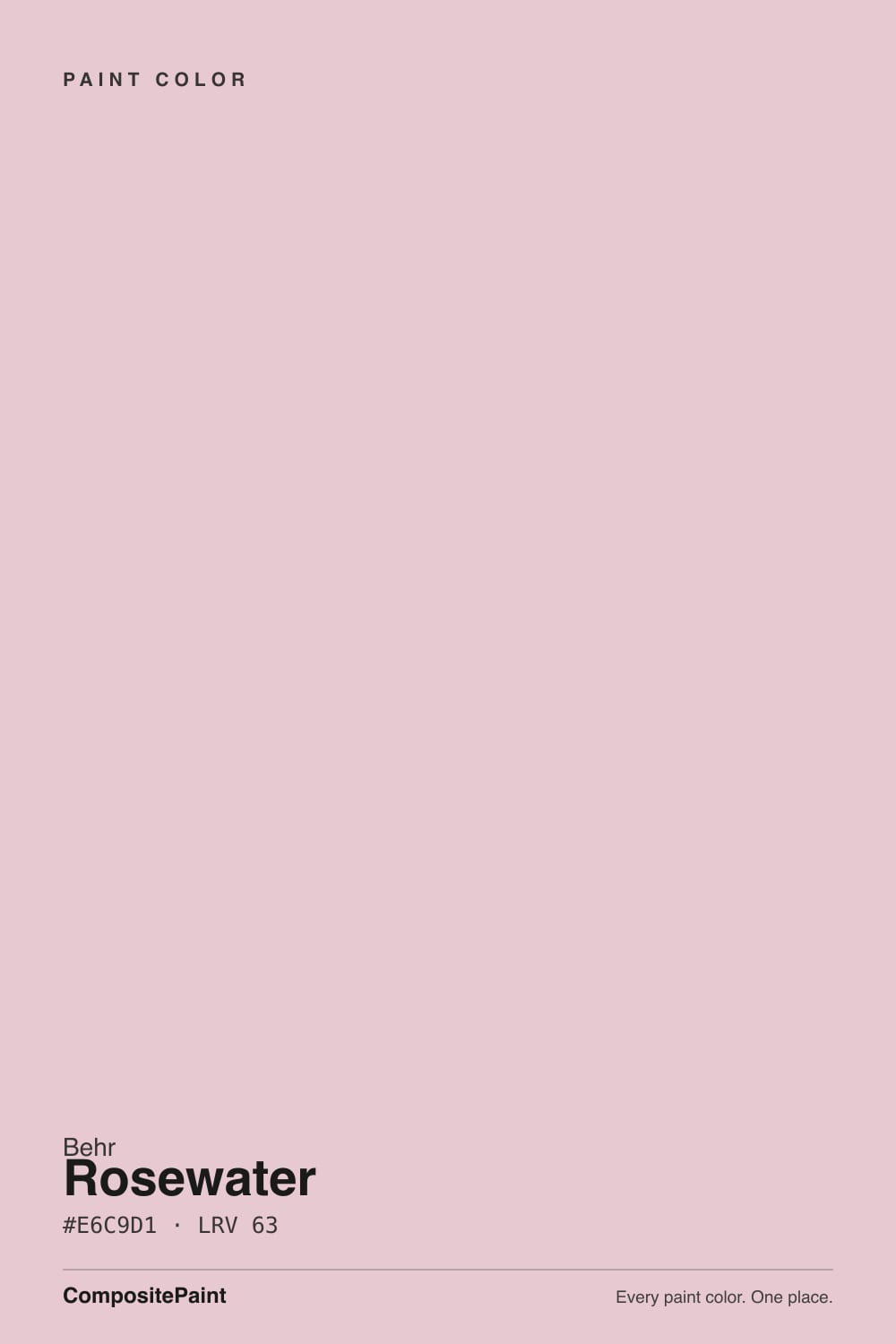
Rosewater is a warm rose-beige built on a red-yellow base rather than a red-blue one — the numbers confirm it: at #E2C8BF, red leads, green trails close behind, and blue sits furthest back. That is the fingerprint of a genuinely warm blush, not a cool lavender-pink. Behr's own color story describes it as light filtered through a pink glass vase, and that is a fair read of the effect on a wall: soft, diffuse, more atmosphere than statement.
At LRV 61 it sits in the exact light band as two Benjamin Moore colors that look, on paper, almost identical: Pale Cherry Blossom (LRV 61, hex #E0CBC5) and Odessa Pink (LRV 59, hex #E2C8BA). All three chips are close enough that a painter moving a client from a BM deck to Behr for this look could hand over Rosewater and nobody would spot the swap on the wall. That is worth knowing if your contractor only stocks one brand — you are not settling for a knockoff, you are getting essentially the same color under a different name.
Undertone in one line: warm rose-beige, never lavender, never a true saturated pink. In good light it reads as a gentle blush; in flat or cool light the pink recedes and what is left is a plain beige-taupe. If your sample looks gray or muddy on the wall, that is cool daylight or cool bulbs pulling the warmth out — not a flaw in the paint.
Where It Shines
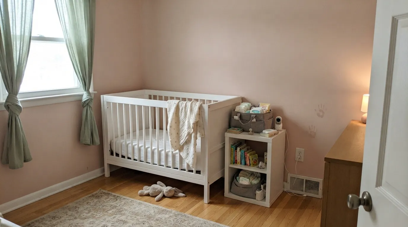
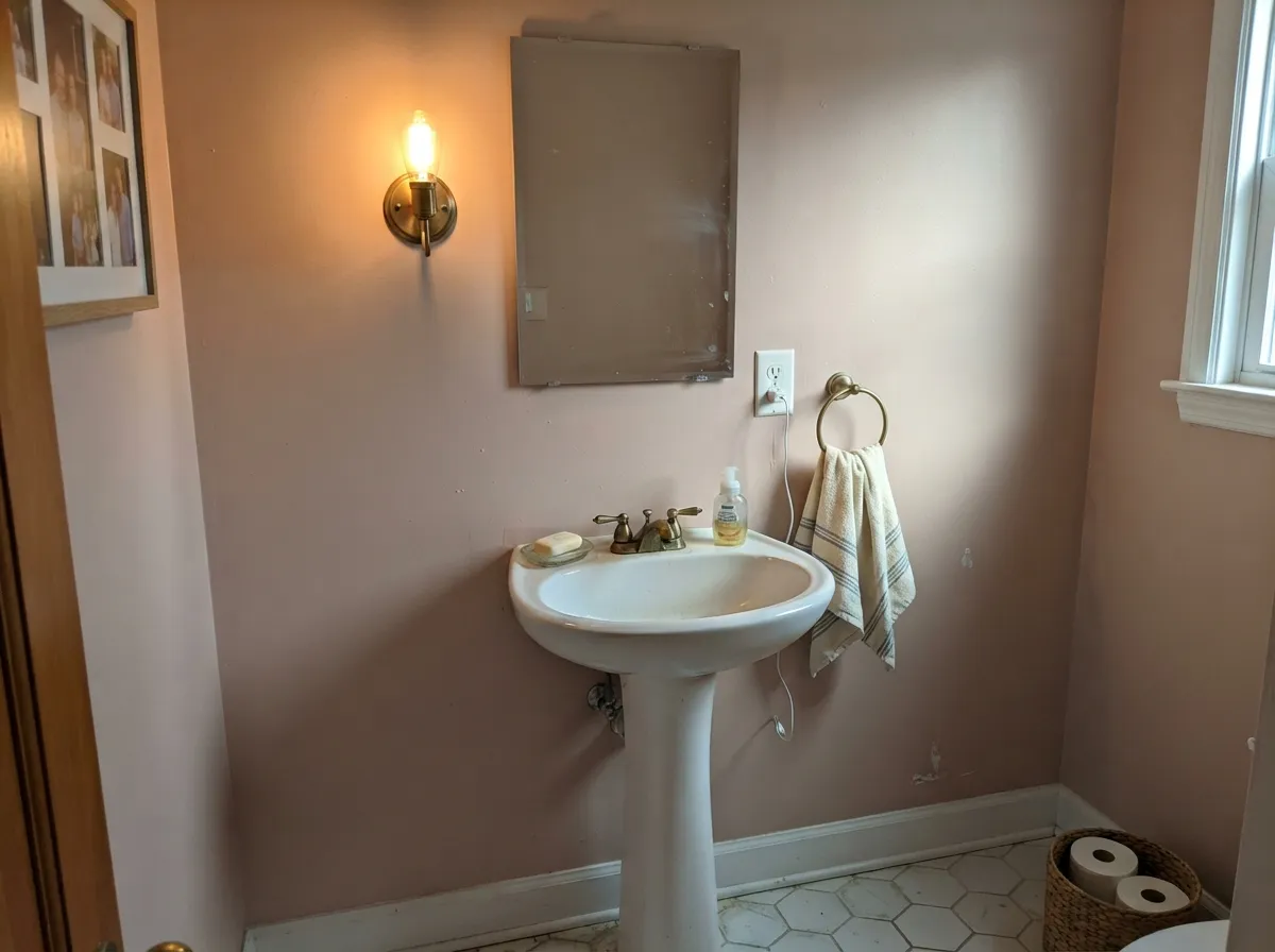
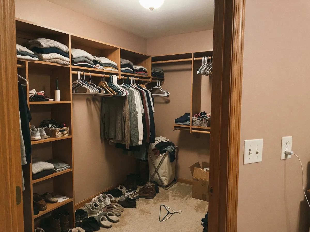
Give it warm lamplight and skin tones nearby and it does exactly what a blush color is supposed to do: soften a small room without turning it into a nursery cliché. It is at its best in intimate spaces — a nursery, a powder room, a walk-in closet — where the color has room to read as considered rather than as "the pink room," and where a warm bulb is doing half the work.
Where It Fails
Almost every disappointment with Rosewater comes down to one of three predictable situations, all rooted in the same fact: this is a light-dependent color, and it needs warmth to show its hand.
Under an overcast sky or flat north daylight, the blush drops out and Rosewater settles into a plain beige-taupe — closer to a neutral than a color. If you need the pink to survive every light condition, it is the wrong color; look at something more saturated like Behr Vintage Tea Rose instead.
Powder rooms and bathrooms are Rosewater's best rooms, but only with warm bulbs. Cool 4000K-plus LEDs — the kind builders default to over a mirror — strip the blush out and can leave the wall, and your reflection, looking flat and a little sallow. Swap the bulbs before blaming the paint.
Pair Rosewater with a bright, cool white and the wall reads dingy by comparison — the same trap that catches every soft near-white in a paint deck. Use a warm trim white like Behr Whisper White or Swiss Coffee, not a stark white like Ultra Pure White.
Room by Room
Warm daylight plus a lamp is exactly the light this color wants, and a nursery gets both. Pair with a muted sage for crib bedding or curtains and the room reads gently curated instead of theme-park pink.
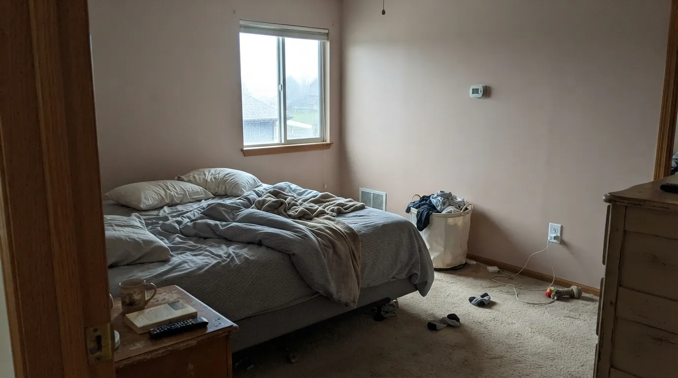
As an accent wall behind the headboard or across all four walls in a smaller bedroom, it turns genuinely blush at night under 2700K bulbs. In a large, bright bedroom it can wash out; keep it to cozier rooms.
A small room under one warm sconce is where Rosewater earns its keep — brass fixtures and a marble or white counter make the blush look deliberate, not accidental.
Closets run on artificial light almost exclusively, which plays to this color's strength. A warm-toned overhead fixture keeps it soft and flattering for the mirror check on the way out the door.
With warm lighting and a warm-toned vanity it works well. Most production bathrooms ship with cool LED strip lighting, and that is the one setup where this color genuinely disappoints — check your bulbs before committing.
A single accent wall with warm lamps and walnut furniture can look intentional. A whole open-plan living space in Rosewater tends to read indecisive rather than pink, especially with the mixed daylight those rooms usually get.
Your Light Is the Risk
A 2700K lamp a few feet away is when the blush is most obvious — this is the light the color is built for.
Cool, flat light strips the pink and leaves a plain beige-taupe. Disappointing if you were hoping for visible color.
Warm and clearly blush at the sun hours, quieter and more neutral the rest of the day. Sample through a full day before deciding.
Warm bulbs bring the rose forward; cool 4000K-plus LEDs flatten it toward gray-beige. In a vanity room, the bulb choice matters as much as the paint choice.
Most complaints about Rosewater are a light mismatch. Upload a photo of your actual room and see it on your walls — then ask for the same wall in north light or evening lamps before you buy a single sample.
Need It From Another Brand?
Any paint counter can custom-tint Behr S170-2 directly. If you would rather stay in one brand's own deck, these are the closest stock matches, measured as ΔE2000. Under 2 is a difference you will not see on the wall.
| Brand | Closest color | ΔE | LRV | |
|---|---|---|---|---|
| Sherwin-Williams | Malted MilkSW 6057 · Sherwin-Williams | 3.6 | 62 | Color page → |
| Benjamin Moore | Rosetone1186 · Benjamin Moore | 1.1 | 62 | Color page → |
| Valspar | Pink Chantilly8004-5B · Valspar | 3.0 | 62 | Color page → |
| PPG / Glidden | Sultan SandPPG1068-3 · PPG / Glidden | 0.5 | 61 | Color page → |
| Glidden | Sultan SandPPG1068-3 · Glidden | 1.0 | 62 | Color page → |
| Dutch Boy | Birmingham Blush303-1DB · Dutch Boy | 1.4 | 62 | Color page → |
Similar Behr Colors
The nearest shades to Rosewater within Behr's own range, ranked by perceptual color distance — useful when you want the same look a touch lighter, darker, or warmer.
WCAG 2.1: AA is 4.5 : 1 for normal text, 3 : 1 for large text, AAA is 7 : 1.
Rosewater vs the Colors You're Also Considering
Every Rosewater sample board has the same rivals on it. The numbers show the real lightness gap — then it comes down to which risk you would rather live with.
Pick this if you're already buying Behr and don't want to open a second brand's fan deck for an identical result.
Benjamin Moore 2101-60 · LRV 61Pale Cherry BlossomPick this if your painter works in Benjamin Moore — at the same LRV and nearly the same hex, it is the same color under a different name.
Pick this for the version most home centers can actually mix same-day.
Benjamin Moore HC-59 · LRV 59Odessa PinkPick this for a Historical Collection alternative that leans a hair more beige and slightly deeper.
Almond Willow 210E-3 is the closest in-brand neighbor, at LRV 64 with hex #EAC9CB. It is a shade lighter and clearly less violet, so it reads as a warmer, peachier blush where Rosewater keeps a cool mauve edge. Fairview Taupe 130E-2 at LRV 63, hex #DFCAD6, goes the other way and pulls further toward lilac.
Across brands, Benjamin Moore Pink Innocence 2082-60, hex #E9CCD4 at LRV 65, is a deltaE of 0.71 from Rosewater, which is the same color in practice. PPG Tinted Rosewood PPG1044-3 at LRV 62 and Glidden Rose Cloud PPG1048-3 at LRV 62 sit at 1.4 and 1.83, close enough to look identical in normal room light.
Sherwin-Williams Panache Pink SW 6848 at LRV 64 is a deltaE of 2.57, so it is very close but worth sampling first. Valspar Pocketful of Promise V078-2 at LRV 62.3 is 3.59 away and reads noticeably more peach side by side.
Rosewater Coordinating Colors
The rule for coordinating with Rosewater is simple: stay warm, keep contrast soft, and let one darker note anchor the room. It pairs beautifully with muted sage, warm whites, walnut, and brass — and it argues with anything stark white or cool gray, which flattens its blush by comparison. These are the partners that keep showing up in rooms that work:
The Pink-Beige Cluster: How Rosewater Compares
Every major brand's fan deck has a color like this one — a rose-beige right around LRV 60 that reads as "barely pink." What is unusual is how close Behr's version sits to two separate Benjamin Moore colors. Pale Cherry Blossom (#E0CBC5, LRV 61) and Odessa Pink (#E2C8BA, LRV 59) are both close enough to Rosewater (#E2C8BF, LRV 61) that the difference would not survive a paint chip's own printing tolerance, let alone a coat on drywall.
That is genuinely useful information, not a knock on the color: it means a designer working across brands, or a homeowner comparing an inspiration photo shot in one brand against a can from another, can treat these three as interchangeable. If a contractor tells you they can't match a Benjamin Moore blush because they only stock Behr, Rosewater is the answer.
Rosewater With Wood Tones and Metals
Warm woods are the easy pairing: walnut, white oak, and rattan all sit comfortably with Rosewater because their warmth matches the paint's own. Cold gray-washed floors are the one flooring that fights it — the same way they fight most warm blush and beige colors — pulling the wall toward a flatter, less rosy read.
Metals split cleanly along temperature lines. Brass and unlacquered bronze bring out the warmth and are the classic pairing in the nursery and powder-room photos this color shows up in most. Polished chrome and cool nickel are the metals that make it look coolest and least intentional; matte black works as a sharp, neutral contrast rather than a warm complement.
Three Ready Palettes Built on Rosewater
A color is never alone on the wall. These are complete combinations in the 60-30-10 pattern, with the reason each one holds together. Every one opens in the visualizer.
Blush and sage is the pairing every nursery mood board reaches for, and it works because both colors are grayed down enough to feel considered rather than themed. A warm trim white keeps the room bright without the cool-white clash that dulls the blush.
Try this palette in your roomOne near-black note against the blush keeps a small powder room from feeling saccharine — the dark mirror frame and hardware read intentional, and with a warm sconce the pink stays gently rosy instead of chalky.
Try this palette in your roomKeeping Rosewater to one wall solves its biggest weakness — it needs warm light to read as pink, and a headboard wall under a lamp gets exactly that, while the cream main walls carry the room in daylight.
Try this palette in your roomRosewater FAQ
Is Rosewater a pink or a beige?
Both, depending on the light. It is built on a warm rose-beige base, so under warm lamplight it reads as a genuine soft blush, and under cool or overcast daylight it settles into plain beige-taupe. It never goes lavender or cool — the shift is warm-to-neutral, not pink-to-gray.
Is it good for a nursery?
Yes — it is one of its best uses. The color needs warm light to show its blush, and a nursery typically gets both daylight and a lamp for feedings, which plays to its strength. Pair with a muted sage or warm white so it reads gender-neutral if that matters to you.
What's the difference between Rosewater and Benjamin Moore's Pale Cherry Blossom or Odessa Pink?
Almost nothing on the wall. All three sit at LRV 59–61 with nearly identical hex values, so if your painter or fan deck is one brand and your inspiration photo is another, you can substitute Rosewater for either BM color with confidence.
Does it work in a bathroom with cool LED lighting?
Not well. Cool white LEDs above 4000K strip the warmth out and leave the wall — and your reflection — looking flat and slightly sallow. If you can't swap to 2700K bulbs, pick a cooler-leaning neutral instead.
What trim white pairs with Rosewater?
A warm white, not a stark one — Behr Whisper White or Swiss Coffee keep the wall looking finished. A bright, cool trim white makes Rosewater read dingy by comparison, the same trap that catches most soft blush and cream colors.
Does a dusty pink like this look dated?
Muted rose-beiges have circled back into favor for nurseries and powder rooms precisely because they read as a neutral with a hint of color rather than a saturated 1990s dusty rose. At LRV 61 it is lighter and quieter than the deeper dusty-rose colors that do carry that association.
Have you painted with Rosewater?
Rate it — one tap helps the next reader decide.
Ask a Question