Riverdale
The pale mint-sage hiding in Behr's gray aisle, reviewed honestly: the rooms where it reads spa, the light that turns it cement-blue, and what to pick instead.

Jessica has spec'd whites and neutrals for more than 300 rooms and keeps a sample wall of painted drawdowns in her studio. Every color review is checked against real reader rooms in the comments and re-tested when a formula changes. About the testing process →
- 1Stardew43
- 2Quietude48
- 3Riverdale54
- 4Sea Salt63
- 5Wickham Gray68
The Fast Verdict
Riverdale is the soft green people keep hoping to find in the gray aisle at Home Depot: a dusty mint-sage at LRV 54 that still reads light. Behr files it as a gray, and on the chip it can pass for a pale greige — on four walls the green is obvious. South light makes a calm spa color for nurseries and baths; a dim north room goes cement-blue. If you want gray, keep walking.
Nurseries and bathrooms · coastal living rooms with real daylight · cottage kitchens that need color but stay light · anyone who wants sage without a dark green
You actually want gray · honey oak floors or orange cabinets · the room is dim and north-facing · you want a saturated mint or a true olive sage
- Real mint-sage that still reads light at LRV 54
- Spa bathrooms and nurseries without going candy-mint
- Gray dusting keeps it from dating like a pastel green
- Same lightness as Comfort Gray, greener, sold at Home Depot
- Holds more color than paler spa tints such as Sea Salt
- Not gray — buyers who believed the aisle label see green
- North light and windowless rooms go cement gray-blue
- Fights honey oak, orange cabinets, and beige travertine
- Almost no photo trail, so you are sampling without a famous-color safety net
What Color Is Riverdale, Really?
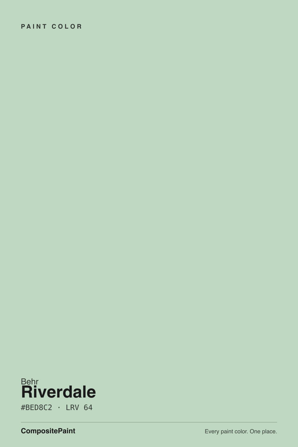
A pale mint-sage with a heavy dusty-gray base — and the gray is the whole trick. Straight pastel greens go candy-mint the moment they hit a wall; the dust in Riverdale knocks the chroma down so it reads soft and spa-like instead of themed. Behr files it in the gray family, which is how most people find it: scrolling the N410 cards looking for something that is not beige and not dark. On the chip it can pass for a light greige. On four walls the green is the first thing you see.
At LRV 54 it sits in the useful middle. That is a full step deeper than Sherwin-Williams Sea Salt (LRV 63), which can wash toward a tinted neutral in a bright room, and a step lighter than Benjamin Moore October Mist (LRV 47), which commits to sage. It is the same lightness as Sherwin-Williams Comfort Gray — Comfort Gray built a thousand farmhouse exteriors with a quieter, slightly bluer green-gray; Riverdale keeps more plant-green in the mix. The room will always look like a color decision, never like a safe off-white, but a nursery or a small bath still stays open.
Undertone in one line: green first, dusty gray second, a silver-blue flash third — never yellow, never olive. If the sample reads minty, you have bright daylight or foliage bounce pulling the green forward. If it reads cool gray-blue, your light is cold. Both versions are the same paint being honest about the room.
Where It Shines
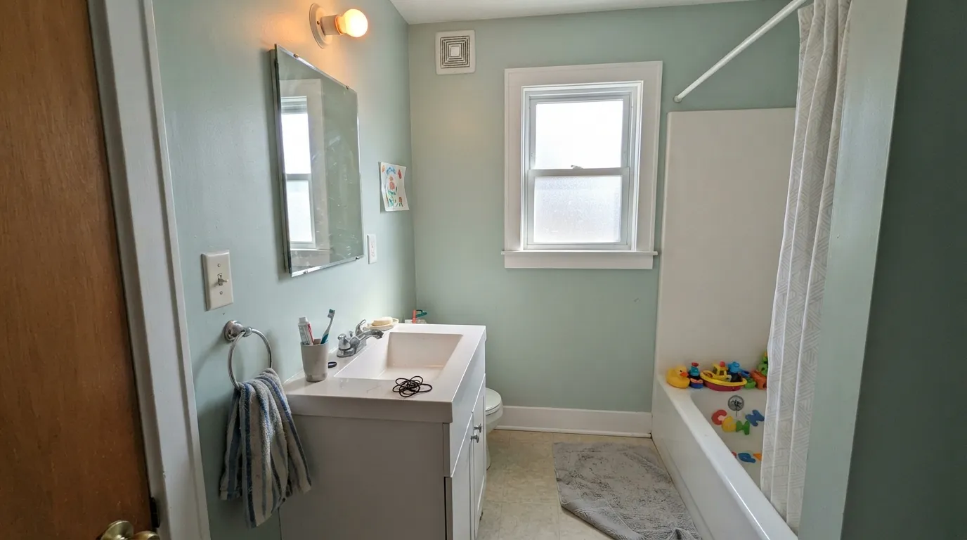
Give it real daylight and a clean white trim and Riverdale does the spa job people actually want from a pale sage: color on the wall that still behaves. Bathrooms and nurseries are its home turf — LRV 54 holds the mint-sage without closing a small room in — and a south-facing living room with linen, pale oak, and brass is the grown-up version of the same idea. It is the Home Depot color you pick when you want Comfort Gray's lightness with a greener, quieter indoor read.
Where It Fails
Almost every regret about Riverdale follows one of three scripts, and all three are visible on a sample board before the first gallon. None of them are a bad batch — but if your room matches one, this is not your color, and a bigger sample will only confirm it.
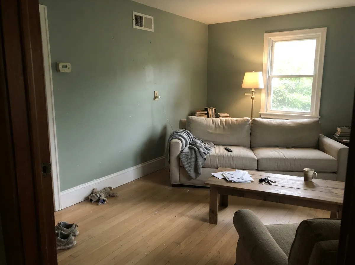
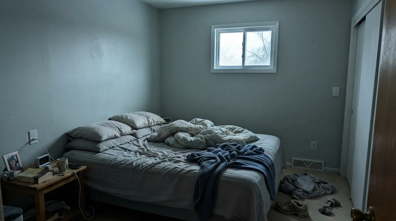
Cool gray daylight strips the green and leaves the silver-blue base exposed. The wall goes flat, cement-like, a little dingy — not spa, not sage. Windowless baths and hallways do the same thing without warm lamps. If the room never sees noon, pick a greener sage that holds in low light, or commit to 2700K bulbs before you commit to the paint.
The aisle label is Gray. The chip can pass. Four walls do not. Riverdale is a muted green, and depth multiplies the green. If your goal is a light gray with a hint of personality, this is too much personality; Comfort Gray is the quieter green-gray with the same LRV 54, and even that is not a true gray.
Yellow-orange wood sits opposite this cool green-gray, so honey oak floors, orange builder cabinets, and beige travertine all push the walls toward blue-gray while the wood goes more orange. Both sides lose. Riverdale wants bleached oak, walnut, painted cabinets, or a large rug between it and anything golden.
Room by Room
The spa read everyone is after, and at LRV 54 it still bounces enough light to keep a small bath open. Satin for steam, white tile, Extra White or Ultra Pure White trim so the green stays crisp. Check the window first: south light keeps it sage; north light is the cement-blue version.
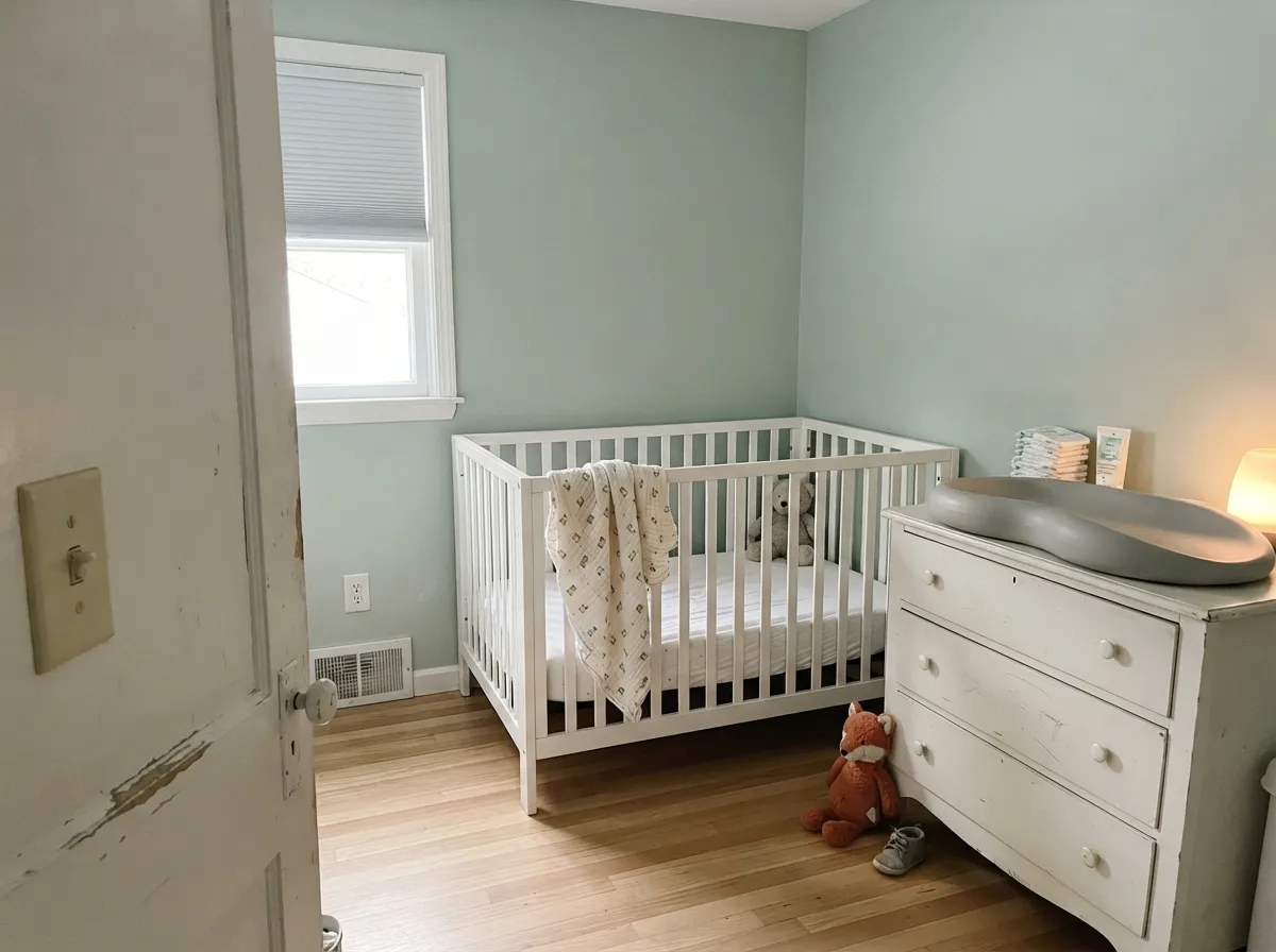
Pale enough to keep a small room airy, green enough to feel like a choice, gray enough not to read as mint-baby. Eggshell, White Dove or Polar Bear trim, warm 2700K lamps at night. This is the known job for Riverdale, and it earns it.
Soft and restful in a south or east room with cream bedding and warm lamps. Skip it if the bedroom is both north-facing and dim — you will get the gray-blue, not the sage. Matte or eggshell; same crisp or soft-white trim rule as the bath.
Beautiful in a daylight living room with linen, pale oak, and brass — the quiet coastal look without Sea Salt's chameleon act. Riskier in an open plan that dumps into a honey-oak kitchen. Polar Bear or Extra White trim; do not leave cream woodwork next to it.
On walls under painted cabinets, or on the cabinets themselves in satin, it gives a cottage kitchen color without going dark sage. A whole kitchen of Riverdale cabinets works only if the floors are pale or the cabinets are the only wood. Honey oak plus this green-gray is a losing bet.
Small utility rooms are a low-risk place to use it: satin on a laundry cabinet or all four powder-room walls, crisp white trim, warm bulbs. These rooms rarely have the north-light problem if you control the lamps. It is the weekend project version of the spa bath.
Your Light Is the Risk
Warm strong daylight brings the sage-green forward. This is the spa-mint people sampled it for — airy, lightly cool, clearly green.
Cool gray daylight strips the green and leaves a silver-blue, cement-like wall. Fine if you half-wanted gray; disappointing if you wanted sage.
Greener and mintier at the sun hours, dustier and grayer once the sun moves off the wall. The shift is real; most people like it. Sample at noon and at 6pm.
2700K bulbs warm it back toward a subdued gray-green. Cool 4000K LEDs push the silver-blue and flatten it — swap the bulbs before you blame the paint.
Most complaints about Riverdale are a light mismatch. Upload a photo of your actual room and see it on your walls — then ask for the same wall in north light or evening lamps before you buy a single sample.
Need It From Another Brand?
Any paint counter can custom-tint Behr N410-3 directly. If you would rather stay in one brand's own deck, these are the closest stock matches, measured as ΔE2000. Under 2 is a difference you will not see on the wall.
| Brand | Closest color | ΔE | LRV | |
|---|---|---|---|---|
| Sherwin-Williams | Comfort GraySW 6205 · Sherwin-Williams | 1.7 | 54 | Color page → |
| Benjamin Moore | Gray Wisp1570 · Benjamin Moore | 0.3 | 55 | Color page → |
| Valspar | Irish Moor8004-32C · Valspar | 0.7 | 55 | Color page → |
| PPG / Glidden | BalsamPPG1128-4 · PPG / Glidden | 1.3 | 54 | Color page → |
| Glidden | BalsamPPG1128-4 · Glidden | 0.9 | 54 | Color page → |
| Dutch Boy | Grayed Wolf426-3DB · Dutch Boy | 2.3 | 55 | Color page → |
Similar Behr Colors
The nearest shades to Riverdale within Behr's own range, ranked by perceptual color distance — useful when you want the same look a touch lighter, darker, or warmer.
WCAG 2.1: AA is 4.5 : 1 for normal text, 3 : 1 for large text, AAA is 7 : 1.
Riverdale vs the Colors You're Also Considering
Every Riverdale sample board has the same rivals on it. The numbers show the real lightness gap — then it comes down to which risk you would rather live with.
Pick this when you want the greener, mintier indoor version of that same lightness, and you are already at Home Depot.
Sherwin-Williams SW 6205 · LRV 54Comfort GrayPick this if you want the famous farmhouse green-gray at the same LRV 54, a touch bluer and with a huge exterior photo trail.
Pick this when Sea Salt would wash out — Riverdale holds more color at LRV 54 and stays a step greener.
Sherwin-Williams SW 6204 · LRV 63Sea SaltPick this if you want it lighter and airier, and the room already has even daylight that agrees with a chameleon.
Within Behr, Contemplation 700E-3 (#BED9C2, LRV 64) is a direct twin and interchangeable on a wall. Free Spirit MQ4-18 (#B1DBC7, LRV 64) is the same lightness but pushes further toward mint and blue-green. Chinese Jade PPU10-09 (#CBD1BB, LRV 62) goes the other way into yellow-green, so it reads as a sage where Riverdale reads as a clean green. Rhino 710E-3 (#BCD1C3, LRV 60) is the grayer, quieter option.
Across brands, Diamond Vogel Cool Spring 0735 (#BFDAC4, LRV 65) is deltaE 0.51, effectively the same color. Dutch Boy Coastal Green 230-2DB (#BED5C2, LRV 62) at deltaE 1.45 and Sherwin-Williams Reclining Green SW 6744 (#B7D7BF, LRV 63) at deltaE 1.86 are both visually identical in normal room light.
Benjamin Moore Van Alen Green HC-120 (#CAD7C0, LRV 65) is deltaE 4.24, close but visibly different side by side, reading warmer and more yellow-green than Riverdale.
Riverdale Coordinating Colors
The rule for coordinating with Riverdale: clean whites, deeper gray-greens, and one near-navy — and keep cream and golden wood at arm's length. It wants a crisp or quietly warm white beside it, not a yellowed off-white, and it layers cleanly with the rest of its own N410 strip. These are the partners that keep the mint-sage looking deliberate:
Why Behr Files a Green as Gray
Riverdale lives on the N410 strip with Natures Gift (N410-4, LRV 35) and Village Green (N410-5, LRV 23). The whole strip sits in Behr's gray family even though the color on the wall is a muted green. That filing is how it stays obscure: people searching sage skip it, people searching gray find a mint they did not expect, and it never became a Color of the Year or a Pinterest headline the way Sea Salt and Comfort Gray did.
Treat that as a feature, not a slight. Comfort Gray did the public work of proving this exact lightness — LRV 54, dusty green-gray — on a thousand farmhouse exteriors. Riverdale is the greener indoor cousin sold in the same store as the primer. You do not get a famous-color photo trail. You do get a predictable spa sage at a Home Depot price, as long as you sample it as a green and not as a gray.
Riverdale With Wood Tones and Floors
This decision gets made at the floor. Pale white oak, bleached oak, and walnut are the easy yes — the cool green-gray sits next to them like linen next to driftwood. Gray-washed floors and cream carpet are fine. Painted cabinets in Polar Bear or Extra White are better than leaving orange wood in the room.
The honest no is golden: honey oak floors, orange-stained cabinets, yellow-beige carpet, beige travertine. The yellow-orange and the cool green-gray exaggerate each other — the wood goes more orange, the walls go more blue-gray, and no extra coat fixes the geometry. If the golden floor is staying, put a large rug between it and this paint, or pick a warmer sage that can meet the wood halfway.
Metals are straightforward. Brushed nickel and chrome keep the spa read; unlacquered brass and antique bronze pull it toward cottage. Matte black works as hardware. Polished gold next to cream tile is the combination that makes the green look chilly.
Three Ready Palettes Built on Riverdale
A color is never alone on the wall. These are complete combinations in the 60-30-10 pattern, with the reason each one holds together. Every one opens in the visualizer.
Crisp white is what keeps Riverdale spa instead of dusty. Ultra Pure White is unbeatable on trim and ceiling here; a cream trim would yellow beside the cool green. Hale Navy is the single dark note so the little room reads finished, not pale.
Try this palette in your roomWhite Dove softens the edges so the nursery does not go clinical-crisp. Frosted Sage is a lighter, milkier green on the same side of the fence, so a closet or dresser in it reads as the same family getting quieter, not a second color.
Try this palette in your roomPolar Bear is Behr's everyday white — dependable on cabinets, not a cream — so the wall-to-door handoff stays clean. Evergreen Fog is the cabinet sage with enough depth to ground the island; Riverdale on the walls keeps the room light instead of going full olive.
Try this palette in your roomRiverdale FAQ
Is Riverdale gray or green?
Green — a dusty mint-sage. Behr files it in the gray family, and the chip can pass for a pale greige, but on four walls nobody will call it gray. If gray is what you actually want, this is the wrong color; that mismatch is the main surprise.
What trim white goes with Riverdale?
A clean, slightly cool or true white. Extra White and Ultra Pure White keep the spa edge crisp. Polar Bear is the easy Behr-house white. White Dove works when you want a softer cottage edge. Skip cream and almond — they yellow beside this cool green and make the walls look colder.
Is it good for a nursery?
Yes — it is one of the best rooms for it. LRV 54 keeps a small room open, the gray dusting stops it from reading mint-baby, and warm 2700K lamps keep it sage at night. Pair with a soft white trim, not a stark gallery white, if you want the room to stay gentle.
Does Riverdale work with oak floors?
Depends on the oak. Bleached oak, pale white oak, and walnut are excellent. Golden honey oak is the clash: the yellow-orange wood pushes the walls toward blue-gray and the floor goes more orange. A large rug helps; wall-to-wall honey tones need a different color.
How does Riverdale compare to Comfort Gray and Sea Salt?
Comfort Gray is the same LRV 54 with a quieter, slightly bluer green-gray and a huge farmhouse-exterior following. Sea Salt is lighter (LRV 63) and more of a chameleon — green, gray, or blue depending on the room. Riverdale is the greener, mintier Home Depot version of Comfort Gray's lightness, with more body than Sea Salt.
Will it look blue in a north-facing bathroom?
It will look gray-blue, not spa-green. Cool north light strips the green and leaves the silver-blue base — a flat, cement-like read. Warm 2700K bulbs pull some green back. If the bath has no real daylight and you will not change the bulbs, pick a sage that holds its green in low light.
Have you painted with Riverdale?
Rate it — one tap helps the next reader decide.
Ask a Question