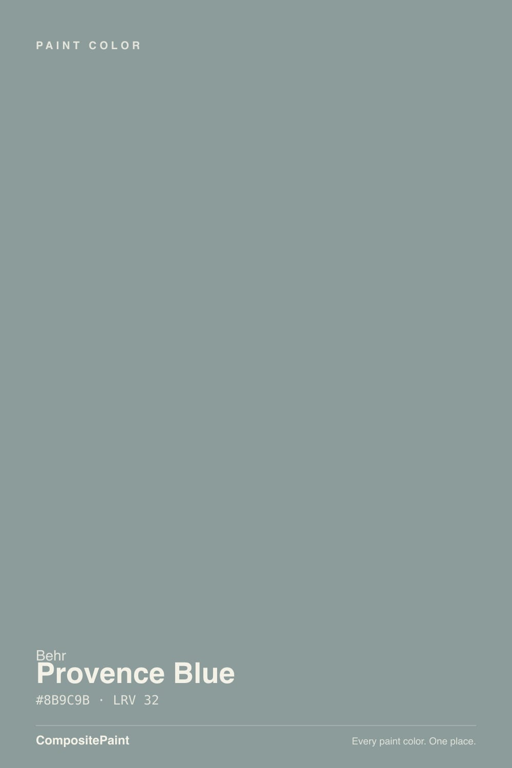
Provence Blue
Behr's quietly excellent sage-blue, reviewed honestly: the light where it turns coastal green, the light where it goes flat, and what to pick instead.

Jessica has spec'd whites and neutrals for more than 300 rooms and keeps a sample wall of painted drawdowns in her studio. Every color review is checked against real reader rooms in the comments and re-tested when a formula changes. About the testing process →
- 1Black Fox7
- 2Pewter Green12
- 3Provence Blue32
- 4Stardew43
- 5Palladian Blue60
The Fast Verdict
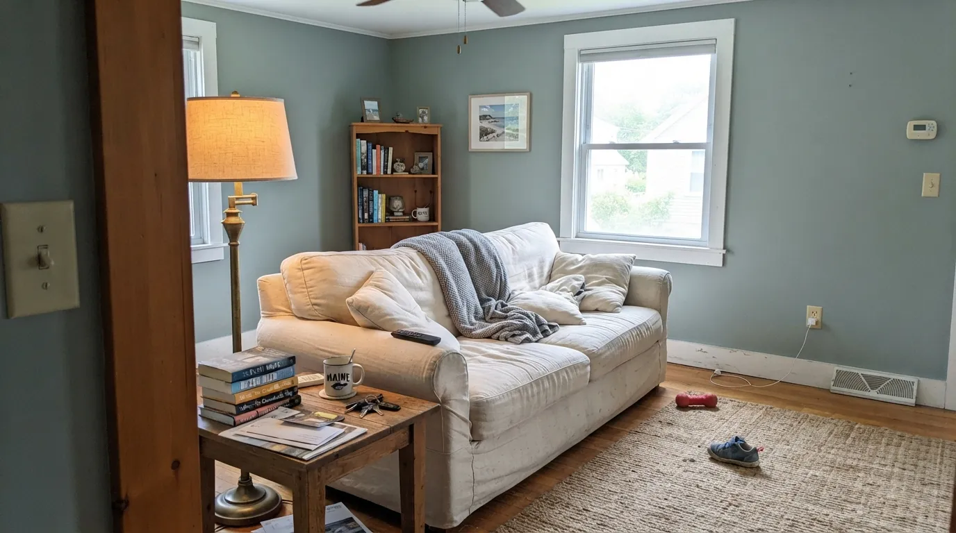
Provence Blue is a low-chroma blue-green that spends most of its life deciding which word in its name it wants to be. In real daylight the green comes forward and it reads coastal, sagey, almost herbal. In shade or under cool bulbs the blue and a gray trace take over and it reads slate. Neither read is wrong — that is just what the color is — but if you need one fixed answer on the paint chip, this is not a color that gives you one.
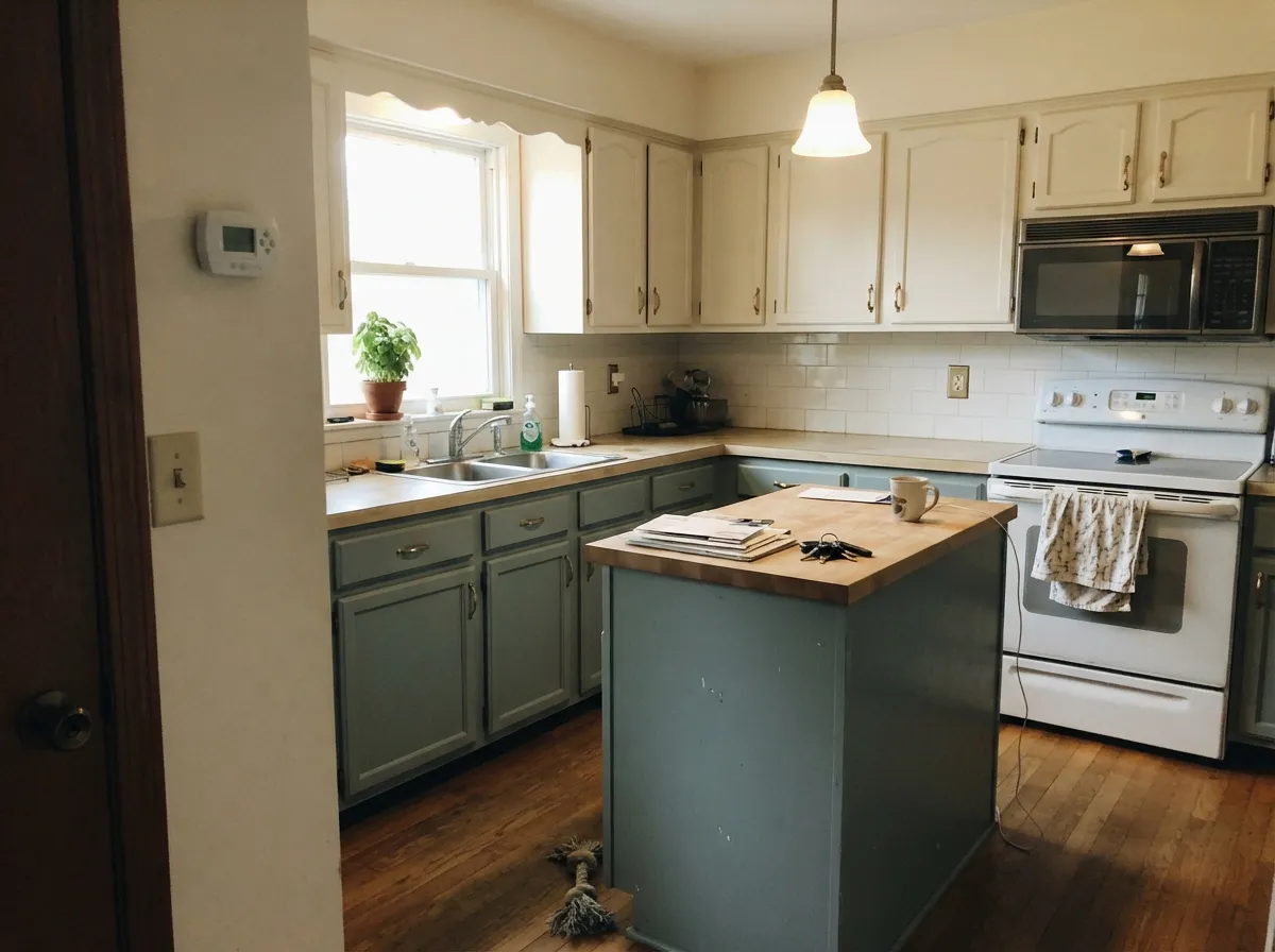
Coastal and cottage-style rooms · kitchen islands and cabinets with gold or brass hardware · bedrooms wanting quiet, grounded color · exterior shutters and doors in full sun
You need a true, unmistakable blue with no green in it · your room stays dim without lamps · your counters are icy white or blue-gray quartz · you want one fixed color that reads the same in every light
- A genuine sage-blue chameleon that reads calm across coastal, cottage, and transitional styles
- Holds real color at LRV 32 instead of washing out in a bright room
- Flatters gold and brass hardware on cabinets and islands
- Deep enough for a full room, restrained enough for just an accent wall
- A near-identical color exists in Sherwin-Williams (Jasper Stone) if your painter only stocks one brand
- Green comes forward more than the name "blue" promises — surprises buyers expecting a true coastal blue
- Goes flat and muddy in a dim room with no warm lamps
- Argues with icy white or blue-gray quartz counters
- Never had a Color of the Year moment, so real styled-room photos of it are harder to find than for louder colors
What Color Is Provence Blue, Really?
Provence Blue is a Home Decorators Collection color, which is Behr's way of saying it lives across several product lines — Premium Plus, Ultra, Marquee, interior and exterior — rather than being a single flagship SKU. Behr has run it as a January Color of the Month, wrapped in the expected south-of-France, lavender-and-sage-fields marketing that the name promises. It never got the bigger push a Color of the Year gets, and that is the honest story here: a genuinely well-made low-chroma blue-green that sits quietly in the deck instead of trending on a design blog.
At LRV 32 it sits at the same mid-depth as Sherwin-Williams Sage and Sherwin-Williams Jasper Stone (SW 9133, hex #8D9E97, also LRV 32) — close enough in hue and depth to be a coincidence of chemistry rather than a copy. Deep enough to read as a real, committed color instead of a tinted white; not so dark it swallows a small room. Put it on an island or an accent wall and it holds its color; put it across four walls in a dim room and the low chroma stops working in its favor.
Undertone in one line: green first, blue second, with a gray trace that keeps both in check — never a clean, saturated teal. If your sample reads flatly gray with no color at all, the room is starved for daylight; bring in a warm lamp before deciding the paint is wrong.
Where It Shines
Give it real daylight and it earns its Provence branding: the green comes forward, the low chroma keeps it from reading like a craft-store sage, and the whole thing lands coastal without a single nautical cliché. Its best trick is range — cottage kitchens, quiet bedrooms, exterior shutters all work off the same can. Pair it with gold or brass hardware and warm wood tones and it reads considered rather than themed, which is more than most blue-greens can say.
Where It Fails
Almost every regret story about Provence Blue follows one of three scripts, and all three are predictable before the first coat. None of them are the paint's fault — but if your room or your expectations match one, this is not your color, and a bigger sample will only confirm it.
The name over-promises. In bright or south-facing light the green undertone takes over and the wall reads sage or teal-gray, not the crisp coastal blue the little chip suggested at the store. If a true blue is non-negotiable, look at Behr Aegean Blue or Benjamin Moore Palladian Blue instead — both commit harder to blue and stay there.
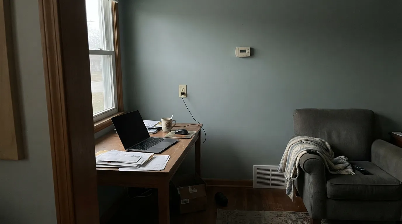
Without real daylight, the low chroma works against it: the color drains toward a flat, muddy gray-green and loses the sage-versus-slate personality that makes it interesting in the first place. This color needs light to earn its keep — a north-facing room with small windows and no warm bulbs will disappoint.
The green undertone argues with cool blue-white stone; both sides end up looking slightly wrong, like they can't agree which one is actually blue. Warm white counters or butcher block let the paint read clean. Pair the walls with a creamy white like Behr Swiss Coffee, not a stark, cool white.
Room by Room
In a room with real windows it is the calm, coastal backdrop that makes oak floors and linen furniture look deliberate. Eggshell on the walls; keep the trim a warm white, not a bright cool one.
On an island or lower cabinets under cream walls and gold or brass hardware, it is genuinely charming and reads more expensive than the can price suggests. A full kitchen of it is a bigger bet than most buyers realize — an island or hutch is the safer, more common move.
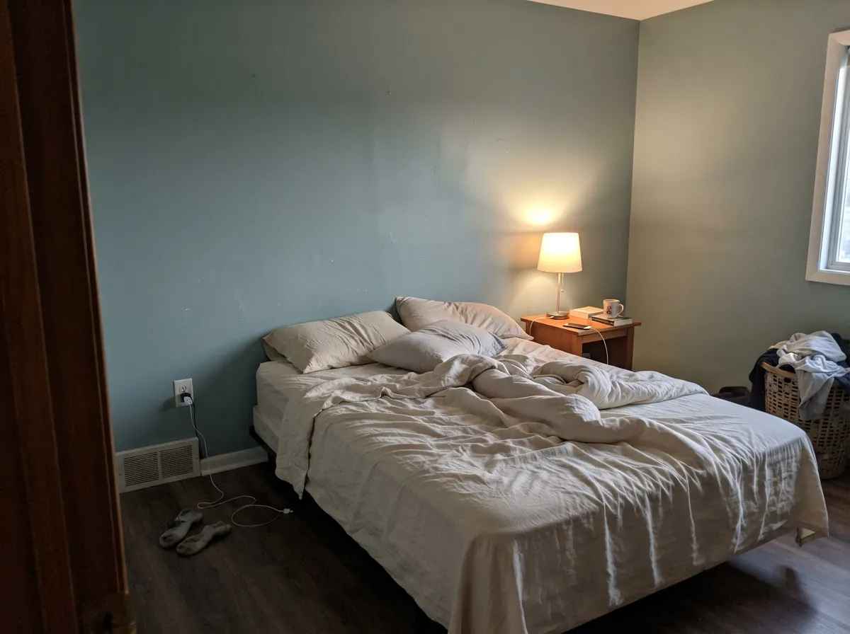
Calming without being flat, and grounded enough at LRV 32 to work as a full-room color, not just an accent. Keep bulbs at 2700K; cool LEDs pull it toward a duller slate at night.
With warm or neutral stone and wood vanities it works well. With icy white or blue-gray quartz it fights — swap the counter plan or pick a bluer color that matches the stone's temperature.
Outdoors it reads richer and greener than it does indoors, and the classic combo — cream or white siding, this color on the shutters and front door — is a dependable cottage look.
A quiet, focus-friendly color for a room you actually use, but check the light first. A north-facing office with no lamps is exactly the situation where this color goes dull.
Your Light Is the Risk
The green comes forward and the color reads richly coastal — this is the light the Provence name is selling you.
The low chroma has nothing to work with; the color drains to a flat, muddy gray-green. Test with a lamp on before you judge it here.
Blue-gray and quiet in early shade, greener and more saturated as direct sun hits it midday. The swing is gentle, not a different color.
2700K lamps push it toward a warm, muted sage. Cool LEDs flatten it back toward slate-gray — pick your bulb on purpose, not by accident.
Most complaints about Provence Blue are a light mismatch. Upload a photo of your actual room and see it on your walls — then ask for the same wall in north light or evening lamps before you buy a single sample.
Need It From Another Brand?
Any paint counter can custom-tint Behr HDC-AC-23 directly. If you would rather stay in one brand's own deck, these are the closest stock matches, measured as ΔE2000. Under 2 is a difference you will not see on the wall.
| Brand | Closest color | ΔE | LRV | |
|---|---|---|---|---|
| Sherwin-Williams | DelftSW 9134 · Sherwin-Williams | 1.5 | 33 | Color page → |
| Benjamin Moore | AtmosphericAF-500 · Benjamin Moore | 1.9 | 32 | Color page → |
| Valspar | Winter Flannel4007-1C · Valspar | 3.7 | 31.5 | Color page → |
| PPG / Glidden | Aqua SmokePPG1034-5 · PPG / Glidden | 1.4 | 33 | Color page → |
| Glidden | Blue Grass Field70GG 32/067 · Glidden | 0.4 | 32 | Color page → |
| Dutch Boy | Life's Whirlwind428-5DB · Dutch Boy | 2.2 | 33 | Color page → |
Similar Behr Colors
The nearest shades to Provence Blue within Behr's own range, ranked by perceptual color distance — useful when you want the same look a touch lighter, darker, or warmer.
WCAG 2.1: AA is 4.5 : 1 for normal text, 3 : 1 for large text, AAA is 7 : 1.
Provence Blue vs the Colors You're Also Considering
Every Provence Blue sample board has the same rivals on it. The numbers show the real lightness gap — then it comes down to which risk you would rather live with.
Pick this for Behr's version and a product name that at least promises the blue you're buying it for.
Sherwin-Williams SW 9133 · LRV 32Jasper StonePick this if your painter works in Sherwin-Williams — same depth, same low-chroma green-gray-blue, close enough to call a twin.
Pick this for the quieter, lower-chroma version that argues with fewer rooms and fewer floors.
Behr BXC-36 · LRV 25Aegean BluePick this for more saturation and a color that commits to blue instead of drifting toward sage in bright light.
Pick this for real depth on the wall instead of a near-white with a tint.
Benjamin Moore HC-144 · LRV 53Palladian BluePick this for a paler, airier spa version of the same green lean — LRV 53 is a much lighter weight of color.
Pick this for a deeper, more grounded version of the same green-blue mood, closer to a real color than a wash of one.
Sherwin-Williams SW 6211 · LRV 47RainwashedPick this for a lighter, more clearly watery green-blue at LRV 47 — it surprises buyers the same way Provence Blue does.
Behr's own neighbors are close. Cool Ashes N520-4 at LRV 32, hex #899D9D, is a touch bluer and grayer. Anonymous 780F-5 at LRV 32, hex #8A9E9B, and Agave PPU12-04 at LRV 32, hex #879D9A, both push slightly greener. Evening Fog ECC-61-3 at LRV 31 is a shade deeper and quieter, and Teal Wave ECC-65-3 at LRV 33 is the lightest and most openly blue of the group.
Across brands, Glidden Blue Grass Field 70GG 32/067 at deltaE 0.37 and Farrow and Ball Oval Room Blue No. 85 at deltaE 0.89 are the same color for all practical purposes. PPG Aqua Smoke PPG1034-5 at deltaE 1.38, Sherwin-Williams Delft SW 9134 at deltaE 1.52, and Benjamin Moore Atmospheric AF-500 at deltaE 1.91 are visually identical in normal room light. Dutch Boy Life's Whirlwind 428-5DB at deltaE 2.16 is very close, worth sampling. Dunn-Edwards Gray Flannel DE6319 at deltaE 3.5 and Valspar Winter Flannel 4007-1C at deltaE 3.68 are close but visibly different side by side, both reading grayer.
Provence Blue Coordinating Colors
The rule for coordinating with Provence Blue: stay warm on the neutrals and let the color itself carry the coastal-green mood. It flatters creamy whites and warm wood far more than it flatters anything icy, and a single near-black accent is usually enough contrast — it does not need a busy palette to look finished. These are the partners that keep showing up in rooms that work:
Provence Blue: A Quiet Color, Not a Headline Color
This color has never had the marketing moment plenty of its neighbors got. Behr has run it as a January Color of the Month, wrapped in south-of-France, lavender-fields copy, but it never became a Color of the Year — that spotlight has gone to louder, more saturated blue-greens instead, including Behr's own recent jewel-toned picks. The result is a color that is genuinely well made and genuinely useful, with far fewer styled photos and forum threads to learn from than a color half as good but twice as hyped.
That quietness cuts both ways. On the plus side, a color nobody is chasing rarely feels dated in five years — low-chroma blue-greens like this one have been a steady, unglamorous presence in paint decks for decades, largely because they behave. On the downside, if you want to see fifty real rooms before committing, you will have to look harder for this one than for a color that had its own ad campaign.
Provence Blue With Wood Tones and Metals
Warm wood is this color's best company. Oak, walnut, and butcher block all read comfortably against it, and gold or brass hardware is close to the ideal finish — the warmth balances the color's cool-leaning blue side without fighting the green.
Metals split the same way most cool-leaning colors do: unlacquered brass and antique bronze work well, matte black holds its own as a near-black accent, and polished chrome or nickel is the one finish that can look slightly cold against it. If chrome is fixed and non-negotiable, lean the room's other neutrals warmer to compensate.
Three Ready Palettes Built on Provence Blue
A color is never alone on the wall. These are complete combinations in the 60-30-10 pattern, with the reason each one holds together. Every one opens in the visualizer.
Swiss Coffee's warmth keeps the room from feeling cold next to a green-blue island, and Cracked Pepper gives one near-black note so the scheme reads deliberate instead of pastel. Gold or brass hardware is the finishing move.
Try this palette in your roomA warm trim white keeps the walls from tipping toward the cool, flat side of the color; the warm brown wood note grounds the room so the blue-green reads calm rather than cold, especially under evening lamps.
Try this palette in your roomWhite siding lets the shutters and door carry all the color, and full outdoor sun brings out more green than the same paint shows indoors. The warm beige trim keeps the porch from feeling stark against a light-colored house.
Try this palette in your roomProvence Blue FAQ
Is Provence Blue more blue or more green?
More green, honestly — that is the undertone the light brings forward first, with blue and a gray trace underneath. Buyers set on a clean, unmistakable blue are often surprised by how sagey it reads on the wall, especially in bright rooms.
Does it work with warm wood floors and gold hardware?
Yes — this is its best pairing. Oak, walnut, and butcher block all sit comfortably against it, and gold or brass hardware is exactly the finish the color was built to flatter.
Will it look dull in a room without much natural light?
Yes, and this is the most common disappointment with this color. The low chroma needs daylight or warm lamps to hold its sage-versus-slate character; without either, it drains toward a flat, muddy gray-green.
What white goes with Provence Blue walls?
A warm white, not a stark cool one. Behr Swiss Coffee or a similarly creamy off-white keeps the pairing soft; an icy blue-white trim makes the walls look muddier by contrast.
Is it good for a whole kitchen or just an accent?
Most of the real-world use is an island, lower cabinets, or a hutch — not the whole kitchen. It is a genuinely good color in doses; committing every cabinet to it is a bigger bet, especially in a kitchen without strong natural light.
Does Provence Blue work on exteriors?
Yes — Behr sells it in exterior formulations specifically for this, and full outdoor sun reads it greener and richer than the same color looks indoors. Shutters and a front door against white or cream siding is the classic, low-risk way to use it outside.
Have you painted with Provence Blue?
Rate it — one tap helps the next reader decide.
Ask a Question