Ottertail
The quiet gray-khaki nobody searches for by name, reviewed honestly: where it goes handsome, the light that turns it muddy, and what to pick instead.

Jessica has spec'd whites and neutrals for more than 300 rooms and keeps a sample wall of painted drawdowns in her studio. Every color review is checked against real reader rooms in the comments and re-tested when a formula changes. About the testing process →

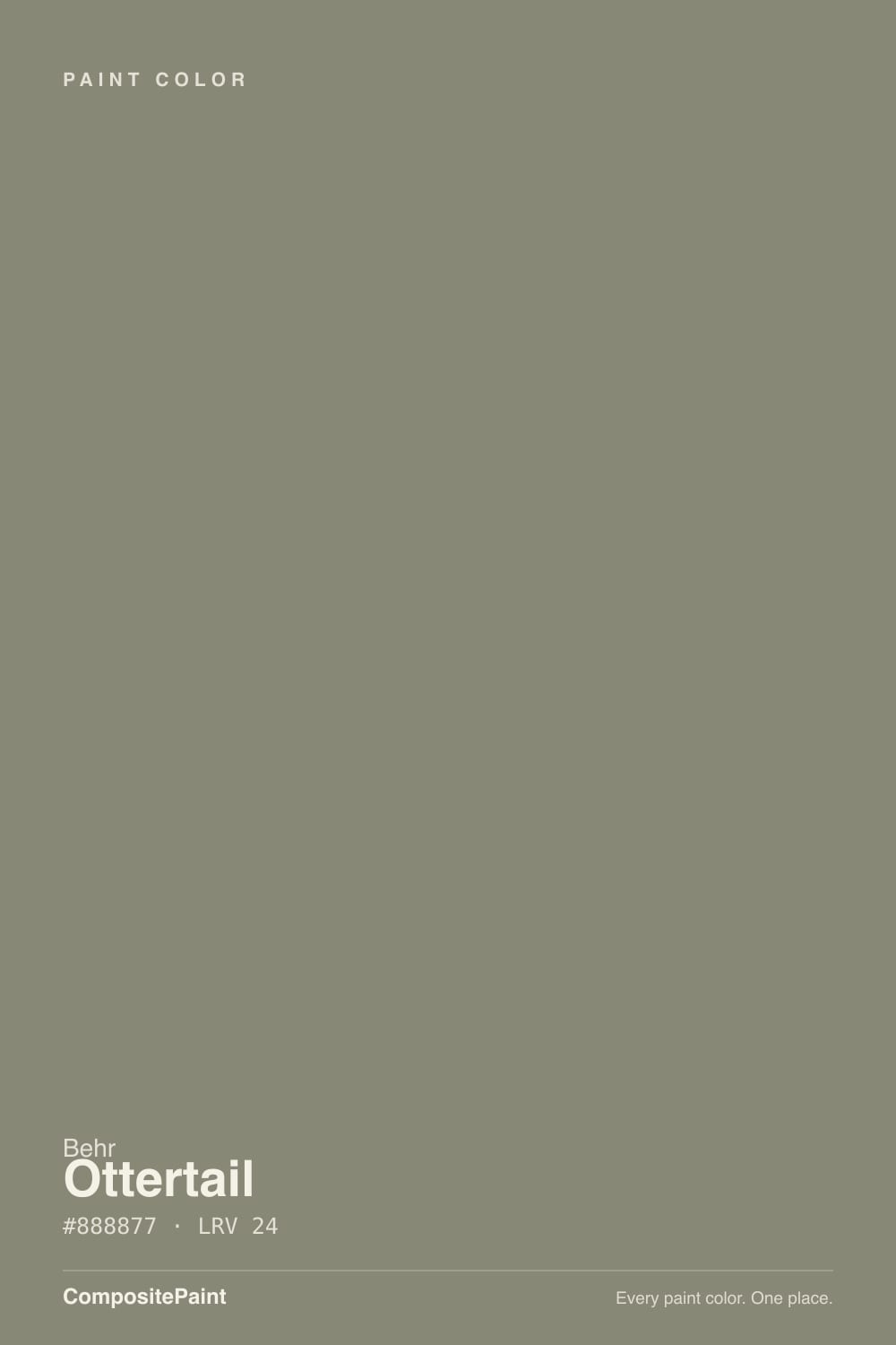
- 1Nocturne8
- 2Mocha Latte17
- 3Ottertail24
- 4Mindful Gray48
- 5Light French Gray53
The Fast Verdict
Ottertail is what you get when a gray decides to borrow a little green instead of a little brown. It is not a famous color — you will not find a hundred Reddit threads about it — but the number is honest: a mid-depth, warm-neutral gray with a khaki whisper that reads calm outdoors and grounded indoors, as long as the room hands it real light. Ask it for a crisp, colorless gray and it will disappoint you; ask it to be an easy, under-the-radar earthy neutral and it delivers.
Exterior siding with real sun exposure · a kitchen island or den that wants an earthy neutral · rooms with walnut, leather, or black hardware · anyone who wants gray without it going cold or trendy
Your room is dim and north-facing · you want a true, colorless gray · your trim or tile runs pink-toned or stark cool white · you need a color with a track record of real owner reviews to point to
- A genuinely quiet, unfussy gray-khaki that reads current without chasing a trend
- Strong exterior performer — Behr backs it with one-coat hide in Marquee exterior paint
- Flatters walnut, leather and black hardware indoors
- Deep enough (LRV 24) to hide dirt and hold its color in strong sun
- Works as a small commitment — island, den, or accent — without betting the whole house
- Goes flat and muddy in a dim, north-facing room
- Too utilitarian and outdoorsy for most soft, restful bedrooms
- Clashes with pink-toned tile or stone and with stark cool-white trim
- Very little real owner discussion online — this is a sample-first color, not a crowd-tested one
What Color Is Ottertail, Really?
Ottertail sits in Behr's N-numbered family alongside a run of quiet, earthy neutrals the brand rarely markets hard — the same shelf that produced colors like Silver Drop and Dolphin Fin. It is a warm gray with the yellow pulled toward green rather than toward brown, which is the detail that separates it from a plain greige: on the wall it reads as gray that has spent time outdoors, not gray mixed with coffee. That khaki lean is subtle, not a sage-green statement — most people would call it "a good gray" before they would call it green.
At LRV 24 it sits in the same mid-depth bracket as other earthy neutrals already in this deck — Chelsea Gray, Storm Cloud, Anonymous — colors that are clearly not pale and clearly not near-black. That depth is the whole point: it is dark enough to hide dirt and hold its color in strong sun, which is exactly why Behr sells it tinted into Marquee exterior paint with a one-coat-hide guarantee, but light enough to still read as gray-green rather than charcoal on a wall.
Undertone in one line: warm gray with a whisper of khaki-green — never blue, never pink. If your sample looks distinctly brown, that is warm lamp light or a wood floor bouncing color up at it; if it looks flat and lifeless, that is cool, dim daylight starving the green out of it.
Where It Shines
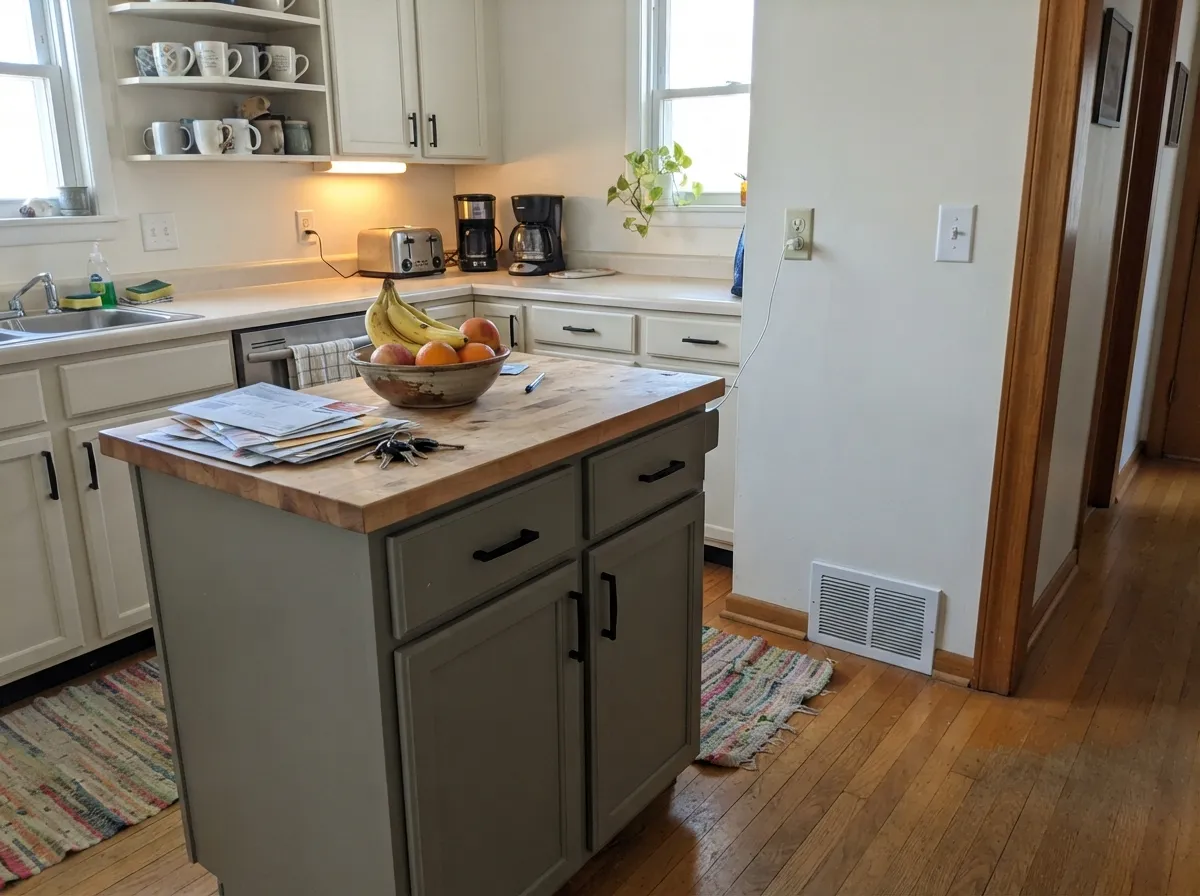
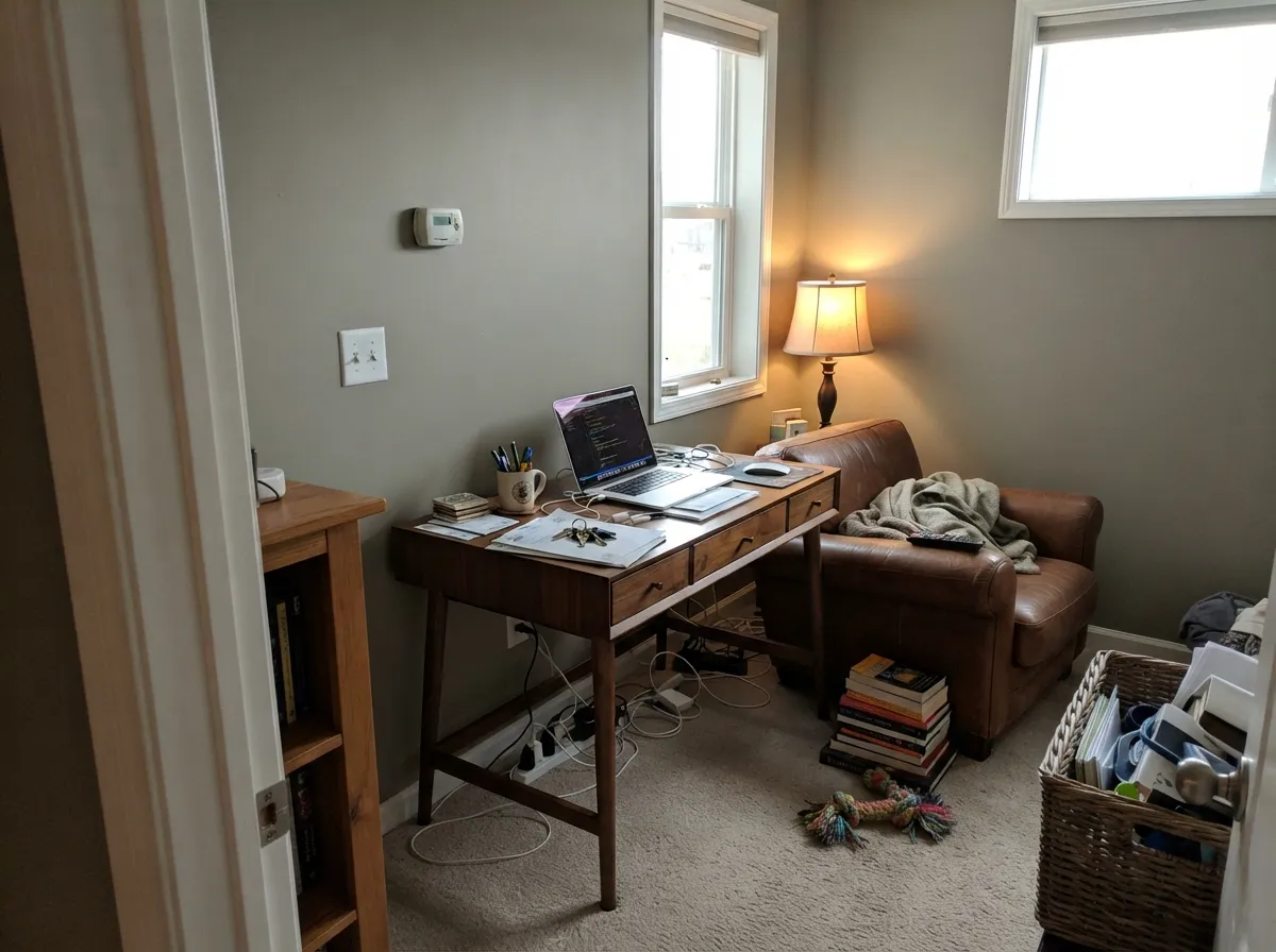
Give it strong daylight or full exterior sun and it earns its keep. Outside, it is a genuinely easy siding color — dark enough to hide streaking, warm enough not to look like poured concrete, and Behr backs it with a one-coat-hide claim in the Marquee exterior line. Indoors, its best rooms are the ones that already lean earthy and warm: a den or office with leather and walnut, or a kitchen island painted apart from the main cabinets, where its khaki-gray reads custom instead of default.
Where It Fails
Almost every regret with a quiet color like Ottertail traces back to one of three mismatches, and none of them are the paint's fault. This color was never trying to be a crisp designer gray — if your room or your expectations pull the other way, no amount of extra coats fixes that.
Cool, low daylight starves the khaki-green out of Ottertail and leaves a flat, slightly muddy gray with none of its warmth. It is not broken — it is just a color that needs light to do its job. In a genuinely dim room, step up to something with more built-in glow, like Behr's own lighter greige Silver Drop, or add real lamp light before you decide the color failed.
A cool, bright white trim makes Ottertail's green lean look accidental rather than intentional, and pink-toned tile or marble fights it outright. Pair it with a warm trim white instead — Behr's own Swiss Coffee or Blank Canvas keep the whole wall reading as one warm family.
In daylight the khaki shows, and on four walls it is unmistakable — this is not a neutral you can mistake for plain gray once it is up. If gray without any color story is the goal, Sherwin-Williams Light French Gray is the truer answer; Ottertail will always have an opinion.

Room by Room
In a room with good daylight it reads as a grounded, unfussy neutral that lets furniture and art do the talking. Eggshell finish keeps it from going flat matte on a big wall.
Painted on an island alone, under lighter perimeter cabinets, it reads intentional and current, especially with black or brass hardware. A whole kitchen of it is a bigger, riskier bet than a single island.
With walnut shelving, leather chairs and warm lamp light this is exactly the mood the color wants to make. It reads settled and a little masculine without tipping into a cave.
Full sun keeps the color honest and the depth hides dirt and streaking well. Behr guarantees one-coat hide when it is tinted into Marquee exterior paint, which says something about how forgiving the base is to work with.
It is a workmanlike, outdoorsy neutral, not a soft or restful one. Most bedrooms are better served by something with more warmth or more quiet than Ottertail's gray-khaki edge.
With warm stone, wood vanities and brass it works as a vanity or accent color. With cool white subway tile or pink-toned marble, it argues with the room instead of finishing it.
Your Light Is the Risk
Strong daylight keeps the khaki-green alive and lets the depth hide dirt and streaking. This is the light Behr built the exterior formula for.
Cool, low daylight drains the green out and leaves a flat, slightly muddy gray. Test a large sample before committing a whole dim room.
Warmer and more distinctly khaki at the sun hours, quieter and grayer the rest of the day. Expect it to move, not to sit still.
2700K lamps push it toward warm gray-brown. Cool white LEDs flatten it back toward plain gray — pick your bulbs to match the mood you want.
Most complaints about Ottertail are a light mismatch. Upload a photo of your actual room and see it on your walls — then ask for the same wall in north light or evening lamps before you buy a single sample.
Need It From Another Brand?
Any paint counter can custom-tint Behr N220-5 directly. If you would rather stay in one brand's own deck, these are the closest stock matches, measured as ΔE2000. Under 2 is a difference you will not see on the wall.
| Brand | Closest color | ΔE | LRV | |
|---|---|---|---|---|
| Sherwin-Williams | Timeless TaupeSW 9579 · Sherwin-Williams | 2.0 | 24 | Color page → |
| Benjamin Moore | Stardust2108-40 · Benjamin Moore | 0.9 | 24 | Color page → |
| Valspar | Artichoke6003-2A · Valspar | 3.6 | 24.1 | Color page → |
| PPG / Glidden | Ranch MinkPPG1075-5 · PPG / Glidden | 3.3 | 24 | Color page → |
| Glidden | Wild WildernessPPG1019-5 · Glidden | 2.3 | 24 | Color page → |
| Dutch Boy | Promising Gray439-4DB · Dutch Boy | 4.5 | 24 | Color page → |
Similar Behr Colors
The nearest shades to Ottertail within Behr's own range, ranked by perceptual color distance — useful when you want the same look a touch lighter, darker, or warmer.
WCAG 2.1: AA is 4.5 : 1 for normal text, 3 : 1 for large text, AAA is 7 : 1.
Ottertail vs the Colors You're Also Considering
Every Ottertail sample board has the same rivals on it. The numbers show the real lightness gap — then it comes down to which risk you would rather live with.
Pick this when you want the green kept in, not smoothed out — Anonymous leans plainer brown by comparison.
Sherwin-Williams SW 7046 · LRV 20AnonymousPick this for an even quieter, flatter taupe-gray with less green in it — one of the best-behaved exteriors in the SW deck.
Pick this for the extra khaki-green lean that keeps a wall from reading like plain warm gray.
Sherwin-Williams SW 7018 · LRV 26DovetailPick this for a true warm gray with barely any green — reliable as long as the room has real light.
The Behr neighbors all share the LRV of 24 to 25, so they differ in cast, not in weight. Dried Basil UL200-5 at #898873 is slightly more yellow, Mossy Bank PPU8-21 at #8B8670 is the warmest and most khaki, Woodcraft N200-5 at #84887D is the coolest and greenest, and Fifth Olive-Nue T16-08 at #8E8779 is a touch lighter in feel and browner.
Across brands the matches are unusually tight. Rodda Willow CA171 at LRV 26 sits at a deltaE of 1.42 and Farrow & Ball Treron No. 292 at LRV 26 at 1.45, both visually identical in normal room light though each is a hair lighter. Benjamin Moore Rolling Hills 1497 at LRV 25 is 2.08 away and Sherwin-Williams Willowleaf SW 9649 at LRV 24 is 2.25 away, so both are very close but worth sampling first.
Backdrop Hartford BD-HF at LRV 22 is 4.55 away, close but visibly greener and darker side by side.
Ottertail Coordinating Colors
The rule for coordinating with Ottertail is the same rule that governs most earthy neutrals: stay warm, and let one color per room go near-black or crisp white for contrast. It pairs best with warm whites, walnut-toned wood, and other quiet greens and grays — and it argues with pink-toned stone and stark, cold whites. These are the partners that keep showing up in rooms and facades that work:
Ottertail on Exteriors
This is where Ottertail does its best, least-complicated work. Behr guarantees one-coat hide when it is tinted into Marquee exterior paint, which matters on a facade where a second full coat is real time and real money. Full sun keeps the color honest — it neither washes out nor goes muddy the way it can indoors in weak light — and the mid-depth tone is genuinely good at hiding dirt, pollen and streaking between washes.
The trim decision does most of the work. A crisp warm white keeps the siding reading intentional; a near-black on shutters and the front door adds the one dark note the facade needs. Avoid pairing it with pink-toned brick or stone, which pulls its green lean into an unflattering fight — a neutral gray brick or a warm wood door is the safer company.
Ottertail With Wood Tones and Floors
Walnut, espresso and other deep, red-brown woods are this color's best company — the warmth in the wood meets the warmth in the gray halfway and the whole room reads settled rather than cold. Pale white oak and gray-washed floors are safe too, giving a lighter, more Scandinavian-leaning result.
Golden honey oak is the one combination worth testing carefully first. It will not fight Ottertail the way it fights a true purple or blue, but the pairing can read a little flat rather than intentional — a walnut accent piece or a warm rug in the room usually settles the mismatch without repainting anything.
Three Ready Palettes Built on Ottertail
A color is never alone on the wall. These are complete combinations in the 60-30-10 pattern, with the reason each one holds together. Every one opens in the visualizer.
A crisp white trim keeps the earthy siding color from reading muddy at the edges, and one near-black note on the shutters and door gives the facade the contrast it needs to look deliberate instead of accidental.
Try this palette in your roomWarm-white perimeter cabinets keep the kitchen bright while the island carries all the color; a deeper charcoal on one pantry door or hutch adds a second depth of neutral without competing with the island.
Try this palette in your roomWhite Dove trim keeps the room from feeling closed in, while a deeper, browner accent on the built-ins gives the earthy walls a second note to play against instead of standing alone.
Try this palette in your roomOttertail FAQ
Is Ottertail gray or green?
Gray, with a whisper of khaki-green — not a green paint by any stretch, but enough green lean that nobody will mistake it for a colorless neutral once it is on four walls. In cooler light the green fades and it reads as plain warm gray.
Does Ottertail work as an exterior color?
It is arguably its strongest use. Behr guarantees one-coat hide when it is tinted into Marquee exterior paint, and the mid-depth tone hides dirt and streaking well in full sun. Pair it with a crisp white trim and it looks deliberate rather than dated.
What trim white goes with Ottertail?
A warm white, not a stark cool one — Behr's own Swiss Coffee or Blank Canvas indoors, or plain Behr White outside. A cool, bright white trim exaggerates the green lean instead of balancing it.
Is it good for a kitchen island or cabinets?
Yes, in doses. An island painted Ottertail under lighter perimeter cabinets reads current and intentional, especially with black or brass hardware. A whole kitchen of it is a much bigger commitment and needs a well-lit room to pull off.
Will it look muddy in a north-facing room?
It can. Cool, low daylight strips the khaki-green out and leaves a flatter, duller gray than the sample suggested. Test a large swatch on the actual wall before committing a genuinely dim room to it.
How many coats does it take?
Two coats over a similar mid-tone color is typical. Going over a pale wall or a very different color, prime first — Behr's own Marquee formula is built for strong hide, but a dramatic color change still benefits from a tinted primer.
Have you painted with Ottertail?
Rate it — one tap helps the next reader decide.
Ask a Question