Newport Blue
Behr's coastal teal-blue, reviewed honestly: why most people meet it on a porch floor before they meet it on a wall, the light that turns it flat, and what to pick instead.

Jessica has spec'd whites and neutrals for more than 300 rooms and keeps a sample wall of painted drawdowns in her studio. Every color review is checked against real reader rooms in the comments and re-tested when a formula changes. About the testing process →
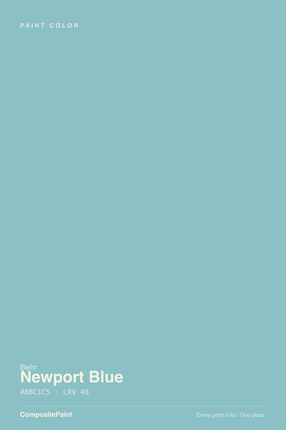
- 1Adirondack Blue22
- 2Van Courtland Blue31
- 3Newport Blue48
- 4Ocean Boulevard53
- 5Refresh59
The Fast Verdict
Newport Blue is a soft, gray-muted teal-aqua that Behr formulates for nearly every surface in the house except, it turns out, the wall you're most likely to paint it on. Search for it and you land on porch-floor enamel, fence stain, and exterior siding paint before you find a single living-room photo. That is not a knock — it means the color is genuinely dependable outdoors and in small, saturated indoor doses — but walk in expecting a true "blue" and you'll be surprised by how green it reads.
Porch and patio floors · exterior trim, shutters, and siding on a light-sided cottage · coastal-styled bathrooms and powder rooms · a playful kid's room that isn't a literal baby blue
You want a true, unmistakably blue blue · your room is dim and north-facing · you're ordering it sight-unseen to match a navy-and-white nautical scheme · you want a color with a stack of Houzz photos to copy
- A genuine coastal teal-aqua that reads calm without the coldness of a true blue
- LRV 48 holds real color without bleaching to pastel or sinking to murk
- Sold across nearly every Behr line — floor enamel, wood stain, exterior, interior — so porch, fence, trim, and walls can all match exactly
- Gray undertone keeps it from reading like a kid's-aisle primary blue
- Genuinely tested outdoors and on floors, with real, mostly positive owner reviews in those categories
- The name oversells "blue" — most buyers are surprised by how green-teal it actually reads
- Goes flat and muddy in a dim, north-facing room
- Almost no interior styling coverage online — you are testing it without inspiration photos to lean on
- Reads noticeably more pastel on a full wall than the small fan-deck chip suggests
What Color Is Newport Blue, Really?
The name says blue; the paint says teal. Newport Blue's RGB breaks down to 139 red, 193 green, 197 blue — more green in the mix than blue — and Behr's own marketing copy admits the gray undertone that keeps it "muted and sophisticated" rather than bright. Our own color family classifies it as teal, not blue, for exactly this reason. It is a real, useful color; it is just not the color its name promises, and that gap is the single most common reason buyers end up disappointed.
At LRV 48 it sits in the medium-light range — light enough to stay fresh in a bright room, with enough body that it does not wash out to a pastel wisp the way LRV 60-plus blues do. Behr describes it as appearing fresher in daylight and deeper in low light, which is an honest description of how a mid-value teal actually behaves: it has real substance to lose in the shadows, unlike a paler sky blue that just goes chalky.
Undertone in one line: gray-green teal first, blue second — never a clean, cool navy-adjacent blue. If your sample reads more pastel than the fan deck chip suggested, that is the LRV doing exactly what a 48 does in real daylight, not a defective can; one Home Depot buyer said as much, calling it "more pastel than I had originally thought" after painting a boy's room, and still recommending it.
Where It Shines
This is a workhorse, not a showpiece, and it shines exactly where workhorses shine: a covered porch floor in gloss or low-lustre enamel, exterior trim and shutters against a light-sided cottage, a small powder room or bathroom taking the full saturated dose. Because Behr sells it across nearly every product line — porch and patio floor enamel, solid-color wood stain, flat and satin exterior, semi-gloss and flat interior/exterior samples — you can match the deck boards, the fence, the shutters, and the powder-room walls to the exact same can. That cross-surface consistency is the real selling point, more than any single showcase room.
Where It Fails
Almost every disappointed review of Newport Blue traces back to one of three predictable moments, and none of them are the paint failing to do its job.
"Newport Blue" reads as a promise of true blue. What arrives is a green-leaning teal-aqua — gorgeous on its own, but jarring next to a navy-and-white nautical scheme you already committed to. If the room is built around a true blue (navy trim, cobalt accents), sample Newport Blue against them before you buy; the green will fight the blue instead of complementing it.
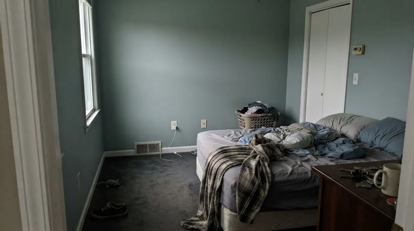
Behr's own copy admits the color deepens in low light — the honest flip side is that without real daylight it can slide toward a flat, muddy grey-green instead of the clean coastal teal in the photos. This is a color that needs a bright room to read as advertised; test it in the actual room, at the actual hour you use it most.
At LRV 48, a full wall in real daylight reads noticeably softer and more pastel than the small fan-deck square. That is the most common real-world surprise reported for this color — not a bad reaction, usually, but a different one than expected. Paint a big sample before committing four walls.
Room by Room
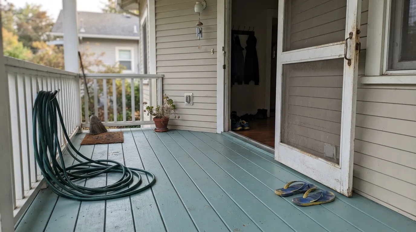
Its best-documented job. In a low-lustre or gloss enamel floor finish it reads as a classic coastal-cottage porch color, durable and easy to maintain. This is the product line with by far the most real customer reviews.
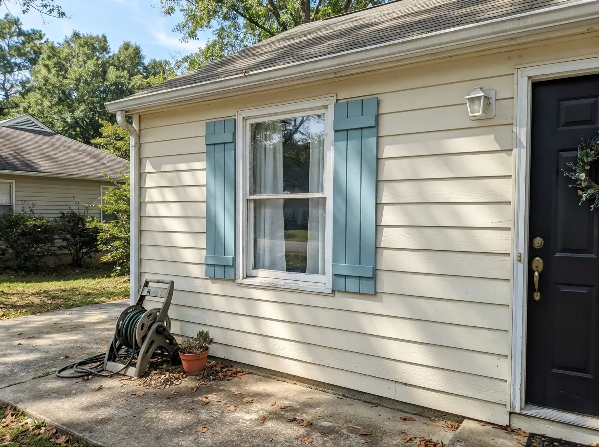
On a light-sided house, Newport Blue shutters or trim read crisp and coastal without the weight of a true navy. Full sun brightens it toward a cleaner aqua than it shows indoors.
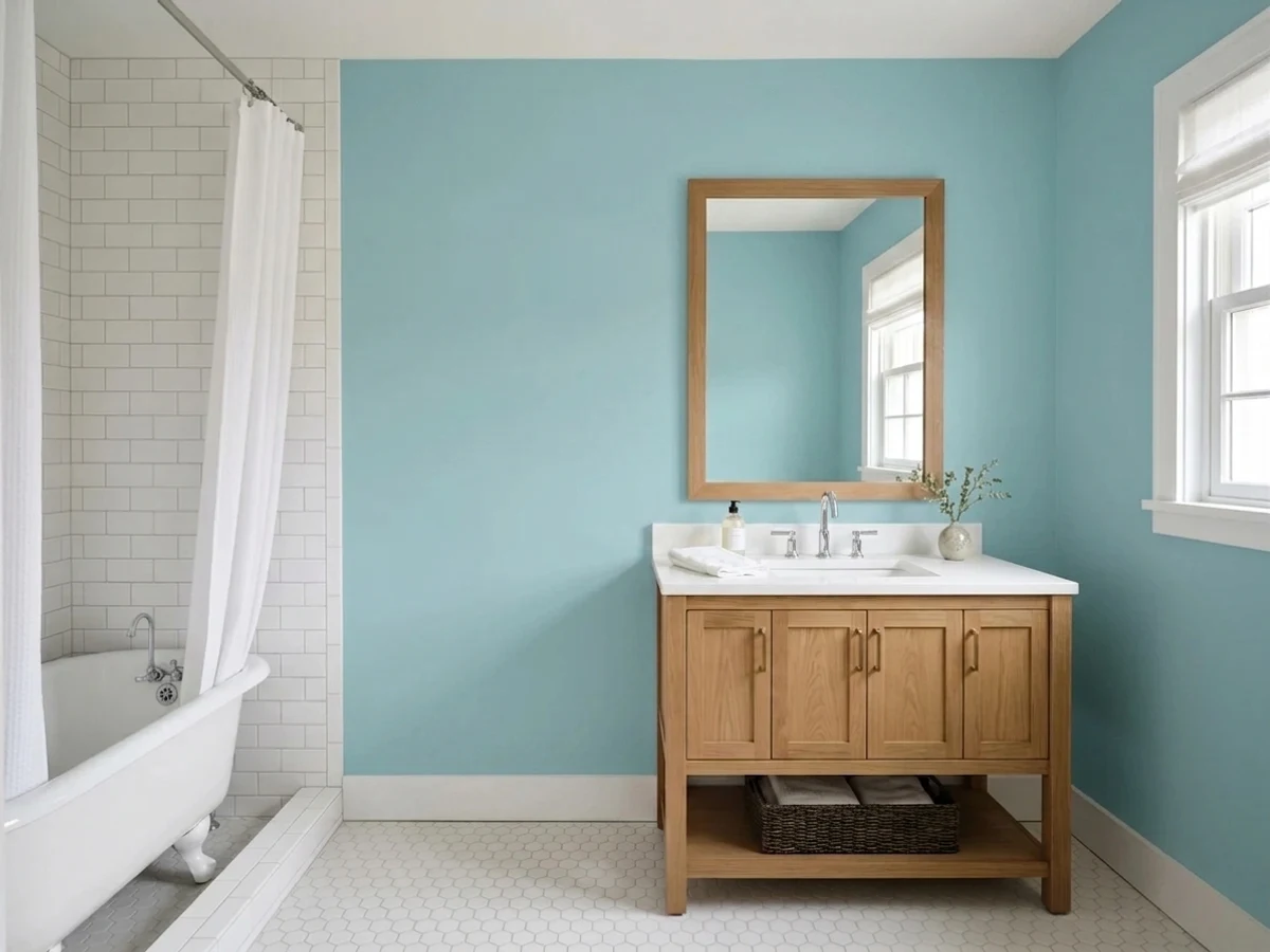
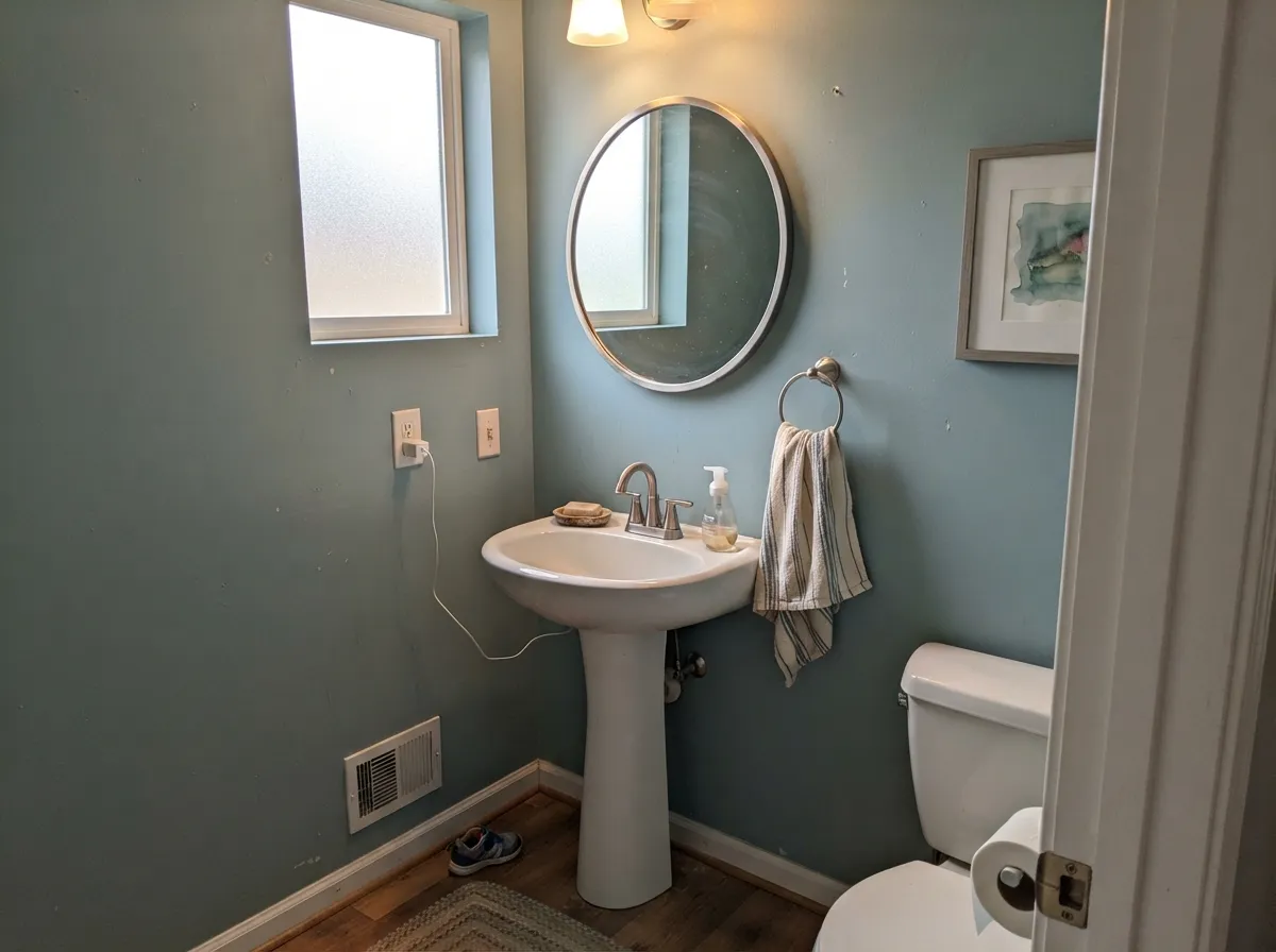
A whole small room in this color, with white or cream trim, reads spa-like and deliberate. It is at LRV 48 saturated enough to hold its own against tile and chrome without going cold.
Real owner feedback backs this up: one buyer painted a boy's room and found it softer and more pastel than expected, but still "a wonderful blue." It avoids the primary-colors-aisle look most baby blues fall into.
As an island or a single hutch against white or cream cabinetry, the teal reads intentional and collected. A full kitchen in this color is a bigger, less-tested bet — there is little real-world documentation of it.
Workable, but only with strong, direct daylight; in anything less it drifts toward the flat, muddy read described above. Pair with a warm white trim, never a stark cool white, to keep the room from feeling clinical.
Your Light Is the Risk
A covered porch or a room with strong indirect daylight is the light Behr's own copy describes: fresher, cleaner, coastal. This is the color at its truest.
Without real daylight the teal sinks toward a flat, muddy grey-green instead of the aqua in the product photos. Test here first if this is your room.
Cooler and bluer in morning light, greener and warmer by late afternoon. The shift is gentle, not a color change most people notice as a problem.
2700K warm bulbs pull it toward a soft, muted sage-teal. Cool LEDs keep the aqua crisper but can feel sterile — pick based on the room's mood, not the paint.
Most complaints about Newport Blue are a light mismatch. Upload a photo of your actual room and see it on your walls — then ask for the same wall in north light or evening lamps before you buy a single sample.
Need It From Another Brand?
Any paint counter can custom-tint Behr 530F-4 directly. If you would rather stay in one brand's own deck, these are the closest stock matches, measured as ΔE2000. Under 2 is a difference you will not see on the wall.
| Brand | Closest color | ΔE | LRV | |
|---|---|---|---|---|
| Sherwin-Williams | Blithe BlueSW 9052 · Sherwin-Williams | 2.3 | 46 | Color page → |
| Benjamin Moore | Pool Blue2052-50 · Benjamin Moore | 1.4 | 47 | Color page → |
| Valspar | Tidal Wave5002-7C · Valspar | 3.9 | 47.7 | Color page → |
| PPG / Glidden | Aqua FiestaPPG1147-4 · PPG / Glidden | 1.7 | 48 | Color page → |
| Glidden | Aqua FiestaPPG1147-4 · Glidden | 1.8 | 49 | Color page → |
| Dutch Boy | Rockets233-4DB · Dutch Boy | 2.3 | 45 | Color page → |
Similar Behr Colors
The nearest shades to Newport Blue within Behr's own range, ranked by perceptual color distance — useful when you want the same look a touch lighter, darker, or warmer.
WCAG 2.1: AA is 4.5 : 1 for normal text, 3 : 1 for large text, AAA is 7 : 1.
Newport Blue vs the Colors You're Also Considering
Every Newport Blue sample board has the same rivals on it. The numbers show the real lightness gap — then it comes down to which risk you would rather live with.
Pick this for more saturated color and a truer coastal-teal presence, especially outdoors.
Benjamin Moore HC-144 · LRV 53Palladian BluePick this for a lighter, greener spa color that behaves itself in almost any light.
Pick this for a lighter, porch-friendly version that won't overpower a small exterior surface.
Benjamin Moore 2049-40 · LRV 35Peacock BluePick this for a deeper, steadier jewel-tone teal built for a full interior wall.
Within Behr, Cosmic Blue MQ6-32 (#8FBFCA, LRV 47) is the bluer version, so choose it if you want less green. Norwester N470-4 (#93BCBC, LRV 46) is grayer and quieter, a safer pick for a large room. Not A Cloud In Sight MQ4-50 (#83C5D2, LRV 49) is clearly brighter and more openly sky blue, the opposite direction from Newport Blue's dusty balance.
Across brands, Benjamin Moore Pool Blue 2052-50 (#85C1C8, LRV 47) comes in at deltaE 1.39, which is visually identical in normal room light. Sherwin-Williams Blithe Blue SW 9052 (#90BDBD, LRV 46) is deltaE 2.3, very close but worth sampling first since it is a touch grayer.
Valspar Tidal Wave 5002-7C (#84C1CF, LRV 47.7) is deltaE 3.87, close but visibly different side by side, reading bluer. Farrow and Ball Blue Ground No. 210 (#A0C5CA, LRV 52) is deltaE 4.4 and noticeably lighter and softer.
Newport Blue Coordinating Colors
Because this color already leans muted and gray, its best partners are warm and calm rather than crisp and cool: creamy off-whites, sandy neutrals, and one near-black anchor. Stay away from stark, blue-white trims, which push the teal colder than it wants to be. These are the pairings its own product lines are built around:
Newport Blue's Real Job: Porches, Floors, and Exteriors
Search for this color and the internet hands you porch-floor enamel, solid-color fence stain, and exterior paint listings long before it hands you a single styled living room. That is not a coincidence — Behr sells Newport Blue in an unusually wide spread of product lines: textured low-lustre and gloss enamel porch-and-patio floor paint, solid-color house-and-fence wood stain, flat and satin exterior paint, and semi-gloss or flat interior/exterior formulas for walls. Most colors get one or two of these; Newport Blue gets nearly all of them.
The practical upshot is that most owners of this color first met it outside, on a deck or a fence, and the reviews reflect it: the exterior wood-stain version carries a strong satisfaction rating, with owners praising coverage and how long it lasts outdoors. If you're considering it for a wall, you are choosing a color whose reputation was built somewhere else — which makes a real sample in your own room more important than usual, not less.
Newport Blue With Wood Tones and Metals
Weathered cedar decking, teak porch furniture, and grayed driftwood-toned trim are its most natural company — the muted, gray-leaning teal sits comfortably next to wood that has already lost its orange warmth. Fresh honey-oak or orange-toned pine is a tougher match; the warm wood and the cool-leaning teal read as two different projects rather than one finished look.
For hardware, brushed nickel, matte black, and aged bronze all work cleanly. Bright polished brass can look slightly at odds with the color's cool-gray lean — it is not a clash, but it reads less effortless than it does against a warmer color like Swiss Coffee or Almond Wisp.
Three Ready Palettes Built on Newport Blue
A color is never alone on the wall. These are complete combinations in the 60-30-10 pattern, with the reason each one holds together. Every one opens in the visualizer.
The exact combination Behr's own product lines are built to match: a warm cream siding, a near-black door for contrast, and the teal doing double duty on the porch floor and the shutters.
Try this palette in your roomA small room can carry the full saturated wall color. Aegean Blue on the vanity gives the room one deeper tonal note in the same family, and Ultra Pure White trim keeps the whole thing crisp instead of murky.
Try this palette in your roomAlmond Wisp keeps the room warm instead of nursery-primary, and Swiss Coffee trim is soft enough not to fight the teal. The gray undertone in the walls is what keeps this from reading as a literal baby-blue theme.
Try this palette in your roomNewport Blue FAQ
Is Newport Blue actually blue, or is it teal?
It reads as teal — its own RGB mix has more green than blue, and it carries a gray undertone that mutes it further. The name promises a cleaner blue than the paint delivers, which is the single most common surprise reported for this color. Sample it before pairing with a true navy.
Is Newport Blue good for exterior siding or trim?
Yes — this is one of its best-documented uses. Behr sells it in flat and satin exterior formulas specifically for this, and full sun brings out a cleaner, brighter aqua than it shows indoors. It pairs well with a light siding and a near-black door or shutters.
Can I use it on a porch or patio floor?
That is arguably its primary job. Behr sells Newport Blue in gloss and textured low-lustre porch-and-patio floor enamel, and that product line has the most real customer reviews of anything sold in this color.
What's the difference between Newport Blue and Behr's Aegean Blue?
Same teal-blue family, different depth. Newport Blue (LRV 48) is lighter and reads more coastal and porch-friendly; Aegean Blue (LRV 25) is a genuinely deeper teal built for a full interior wall. Use Aegean Blue where you want moodier presence, Newport Blue where you want it fresh and bright.
What trim white goes with Newport Blue?
A warm off-white — Behr's own Swiss Coffee or a similar cream — keeps the room from feeling clinical. A stark, cool white trim can make the teal read colder and flatter than it should.
Will it look pastel, or does it hold real color?
At LRV 48 it holds real color in most rooms — it is not a washed-out pastel by design. But real daylight on a full wall does read noticeably softer than the small fan-deck chip, which is the most common real-world surprise; one buyer described it as "more pastel than I had originally thought" after painting a room, and still liked the result.
Have you painted with Newport Blue?
Rate it — one tap helps the next reader decide.
Ask a Question