Coconut Twist
Behr's palest warm white, reviewed honestly: what its whisper-thin cream actually does in real light, the rooms where it goes flat, and what to pick instead.

Jessica has spec'd whites and neutrals for more than 300 rooms and keeps a sample wall of painted drawdowns in her studio. Every color review is checked against real reader rooms in the comments and re-tested when a formula changes. About the testing process →
- 1Classic Gray74
- 2Alabaster82
- 3Coconut Twist88
- 4Ultra Pure White97
The Fast Verdict
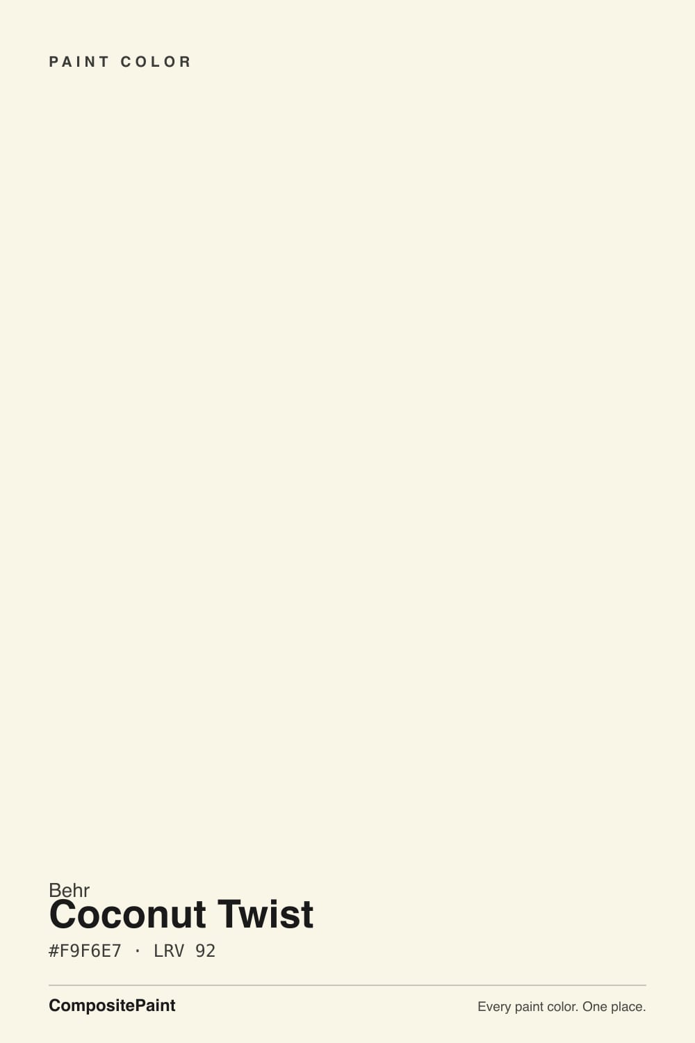
Coconut Twist is Behr's whisper of a warm white: at LRV 92 it sits among the lightest colors in the deck, with just enough cream to avoid feeling clinical and just little enough that paint databases can't agree whether the undertone leans yellow-green, orange, or plain beige. That is not really a flaw — it is the whole personality. It is built to brighten a room without announcing itself, and it does that job well. What it does not do is stand out: set next to Behr's own Ultra Pure White, at the same LRV, most people cannot tell them apart without swatches in hand.
Whole-house walls + trim in rooms with real daylight · kitchens and baths that want brightness without a stark white · ceilings under almost any wall color · anyone who wants a white that recedes instead of announcing itself
Your room is dim or north-facing · you want a color with a clear, describable identity · you're choosing between this and Behr Ultra Pure White and hoping there's a real difference · you want an obviously creamy white like Swiss Coffee or Blank Canvas
- Extremely light without the cold, clinical feel of a true white
- Softens a room's brightness instead of just bouncing light back flat
- Pairs easily with earth tones, jewel accents and soft grays — it never commits hard to one undertone
- Flatters warm wood, brass and cream textiles the way a bluer white cannot
- A dependable ceiling and trim companion under a wide range of wall colors
- So faint its identity is genuinely hard to pin down — paint databases disagree on the undertone
- Needs real daylight; in dim or north light it goes flat and slightly chalky
- Nearly indistinguishable from Behr's own Ultra Pure White at the same LRV — a confusing choice at the paint counter
- Too quiet for anyone who wants a white with a clear, describable personality
What Color Is Coconut Twist, Really?
Coconut Twist is an extremely light warm off-white — at LRV 92 it sits alongside Behr's own Ultra Pure White as one of the palest colors in the whole deck, closer to a near-white than a color with real body. The base is a soft cream, built to avoid the flat, cool feel of a true white without going anywhere near the buttery territory of Behr Blank Canvas or Swiss Coffee. It is the color you reach for when plain white feels too stark but a visible cream feels like too much of a decision.
The strange part of researching this color is how little agreement there is about what, exactly, it is warm with. Some sources call the undertone yellow-green, others call it orange, others just call it beige and leave it there. All three are technically defensible, because at this LRV the color is so diluted that its hue barely registers — you are looking at a suggestion of a color more than a statement of one. That is honest, not evasive: on the wall it reads as a soft warm white, and asking for more precision than that is asking more of the paint than the paint is offering.
Put it next to Behr's own Ultra Pure White (same LRV 92) and the difference is real but small: Ultra Pure White leans a touch cooler and grayer, Coconut Twist a touch warmer and creamier. Side by side in good daylight you can see it. On separate walls in separate rooms, most people will not.
Where It Shines
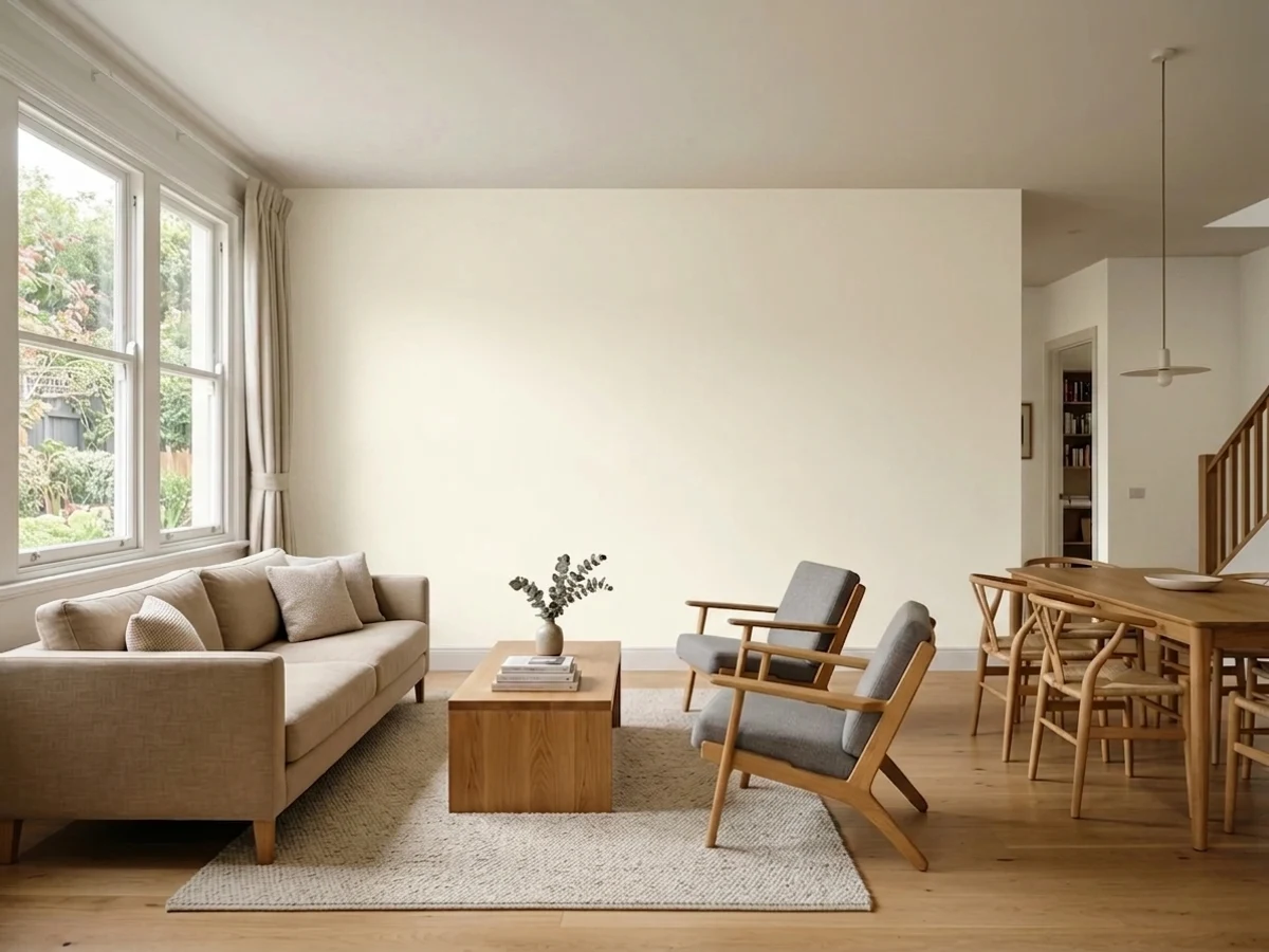
Give it real daylight and it does exactly what a whisper-white should: brighten a room without the sterile, clinical edge of a true white. It is at its best on ceilings, wide runs of trim, and any room already carrying warm materials — wood, brass, cream textiles — where its job is to recede and let everything else read clean. It is also a genuinely easy whole-house choice for anyone who wants low commitment and low risk over a strong opinion.
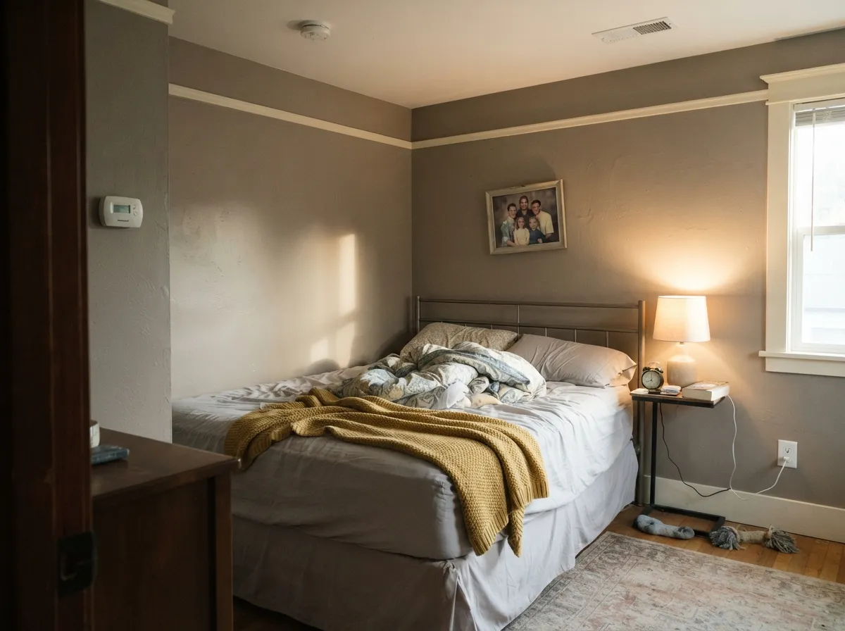
Where It Fails
Every regret story with a color this pale follows the same shape: someone expected more identity, or more brightness, than an LRV 92 near-white with a whisper of warmth can honestly deliver. None of these are the paint's fault — but they are predictable before the first coat.
Coconut Twist is deliberately faint — even paint databases disagree on whether its undertone is yellow-green, orange, or plain beige. If you want a white that reads clearly creamy on the wall, look at Behr Swiss Coffee or Blank Canvas instead; this one is quieter than either.
At LRV 92, almost all of this color's identity comes from the light hitting it. Take the light away and the whisper of warmth goes with it — the wall reads flat and slightly chalky instead of soft and bright.
Trim, ceiling, or a neighboring room in a bluer white makes Coconut Twist's faint cream look like a wash of grime by comparison. Keep whites in the same temperature family on shared sightlines, or commit to the one-color rule and paint trim the same shade.
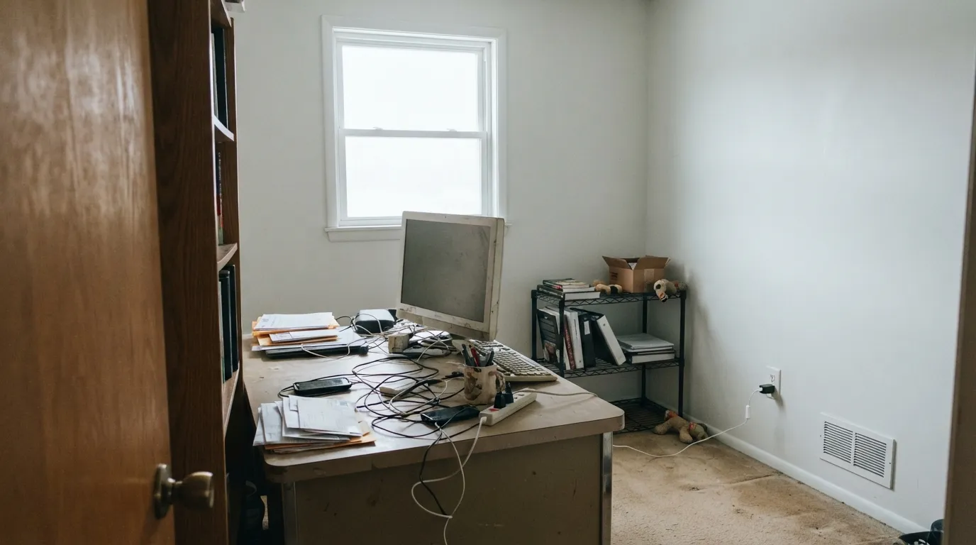
Room by Room
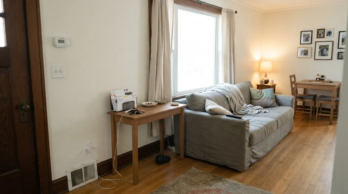
With real sun and wood furniture it brightens the room without the cold edge of a true white. Eggshell on walls; same color in semi-gloss on trim keeps the room seamless.
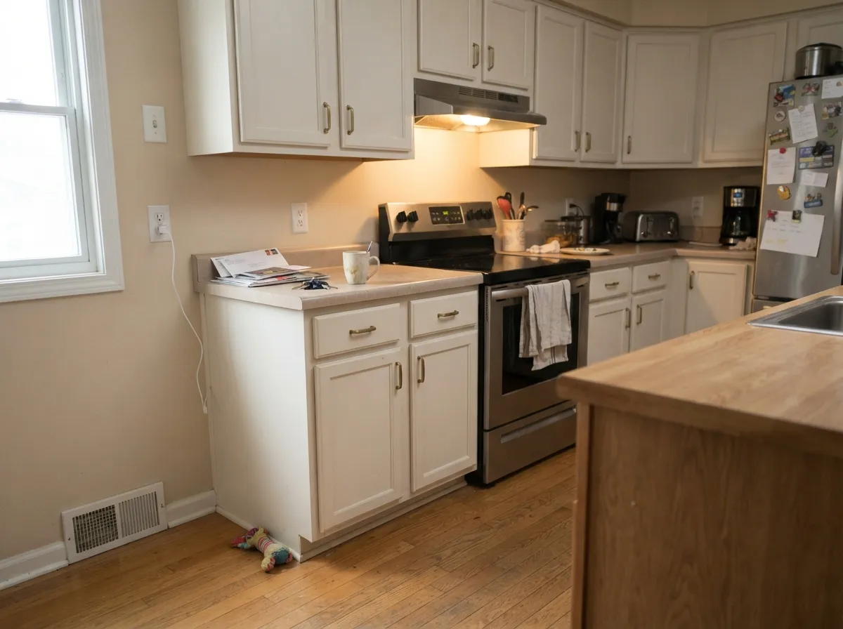
It flatters brass hardware and butcher block the way a bluer white cannot, and at LRV 92 it still bounces plenty of light around a galley kitchen. Satin cabinet enamel wipes clean.
Warm bedding, wood furniture and a lamp or two keep it soft at night. A bedroom with cool gray textiles and no warm light will read the walls as plain white, not cream.
With warm-toned tile, wood vanities or brass fixtures it is genuinely pretty. Against cool gray or blue-gray tile it loses its only distinguishing feature and just looks like a slightly dingy white.
The widest and safest use: it softens the transition under almost any wall color without the harsh cut of a bright white, and it is nearly foolproof painted on the ceiling of a warm-toned room.
Full sun reads it clean and bright, closer to a true white than it looks indoors. It is not a statement color for a facade — pair it with black or charcoal trim if you want the house to have an opinion.
Your Light Is the Risk
South or west sun keeps the cream visible and the wall reads soft, not stark. This is the light the color needs to actually be itself.
The faint warmth disappears almost entirely; the wall goes flat and slightly chalky, hard to tell from a builder-grade white.
Morning and evening sun nudge it a shade creamier; midday flattens it back toward plain white.
2700K bulbs bring out what little cream it has. Cool LEDs erase it, and the wall reads like an ordinary flat white.
Most complaints about Coconut Twist are a light mismatch. Upload a photo of your actual room and see it on your walls — then ask for the same wall in north light or evening lamps before you buy a single sample.
Need It From Another Brand?
Any paint counter can custom-tint Behr GR-W14 directly. If you would rather stay in one brand's own deck, these are the closest stock matches, measured as ΔE2000. Under 2 is a difference you will not see on the wall.
| Brand | Closest color | ΔE | LRV | |
|---|---|---|---|---|
| Sherwin-Williams | Roman ColumnSW 7562 · Sherwin-Williams | 0.8 | 88 | Color page → |
| Benjamin Moore | Butter Pecan2165-70 · Benjamin Moore | 0.5 | 86 | Color page → |
| Valspar | Lemon Edge7003-23 · Valspar | 0.9 | 87.7 | Color page → |
| PPG / Glidden | White ChipPPG15-06 · PPG / Glidden | 1.0 | 87 | Color page → |
| Glidden | Linwood Beach White71YY 87/078 · Glidden | 1.0 | 87 | Color page → |
| Dutch Boy | Aged Marble006W · Dutch Boy | 0.8 | 87 | Color page → |
Similar Behr Colors
The nearest shades to Coconut Twist within Behr's own range, ranked by perceptual color distance — useful when you want the same look a touch lighter, darker, or warmer.
WCAG 2.1: AA is 4.5 : 1 for normal text, 3 : 1 for large text, AAA is 7 : 1.
Coconut Twist vs the Colors You're Also Considering
Every Coconut Twist sample board has the same rivals on it. The numbers show the real lightness gap — then it comes down to which risk you would rather live with.
Pick this for the warmer, creamier version of the same near-white brightness.
Behr 1850 · LRV 92Ultra Pure WhitePick this if you want the same LRV with a slightly cooler, grayer cast — the two are close enough to need side-by-side samples.
Pick this when you want brightness first and a hint of warmth second, not the other way around.
Behr 12 · LRV 80Swiss CoffeePick this if you want a white that reads obviously, unmistakably creamy — Coconut Twist is much quieter.
Benjamin Moore Crisp Linen CSP-305 is an exact match. It shares the same hex, #F9F6E7, the same LRV of 92, and a deltaE of 0, so the two are the same color under different names. Kompozit and Hirshfield's Yellow Bonnet 0929 at deltaE 0.41 and Diamond Vogel Touch of Sun 0852 at deltaE 0.41 are matches for practical purposes too, as are Valspar Betsy's Linen 7005-16 and C2 Lily C2-644 at deltaE 0.6.
Glidden Linwood Beach White 71YY 87/078 at deltaE 0.96 is another match, though its LRV of 87 is five points lower, so it will look slightly less bright. Dunn-Edwards Ivory Keys DEW353 at deltaE 1.35 is visually identical in hue but reads deeper at LRV 85.
Stepping out, Sherwin-Williams Cheviot SW 9503 at #F6F2E8 and LRV 89 is at deltaE 2.41, very close but worth sampling first. Magnolia Home True White JG-21 at deltaE 4.34 is close but visibly different side by side, reading cooler and cleaner.
Coconut Twist Coordinating Colors
Because the color itself is so quiet, it works as a backdrop for almost anything with more presence — the rule is just to keep other whites in the same warm family and let stronger colors carry the room's personality. These are the partners that make the most sense with it:
Coconut Twist vs. Behr's Other Near-Whites
Behr sells several warm whites within a few LRV points of each other, and Coconut Twist sits right in the crowded middle of that lineup: Ultra Pure White matches it almost exactly at LRV 92, Whisper White comes in just under at LRV 90, and Polar Bear and Swiss Coffee sit progressively lower and progressively more clearly cream. None of these is a wrong choice — they are close enough that the honest answer is to buy two samples, not one, and look at them on the actual wall in the actual light before deciding.
If there is a rule worth following, it is this: the lower the LRV in that group, the more obviously creamy the color reads, and the more it can carry a room on its own. Coconut Twist, at the very top of the range, is the one to pick when the goal is brightness with the faintest possible suggestion of warmth — not a color you choose because you fell in love with its identity, since at this LRV it barely has one to fall in love with.
Coconut Twist With Wood Tones and Floors
Warm wood is this color's best friend. Oak, walnut and butcher block all sit comfortably against it, because the wall's faint cream meets the wood's warmth instead of fighting it the way a bluer white would. Orange-leaning builder oak looks calmer next to Coconut Twist than it does next to a stark white.
Cool gray or gray-washed floors are the one pairing that needs a sample first. Against true gray flooring, Coconut Twist's already-faint warmth can look slightly yellowed rather than complementary — not a dramatic clash, but enough of a mismatch that it is worth testing a large swatch above the actual floor before committing to the whole room.
Three Ready Palettes Built on Coconut Twist
A color is never alone on the wall. These are complete combinations in the 60-30-10 pattern, with the reason each one holds together. Every one opens in the visualizer.
One color at two sheens keeps a small house feeling seamless and bigger than it is, and the near-black door supplies the single dark note the scheme needs to avoid floating away into nothing.
Try this palette in your roomEven Better Beige and Coconut Twist share the same warm, low-saturation base, so the wall-to-cabinet handoff is invisible; the dark green-blue island gives the kitchen one real color decision instead of zero.
Try this palette in your roomCreamy Mushroom's warm taupe and Coconut Twist's warm near-white sit close enough in temperature to feel intentional rather than mismatched, and the near-black accent wall gives the room the depth an all-pale scheme is missing.
Try this palette in your roomCoconut Twist FAQ
Is coconut twist warm or cool?
Warm, but faintly — it is a near-white with a whisper of cream, not a color with a strong yellow or orange presence. In dim or cool light that whisper can disappear almost entirely and the wall reads as plain white.
How is it different from behr ultra pure white?
Both sit at LRV 92, among the palest colors in the deck. Ultra Pure White leans a touch cooler and grayer; Coconut Twist leans a touch warmer and creamier. The difference is real in a side-by-side sample and easy to miss on separate walls.
Does it work on kitchen cabinets?
Yes — it flatters brass hardware and butcher block without the cold edge a bluer white gives those same materials. Use a satin or semi-gloss cabinet-rated enamel, not a flat wall paint.
What trim goes with coconut twist walls?
Coconut Twist itself in semi-gloss is the safest choice. A noticeably cooler, bluer trim white will make the walls look faintly dingy by comparison — keep the whites in the same warm family or paint trim and walls the same color.
Will it look good in a dim room?
No — this is the color's real weak point. At LRV 92 almost all of its warmth depends on real light hitting it. In a dim or north-facing room it goes flat and slightly chalky instead of soft and bright.
How many coats does it take?
Two coats over any existing light color. Over a dark or saturated wall, prime first with a tinted primer — an extremely pale color like this one will otherwise need three or four coats to fully hide what was there before.
Have you painted with Coconut Twist?
Rate it — one tap helps the next reader decide.
Ask a Question