White Veil
Behr's warmest bright white, reviewed honestly: the gold undertone the bridal name doesn't warn you about, where it glows, and what to pick instead.

Jessica has spec'd whites and neutrals for more than 300 rooms and keeps a sample wall of painted drawdowns in her studio. Every color review is checked against real reader rooms in the comments and re-tested when a formula changes. About the testing process →
- 1Classic Gray74
- 2Alabaster82
- 3White Veil88
- 4Ultra Pure White97
The Fast Verdict
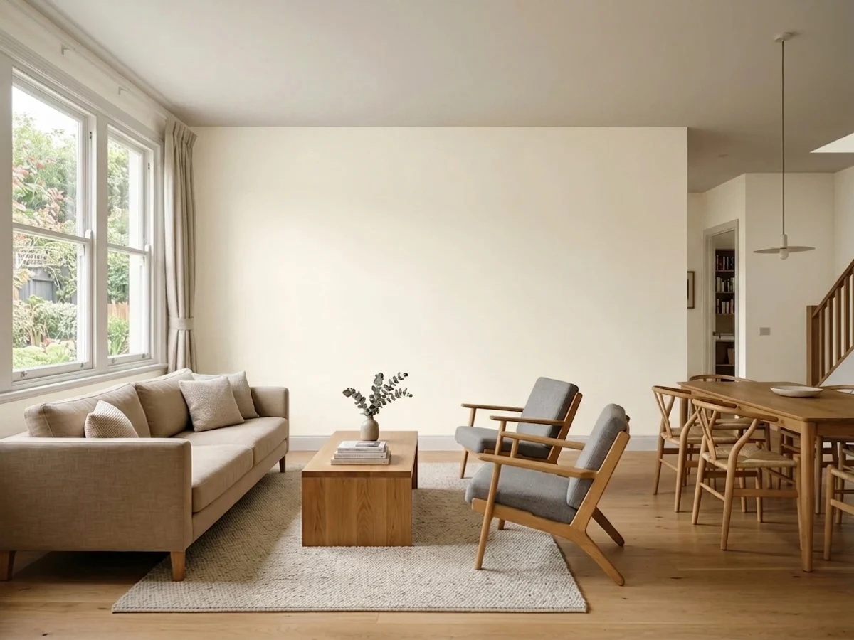
White Veil is Behr's palest cream white, and it is not the sheer, cool almost-nothing color its name suggests. At LRV 91 it photographs like a near-white, but on the wall the yellow-gold undertone is plain to see — warm, soft, a little honeyed. It is a genuinely likeable whole-house white in the right light; it is also a quiet, under-discussed color that most buyers find only by scrolling Behr's deck, not by reading a hundred reviews first.
Whole-house walls + trim in a room with real daylight · kitchens with brass, butcher block or warm stone · anyone who wants cream without committing to a deep ivory · shoppers comparing Behr's own warm-white lineup
You pictured a cool, sheer, almost-translucent white from the name alone · your trim or ceiling is staying a cooler white · your fixtures are chrome or brushed nickel · your counters are cool gray quartz or marble
- Soft, finished cream white — warm without going butter-yellow
- LRV 91 keeps rooms genuinely bright despite the warmth
- Flatters brass, oak, butcher block and warm stone
- One-color rooms (walls + trim + ceiling) avoid its one real trap
- A dependable, low-drama Behr option once you know what it actually is
- The name promises a cool sheer white; the paint is a confident warm cream
- Reads dated next to a cooler white on trim or ceiling
- Clashes with chrome, brushed nickel and cool gray stone
- Little real-world documentation online — you are largely sampling blind
What Color Is White Veil, Really?
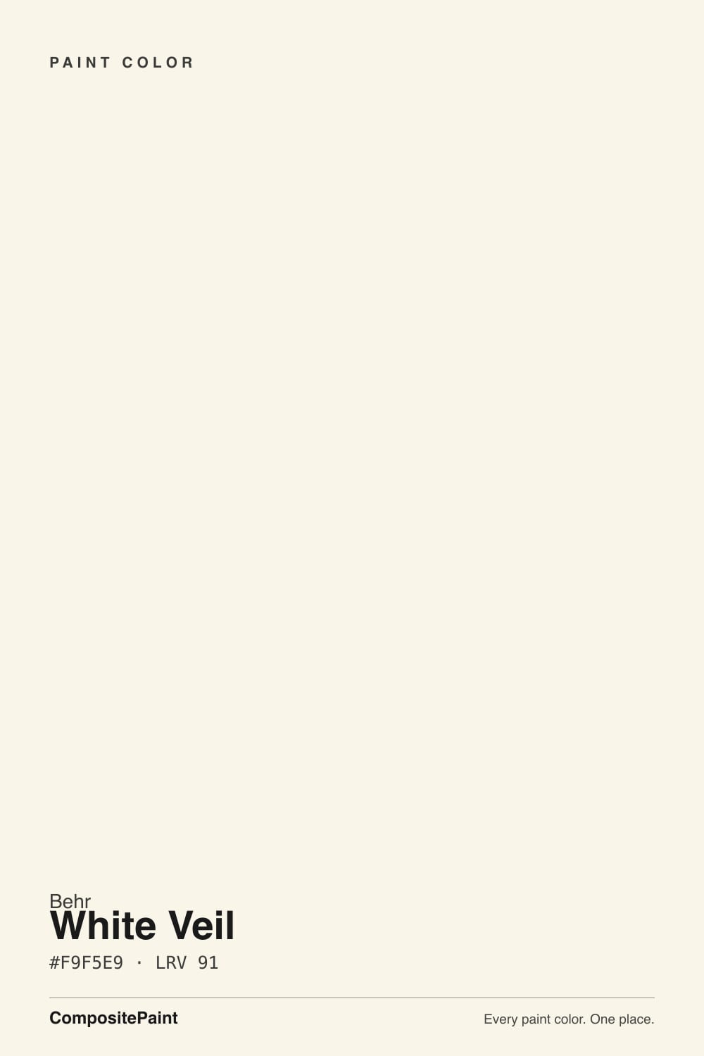
White Veil is a pale cream white built on a real yellow-gold undertone — not a hint of warmth, an actual one. Behr's own marketing leans on lace-and-wedding-gown imagery, which sets up the one expectation this color does not meet: "veil" suggests something sheer, cool, barely-there. What lands on the wall is closer to a soft honey cream, gentle but unmistakably golden once it is next to anything cooler. It is a good color; it is just not the color its name is selling.
At LRV 91 it sits among the brightest whites in any deck — close to Behr's own Ultra Pure White (LRV 92) and Benjamin Moore's Chantilly Lace (LRV 92) — which is exactly why the undertone surprises people. A color this pale should read nearly neutral, the way Ultra Pure White does; White Veil holds onto its gold instead, because the base leans yellow rather than gray. Put a sample next to Ultra Pure White and the gap is immediate: Ultra Pure White is crisp and slightly cool, White Veil is soft and clearly cream.
Undertone in one line: warm yellow-gold, plainly — never pink, never gray, never the cool sheer white the name implies. If your sample looks flat or slightly dull, that is a dim room pulling the warmth out, not a different undertone hiding underneath.
Where It Shines
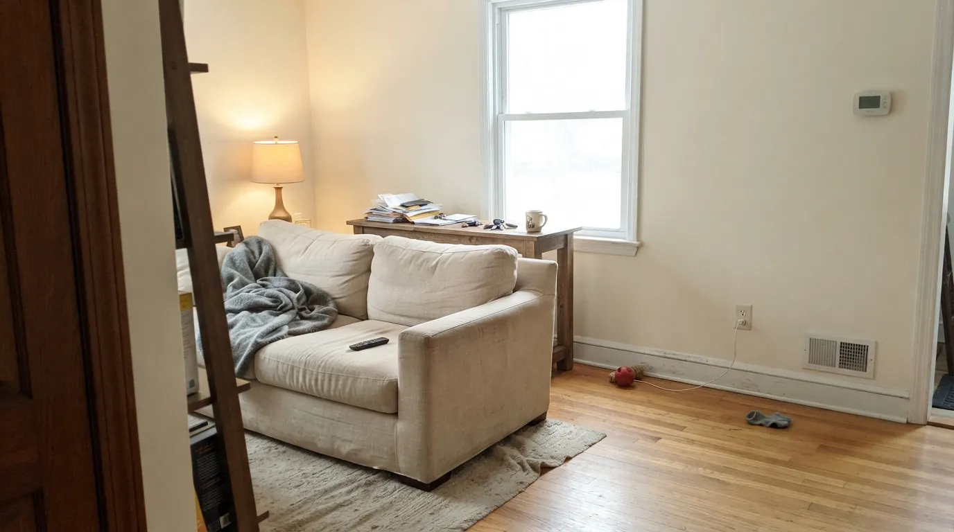
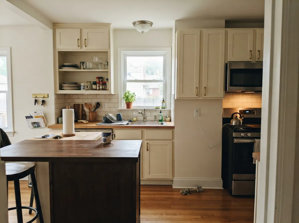
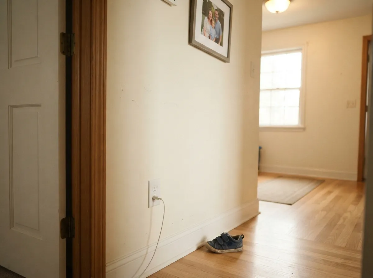
Give it real daylight and it earns its keep as a soft, finished whole-house white — the cream comes forward without tipping into a loud butter-yellow, which is the trap most creamy whites fall into. Kitchens are where it works hardest: against brass hardware, butcher block and warm oak it looks intentional and a little expensive, the way a well-chosen cream always does. Because so few reviews exist for this specific color, most of what you will find of it online is in kitchen and cabinet photos — that is genuinely its best use.
Where It Fails
The complaints that exist for White Veil follow one of three scripts, and all three trace back to the same root cause: the name promises something cooler and quieter than the paint actually is.
The name sells a barely-there bridal white. The paint is a confident warm cream. If you bought it sight-unseen based on the name, the gold on the wall reads as a surprise, not a subtlety — sample it before you commit a whole room.
Pair White Veil walls with a cooler trim white — Behr Ultra Pure White, Polar Bear, anything marketed as "bright" — and the gold looks dated by comparison, almost yellowed. The fix is the one-color rule: walls, trim and ceiling all in White Veil, separated by sheen, not by a different white.
Cool stone and cool metal sit at the opposite temperature and pull the gold forward until it reads more like an aged, slightly yellowed white than a fresh cream. With cool countertops or chrome plumbing, choose a more neutral white instead.
Room by Room
With real daylight and warm floors it reads calm and finished, not stark. Eggshell on walls, same color on trim in semi-gloss to avoid the cool-trim clash.
Brass hardware, butcher block, warm stone: all of it loves White Veil. Satin cabinet enamel wipes clean and the gold undertone hides fingerprints better than a stark white would.
Under 2700K lamps it goes gently golden and cozy at night. If the room is north-facing and dim, expect it to look flatter than the sample promised.
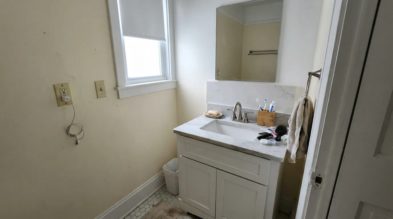
With warm brass and wood vanities: lovely. With chrome, brushed nickel or cool gray tile: the gold starts to look off rather than warm — test big before committing.
White Veil trim under a mid-tone warm wall color works well. Using it as trim against a cooler wall white is the one pairing to avoid — pick one temperature and stay there.
Full sun reads it brighter than indoors and the gold softens rather than glares. Pair with a dark warm trim (near-black, not blue-black) rather than cool charcoal.
Your Light Is the Risk
The cream glows softly and evenly all day without turning loud. The most forgiving light for this color by far.
Cool, gray daylight flattens the warmth and can leave the color looking dull rather than creamy. Sample it in the actual room first.
Golden at the sun hours, quieter and softer the rest of the day. The shift is gentle, not a different color.
2700K lamps deepen the gold and make it feel warm and inviting. Cool LEDs fight the undertone and can make it look slightly murky — swap the bulbs before you blame the paint.
Most complaints about White Veil are a light mismatch. Upload a photo of your actual room and see it on your walls — then ask for the same wall in north light or evening lamps before you buy a single sample.
Need It From Another Brand?
Any paint counter can custom-tint Behr OR-W14 directly. If you would rather stay in one brand's own deck, these are the closest stock matches, measured as ΔE2000. Under 2 is a difference you will not see on the wall.
| Brand | Closest color | ΔE | LRV | |
|---|---|---|---|---|
| Sherwin-Williams | Roman ColumnSW 7562 · Sherwin-Williams | 0.2 | 88 | Color page → |
| Benjamin Moore | Butter Pecan2165-70 · Benjamin Moore | 0.8 | 86 | Color page → |
| Valspar | Crème de la CrèmeT660 · Valspar | 1.0 | 87.8 | Color page → |
| PPG / Glidden | White ChipPPG15-06 · PPG / Glidden | 1.2 | 87 | Color page → |
| Glidden | Linwood Beach White71YY 87/078 · Glidden | 1.4 | 87 | Color page → |
| Dutch Boy | Aged Marble006W · Dutch Boy | 0.2 | 87 | Color page → |
Similar Behr Colors
The nearest shades to White Veil within Behr's own range, ranked by perceptual color distance — useful when you want the same look a touch lighter, darker, or warmer.
WCAG 2.1: AA is 4.5 : 1 for normal text, 3 : 1 for large text, AAA is 7 : 1.
White Veil vs the Colors You're Also Considering
Every White Veil sample board has the same rivals on it. The numbers show the real lightness gap — then it comes down to which risk you would rather live with.
Pick this when you actually want the cream, not just a bright white with a pretty name.
Behr 1850 · LRV 92Ultra Pure WhitePick this if you want the crisp, barely-warm version of a near-white — it is the color most people picture when they hear "White Veil."
Pick this when you want more shine and more gold than a grayed-down white gives you.
Benjamin Moore OC-17 · LRV 85White DovePick this for the same warm-but-grounded idea with the yellow grayed out — the safer whole-house default.
Inside Behr, Calla Lily PWN-11 at #F9F4E8 and LRV 91 and Whipping Cream PWN-20 at #FAF5E7 and LRV 91 are effectively the same white on a wall. Clear Moon PWN-30 at LRV 92 is a touch brighter and cleaner, which makes it a workable trim white above White Veil walls.
Across brands, Dunn-Edwards Swiss Coffee DEW341 at hex #F8F5E9 sits at a deltaE of 0.49, a true match by color, although its published LRV is listed lower at 83. Sherwin-Williams Cheviot SW 9503 at LRV 89 and deltaE 1.05, Benjamin Moore Mountain Peak White 2148-70 at LRV 91 and deltaE 1.11, and Valspar Gauzy White V152 at LRV 91 and deltaE 1.11 all look identical in normal room light.
Farrow & Ball Wimborne White No. 239 at LRV 89 and deltaE 1.17 is the same story. Dutch Boy Ultra White 002W at LRV 91 and deltaE 2.88 is very close but cleaner and less creamy, so sample it first.
White Veil Coordinating Colors
The rule for coordinating with White Veil is the same as with any strongly warm white: stay warm, and keep cool metals and cool stone at a distance. It pairs easily with warm beiges, deep near-blacks and muted greens — and it argues with anything blue-gray or icy. These are the partners that keep the gold looking intentional instead of accidental:
A Quieter White Than Its Name Sells
White Veil does not have a Color of the Year story, a viral design-blog moment, or a famous room attached to it. It is a straightforward entry in Behr's warm-white lineup, and most of what exists about it online is product-page marketing copy rather than owner reviews — the imagery leans hard on a lace-and-wedding-gown idea that promises something sheer and cool.
That is worth knowing before you buy: the name sets an expectation of a barely-there, almost translucent white, and the actual paint is a confident, honeyed cream. Neither fact makes it a bad color — it is a genuinely usable warm white at a very high LRV — but it means you are sampling somewhat blind compared to a color with a hundred reviews and a dozen viral rooms behind it. Test a real sample on your actual wall before committing a whole house to it.
White Veil With Wood Tones and Floors
Warm wood is this color's best company. Oak, walnut and butcher block all sit comfortably against White Veil because the paint's gold undertone meets the wood's warmth halfway — if your floors lean orange, this is one of the few whites that will not fight them.
Cool gray-washed or LVP flooring is the pairing to test first. Cool floors pull the gold into sharper relief, and the walls can start to look slightly yellowed rather than creamy. It is not a dealbreaker in every room, but sample a large piece above the actual floor before committing.
Three Ready Palettes Built on White Veil
A color is never alone on the wall. These are complete combinations in the 60-30-10 pattern, with the reason each one holds together. Every one opens in the visualizer.
One color at two sheens sidesteps White Veil's one real trap — a cooler trim white making it look dated — and keeps the house reading as a single warm gesture. The near-black door supplies the one dark note the scheme needs.
Try this palette in your roomEven Better Beige and White Veil share the same warm family, so the wall-to-cabinet handoff stays quiet; the dark green-blue island gives the kitchen one grounded note without fighting the gold.
Try this palette in your roomCreamy Mushroom is a warm taupe close enough in temperature that White Veil trim never looks like a different white; the charcoal accent wall gives the room one deep, cozy anchor for lamp-lit evenings.
Try this palette in your roomWhite Veil FAQ
Is White Veil warm or cool?
Warm, plainly — despite a name that suggests something sheer and cool. It carries a real yellow-gold undertone rather than the grayed-out warmth of colors like White Dove. Sample it before assuming from the name.
Is it good for kitchen cabinets?
Yes — it is arguably its best use. It flatters brass, butcher block and warm stone, and the LRV 91 keeps the kitchen bright. It argues with cool gray quartz and chrome hardware, so match your fixtures to the paint, not the other way around.
What trim goes with White Veil walls?
White Veil itself, in semi-gloss. Any cooler white on the trim makes the walls look dated by comparison — the single most predictable mistake with this color. If you want contrast, go darker, not brighter or cooler.
Why don't I see many reviews of this color?
Honestly — it is not a heavily discussed color. It has no Color of the Year moment and no viral design-blog fame; it is a quiet, dependable entry in Behr's warm-white lineup that most people find while comparing swatches, not while reading reviews. That is not a red flag, just a reason to sample before you commit a whole room.
Does it work on exteriors?
Yes, especially in warm-climate sun, where the gold softens rather than glares. Pair it with a dark, warm-leaning trim — a near-black rather than a blue-black — to avoid a temperature fight on the facade.
How does it compare to Behr's other whites?
Ultra Pure White (LRV 92) is the crisp, barely-warm sibling most people expect from the "veil" name. Polar Bear (LRV 86) is Behr's plainer, more neutral everyday white. White Veil is the one to pick specifically when you want the gold, not despite it.
Have you painted with White Veil?
Rate it — one tap helps the next reader decide.
Ask a Question