Chard
A dark olive-forest green from Behr's everyday deck, reviewed honestly: the light where it glows, the light where it reads black, and what to pick instead.

Jessica has spec'd whites and neutrals for more than 300 rooms and keeps a sample wall of painted drawdowns in her studio. Every color review is checked against real reader rooms in the comments and re-tested when a formula changes. About the testing process →
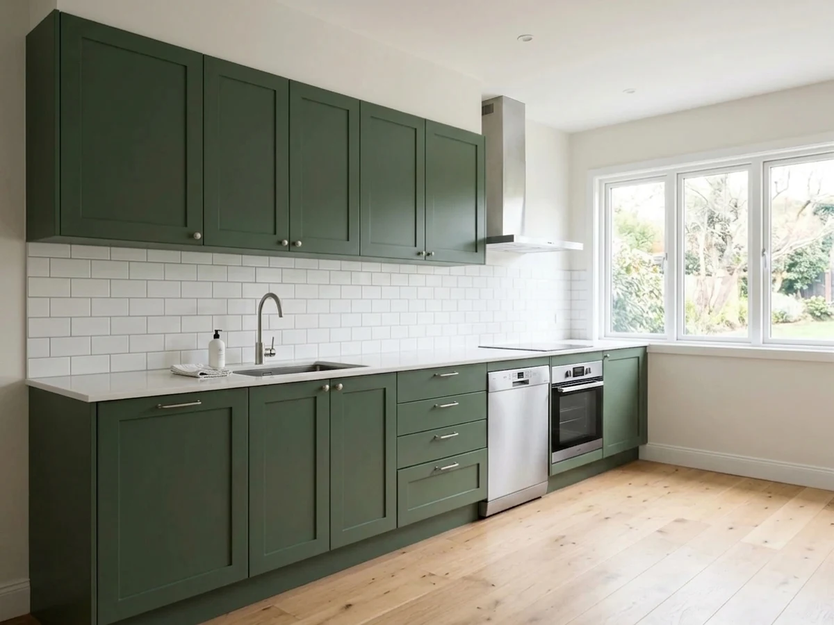
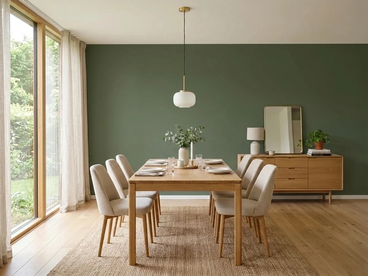
- 1English Ivy2
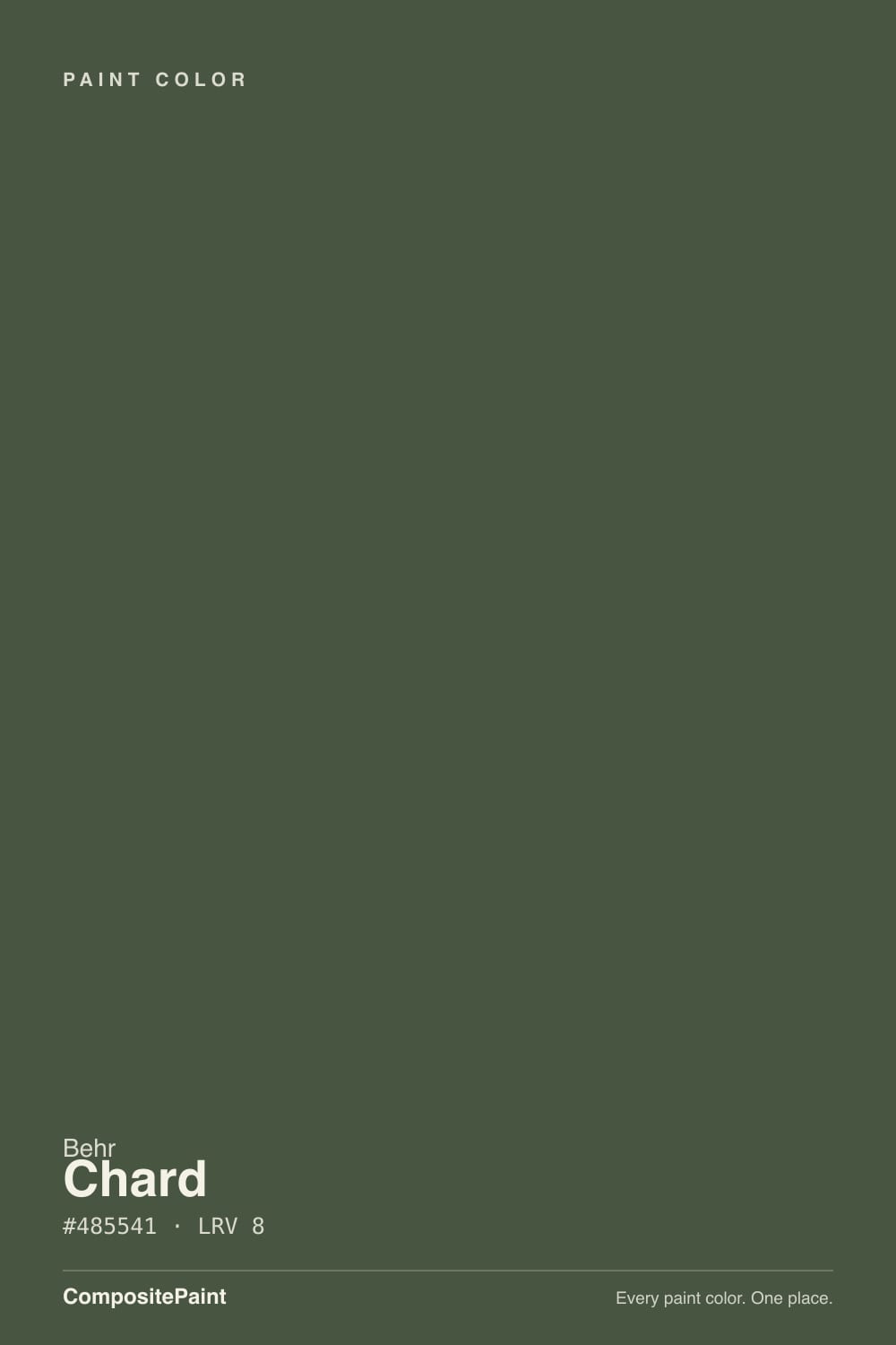
- 2Chard8
- 3Sage Green22
- 4Evergreen Fog30
The Fast Verdict
Chard is Behr's answer to the near-black greens other brands have famous versions of — Essex Green, Rosemary, Black Bean — except almost nobody has heard of it. At LRV 8 it sits right on the border between green and black: warm olive in real daylight, flat charcoal the moment the light drops. It has never had a Color of the Year moment or a viral kitchen, and that is fine — it does the one job a deep utility green needs to do, holding its color on a cabinet or a door without turning muddy or blue.
Kitchen islands and cabinets · front doors and shutters · dens and home offices that want depth · anyone who wants a dark green without the trendy blue-sage lean
Your room faces north with no lamps · you pictured a bright, leafy green because of the name · your counters or stone are cool gray · you need the wall to still read green after sunset
- A genuinely warm forest-olive green, not the trendy blue-sage everyone else sells
- Reads rich and expensive on a kitchen island or front door in real light
- Deep enough (LRV 8) to work as a near-black alternative with more personality
- Flatters brass, walnut, and warm wood without a fight
- An honest deck workhorse — no hype, no trend-chasing, just a dependable dark green
- Reads flat black, not green, in any room without real daylight or a lamp
- The name suggests a bright leafy green; the paint is nearly the opposite
- Fights cool gray stone and quartz
- Too dark for a whole-room color unless the room gets real light
What Color Is Chard, Really?
The name is the first surprise: Swiss chard the vegetable is a bright, saturated leafy green, but Behr's Chard is nearly the opposite — a dark, muted olive-forest green sitting close to black. The math explains the character: its deck RGB is 72 red, 85 green, 65 blue. Green leads, but blue trails furthest behind, which is what keeps the color warm and yellow-leaning rather than pulling toward the cooler blue-teal greens so many current 'sage' colors chase. It reads as a forest at dusk, not a garden bed.
At LRV 8 this is a genuinely dark color — in the same near-black neighborhood as Benjamin Moore Wrought Iron (LRV 6) or Sherwin-Williams Iron Ore (LRV 6), except green instead of neutral. That depth is the whole trade-off: it gives Chard real presence on a cabinet or a door, but it also means the color needs actual light to prove it isn't black. In a shadowed corner, it just isn't going to volunteer its green.
Undertone in one line: warm olive-green, leaning yellow, never blue and never a true neutral black. If your sample reads flat charcoal with no hint of green, that's the room's light being cool or dim — not a different can of paint.
Where It Shines
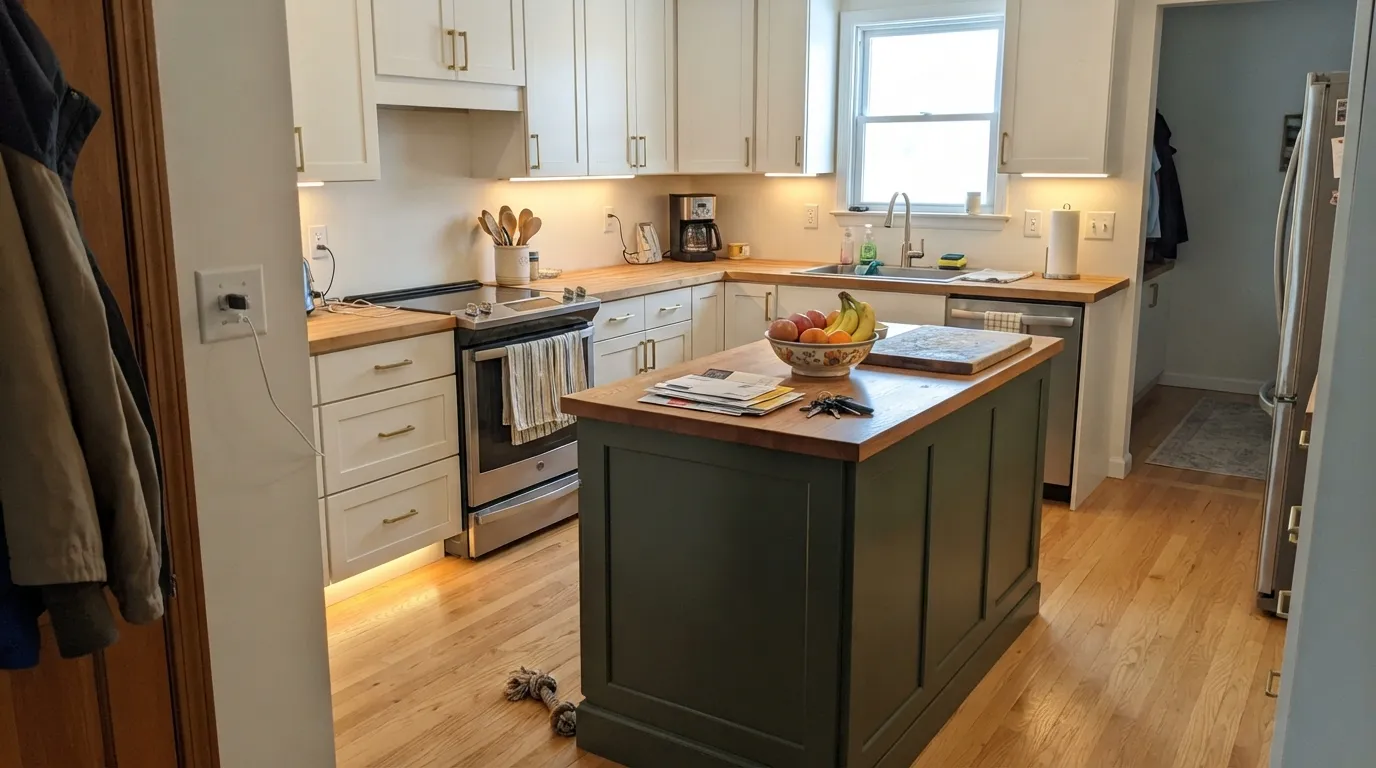
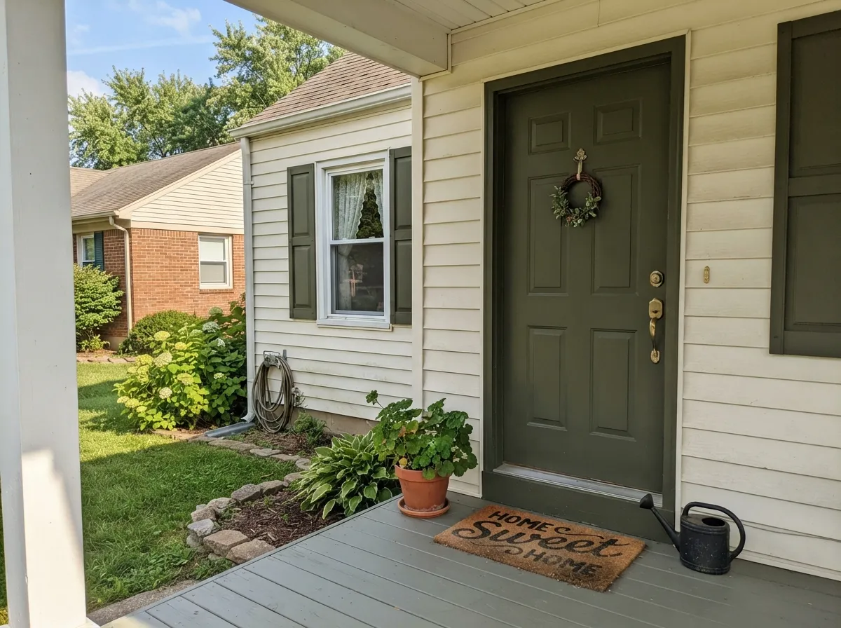
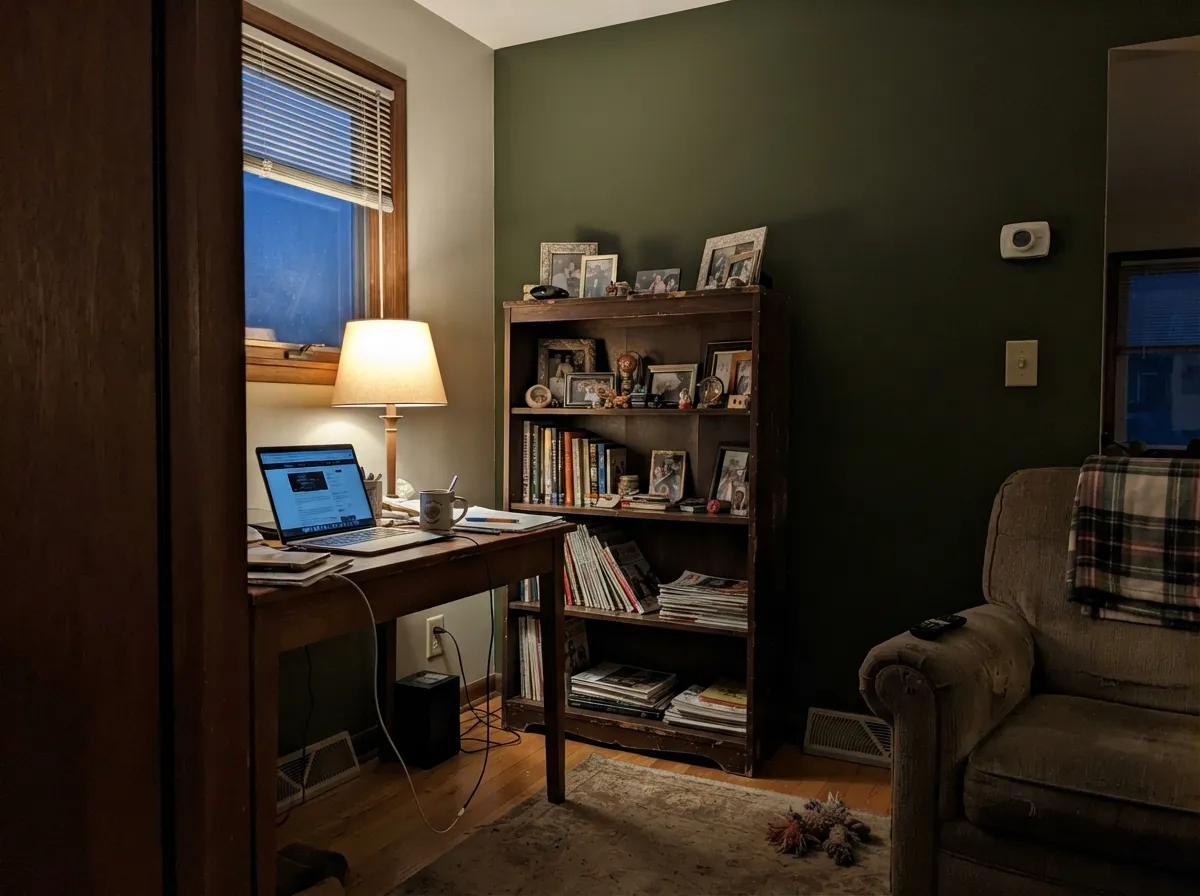
Give it a lit kitchen island, a sunlit front door, or a lamp-lit den with walnut and brass, and Chard reads like a serious, expensive dark green — the kind of color a paint counter reaches for when a client says 'I want black cabinets, but not literally black.' Real daylight or a dedicated fixture is non-negotiable here; this is not a color that shows up on its own in a dim corner.
Where It Fails
Almost every disappointing story with Chard comes down to one of three mismatches, and each one is predictable before the first coat goes on.
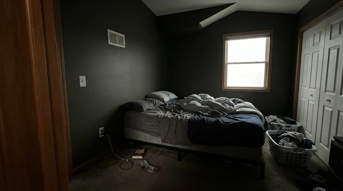
Cut the daylight and Chard's olive drains out fast — at LRV 8 it is already close to black, and cool, indirect daylight pushes it the rest of the way. Readers expecting a green feature wall end up with a flat, characterless dark instead. Add real fixture light, or step up to a shallower green like Sherwin-Williams Rosemary (LRV 12) that forgives more.
Chard's undertone is warm and yellow-leaning, so cool blue-gray countertops or marble make the pairing read muddy rather than sophisticated. It wants warm stone, butcher block, or a plain white counter — not anything blue-gray.
Swiss chard the plant is bright, saturated leafy green. Behr's Chard is a near-black olive at LRV 8 — closer to a forest at dusk than a garden bed. If the name is what sold you, this will surprise you on the wall; Behr's own brighter greens (Urban Nature, Sage Brush) are the ones that actually look like the vegetable.
Room by Room
Perimeter cabinets in a warm white, island in semi-gloss Chard, brass or matte-black pulls: the classic two-tone kitchen move, and Chard's warm olive keeps it from reading cold or trendy-blue the way many current 'sage' kitchens do.
A full-sun front door reads a rich, confident green; a shaded porch reads almost black. Both can look good, but know which one you're actually getting — check the door at the hour of day you'll see it most before committing a gallon.
Under a warm desk lamp and walnut shelving it turns moody and expensive. Skip it if the room only gets overhead cool LED light with no accent lamp to warm it up.
A full room of Chard needs more daylight than most bedrooms get. Used as a single wall behind the headboard, with warm lamps on either side, it reads intentional instead of cave-like.
On a vanity with brass fixtures and a light-colored counter it's a confident small-room move. On all four walls of a windowless bath it just disappears into black.
As a whole-house color it reads nearly black from the street except in direct sun. It is a much stronger door, shutter, or trim color than a siding color.
Your Light Is the Risk
Direct sun or a well-lit kitchen shows the true warm olive-green — this is the light Chard needs to prove it isn't black.
Cool, indirect daylight with nothing to warm it up reads Chard as flat charcoal-black. Sample it in the actual room before committing to four walls.
Warmer and greener at the sun hours, quieter and darker the rest of the day — normal behavior for a color this deep.
2700K lamps keep a trace of green visible after dark; cool white LEDs flatten it into near-black. Warm bulbs are part of this paint job, not optional.
Most complaints about Chard are a light mismatch. Upload a photo of your actual room and see it on your walls — then ask for the same wall in north light or evening lamps before you buy a single sample.
Need It From Another Brand?
Any paint counter can custom-tint Behr MQ6-49 directly. If you would rather stay in one brand's own deck, these are the closest stock matches, measured as ΔE2000. Under 2 is a difference you will not see on the wall.
| Brand | Closest color | ΔE | LRV | |
|---|---|---|---|---|
| Sherwin-Williams | Vogue GreenSW 65 · Sherwin-Williams | 1.6 | 9 | Color page → |
| Benjamin Moore | ChimichurriCSP-810 · Benjamin Moore | 1.9 | 8 | Color page → |
| Valspar | Treeline5006-4C · Valspar | 1.7 | 8.9 | Color page → |
| PPG / Glidden | Pine ForestPPG1134-7 · PPG / Glidden | 2.5 | 7 | Color page → |
| Glidden | Pine ForestPPG1134-7 · Glidden | 2.3 | 8 | Color page → |
| Dutch Boy | Jolly Holly326-7DB · Dutch Boy | 1.8 | 9 | Color page → |
Similar Behr Colors
The nearest shades to Chard within Behr's own range, ranked by perceptual color distance — useful when you want the same look a touch lighter, darker, or warmer.
WCAG 2.1: AA is 4.5 : 1 for normal text, 3 : 1 for large text, AAA is 7 : 1.
Chard vs the Colors You're Also Considering
Every Chard sample board has the same rivals on it. The numbers show the real lightness gap — then it comes down to which risk you would rather live with.
Pick this when you want a dark green that keeps a little more visible color indoors — Chard's higher LRV gives it slightly more room to breathe.
Benjamin Moore PM-22 · LRV 4Essex GreenPick this for even more depth on an exterior door or shutters — it goes darker still and reads black indoors without hesitation.
Pick this for the warmer, more muted olive that sits easier next to honey and walnut wood tones.
Benjamin Moore 2044-10 · LRV 9GreenPick this for a bluer, more saturated jewel-green with the same cabinet strength.
Chard Coordinating Colors
The rule with Chard: stay warm. It pairs cleanly with warm whites, warm woods, and other earth tones near its own depth, and it fights cool grays and blue-whites. These are the partners that keep it looking deliberate rather than accidental:
Chard's Story: A Deck Workhorse, Not a Headline Color
There is no famous Chard moment to report here — no Color of the Year run, no viral kitchen photo, no designer quote. It sits in Behr's everyday deck alongside dozens of other near-black greens (Black Bamboo, Secluded Woods, North Woods among them), sold in flat interior/exterior formulas and in a semi-gloss cabinet, door and trim enamel — which tells you exactly what job Behr expects it to do: cabinets, doors, and trim, not a starring wall role.
That honest obscurity is not a knock. A color doesn't need a marketing campaign to be a good, dependable dark green — it just needs to behave the same way every time someone mixes a gallon, and by every account it does. If you found Chard by sampling swatches at the store rather than reading about it online first, that is exactly how a workhorse color is supposed to get discovered.
Chard With Wood Tones and Metals
Warm woods are the natural partner: walnut, oak, and butcher block all sit comfortably against Chard's yellow-leaning olive, and the paint reads richer rather than competing with the wood's warmth. Cool, gray-washed wood is the one flooring or shelving choice that fights it — the mismatch reads as muddy rather than intentional.
Metals split cleanly: unlacquered brass and matte or oil-rubbed black hardware both look intentional against Chard, echoing its warmth or its depth respectively. Polished chrome and bright nickel are the two finishes that read cold and slightly out of place next to it.
Three Ready Palettes Built on Chard
A color is never alone on the wall. These are complete combinations in the 60-30-10 pattern, with the reason each one holds together. Every one opens in the visualizer.
White Dove's warm neutral doesn't fight Chard's olive lean the way a cool white would, so the two-tone kitchen reads calm instead of contrasty. Wrought Iron's soft near-black ties the metal fixtures back to the island without competing with the green.
Try this palette in your roomA warm-white siding keeps the olive green from reading black against the house the way a cool white would. Kendall Charcoal grounds the roofline in the same value range as Chard without pulling attention away from the door.
Try this palette in your roomTaupe sits at the same LRV as Chard, so the room reads as two rich earth tones working together instead of one dark green cave. White Dove trim keeps the edges soft where the two darks meet.
Try this palette in your roomChard FAQ
Is Chard green or black?
Green — but only in real light. At LRV 8 it is genuinely dark, and in a dim or north-facing room it can read as flat charcoal-black. Give it daylight or a warm lamp and the olive-green comes through clearly.
What white goes with Chard?
A warm white — White Dove or Behr's own Swiss Coffee are the safe defaults. A stark, cool-blue white makes Chard look muddier by contrast; warm whites let the olive undertone stay the star.
Is Chard good for kitchen cabinets?
Yes, especially on an island against warm-white perimeter cabinets — it's sold in a semi-gloss cabinet, door and trim enamel specifically for this kind of job. Use it with brass or matte-black hardware and give it real kitchen light.
Can I use Chard on a front door or exterior?
Yes — it's a classic dark green door and shutter color. Check it in the light the door actually gets: full sun shows a rich green, a shaded north-facing porch will read it much closer to black.
Will Chard work in a north-facing room?
Be cautious. Without direct sun or warm lamps, Chard's green drains out fast at this depth and the wall reads as a flat dark neutral instead. Sample a large board in the actual room before committing to four walls.
How is Chard different from Essex Green or Rosemary?
All three are dark, warm-leaning greens, but they sit at different depths. Essex Green (LRV 4) is darker and reads black indoors even more readily; Rosemary (LRV 12) is a step lighter and more forgiving in average light. Chard sits between them — dark enough for real drama, with just enough LRV to still show color with decent light.
Have you painted with Chard?
Rate it — one tap helps the next reader decide.
Ask a Question