Teal Study Palette — Deep Teal & Warm Oak
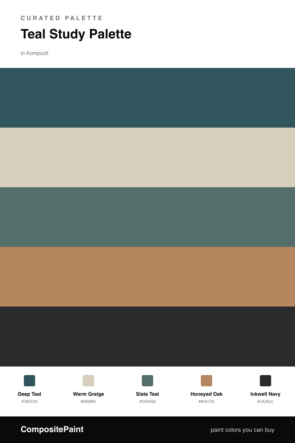
A composed five-color study scheme led by deep teal, softened with a warm greige backdrop, crisp white trim, honeyed oak, and a moody ink accent — every color matched to real paint you can buy.
By Jessica Williams · Color Stylist & Interior Editor
A study should feel like a held breath, and teal does that better than almost any color. Deep Teal on the walls reads calm and focused — cool enough to settle your shoulders, green enough to feel alive. It is the kind of shade that looks expensive in lamplight and grounded in morning sun.
Around it, Warm Greige softens the trim and ceiling so the teal never feels boxed in, and Slate Teal on built-ins or a vanity gives you a tonal step that reads considered rather than matchy. Honeyed Oak is the warmth the whole scheme leans on — bring it in through a desk, shelving, or floors so the cool walls have something to hold hands with.
For the final note, Inkwell Navy is your anchor. Use it sparingly — a single painted nook, the inside of a bookcase, or a door — and it pulls the whole study into focus. It feels quietly modern, which is exactly where 2026 interiors are headed.
Buy These Colors
Each color matched to the closest real paint in every brand, by ΔE2000. Kompozit first; take any SKU to the store — these mix on demand.
Questions
Teal is restful and slightly cool, so it quiets the mind without feeling cold the way a flat blue can. That makes it easy to think and read against, and the warm oak and greige keep the room from tipping into chilly.
Let the deep teal lead the walls, then use the greige and white for trim and ceiling so the room can breathe. Save the inkwell navy for one grounding moment — a built-in, a desk wall, or the back of a shelf.
Similar Palettes
Closest schemes by color — not by label.