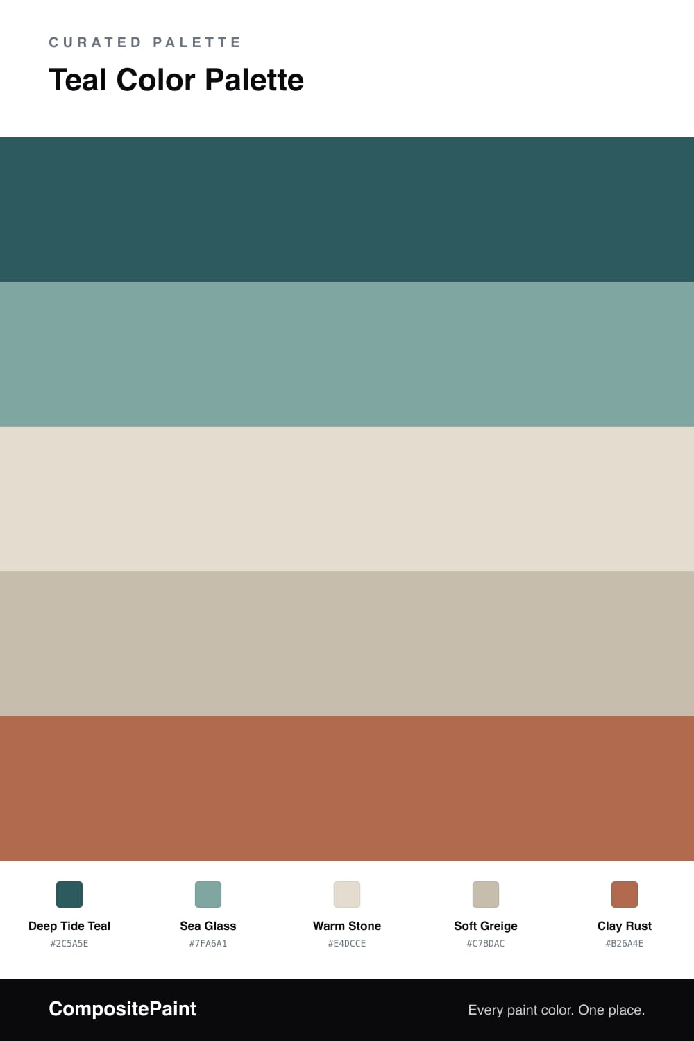
Teal Color Palette — Quiet Tide
A calm five-color scheme led by a deep teal, softened by warm stone neutrals and grounded with a single clay accent — every color matched to real paint you can buy.
By Jessica Williams · Color Stylist & Interior Editor
Teal has quietly become one of the most lived-in colors of 2026 — deep enough to feel grounding, soft enough to live with every day. This scheme leans into that with Deep Tide Teal as the anchor, a shade that reads almost like a deep forest in low light and turns clearly blue-green when the sun hits it.
Around it, Sea Glass carries the same family at a lighter, airier volume, while Warm Stone and Soft Greige do the quiet work of keeping the whole thing from feeling cold. Those warm neutrals are the trick here — they let the teal stay rich without tipping into a chilly, clinical feel.
The one thing I would not skip is the Clay Rust accent. A little earthy warmth against all that cool teal is what makes the palette feel current rather than expected. Use it sparingly and let the teal stay the star.
Buy These Colors
Each color matched to the closest real paint in every brand, by ΔE2000. Tap a swatch for its full guide or + to save it — take any SKU to the store, they mix on demand.
Questions
Teal sits right between blue and green, so it carries the quiet of both. Pairing it with warm stone neutrals keeps the cool tone from feeling chilly, and the single clay accent adds just enough warmth to feel grounded rather than sterile.
Let the deep teal lead at roughly two-thirds, with the stone and greige neutrals filling the rest. Keep the clay rust to small doses — a chair, a vase, a throw — so it reads as a spark instead of a second lead.
Similar Palettes
Closest schemes by color — not by label.