CP

Teal Color Palette — Teal Ember

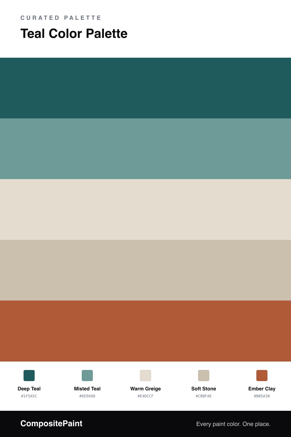
A teal-led five-color scheme that pairs deep teal with soft greige and a warm ember accent, every color matched to real paint you can buy.

By Jessica Williams · Color Stylist & Interior Editor

Teal has a way of feeling both grounded and a little bit cool, and this scheme leans all the way into that. Deep Teal carries the room as the dominant color, with Misted Teal softening the edges where you want the same family but quieter — think trim, a built-in, or the back of a shelf.

The middle of the palette stays gentle. Warm Greige and Soft Stone are the neutrals that let the teal breathe, and they keep everything from tipping too cold. That warmth matters here, because it sets up the one spark.

Ember Clay is that spark. A single warm, earthy clay against all that teal feels current for 2026 — confident but lived-in. Use it sparingly and let it glow.

View palette in
Deep Teal
Dominant
Benjamin Moore Oasis Blue · 2049-20
#225A5D
LRV 8
Misted Teal
Secondary
PPG / Glidden Wright Echo Blue · FLLW741
#6D9A9B
LRV 29
Warm Greige
Base
Sherwin-Williams Pacer White · SW 6098
#E5DDD0
LRV 73
Soft Stone
Support
Sherwin-Williams Sandbar · SW 7547
#CBBFAD
LRV 53
Ember Clay
Accent
Benjamin Moore Pilgrimage Foliage · 2175-20
#AD5935
LRV 16

Buy These Colors

Each color matched to the closest real paint in every brand, by ΔE2000. Tap a swatch for its full guide or + to save it — take any SKU to the store, they mix on demand.

Deep Teal
#1F5A5C · LRV 8 · Dominant
Sherwin-Williams · SW 6496 · ΔE 6.63
Behr · S450-7A · ΔE 2.36
Benjamin Moore · 2049-20 · ΔE 0.75
Valspar · 8002-37G · ΔE 2.37
PPG / Glidden · PPG1146-7 · ΔE 1.81
Glidden · PPG1146-7 · ΔE 1.83
Dutch Boy · 234-7DB · ΔE 6.46
HGTV Home by Sherwin-Williams · HGSW 2331 · ΔE 6.63
Dunn-Edwards · DEFD38 · ΔE 2.96
Magnolia Home · JG-82 · ΔE 7.13
Farrow & Ball · NO. 35 · ΔE 11.64
Diamond Vogel · 0690 · ΔE 3.28
Hirshfield's · 0669 · ΔE 6.02
Rodda · R078 · ΔE 10.73
C2 Paint · C2-693 · ΔE 9.85
Clare · PNT100-MD-40 · ΔE 7.8
Portola Paints · LOST HIGHWAY · ΔE 12.08
Annie Sloan · AUBUSSON BLUE · ΔE 10.61
Backdrop · BD-WK · ΔE 15.87
Rust-Oleum · 391445 · ΔE 9.51
Kompozit · 0669 · ΔE 6.02
Misted Teal
#6E9A98 · LRV 29 · Secondary
Sherwin-Williams · SW 20 · ΔE 2.31
Behr · MQ6-06 · ΔE 2.35
Benjamin Moore · 677 · ΔE 1.45
Valspar · 5002-4A · ΔE 3.51
PPG / Glidden · FLLW741 · ΔE 1.34
Glidden · PPG1146-5 · ΔE 1.34
Dutch Boy · 332-5DB · ΔE 3.65
HGTV Home by Sherwin-Williams · HGSW 2323 · ΔE 3.65
Dunn-Edwards · DET552 · ΔE 2.69
Magnolia Home · JG-02 · ΔE 6.8
Farrow & Ball · NO. 14 · ΔE 6.25
Diamond Vogel · 0688 · ΔE 3.56
Hirshfield's · H0078 · ΔE 3.09
Rodda · R081 · ΔE 9.56
C2 Paint · C2-712 · ΔE 3.33
Clare · PNT100-MD-75 · ΔE 3.86
Portola Paints · BLUE HERON · ΔE 9.86
Annie Sloan · PROVENCE · ΔE 3.68
Backdrop · BD-PW · ΔE 10.83
Rust-Oleum · 285141 · ΔE 12.2
Kompozit · 0499 · ΔE 6.52
Warm Greige
#E4DCCF · LRV 72 · Base
Sherwin-Williams · SW 6098 · ΔE 0.23
Behr · HDC-CT-05 · ΔE 0.9
Benjamin Moore · 1023 · ΔE 0.99
Valspar · 6005-1A · ΔE 0.53
PPG / Glidden · PPG1097-2 · ΔE 1.06
Glidden · PPG1102-2 · ΔE 2.25
Dutch Boy · 441-1DB · ΔE 0.23
HGTV Home by Sherwin-Williams · HGSW 4044 · ΔE 1.02
Dunn-Edwards · DEC749 · ΔE 2.93
Magnolia Home · JG-108 · ΔE 0.68
Farrow & Ball · NO. 291 · ΔE 1.72
Diamond Vogel · 0223 · ΔE 1.74
Hirshfield's · 0229 · ΔE 1.44
Rodda · CA024 · ΔE 1.15
C2 Paint · C2-850 · ΔE 0.64
Clare · PNT100-LT-19 · ΔE 2.18
Portola Paints · GEM · ΔE 2.58
Annie Sloan · OLD OCHRE · ΔE 8.49
Backdrop · BD-CC · ΔE 4.24
Rust-Oleum · 285142 · ΔE 9.95
Kompozit · 0229 · ΔE 1.44
Soft Stone
#CBBFAE · LRV 53 · Support
Sherwin-Williams · SW 7547 · ΔE 0.43
Behr · T12-14 · ΔE 0.5
Benjamin Moore · 996 · ΔE 0.84
Valspar · 6006-1B · ΔE 0.93
PPG / Glidden · PPG1023-3 · ΔE 1.78
Glidden · PPG1023-3 · ΔE 1.63
Dutch Boy · 420-2DB · ΔE 1.15
HGTV Home by Sherwin-Williams · HGSW 3506 · ΔE 1.15
Dunn-Edwards · DEC752 · ΔE 0.89
Magnolia Home · JG-109 · ΔE 1.49
Farrow & Ball · NO. 211 · ΔE 1.89
Diamond Vogel · 0188 · ΔE 1.7
Hirshfield's · 0183 · ΔE 1.83
Rodda · CA034 · ΔE 0.49
C2 Paint · C2-800 · ΔE 2.23
Clare · PNT100-LT-09 · ΔE 7.98
Portola Paints · TOPANGA · ΔE 3.79
Annie Sloan · PARIS GREY · ΔE 6.73
Backdrop · BD-BG · ΔE 11.44
Rust-Oleum · 285143 · ΔE 11.31
Kompozit · 0183 · ΔE 1.83
Ember Clay
#B05A38 · LRV 17 · Accent
Sherwin-Williams · SW 7703 · ΔE 2.76
Behr · M210-7 · ΔE 1.51
Benjamin Moore · 2175-20 · ΔE 1.03
Valspar · P045 · ΔE 2.63
PPG / Glidden · PPG1191-7 · ΔE 2.81
Glidden · PPG1199-7 · ΔE 1.84
Dutch Boy · 208-6DB · ΔE 2.25
HGTV Home by Sherwin-Williams · HGSW 2101 · ΔE 3.85
Dunn-Edwards · DE5153 · ΔE 4.15
Magnolia Home · JG-36 · ΔE 3.24
Farrow & Ball · NO. 9916 · ΔE 6.89
Diamond Vogel · 1053 · ΔE 3.79
Hirshfield's · 1039 · ΔE 1.45
Rodda · CA224 · ΔE 6.65
C2 Paint · C2-584 · ΔE 3.79
Clare · PNT100-DP-29 · ΔE 9.54
Portola Paints · ZION · ΔE 9.2
Annie Sloan · EMPERORS SILK · ΔE 15.71
Backdrop · BD-BH · ΔE 13.57
Rust-Oleum · 329211 · ΔE 12.07
Kompozit · 1039 · ΔE 1.45

Questions

Why does this palette work together?

Teal sits across the wheel from warm clay, so the two lift each other. The greige and stone neutrals sit between them and keep the contrast feeling calm instead of busy.

How do I balance these colors in a room?

Let teal lead at roughly 70 percent, keep the neutrals as your quiet middle, and save the ember clay for small moments like a chair, a pillow, or a single piece of art.

KEEP EXPLORING

Similar Palettes

Closest schemes by color — not by label.