CP

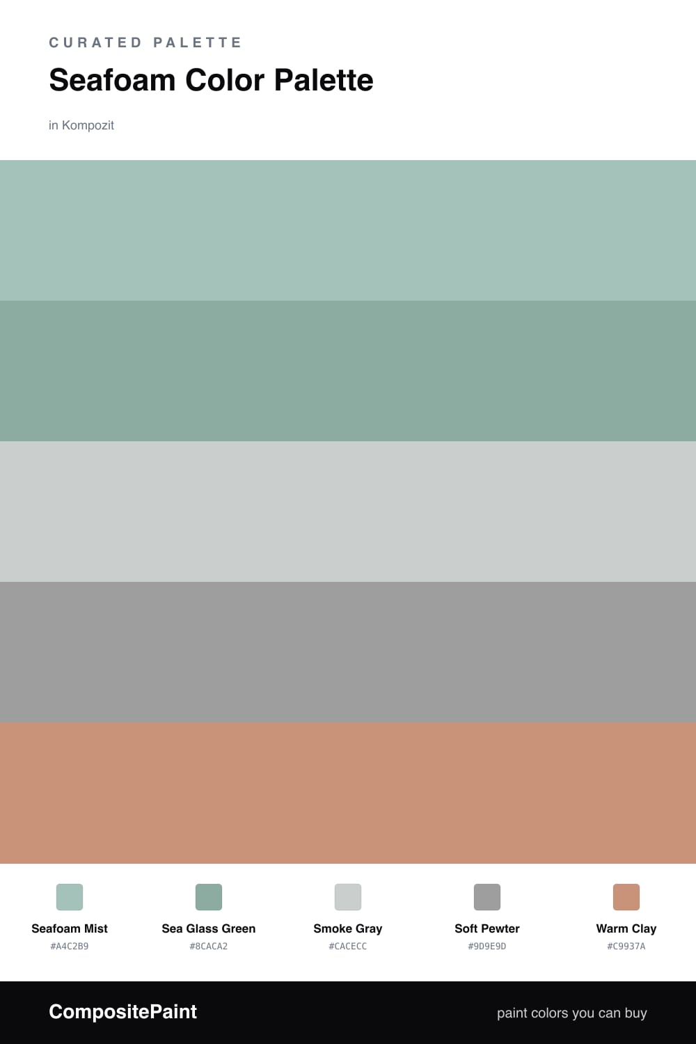
Seafoam Color Palette — Seafoam Smoke

A calm five-color scheme led by soft seafoam green, cooled with smoky grays and warmed by a quiet clay accent — every color matched to real paint you can buy.

By David Chen · Formulation Lead & Resident Chemist

Seafoam Mist
Dominant
Kompozit Plunge · 0701
#A4C2B9
LRV 50
Sea Glass Green
Secondary
Kompozit Peg's Promise · 0702
#8CACA2
LRV 38
Smoke Gray
Base
Kompozit Nomadic Travels · 0524
#CACECC
LRV 61
Soft Pewter
Support
Kompozit Smoky Tone · 0541
#9D9E9D
LRV 34
Warm Clay
Accent
Kompozit Money Tree · 0037
#C9937A
LRV 35
View palette in

Think of seafoam as a green that already has a thumbprint of gray pressed into it. That shared undertone is why this palette holds together so easily. Seafoam Mist leads, with Sea Glass Green stepping in as a slightly deeper version of the same idea, so the eye reads them as one soft wash rather than two separate colors.

The neutrals do the patient work here. Smoke Gray keeps the walls light and airy, while Soft Pewter adds just enough weight to anchor furniture and trim. Because both grays are cool and quiet, they let the seafoam stay the star without ever shouting.

The move that makes this feel current is the Warm Clay accent. A pinch of earthy terracotta against all that cool green is a very 2026 instinct — it warms the room up fast and stops the scheme from drifting into something sterile. Use it sparingly and let the seafoam breathe.

Buy These Colors

Each color matched to the closest real paint in every brand, by ΔE2000. Kompozit first; take any SKU to the store — these mix on demand.

Seafoam Mist
#A8C5BC · LRV 52 · Dominant
Kompozit Plunge · 0701 ΔE 0.89
Backdrop Lost in the 80s · BD-LO ΔE 11.51
Behr Flint Smoke · 730F-4 ΔE 1.4
Benjamin Moore Warm Springs · 682 ΔE 0.9
Clare Summer Friday · PNT100-LT-37 ΔE 7.12
Dunn-Edwards Patina Creek · DE6297 ΔE 5.16
Farrow & Ball Blue Ground · No. 210 ΔE 5.41
Magnolia Home Texas Summer · JG-64 ΔE 2.34
PPG / Glidden Copenhagen · 1137-4 ΔE 1.18
Sherwin-Williams Hazel · SW 6471 ΔE 1.51
Valspar New-Age Green · M315 ΔE 2.19
Sea Glass Green
#88AEA4 · LRV 38 · Secondary
Kompozit Peg's Promise · 0702 ΔE 1.58
Backdrop Nuevo · BD-NU ΔE 11.56
Behr Stone Fence · 720F-4 ΔE 2.48
Benjamin Moore Everglades · 641 ΔE 2.31
Clare Mellow Mood · PNT100-DP-78 ΔE 6.66
Dunn-Edwards Barrier Reef · DE5745 ΔE 3.81
Farrow & Ball Dix Blue · No. 82 ΔE 5.2
Magnolia Home Morning Calm · JG-77 ΔE 4.06
PPG / Glidden Donnegal · 1138-4 ΔE 1.11
Sherwin-Williams Drizzle · SW 6479 ΔE 3.36
Valspar Fog Blue · 8003-38D ΔE 4.64
Smoke Gray
#C9CBC8 · LRV 59 · Base
Kompozit Nomadic Travels · 0524 ΔE 1.19
Backdrop Real Real · BD-RR ΔE 6.81
Behr Mexican Silver · QE-49 ΔE 1.49
Benjamin Moore Metro Gray · 1459 ΔE 1.26
Clare Windy City · PNT100-LT-08 ΔE 1.61
Dunn-Edwards Silhouette · DE6276 ΔE 2.94
Farrow & Ball Cornforth White · No. 228 ΔE 4.17
Magnolia Home Earl Gray · JG-117 ΔE 2.82
PPG / Glidden Swirling Smoke · 1007-2 ΔE 3.65
Sherwin-Williams Passive · SW 7064 ΔE 0.58
Valspar Gray Morn · 8006-11B ΔE 2.13
Soft Pewter
#9B9F9E · LRV 34 · Support
Kompozit Smoky Tone · 0541 ΔE 1.55
Backdrop Nuevo · BD-NU ΔE 4.8
Behr Gateway Gray · MQ6-22 ΔE 2.09
Benjamin Moore Gray Cardigan · 1600 ΔE 0.5
Clare Set In Stone · PNT100-LT-15 ΔE 3.34
Dunn-Edwards Dusty Dream · DE6312 ΔE 3.38
Farrow & Ball Manor House Gray · No. 265 ΔE 2.84
Magnolia Home Watering Can · JG-135 ΔE 4.85
PPG / Glidden Ufo · 1011-4 ΔE 2.77
Sherwin-Williams Stamped Concrete · SW 7655 ΔE 3.02
Valspar Sleepy Kitten · 8006-11D ΔE 2.94
Warm Clay
#C58E72 · LRV 32 · Accent
Kompozit Money Tree · 0037 ΔE 1.85
Backdrop Anita · BD-AN ΔE 12.41
Behr Ferrous · MQ4-37 ΔE 2.26
Benjamin Moore Lightfoot Salmon · CW-220 ΔE 2.62
Clare Pink Sky · PNT100-MD-28 ΔE 9.61
Dunn-Edwards Copper Lake · DE6103 ΔE 1.9
Farrow & Ball Red Earth · No. 64 ΔE 7.16
Magnolia Home Vintage Crown · JG-152 ΔE 10.06
PPG / Glidden Hitching Post · 1070-5 ΔE 2.78
Sherwin-Williams Subdued Sienna · SW 9009 ΔE 2.8
Valspar Desert Carnation · 2005-7C ΔE 1.3

Questions

Why does seafoam pair so well with gray?

Seafoam already carries a little gray inside it, so the two share the same muted, low-saturation family and never fight. The grays read as a quiet extension of the green rather than a contrast, which keeps the whole scheme soft and restful.

How do I keep this palette from feeling cold?

Add the warm clay accent in small doses — a chair, a vase, a single throw. That one earthy note balances all the cool tones and makes the seafoam feel fresh instead of clinical.

Similar Palettes

Closest schemes by color — not by label.