CP

Mint Color Palette — Mint Opal

A soft five-color scheme led by a fresh mint green, balanced by warm white, pale greige, and a gentle clay accent — every color matched to real paint you can buy.

By Emily Roberts · DIY Editor & First-Timer's Guide

Opal Mint
Dominant
Kompozit Vineyard Green · 0734
#C1DCC8
LRV 67
Sage Whisper
Secondary
Kompozit Fair Maiden · 0456
#A5B3A5
LRV 43
Cloud White
Base
Kompozit Cyprus Spring · 0411
#F2F2EA
LRV 88
Pale Greige
Support
Kompozit Earthling · 0216
#DED6C7
LRV 68
Soft Clay
Accent
Kompozit Peace of Mind · 1004
#C1875F
LRV 29
View palette in

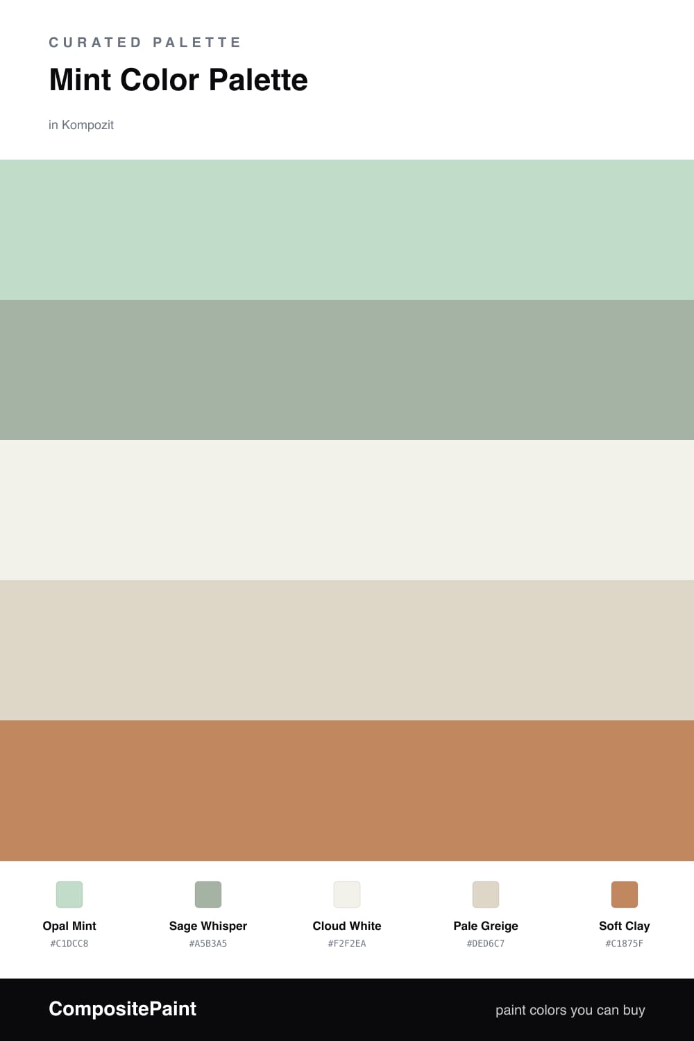
Mint is having a quiet moment right now, and this scheme leans into the softer, more grown-up side of it. Opal Mint is the star here — a gentle green with just enough gray in it to feel calm rather than candy-sweet. It does the heavy lifting on your walls.

Sage Whisper is a deeper cousin of that mint, so it adds a little shadow and depth without breaking the mood. Cloud White and Pale Greige are your easy neutrals — think trim, ceilings, and the big quiet spaces that let the green breathe.

The little surprise is Soft Clay, a warm earthy terracotta that keeps the whole thing from feeling too cool. You only need a small dose of it — a cushion, a lamp, a piece of pottery — and suddenly the mint looks fresh and intentional instead of plain.

Buy These Colors

Each color matched to the closest real paint in every brand, by ΔE2000. Kompozit first; take any SKU to the store — these mix on demand.

Opal Mint
#BFD9C9 · LRV 65 · Dominant
Kompozit Vineyard Green · 0734 ΔE 1.57
Backdrop Real Real · BD-RR ΔE 12.91
Behr Riverdale · N410-3 ΔE 2.18
Benjamin Moore Aberdeen Green · 631 ΔE 2.23
Clare Two Scoops · PNT100-LT-46 ΔE 4.52
Dunn-Edwards Garden Statue · DE5646 ΔE 1.82
Farrow & Ball Teresa's Green · No. 236 ΔE 5.3
Magnolia Home Mineral Green · JG-67 ΔE 4.43
PPG / Glidden Malted Mint · 1139-2 ΔE 1.3
Sherwin-Williams Breaktime · SW 6463 ΔE 2.57
Valspar Aloe Vera · 5006-5B ΔE 3.19
Sage Whisper
#9CB6A4 · LRV 43 · Secondary
Kompozit Fair Maiden · 0456 ΔE 4.35
Backdrop Le Freak · BD-LF ΔE 7.1
Behr Strong Winds · N380-4 ΔE 1.18
Benjamin Moore Garden Path · 466 ΔE 4.38
Clare Make Waves · PNT100-MD-43 ΔE 5.74
Dunn-Edwards Pistachio Ice Cream · DE5717 ΔE 3.39
Farrow & Ball Dix Blue · No. 82 ΔE 5.67
Magnolia Home Local Greenhouse · JG-68 ΔE 5.08
PPG / Glidden Silver Leaf · 1133-4 ΔE 0.28
Sherwin-Williams Spearmint · SW 6465 ΔE 2.4
Valspar Spearmint Haze · 5006-5C ΔE 1.14
Cloud White
#F4F1E9 · LRV 88 · Base
Kompozit Cyprus Spring · 0411 ΔE 1.48
Backdrop Tabula Rasa · BD-TR ΔE 1.56
Behr Solid Opal · BWC-06 ΔE 1.9
Benjamin Moore Gardenia · AF-10 ΔE 0.51
Clare Wing It · PNT100-LT-24 ΔE 2.68
Dunn-Edwards Wishful White · DE6260 ΔE 0.46
Farrow & Ball Wimborne White · No. 239 ΔE 1.35
Magnolia Home Silos White · JG-107 ΔE 0.73
PPG / Glidden Crumb Cookie · 18-01 ΔE 1.19
Sherwin-Williams White Flour · SW 7102 ΔE 1.18
Valspar Crisp Cotton · 7007-4 ΔE 1.05
Pale Greige
#DCD6C8 · LRV 67 · Support
Kompozit Earthling · 0216 ΔE 0.94
Backdrop Real Real · BD-RR ΔE 2.05
Behr Canvas Tan · UL170-14 ΔE 0.53
Benjamin Moore Nature's Essentials · 1521 ΔE 0.81
Clare Turbinado · PNT100-LT-21 ΔE 2.47
Dunn-Edwards Shady · DEC774 ΔE 1.24
Farrow & Ball Skimming Stone · No. 241 ΔE 2.38
Magnolia Home Yarn · JG-132 ΔE 3.2
PPG / Glidden Casual Elegance · 1075-3 ΔE 2.2
Sherwin-Williams Kestrel White · SW 7516 ΔE 2
Valspar September Fog · 6003-1A ΔE 0.78
Soft Clay
#C9876B · LRV 31 · Accent
Kompozit Peace of Mind · 1004 ΔE 5.1
Backdrop Anita · BD-AN ΔE 14.72
Behr Cabana Melon · MQ4-39 ΔE 1.85
Benjamin Moore Mexican Tile · 1194 ΔE 2.51
Clare Pink Sky · PNT100-MD-28 ΔE 8.74
Dunn-Edwards Secluded Canyon · DE5186 ΔE 1.39
Farrow & Ball Red Earth · No. 64 ΔE 4.69
Magnolia Home Vintage Crown · JG-152 ΔE 11.87
PPG / Glidden Hitching Post · 1070-5 ΔE 4.54
Sherwin-Williams Subdued Sienna · SW 9009 ΔE 0.78
Valspar Terra Earth · 2003-5C ΔE 2.63

Questions

Why does mint work so well as a main color?

Mint reads as fresh and calm without feeling cold, so it can carry a whole room. Pairing it with warm whites and a touch of clay keeps it grounded instead of icy.

How much of each color should I use?

Let the mint lead on the biggest surfaces, use the sage and neutrals to fill in, and save the clay for small touches like a chair or a vase — roughly a 70/20/10 split.

Similar Palettes

Closest schemes by color — not by label.