Pink, Blue & Purple Color Palette — Cotton Dusk
A soft four-color scheme blending blush pink, hazy blue and muted lavender with a warm greige base, every color matched to real paint you can buy.
By David Chen · Formulation Lead & Resident Chemist
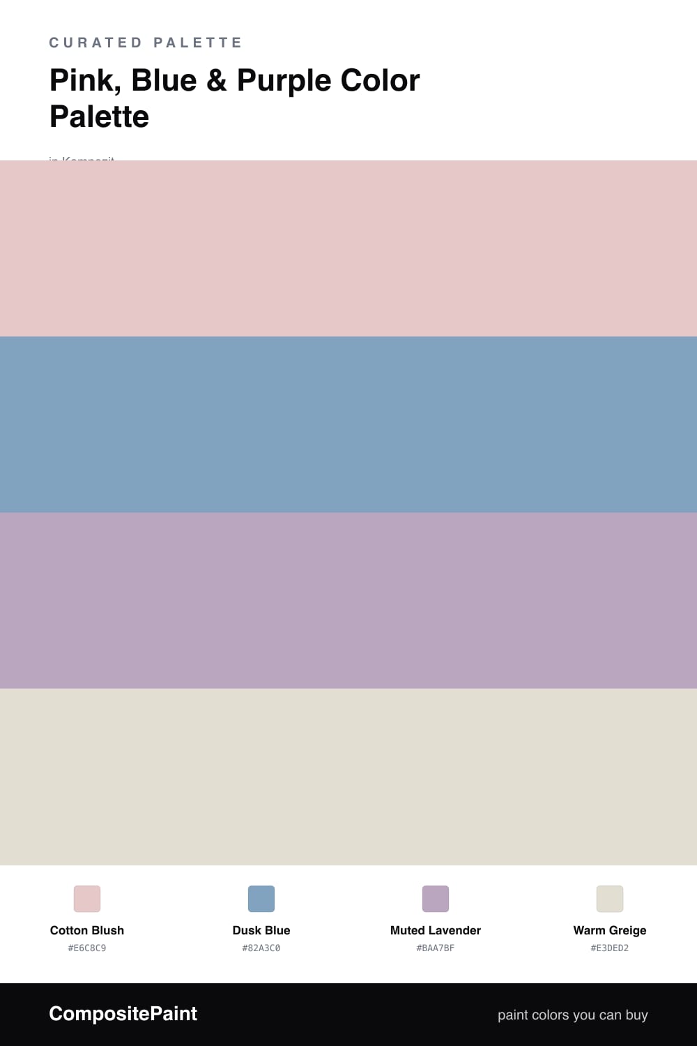
Think of this scheme as the light just after sunset, when pink, blue and purple all soften into the same hazy register. Cotton Blush leads as the dominant, a warm dusty pink that feels like a neutral with a heartbeat rather than a loud rosy statement.
Dusk Blue is the cool counterweight, a grayed sky blue that keeps the blush from getting too sweet, and Muted Lavender slips in between the two as the quiet bridge that ties the warm and cool sides together. Because all three share a slightly grayed undertone, they layer instead of compete.
Warm Greige is the base that makes the whole thing work. Spread it across your largest, calmest surfaces and let the three colors do their soft trading in smaller doses. Lean contemporary by keeping every edge matte and chalky, which is where this dusty trio feels most at home in 2026.
Buy These Colors
Each color matched to the closest real paint in every brand, by ΔE2000. Kompozit first; take any SKU to the store — these mix on demand.
Questions
Give each one a clear job and lean on the greige base. Let Cotton Blush lead across the largest surfaces, drop Dusk Blue in as the cooler counterweight, and use Muted Lavender only as a bridge between them. The warm greige resets your eye so the soft trio reads layered instead of mixed.
No, gentle and dusty is exactly where 2026 sits. The trick is the slightly grayed undertone in all three colors. That haze keeps blush, blue and lavender from going sweet or nursery, so the scheme feels calm and grown up rather than pastel.
Similar Palettes
Closest schemes by color — not by label.