CP

Lavender Color Palette — Lavender Reed

A soft five-color scheme led by gentle lavender, grounded with warm greige and a fresh sage accent — every color matched to real paint you can buy.

By Emily Roberts · DIY Editor & First-Timer's Guide

Reed Lavender
Dominant
Kompozit Petunia Trail · 1253
#B8B0CF
LRV 46
Misty Lilac
Secondary
Kompozit Mountain's Majesty · 1251
#D8D0E3
LRV 65
Warm Greige
Base
Kompozit Feather Stone · 0229
#E3DED2
LRV 73
Soft Dove
Support
Kompozit Rippled Rock · 0580
#C4C5BC
LRV 55
Sage Whisper
Accent
Kompozit Hidden Glade · 0744
#98AD8E
LRV 39
View palette in

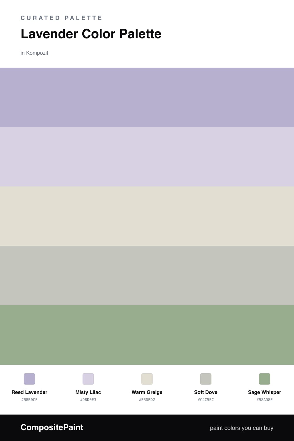
Lavender is having a quiet moment in 2026, and this scheme shows why it feels so easy to live with. Reed Lavender leads the way as a grown-up, dusty purple — soft enough for a whole room but with real character.

Misty Lilac is a paler cousin you can use on a ceiling or trim, while Warm Greige and Soft Dove keep everything anchored and warm. These two neutrals are the secret to making lavender feel modern instead of sweet.

For the spark, Sage Whisper brings a gentle green that plays beautifully off the purple. Use it in small doses — a throw, a chair, some greenery — and the whole palette comes to life.

Buy These Colors

Each color matched to the closest real paint in every brand, by ΔE2000. Kompozit first; take any SKU to the store — these mix on demand.

Reed Lavender
#B8AECB · LRV 45 · Dominant
Kompozit Petunia Trail · 1253 ΔE 1.1
Backdrop Underdog · BD-UD ΔE 16.95
Behr Midsummer Dream · 690F-4 ΔE 1.27
Benjamin Moore Enchanted · 2070-50 ΔE 3.98
Clare Cloud Watching · PNT100-MD-73 ΔE 15.13
Dunn-Edwards Madder Blue · DE5926 ΔE 5.12
Farrow & Ball Lulworth Blue · No. 89 ΔE 15.91
Magnolia Home Vintage Collection · JG-99 ΔE 11.86
PPG / Glidden Spring Lilac · 1170-4 ΔE 5.36
Sherwin-Williams Magical · SW 6829 ΔE 2.72
Valspar Orchid House · 1001-6A ΔE 0.48
Misty Lilac
#D6CFE0 · LRV 64 · Secondary
Kompozit Mountain's Majesty · 1251 ΔE 0.94
Backdrop Real Real · BD-RR ΔE 16.8
Behr Dusty Lilac · N110-1 ΔE 0.92
Benjamin Moore Spring Iris · 1402 ΔE 2.42
Clare Wink · PNT100-LT-31 ΔE 8.28
Dunn-Edwards Hailstorm · DE5925 ΔE 3.66
Farrow & Ball Worsted · No. 284 ΔE 9.15
Magnolia Home In Bloom · JG-98 ΔE 6.17
PPG / Glidden Lavender Haze · 1175-3 ΔE 2.51
Sherwin-Williams Potentially Purple · SW 6821 ΔE 1.54
Valspar Whipped Plum · 4002-9B ΔE 2.31
Warm Greige
#E4DDD2 · LRV 73 · Base
Kompozit Feather Stone · 0229 ΔE 1.24
Backdrop Cookies & Cream · BD-CC ΔE 5.01
Behr Guesthouse · UL190-11 ΔE 1.54
Benjamin Moore Olympic Mountains · 971 ΔE 1.57
Clare No Filter · PNT100-LT-19 ΔE 2.32
Dunn-Edwards Linen White · DEC749 ΔE 2.89
Farrow & Ball School House White · No. 291 ΔE 1.39
Magnolia Home Soft Linen · JG-108 ΔE 0.5
PPG / Glidden Ash · 1076-2 ΔE 0.91
Sherwin-Williams Aesthetic White · SW 7035 ΔE 0.54
Valspar Asiago · 6005-1A ΔE 0.52
Soft Dove
#C9C3BA · LRV 55 · Support
Kompozit Rippled Rock · 0580 ΔE 3.6
Backdrop Real Real · BD-RR ΔE 4.42
Behr Sculptor Clay · PPU5-08 ΔE 1.91
Benjamin Moore Seattle Mist · 1535 ΔE 2.41
Clare Motor City · PNT100-LT-09 ΔE 4.37
Dunn-Edwards Gray Pearl · DEC795 ΔE 2.23
Farrow & Ball Pavilion Gray · No. 242 ΔE 0.94
Magnolia Home Anatolian · JG-127 ΔE 0.97
PPG / Glidden Great Gray · 15-28 ΔE 2.2
Sherwin-Williams Alpaca · SW 7022 ΔE 1.01
Valspar Zen Pebble · V145-2 ΔE 2.08
Sage Whisper
#9DAE94 · LRV 40 · Accent
Kompozit Hidden Glade · 0744 ΔE 2.09
Backdrop Le Freak · BD-LF ΔE 3.96
Behr Ashwood · 720D-4 ΔE 3.12
Benjamin Moore Norway Spruce · 452 ΔE 1.44
Clare Matcha Latte · PNT100-DP-50 ΔE 5.34
Dunn-Edwards Mistletoe Kiss · DE5620 ΔE 5.61
Farrow & Ball Breakfast Room Green · No. 81 ΔE 2.6
Magnolia Home Seasonal · JG-51 ΔE 5.94
PPG / Glidden Olive Sprig · 1125-4 ΔE 5.4
Sherwin-Williams Nurture Green · SW 6451 ΔE 2.46
Valspar Green Garlands · 5007-3C ΔE 2.99

Questions

Why does lavender work with these neutrals?

Lavender can feel cool on its own, so warm greige and dove soften it and keep the room feeling cozy rather than chilly. The sage accent brings in a little life without fighting the calm.

How much lavender should I use?

Let it lead — think walls or a main piece of furniture. The neutrals fill most of the rest, and the sage shows up only in small touches like a pillow or a plant pot.

Similar Palettes

Closest schemes by color — not by label.