CP

Pastel Pink Bedroom Palette — Soft Blush & Warm White

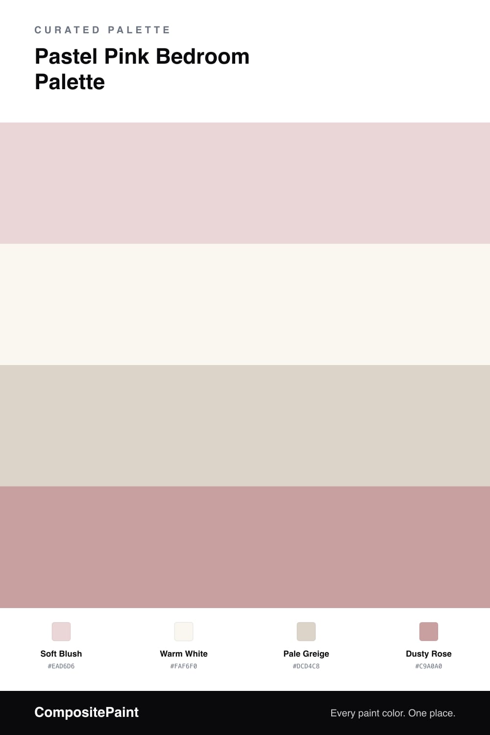
A soft, restful pastel pink bedroom scheme: blush walls, warm white trim, a pale greige for built-ins, and a gentle dusty-rose accent. Every color matched to real paint you can buy.

By Jessica Williams · Color Stylist & Interior Editor

A pastel pink bedroom only works when the pink stays soft. This soft blush is grayed and warm, so it reads as a gentle, restful neutral rather than something candy-bright. It sets a calm mood without taking over the room.

Around it, a warm white on the trim and ceiling keeps things crisp and clean, while a pale greige on built-ins or a dresser grounds the scheme and stops the pink from floating. The greige is the quiet workhorse here, bridging the blush and any wood tones in the room.

Finally, a dusty rose accent — in a headboard, throw pillows, or a single feature wall — deepens the pink story and gives it a grown-up edge. Used sparingly, it makes the whole palette feel intentional and warm rather than sweet.

View palette in
Soft Blush
Walls
Valspar Barely Pink · 1006-8C
#EAD5D4
LRV 70
Warm White
Trim & Ceiling
Dunn-Edwards Milk Glass · DEW358
#FAF7F0
LRV 86
Pale Greige
Built-ins
Behr Windrush · HDC-CT-19
#DCD4C9
LRV 67
Dusty Rose
Accent
Glidden Pepperberry · PPG1055-4
#C79D9B
LRV 39

Buy These Colors

Each color matched to the closest real paint in every brand, by ΔE2000. Tap a swatch for its full guide or + to save it — take any SKU to the store, they mix on demand.

Soft Blush
#EAD6D6 · LRV 70 · Walls
Sherwin-Williams · SW 6295 · ΔE 0.64
Behr · S190-1 · ΔE 0.64
Benjamin Moore · 1261 · ΔE 1.62
Valspar · 1006-8C · ΔE 0.57
PPG / Glidden · PPG18-18 · ΔE 0.58
Glidden · PPG18-18 · ΔE 0.96
Dutch Boy · 203-1DB · ΔE 2.12
HGTV Home by Sherwin-Williams · HGSW 2027 · ΔE 0.64
Dunn-Edwards · DE6009 · ΔE 2.36
Magnolia Home · JG-108 · ΔE 9.63
Farrow & Ball · NO. 202 · ΔE 6.56
Diamond Vogel · 1301 · ΔE 3.13
Hirshfield's · 1301 · ΔE 3.07
Rodda · CA049 · ΔE 8.29
C2 Paint · BD4 · ΔE 7.88
Clare · PNT100-LT-25 · ΔE 2.64
Portola Paints · GEM · ΔE 10.59
Annie Sloan · OLD OCHRE · ΔE 14.44
Backdrop · BD-CC · ΔE 13.88
Rust-Oleum · 285142 · ΔE 2.14
Kompozit · 1301 · ΔE 3.07
Warm White
#FAF6F0 · LRV 93 · Trim & Ceiling
Sherwin-Williams · SW 7757 · ΔE 2
Behr · RD-W5 · ΔE 1.72
Benjamin Moore · 2144-70 · ΔE 3.15
Valspar · V148 · ΔE 1.92
PPG / Glidden · PPG1001-1 · ΔE 2.7
Glidden · 61YY 89/040 · ΔE 1.38
Dutch Boy · 001W · ΔE 2.4
HGTV Home by Sherwin-Williams · HGSW 4001 · ΔE 2
Dunn-Edwards · DEW358 · ΔE 0.81
Magnolia Home · JG-21 · ΔE 2.41
Farrow & Ball · NO. 2005 · ΔE 1.96
Diamond Vogel · 0011 · ΔE 2.44
Hirshfield's · 0011 · ΔE 1.97
Rodda · R007 · ΔE 1.83
C2 Paint · C2-756 · ΔE 2.39
Clare · PNT100-LT-04 · ΔE 2.03
Portola Paints · ONE DROP · ΔE 5.79
Annie Sloan · OLD OCHRE · ΔE 14.16
Backdrop · BD-TR · ΔE 2.95
Rust-Oleum · 285140 · ΔE 4.2
Kompozit · 0011 · ΔE 1.97
Pale Greige
#DCD4C8 · LRV 66 · Built-ins
Sherwin-Williams · SW 9589 · ΔE 1.09
Behr · HDC-CT-19 · ΔE 0.46
Benjamin Moore · 988 · ΔE 1.36
Valspar · 6003-1A · ΔE 0.88
PPG / Glidden · PPG1075-3 · ΔE 0.99
Glidden · 50YY 65/071 · ΔE 0.58
Dutch Boy · 440-1DB · ΔE 1.25
HGTV Home by Sherwin-Williams · HGSW 3157 · ΔE 2.04
Dunn-Edwards · DEC774 · ΔE 1.45
Magnolia Home · JG-132 · ΔE 3.23
Farrow & Ball · NO. 241 · ΔE 0.95
Diamond Vogel · 0026 · ΔE 0.46
Hirshfield's · 0230 · ΔE 0.79
Rodda · CA030 · ΔE 2.98
C2 Paint · C2-833 · ΔE 0.99
Clare · PNT100-LT-21 · ΔE 2.43
Portola Paints · FIGUEROA · ΔE 1.87
Annie Sloan · OLD OCHRE · ΔE 8.04
Backdrop · BD-RR · ΔE 2.74
Rust-Oleum · 285142 · ΔE 9.21
Kompozit · 0230 · ΔE 0.79
Dusty Rose
#C9A0A0 · LRV 40 · Accent
Sherwin-Williams · SW 6297 · ΔE 1.71
Behr · 220F-4 · ΔE 1.34
Benjamin Moore · 2092-50 · ΔE 2.32
Valspar · V079-3 · ΔE 2.03
PPG / Glidden · PPG1056-4 · ΔE 2.59
Glidden · PPG1055-4 · ΔE 1.21
Dutch Boy · 347-4DB · ΔE 3.6
HGTV Home by Sherwin-Williams · HGSW 2025 · ΔE 1.71
Dunn-Edwards · DE6088 · ΔE 5.1
Magnolia Home · JG-110 · ΔE 13.89
Farrow & Ball · NO. 246 · ΔE 3.31
Diamond Vogel · 0078 · ΔE 2.1
Hirshfield's · 0078 · ΔE 2.13
Rodda · R129 · ΔE 12.86
C2 Paint · C2-813 · ΔE 10.63
Clare · PNT100-MD-76 · ΔE 5.15
Portola Paints · HAVANA · ΔE 9.42
Annie Sloan · PALOMA · ΔE 11.67
Backdrop · BD-RO · ΔE 4.1
Rust-Oleum · 371674 · ΔE 24.73
Kompozit · 0078 · ΔE 2.13

Questions

do pastel pink walls feel too childish for a grown-up bedroom?

Not if you keep the pink soft and grayed rather than candy-bright. A blush with a little warmth and a hint of gray reads as a quiet neutral, especially next to warm white trim and a grounding greige. The dusty rose is what adds the mature, lived-in feel.

what flooring works with a blush bedroom?

Warm woods are the easiest match — a honey or walnut floor keeps the pink from feeling cold. If you have lighter floors, lean on the greige and dusty rose in rugs and textiles to anchor the room.

KEEP EXPLORING

Similar Palettes

Closest schemes by color — not by label.