CP

Mustard Color Palette — Mustard Mist

A soft five-color scheme led by warm mustard, softened with misty greige and cream and lifted by a quiet slate accent — every color matched to real paint you can buy.

By Emily Roberts · DIY Editor & First-Timer's Guide

Mustard Mist
Dominant
Kompozit Lemon Bar · 0865
#CEA02F
LRV 38
Honey Ochre
Secondary
Kompozit Bright Idea · 0807
#D8B760
LRV 49
Misty Greige
Base
Kompozit Pebblebrook · 0224
#D8D0BC
LRV 63
Soft Cream
Support
Kompozit Kiara · 0005
#F5ECDC
LRV 85
Quiet Slate
Accent
Kompozit Calm Interlude · 0501
#3C4D51
LRV 7
View palette in

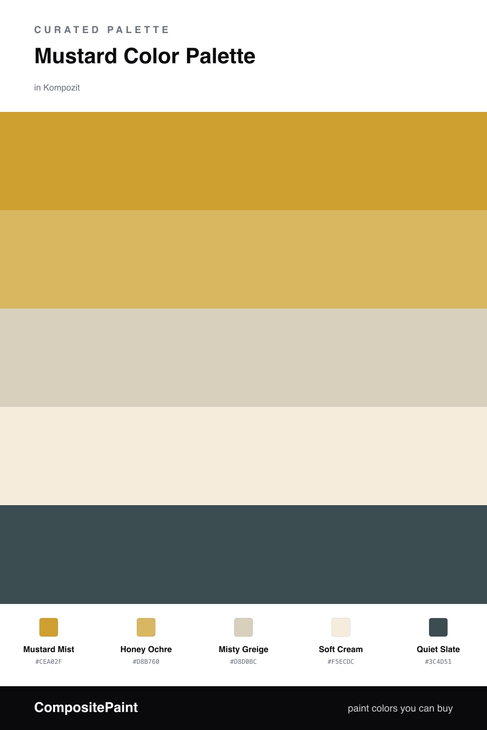
Mustard is having a real moment in 2026, and this is the easy way to use it. Mustard Mist leads the scheme with that warm, golden glow, while Honey Ochre gives you a slightly lighter version of the same color for layering.

The trick to keeping mustard from feeling heavy is the neutrals around it. Misty Greige and Soft Cream are soft, dusty backdrops that let the mustard shine without competing. Think walls in greige, mustard on a sofa or a feature wall, cream in the trim.

Then there is Quiet Slate — a deep, calm blue-gray that grounds everything. You only need a little of it, on a door or a lamp base, to give the whole palette some weight and stop it from drifting too sweet.

Buy These Colors

Each color matched to the closest real paint in every brand, by ΔE2000. Kompozit first; take any SKU to the store — these mix on demand.

Mustard Mist
#C9A237 · LRV 39 · Dominant
Kompozit Lemon Bar · 0865 ΔE 1.96
Backdrop Carry the Two · BD-CT ΔE 18.24
Behr Ginger Jar · M300-5 ΔE 1.85
Benjamin Moore French Quarter Gold · 287 ΔE 2.09
Clare Good as Gold · PNT100-DP-59 ΔE 8.67
Dunn-Edwards Spicy Mustard · DE5384 ΔE 1.68
Farrow & Ball India Yellow · No. 66 ΔE 6.86
Magnolia Home Bright Days · JG-45 ΔE 7.84
PPG / Glidden Golden Field · 1107-7 ΔE 2.5
Sherwin-Williams Kingdom Gold · SW 6698 ΔE 1.87
Valspar Golden Avocado · 3008-5A ΔE 1.91
Honey Ochre
#D9B65A · LRV 49 · Secondary
Kompozit Bright Idea · 0807 ΔE 0.88
Backdrop Eames · BD-EA ΔE 5.54
Behr Dried Chamomile · M320-5 ΔE 3.5
Benjamin Moore Damask Gold · CW-405 ΔE 1.42
Clare Golden Hour · PNT100-MD-23 ΔE 6.49
Dunn-Edwards Santa Fe Tan · DE5375 ΔE 2.89
Farrow & Ball Sudbury Yellow · No. 51 ΔE 4.12
Magnolia Home Bright Days · JG-45 ΔE 3.71
PPG / Glidden Va Va Voom · 1210-6 ΔE 3.59
Sherwin-Williams Nugget · SW 6697 ΔE 2.7
Valspar Dylan Velvet · 3008-5B ΔE 2.22
Misty Greige
#D7CFC0 · LRV 63 · Base
Kompozit Pebblebrook · 0224 ΔE 2.04
Backdrop Real Real · BD-RR ΔE 1.12
Behr Aged Beige · PPU7-09 ΔE 0.43
Benjamin Moore Cedar Key · 982 ΔE 0.54
Clare Flatiron · PNT100-LT-17 ΔE 2.22
Dunn-Edwards Heather · DEC773 ΔE 0.77
Farrow & Ball Shaded White · No. 201 ΔE 1.28
Magnolia Home Stoneware Pieces · JG-55 ΔE 3.82
PPG / Glidden Crushed Silk · 1024-3 ΔE 0.8
Sherwin-Williams Grecian Ivory · SW 7541 ΔE 0.8
Valspar Gentle Shadows · 8005-5A ΔE 1.49
Soft Cream
#F2ECDD · LRV 84 · Support
Kompozit Kiara · 0005 ΔE 1.37
Backdrop Jane · BD-JA ΔE 2.43
Behr Parchment Paper · 710C-1 ΔE 0.74
Benjamin Moore Arbor White · ES-01 ΔE 0.56
Clare Like Buttah · PNT100-LT-62 ΔE 2.54
Dunn-Edwards Bone China · DEW339 ΔE 0.21
Farrow & Ball White Tie · No. 2002 ΔE 1.74
Magnolia Home Pearly Cotton · JG-33 ΔE 1.21
PPG / Glidden Spun Cotton · 1203-1 ΔE 0.52
Sherwin-Williams Classic Light Buff · SW 50 ΔE 0.58
Valspar Statuesque · 7002-5 ΔE 0.53
Quiet Slate
#3E4A4D · LRV 6 · Accent
Kompozit Calm Interlude · 0501 ΔE 2.05
Backdrop North End · BD-NE ΔE 9.84
Behr Black Space · BXC-30 ΔE 0.51
Benjamin Moore Stonecutter · 2135-20 ΔE 1.65
Clare Blackish · PNT100-DP-54 ΔE 6.76
Dunn-Edwards Salem Black · DE6343 ΔE 4.27
Farrow & Ball Railings · No. 31 ΔE 4.56
Magnolia Home Arches · JG-97 ΔE 3.7
PPG / Glidden Black Forest · 1012-7 ΔE 2.3
Sherwin-Williams Mount Etna · SW 7625 ΔE 1.07
Valspar Naval Night · M310 ΔE 1.88

Questions

Why does mustard work with these soft neutrals?

Mustard is a strong, warm color, so it needs calm partners. The misty greige and cream cool it down just enough, which keeps the whole room feeling relaxed instead of loud.

How much mustard should I actually use?

Let mustard lead but not take over — think roughly two-thirds soft neutrals and one-third mustard. Save the slate for small touches like a door, a frame, or trim.

Similar Palettes

Closest schemes by color — not by label.