Lavender Study Palette — Morning Lavender & Quiet Linen
A calm five-color study scheme led by soft lavender walls, balanced with warm linen, crisp white trim, oak-toned wood, and a deep plum accent — every color matched to real paint you can buy.
By Emily Roberts · DIY Editor & First-Timer's Guide
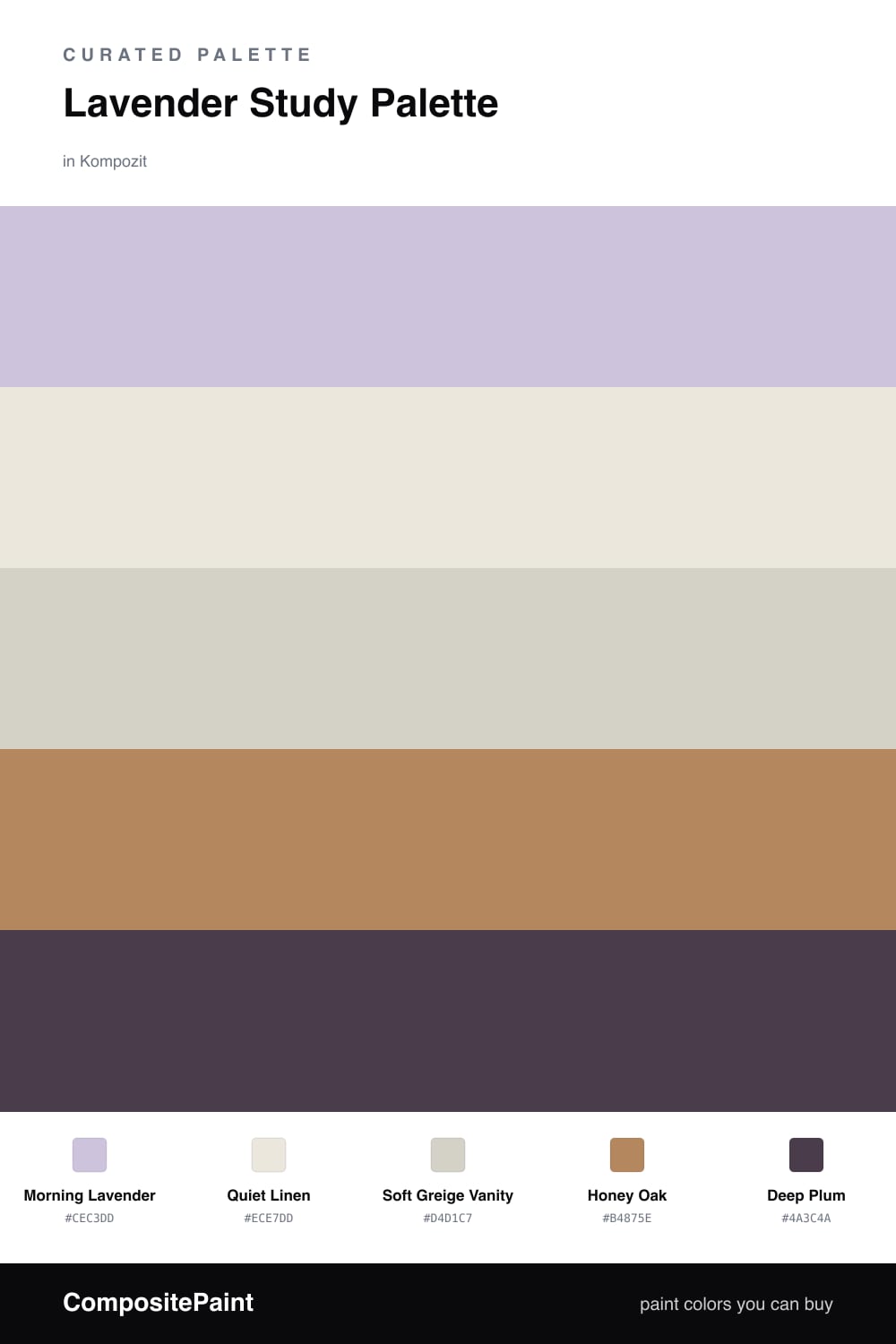
A study is where you want your mind to settle, and a soft lavender does that better than most colors. Morning Lavender on the walls is grayed-down and quiet, the kind of shade that feels calm in the morning light and cozy at night. It leads the room without ever shouting.
To keep things grounded, Quiet Linen handles the trim and ceiling with a warm, barely-there white, and Soft Greige Vanity gives any cabinets or built-ins a gentle neutral that won’t fight the walls. Honey Oak brings in real wood warmth through the floor and desk, so the cool lavender has something earthy to lean on.
The spark here is Deep Plum. Save it for one or two spots — the inside of a shelf, a chair, a painted drawer front — and it pulls the whole scheme together. This is a soft, slightly contemporary look that feels current without trying too hard.
Buy These Colors
Each color matched to the closest real paint in every brand, by ΔE2000. Kompozit first; take any SKU to the store — these mix on demand.
Questions
Not when you keep it soft and grayed out like this one. Morning Lavender has enough gray in it to read as a calm neutral, so it stays restful and focused rather than girly.
Use it in small doses — a bookshelf back, a desk chair, or a single painted door. A little Deep Plum anchors all the soft tones and gives your eye somewhere to land.
Similar Palettes
Closest schemes by color — not by label.