PROFESSIONAL-GRADE PAINT
ONE COAT COVERAGE
MADE FOR REAL RESULTS
CompositePaint

Laundry Room Palette — Soft Blue & Crisp White

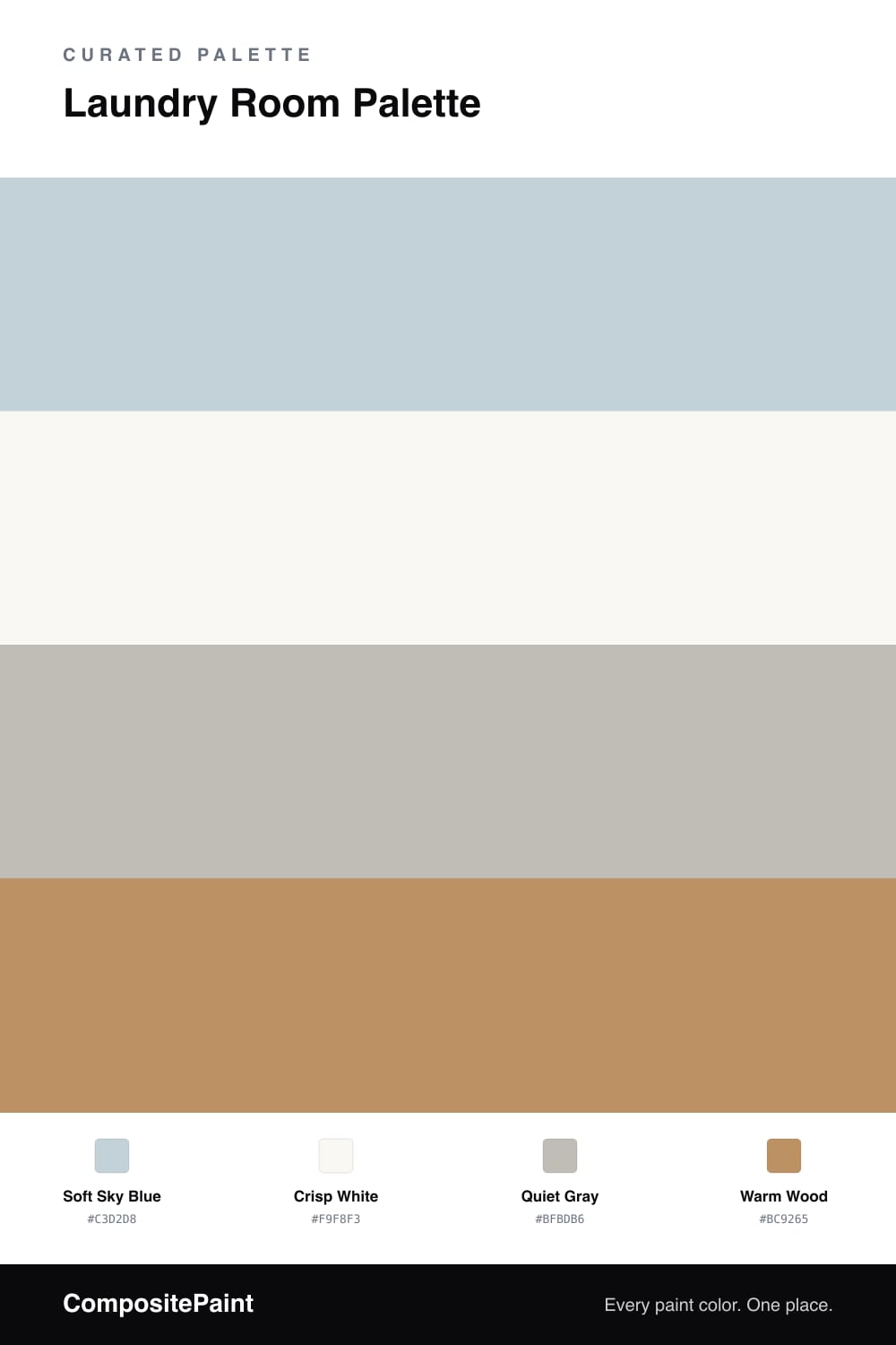
A clean, calming 4-color scheme for laundry rooms: soft blue walls, crisp white cabinets, a quiet gray counter, and warm wood to keep the hardest-working room cheerful. Every color matched to real paint you can buy.

By Jessica Williams · Color Stylist & Interior Editor

Soft Sky Blue
Walls
Kompozit Serene Setting · 0622
#C5D2D9
LRV 63
Crisp White
Cabinets & Trim
Kompozit Sugar Dust · 0011
#F8F6ED
LRV 92
Quiet Gray
Counter & Accent
Kompozit Chintz · 0573
#C0BBAE
LRV 50
Warm Wood
Shelving
Kompozit Apple Crisp · 0247
#BB8E5E
LRV 31
View palette in

The laundry room works hard, so the color should feel light and clean every time you walk in. This palette puts a soft sky blue on the walls — calm, fresh, and just enough color to make a small utility space feel pleasant instead of purely functional. It’s a slightly grayed blue, so it never tips into baby-blue territory.

Crisp white cabinets and trim keep everything bright and make the room read tidy even when the hamper is full. A quiet gray on the counter or a single accent ties the cooler tones together without adding fuss. Then warm wood on open shelving brings in a friendly note so the room feels cared for rather than clinical. Use a wipeable satin or semi-gloss since the space sees humidity and splashes. Light blue walls, white cabinets, a touch of wood — clean and calm.

Buy These Colors

Each color matched to the closest real paint in every brand, by ΔE2000. Kompozit first; take any SKU to the store — these mix on demand.

Soft Sky Blue
#C3D2D8 · LRV 63 · Walls
Kompozit Serene Setting · 0622 ΔE 1.09
Backdrop Real Real · BD-RR ΔE 12.76
Behr Galactic Tint · N510-2 ΔE 1.2
Benjamin Moore Silver Mist · 1619 ΔE 1.92
Clare Wink · PNT100-LT-31 ΔE 5.36
Dunn-Edwards Polished Silver · DE5820 ΔE 2.23
Farrow & Ball Skylight · No. 205 ΔE 5.62
Magnolia Home Dark Moon · JG-74 ΔE 5.27
PPG / Glidden Scandinavian Sky · 1149-3 ΔE 1.91
Sherwin-Williams North Star · SW 6246 ΔE 3.62
Valspar Tinsel Beam · 4005-3A ΔE 1.53
Crisp White
#F9F8F3 · LRV 94 · Cabinets & Trim
Kompozit Sugar Dust · 0011 ΔE 1.86
Backdrop Tabula Rasa · BD-TR ΔE 2.97
Behr Ultra Pure White® · PPU18-06 ΔE 0.6
Benjamin Moore Snowfall White · 2144-70 ΔE 2.32
Clare Whipped · PNT100-LT-02 ΔE 1.48
Dunn-Edwards Milk Glass · DEW358 ΔE 1.18
Farrow & Ball All White · No. 2005 ΔE 1.25
Magnolia Home True White · JG-21 ΔE 1.1
PPG / Glidden Delicate White · 1001-1 ΔE 1.63
Sherwin-Williams High Reflective White · SW 7757 ΔE 0.82
Valspar Ultra White · 7006-24 ΔE 0.5
Quiet Gray
#BFBDB6 · LRV 51 · Counter & Accent
Kompozit Chintz · 0573 ΔE 2.79
Backdrop Underdog · BD-UD ΔE 9.81
Behr Gull Gray · QE-50 ΔE 1.32
Benjamin Moore Half Moon Crest · 1481 ΔE 2.46
Clare Greige · PNT100-LT-13 ΔE 4.4
Dunn-Edwards Gray Pearl · DEC795 ΔE 1.55
Farrow & Ball Purbeck Stone · No. 275 ΔE 2.16
Magnolia Home Day-to-day · JG-123 ΔE 2.24
PPG / Glidden Solstice · 1010-3 ΔE 2.5
Sherwin-Williams Argos · SW 7065 ΔE 1.03
Valspar Ask Me Anything · 8006-2D ΔE 2.37
Warm Wood
#BC9265 · LRV 32 · Shelving
Kompozit Apple Crisp · 0247 ΔE 1.46
Backdrop Anita · BD-AN ΔE 10.22
Behr Burnished Caramel · HDC-CL-15 ΔE 1.78
Benjamin Moore Desert Beach · 1104 ΔE 0.76
Clare Good as Gold · PNT100-DP-59 ΔE 5.29
Dunn-Edwards Maple View · DE6152 ΔE 2.83
Farrow & Ball India Yellow · No. 66 ΔE 6.53
Magnolia Home Vintage Crown · JG-152 ΔE 4.97
PPG / Glidden Honey Haven · 1089-6 ΔE 0.56
Sherwin-Williams Eastlake Gold · SW 9 ΔE 3
Valspar Etruscan Bronze · P051 ΔE 1.72

Questions

Does blue make a laundry room feel cold?

This blue is soft and slightly gray, so it reads calm and clean rather than icy. Pairing it with warm wood shelving and white cabinets keeps the whole room feeling fresh, not chilly.

What finish should I use in a laundry room?

Go with a satin or semi-gloss on walls and cabinets. Laundry rooms see splashes and humidity, and those finishes wipe down easily and hold up to the occasional wet hand far better than a flat.

Similar Palettes

Closest schemes by color — not by label.