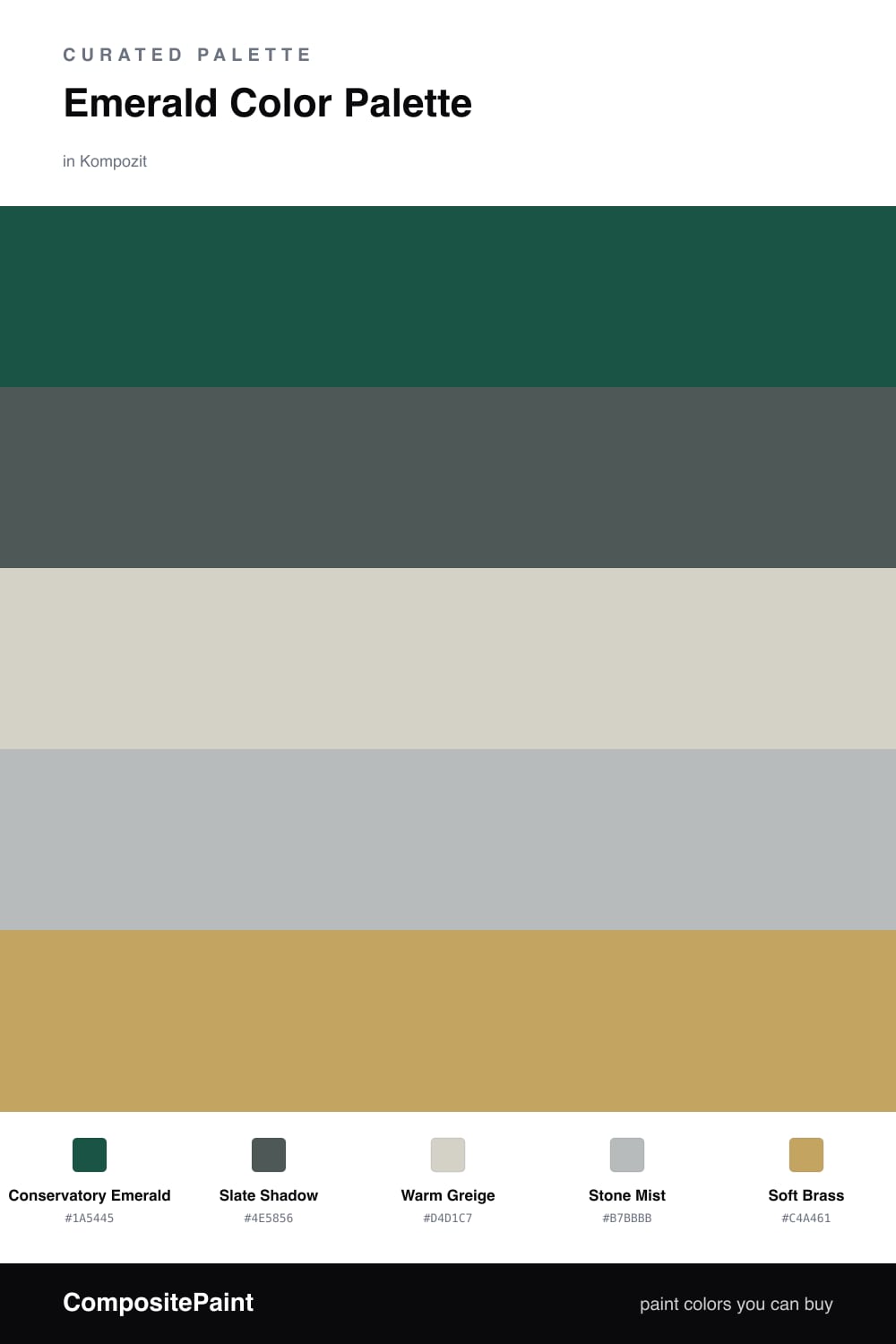
Emerald Color Palette — Slate Conservatory
A jewel-toned five-color scheme led by deep emerald with cool slate, warm greige, and a soft brass accent — every color matched to real paint you can buy.
By Emily Roberts · DIY Editor & First-Timer's Guide
Emerald is having a real moment in 2026, and it is easy to see why. A deep, slightly grayed Conservatory Emerald feels grown-up and cozy at the same time, and it is the kind of green that looks expensive without trying too hard. Here it does all the heavy lifting.
To keep it from feeling like a single bold choice, I leaned on Slate Shadow as a cooler partner and let Warm Greige and Stone Mist do the quiet, in-between work. That mix of warm and cool neutrals is the trick — it stops a dark green from going flat or cave-like and gives your eye somewhere soft to rest.
The last piece is Soft Brass, and you only need a whisper of it. Think a cabinet pull, a picture frame, a lamp base. That small warm glint is what ties emerald, slate, and greige together and makes the whole palette feel finished rather than just dark and pretty.
Buy These Colors
Each color matched to the closest real paint in every brand, by ΔE2000. Kompozit first; take any SKU to the store — these mix on demand.
Questions
Emerald reads as a near-neutral once it covers a wall — your eye treats it like a deep green-gray, so it feels calm rather than loud. The slate and greige keep it grounded, and the little hit of brass is what makes the whole thing feel rich instead of plain.
Let it lead, roughly two-thirds of what you see. Put it on the biggest surfaces, use slate and the warm neutrals for everything around it, and save the brass for tiny moments like hardware or a frame.
Similar Palettes
Closest schemes by color — not by label.