Charcoal Study Palette — Dusk Charcoal & Warm Walnut
A moody five-color study scheme led by deep charcoal, softened with greige walls, crisp white trim, walnut wood, and an ink-blue accent — every color matched to real paint you can buy.
By Maya Patel · Reviews Editor & Product Tester
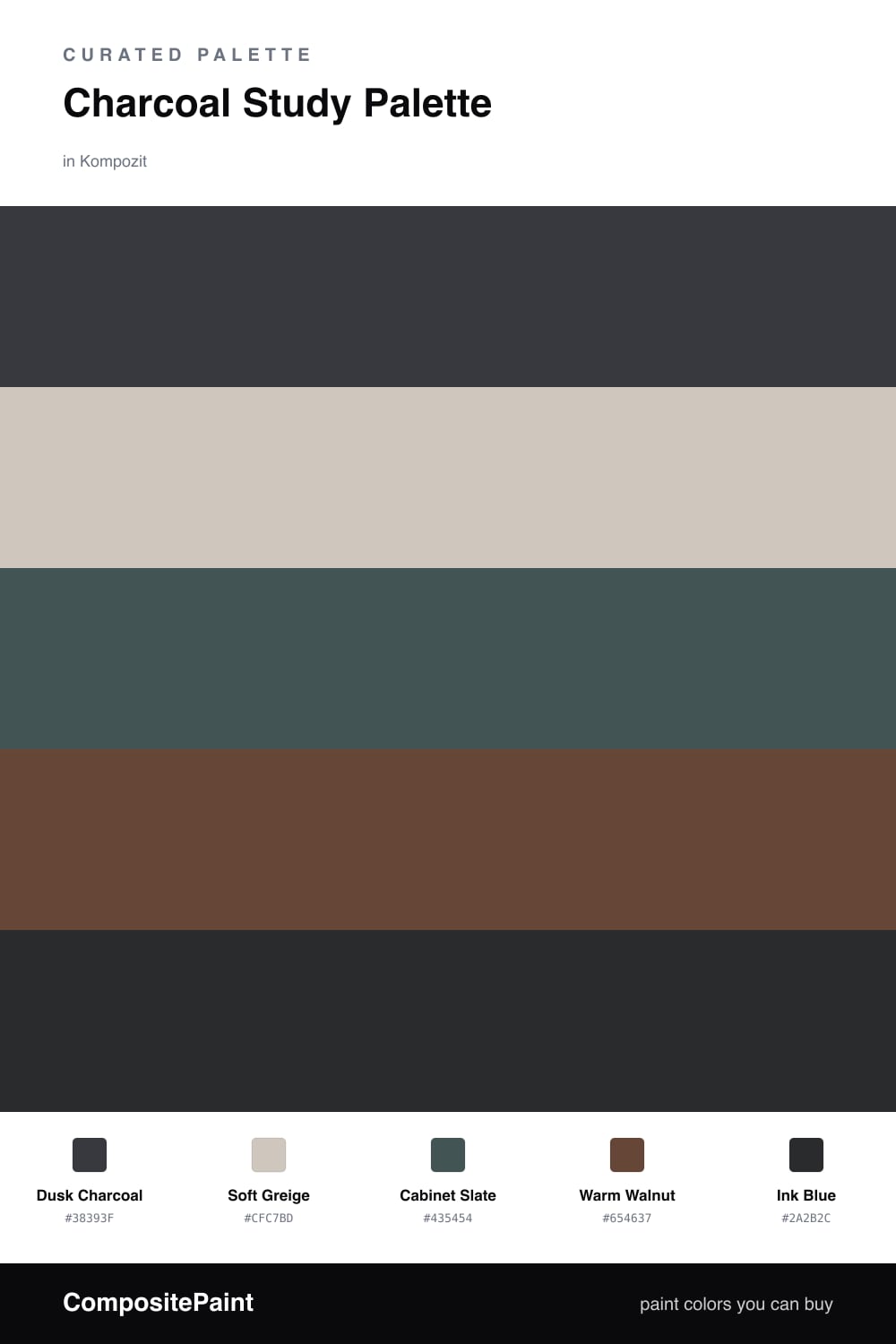
A study is the one room where dark walls earn their keep. Dusk Charcoal wraps the space and pulls your focus inward, which is exactly what you want when you sit down to read or work. It is the lead here, and everything else exists to keep it from feeling heavy.
I balance it with Soft Greige on the trim and ceiling so the light has a place to settle, and Warm Walnut underfoot to add the warmth charcoal lacks on its own. Cabinet Slate sits a step lighter than the walls, so built-ins read as a deliberate layer instead of a black hole.
The spark is Ink Blue, used in the smallest dose — a chair, a frame, the back of a shelf. It reads almost like a deeper charcoal until the light hits it, and then it quietly does the work. This is a calm, slightly contemporary scheme that feels current without chasing a trend.
Buy These Colors
Each color matched to the closest real paint in every brand, by ΔE2000. Kompozit first; take any SKU to the store — these mix on demand.
Questions
Not if you give the light somewhere to land. The greige trim and ceiling lift the room, and a wall of books or a lamp keeps it warm rather than cave-like — charcoal actually reads as focused and calm.
Let charcoal lead on the walls and use the others in roles, not patches. Walnut on the floor, slate on the cabinets, greige up top, and just a touch of ink blue — each color has one job.
Similar Palettes
Closest schemes by color — not by label.