CP

Blue & Orange Color Palette — Dusk Tide

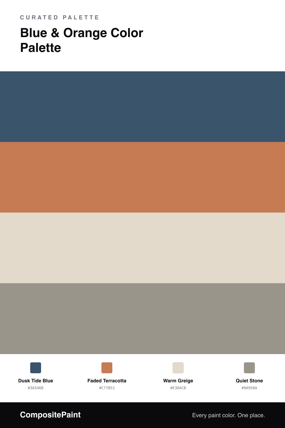
A four-color scheme pairing a deep dusk blue with a soft terracotta orange, settled by warm greige and a quiet stone accent — every color matched to real paint you can buy.

By Maya Patel · Reviews Editor & Product Tester

Blue and orange is the safest bold move in color, but most versions of it shout. This one does the opposite. Dusk Tide Blue is a deep, slightly grayed blue that feels like the last light over water, and it carries the whole scheme as the dominant color.

Against it, Faded Terracotta is the warm answer — a soft clay orange that glows rather than pops. The trick is restraint, so let the terracotta show up in smaller hits while Warm Greige does the quiet base work between the two. That greige is what keeps this from tipping into a sporty look.

Quiet Stone is the closer, a muted gray-taupe that grounds the edges and reads as almost neutral next to the blue. It is the 2026 move here: pairing a confident contrast with low-saturation support so the room feels calm and current, not like a color-wheel demo.

View palette in
Dusk Tide Blue
Dominant
Behr Velvet Rope · MQ5-58
#37546E
LRV 8
Faded Terracotta
Secondary
Valspar Clove Bud · 2004-5B
#C47954
LRV 26
Warm Greige
Base
Behr Varnished Ivory · MQ3-40
#E3DACA
LRV 71
Quiet Stone
Accent
PPG / Glidden Steeped Tea · PPG0999-4
#999489
LRV 30

Buy These Colors

Each color matched to the closest real paint in every brand, by ΔE2000. Tap a swatch for its full guide or + to save it — take any SKU to the store, they mix on demand.

Dusk Tide Blue
#3A546B · LRV 8 · Dominant
Sherwin-Williams · SW 9150 · ΔE 3.7
Behr · MQ5-58 · ΔE 1.07
Benjamin Moore · 1680 · ΔE 1.98
Valspar · 4007-6C · ΔE 4.06
PPG / Glidden · PPG1154-7 · ΔE 4.47
Glidden · PPG1154-7 · ΔE 4.29
Dutch Boy · 338-6DB · ΔE 2.5
HGTV Home by Sherwin-Williams · HGSW 3341 · ΔE 3.7
Dunn-Edwards · DE5811 · ΔE 3.63
Magnolia Home · JG-92 · ΔE 5.08
Farrow & Ball · NO. 253 · ΔE 7.99
Diamond Vogel · 0592 · ΔE 6.46
Hirshfield's · 0627 · ΔE 3.16
Rodda · R077 · ΔE 3.05
C2 Paint · C2-760 · ΔE 2.08
Clare · PNT100-DP-55 · ΔE 12.18
Portola Paints · BLUE MOON · ΔE 5.13
Annie Sloan · AUBUSSON BLUE · ΔE 8.41
Backdrop · BD-WK · ΔE 1.69
Rust-Oleum · 391445 · ΔE 18.7
Kompozit · 0627 · ΔE 3.16
Faded Terracotta
#C77B53 · LRV 27 · Secondary
Sherwin-Williams · SW 7707 · ΔE 1.16
Behr · PMD-103 · ΔE 2.23
Benjamin Moore · 063 · ΔE 1.55
Valspar · 2004-5B · ΔE 1.11
PPG / Glidden · PPG1199-6 · ΔE 1.56
Glidden · PPG1199-6 · ΔE 1.52
Dutch Boy · 310-6DB · ΔE 1.16
HGTV Home by Sherwin-Williams · HGSW 2094 · ΔE 2.35
Dunn-Edwards · DE5180 · ΔE 3.47
Magnolia Home · JG-35 · ΔE 5.78
Farrow & Ball · NO. 64 · ΔE 7.13
Diamond Vogel · 1038 · ΔE 2.55
Hirshfield's · 1038 · ΔE 2.69
Rodda · CA102 · ΔE 10.09
C2 Paint · C2-587 · ΔE 3.15
Clare · PNT100-DP-74 · ΔE 5.09
Portola Paints · MESA · ΔE 3.51
Annie Sloan · SCANDINAVIAN PINK · ΔE 8.1
Backdrop · BD-AN · ΔE 16.69
Rust-Oleum · 398640 · ΔE 4.8
Kompozit · 1038 · ΔE 2.69
Warm Greige
#E3DACB · LRV 71 · Base
Sherwin-Williams · SW 7568 · ΔE 0.77
Behr · MQ3-40 · ΔE 0.43
Benjamin Moore · AF-55 · ΔE 0.55
Valspar · 8004-23A · ΔE 1.69
PPG / Glidden · PPG1024-2 · ΔE 1.52
Glidden · PPG14-07 · ΔE 1.88
Dutch Boy · 414-1DB · ΔE 0.7
HGTV Home by Sherwin-Williams · HGSW 4017 · ΔE 0.77
Dunn-Edwards · DET672 · ΔE 2.05
Magnolia Home · JG-112 · ΔE 2.38
Farrow & Ball · NO. 2009 · ΔE 1.55
Diamond Vogel · 0223 · ΔE 1.13
Hirshfield's · 0223 · ΔE 1.89
Rodda · CA024 · ΔE 1.05
C2 Paint · C2-850 · ΔE 0.88
Clare · PNT100-LT-19 · ΔE 2.42
Portola Paints · GEM · ΔE 3.34
Annie Sloan · OLD OCHRE · ΔE 7.61
Backdrop · BD-CC · ΔE 3.55
Rust-Oleum · 398641 · ΔE 8.09
Kompozit · 0223 · ΔE 1.89
Quiet Stone
#9A958A · LRV 30 · Accent
Sherwin-Williams · SW 9130 · ΔE 4
Behr · MQ2-60 · ΔE 1.5
Benjamin Moore · 1475 · ΔE 0.94
Valspar · 5007-2A · ΔE 2.7
PPG / Glidden · PPG0999-4 · ΔE 0.33
Glidden · PPG0999-4 · ΔE 0.59
Dutch Boy · 405-4DB · ΔE 3.49
HGTV Home by Sherwin-Williams · HGSW 3264 · ΔE 4
Dunn-Edwards · DESS46 · ΔE 1.01
Magnolia Home · JG-136 · ΔE 5.28
Farrow & Ball · NO. 216 · ΔE 2.05
Diamond Vogel · 0422 · ΔE 3.69
Hirshfield's · 0422 · ΔE 3.78
Rodda · CA088 · ΔE 2.59
C2 Paint · C2-889 · ΔE 0.47
Clare · PNT100-MD-14 · ΔE 3.74
Portola Paints · BRONSON · ΔE 5.15
Annie Sloan · FRENCH LINEN · ΔE 6.03
Backdrop · BD-AN · ΔE 5.51
Rust-Oleum · 285141 · ΔE 5.66
Kompozit · 0422 · ΔE 3.78

Questions

Is this palette too soft to feel like real blue and orange?

No. The blue reads clearly as a deep dusty blue and the orange is an unmistakable terracotta, just muted enough that they feel grown-up instead of loud. The greige and stone in between keep both colors honest without washing them out.

Where should the terracotta actually go?

Treat it as the spark, not the wall. Let Dusk Tide Blue lead on the largest surface, then bring Faded Terracotta in on smaller doses so it lands as a warm glow against all that cool blue.

KEEP EXPLORING

Similar Palettes

Closest schemes by color — not by label.