CP

Aqua Color Palette — Aqua Loam

A soft five-color scheme led by a fresh aqua, warmed with earthy loam and oat neutrals and lifted by a terracotta accent — every color matched to real paint you can buy.

By Emily Roberts · DIY Editor & First-Timer's Guide

Shallow Aqua
Dominant
Kompozit Turkish Teal · 0694
#72CAC1
LRV 50
Sea Glass
Secondary
Kompozit Outerspace · 0686
#B4DCDA
LRV 66
Oat Linen
Base
Kompozit Hint of Vanilla · 0001
#EEE8DC
LRV 81
Loam Taupe
Support
Kompozit Abbey Stone · 0365
#A29778
LRV 31
Warm Terracotta
Accent
Kompozit Jack-O-Lantern · 1038
#D37A51
LRV 28
View palette in

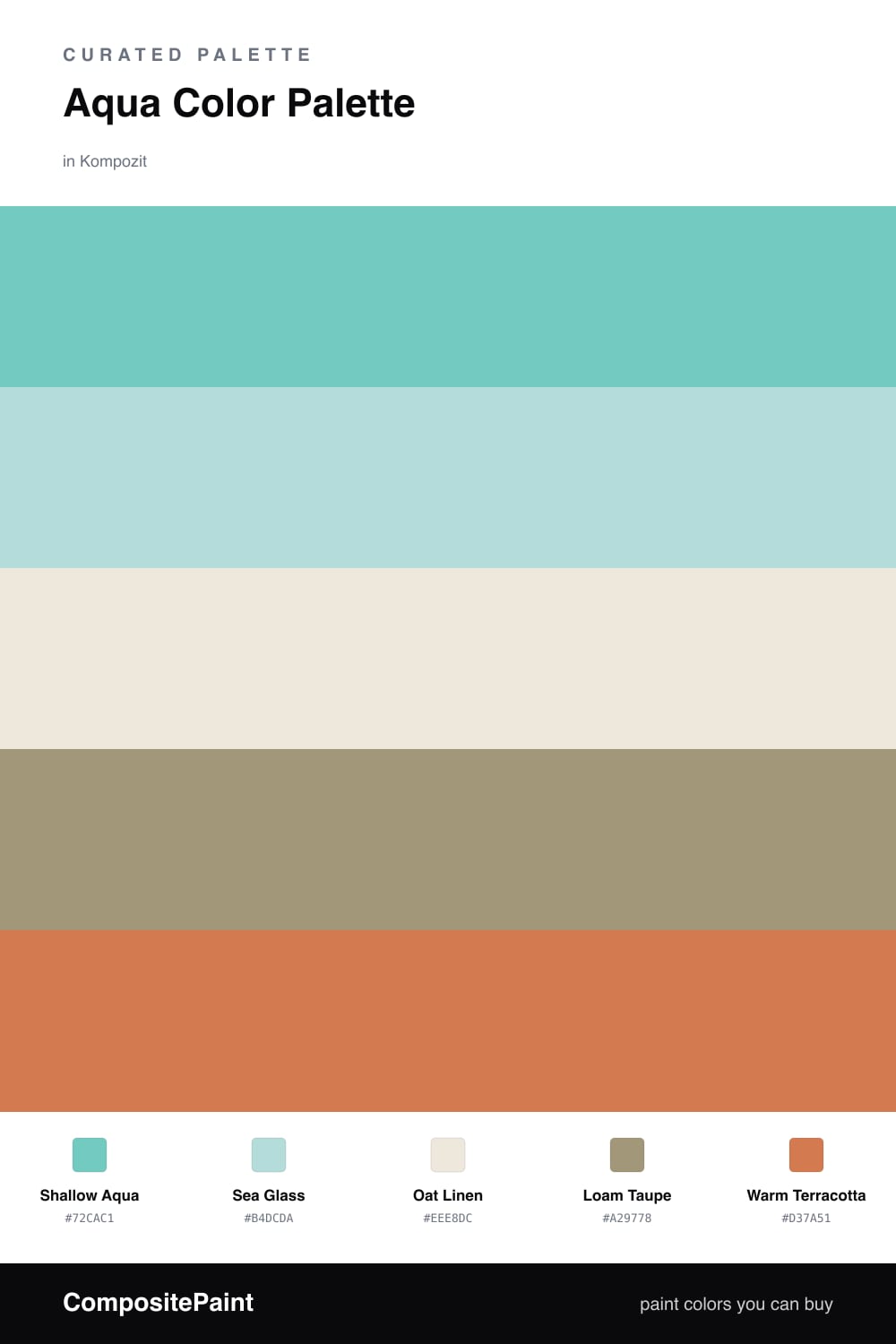
Aqua is having a real moment in 2026, and Shallow Aqua is the kind of clear, watery blue-green that feels calm without being icy. It leads this whole scheme, so think walls, a large piece of furniture, or a cabinet run. Sea Glass is its softer cousin, a lighter wash of the same family you can use on a ceiling or an adjoining wall to keep things airy.

What makes this palette feel current instead of beachy is the earth underneath it. Oat Linen is your warm, almost-white base, and Loam Taupe brings in a real soil-brown that grounds all that cool aqua. That warm-and-cool pairing is the trick — it stops the aqua from reading like a kids bathroom and lets it feel like a thoughtful, lived-in space.

Then a little Warm Terracotta to wake everything up. You only need a touch, since a small clay-orange spark across the wheel from aqua makes both colors look richer. Try it on a single accent and let the rest stay quiet.

Buy These Colors

Each color matched to the closest real paint in every brand, by ΔE2000. Kompozit first; take any SKU to the store — these mix on demand.

Shallow Aqua
#7FC6C2 · LRV 49 · Dominant
Kompozit Turkish Teal · 0694 ΔE 3.03
Backdrop Lost in the 80s · BD-LO ΔE 13.79
Behr Crashing Waves · S450-4 ΔE 1.2
Benjamin Moore Oceanic Teal · 669 ΔE 1.52
Clare Vacay · PNT100-LT-44 ΔE 7.36
Dunn-Edwards Tranquil Teal · DE5703 ΔE 3.47
Farrow & Ball Blue Ground · No. 210 ΔE 8.13
Magnolia Home Texas Summer · JG-64 ΔE 10.29
PPG / Glidden Caribbean Crush · 17-31 ΔE 1.8
Sherwin-Williams Holiday Turquoise · SW 75 ΔE 2.56
Valspar Gentle Wave · 5007-7C ΔE 1.81
Sea Glass
#B7DDD8 · LRV 67 · Secondary
Kompozit Outerspace · 0686 ΔE 1.33
Backdrop Real Real · BD-RR ΔE 16.18
Behr Oceanic Climate · N470-2 ΔE 2.43
Benjamin Moore Maritime Blue · 667 ΔE 1.55
Clare Nairobi Blue · PNT100-LT-36 ΔE 5.93
Dunn-Edwards Jaded Clouds · DE5702 ΔE 3.07
Farrow & Ball Borrowed Light · No. 235 ΔE 11.23
Magnolia Home Mineral Green · JG-67 ΔE 8.8
PPG / Glidden Minerva · 1231-3 ΔE 0.8
Sherwin-Williams Meander Blue · SW 6484 ΔE 2.68
Valspar Brilliante · V065-2 ΔE 1.82
Oat Linen
#EFE8DA · LRV 81 · Base
Kompozit Hint of Vanilla · 0001 ΔE 0.83
Backdrop Don't Eat the Yellow Snow · BD-DS ΔE 3.75
Behr Chenille Spread · HDC-NT-03 ΔE 0.91
Benjamin Moore Stoneware · CSP-245 ΔE 1.23
Clare Like Buttah · PNT100-LT-62 ΔE 2.04
Dunn-Edwards Ball of String · DE6190 ΔE 0.52
Farrow & Ball James White · No. 2010 ΔE 2.19
Magnolia Home Antique Rose · JG-23 ΔE 0.53
PPG / Glidden Angel Food · 1088-1 ΔE 0.52
Sherwin-Williams Creamy · SW 7012 ΔE 0.43
Valspar Dover White · 7007-1 ΔE 0.22
Loam Taupe
#A7967E · LRV 32 · Support
Kompozit Abbey Stone · 0365 ΔE 4.53
Backdrop Anita · BD-AN ΔE 2.45
Behr Pure Earth · PPU7-05 ΔE 2.72
Benjamin Moore Beige Gray · ES-51 ΔE 1.63
Clare Shade · PNT100-MD-14 ΔE 10.22
Dunn-Edwards Wooden Peg · DE6215 ΔE 1.29
Farrow & Ball Charleston Gray · No. 243 ΔE 5.77
Magnolia Home Antiquing · JG-128 ΔE 4.37
PPG / Glidden Sauteed Mushroom · 1085-5 ΔE 2.92
Sherwin-Williams Colonial Revival Stone · SW 2827 ΔE 1.09
Valspar Wild Mushroom · 3007-9C ΔE 1.12
Warm Terracotta
#C77B57 · LRV 27 · Accent
Kompozit Jack-O-Lantern · 1038 ΔE 2.64
Backdrop Anita · BD-AN ΔE 16.7
Behr Moroccan Sky · PPU3-01 ΔE 1.99
Benjamin Moore Pennies From Heaven · 063 ΔE 1.3
Clare Fire Sign · PNT100-DP-74 ΔE 4.44
Dunn-Edwards Spanish Peanut · DE5180 ΔE 2.49
Farrow & Ball Red Earth · No. 64 ΔE 5.31
Magnolia Home Work Worn Wood · JG-35 ΔE 5.44
PPG / Glidden Brown Clay · 1199-6 ΔE 1.01
Sherwin-Williams Copper Wire · SW 7707 ΔE 0.23
Valspar Clove Bud · 2004-5B ΔE 0.9

Questions

Why does aqua work with earthy browns?

Aqua is cool and fresh, so the warm loam and oat tones balance it out. The brown keeps the aqua from feeling cold or clinical, and the two together feel grounded and modern.

How much aqua should I actually use?

Let aqua lead on your biggest surfaces, then keep the loam and oat as the quiet middle. Save the terracotta for small doses like a chair, a pillow, or a single shelf.

Similar Palettes

Closest schemes by color — not by label.