Oyster Cracker
A light warm beige sold at Home Depot in nearly every sheen there is, reviewed honestly: the light it needs, the tile it fights, and what to pick instead.

Jessica has spec'd whites and neutrals for more than 300 rooms and keeps a sample wall of painted drawdowns in her studio. Every color review is checked against real reader rooms in the comments and re-tested when a formula changes. About the testing process →
- 1Agreeable Gray60
- 2Pale Oak69
- 3Oyster Cracker86
- 4Lightning White92
The Fast Verdict
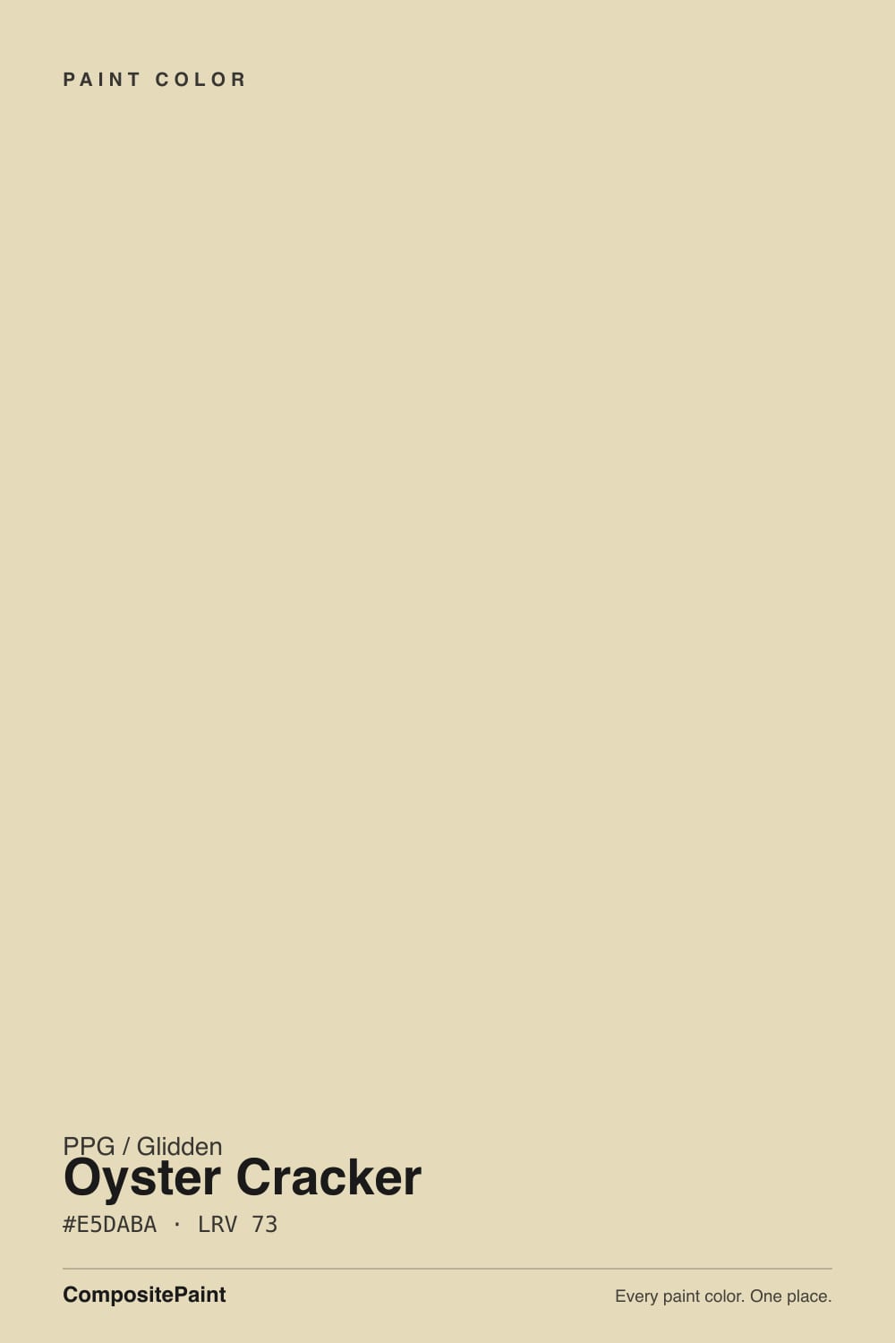
Oyster Cracker is the color a builder reaches for when a room needs one safe wall color and nothing else. It is a light, warm beige with a yellow base — but PPG grays that yellow down with a whisper of green, so it never tips buttery or peach. At LRV 86 it reflects plenty of light without going stark. It will not win a magazine feature. It will also not embarrass a room, which is the entire point of a color like this.
Whole-house walls in decent daylight · hallways and stairwells that need one safe neutral · resale-ready rooms and rental flips · anyone who wants an off-white but finds true white too stark
You actually want a true bright white · your room runs cool LEDs with little daylight · your tile or stone leans pink or rosy · you want a color with a documented design pedigree
- A genuinely safe, forgiving warm beige for whole-house walls
- LRV 86 hides everyday scuffs and shadows better than a true white
- Never tips buttery-yellow or peach — the green keeps it grounded
- Sold in nearly every sheen, inside and out, on one color chip
- Flatters warm wood floors and trim without competing with them
- Reads flat and slightly minty in cool, dim light
- Fights pink or rosy tile and stone
- Not a true white — disappoints buyers expecting bright
- No trend story or design pedigree — a plain workhorse, nothing more
What Color Is Oyster Cracker, Really?
A light warm beige built on a yellow-white base, cooled by a real whisper of green rather than the usual pink or gray most off-whites lean on. That green is subtle enough that most people will only ever call it "a nice warm beige," but it is doing real work: it keeps the color from drifting into the peachy or apricot territory that pure yellow-based off-whites fall into under strong afternoon sun. It is sold across nearly every sheen PPG's Glidden line makes — flat, eggshell, satin, semi-gloss, even a dedicated exterior satin — which is a good sign of what kind of color it is: an all-purpose, work-anywhere neutral, not a boutique designer pick with one recommended use.
At LRV 86 it sits in the same light-mid band as most "safe" off-whites: clearly lighter than a taupe or greige, clearly not a true white. Put it next to an actual white and the beige shows immediately — that gap is useful, because it means the color absorbs scuffs, shadows and handprints in a way a brighter white would broadcast. On a wall in good light it reads calm and finished; it is not going to surprise anyone, which for a whole-house color is a feature, not a flaw.
Undertone in one line: warm yellow at the base, grayed by a touch of green — never pink, never blue. If your wall looks minty or flat gray, that is cool daylight pulling the green forward, not a different can of paint. If it looks slightly peachy in strong afternoon sun, that is normal for any warm-based off-white and will settle back once the light moves.
Where It Shines
This is a color built for the practical rooms of a house rather than the photographed ones. Give it real daylight and it is a genuinely easy whole-house wall color — hallways, stairwells, bedrooms, the rooms that need to look finished without asking for a design decision. Because it is sold in nearly every finish and even as an exterior paint, it is the kind of color a painter can use on walls, trim and siding in the same job without hunting for a match. It flatters warm wood floors and trim, hides everyday wear better than a bright white, and never demands the room work around it.
Where It Fails
The complaints about a plain, all-purpose beige like this one are predictable, and none of them are really about the paint failing — they are about the paint being asked to do a job it was never built for.
North light or a shaded exposure pulls the green forward and drains the yellow warmth, leaving a flat, slightly minty gray-beige instead of the soft warm neutral on the sample chip. The paint did not change; the light did. Test a large sample in the actual room before committing a whole floor plan to it.
Green sits opposite pink on the color wheel, and this color's green whisper is real enough to argue with rosy marble, blush tile or warm-pink vinyl plank. Both sides end up looking a little muddy. If your bathroom or kitchen already has pink-leaning stone, sample this color against it before buying the gallon.
At LRV 86 this is a beige, not a white, and buyers who picked it hoping for "off-white, basically white" are the ones who end up disappointed. Next to a genuinely bright white trim or ceiling it will read dingy by comparison — the fix is either committing to the beige everywhere or choosing an actual white instead.
Room by Room
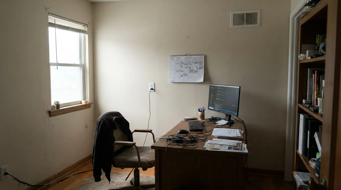
In a room with real daylight it is a calm, forgiving backdrop for wood furniture without pulling focus. Eggshell finish holds up to daily wear; keep bright white trim to a minimum or it will make the walls look flatter by comparison.
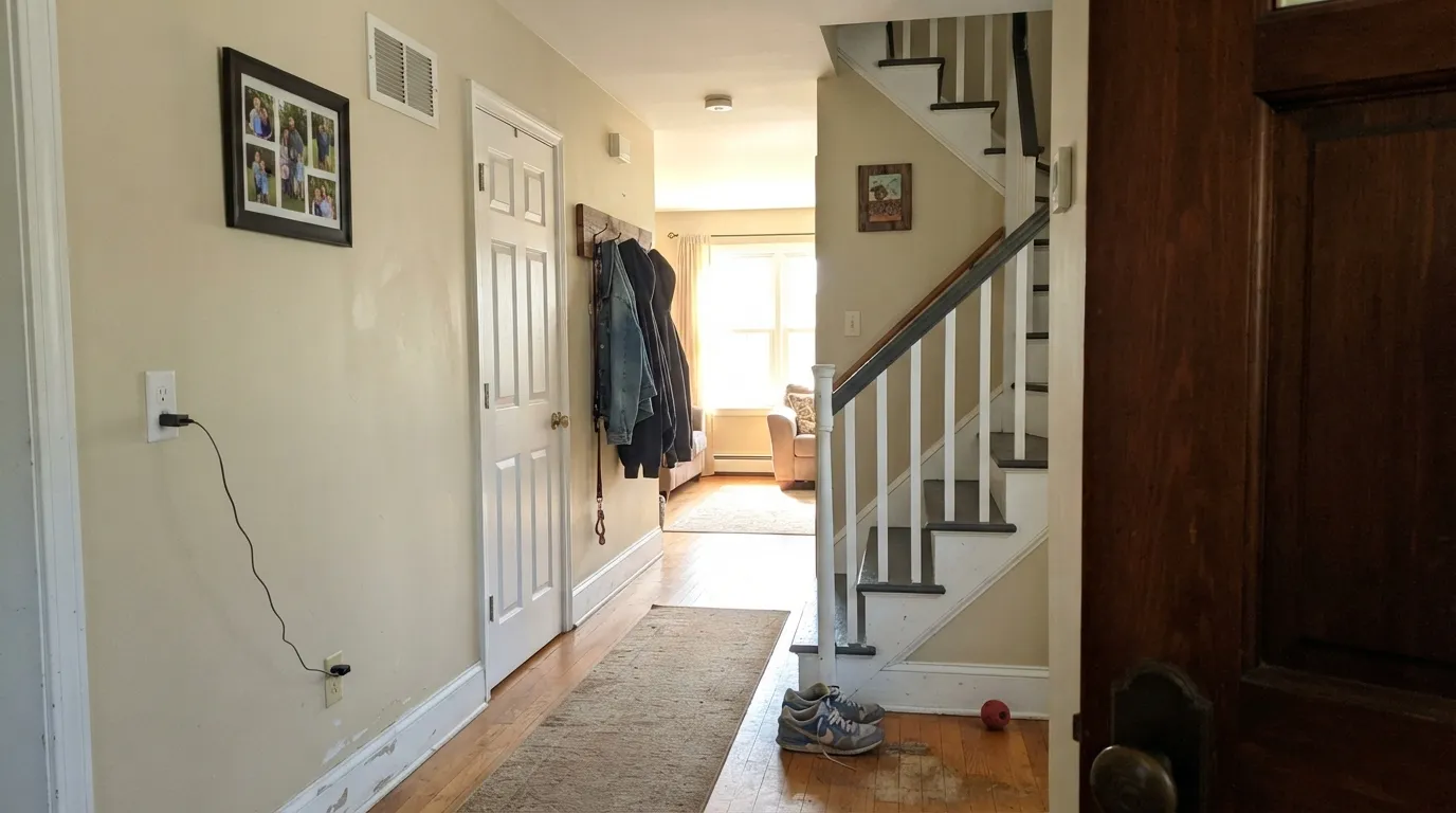
This is exactly the kind of color a hallway needs: one safe neutral that carries from room to room without an opinion. It hides the scuffs a hallway collects better than a brighter white would.
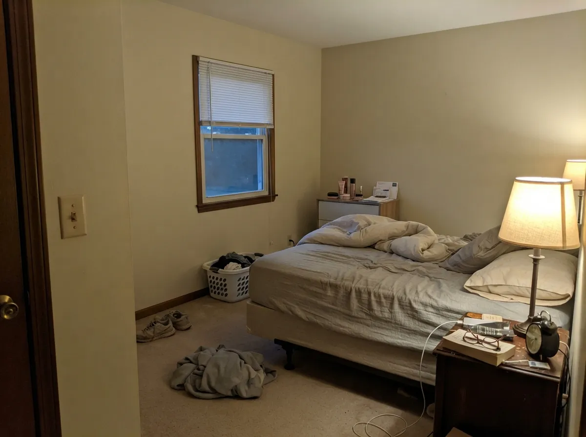
Under warm 2700K lamps it turns gently tan and cozy. In a north-facing bedroom with little natural light, expect it to read flatter and grayer than the chip suggests.
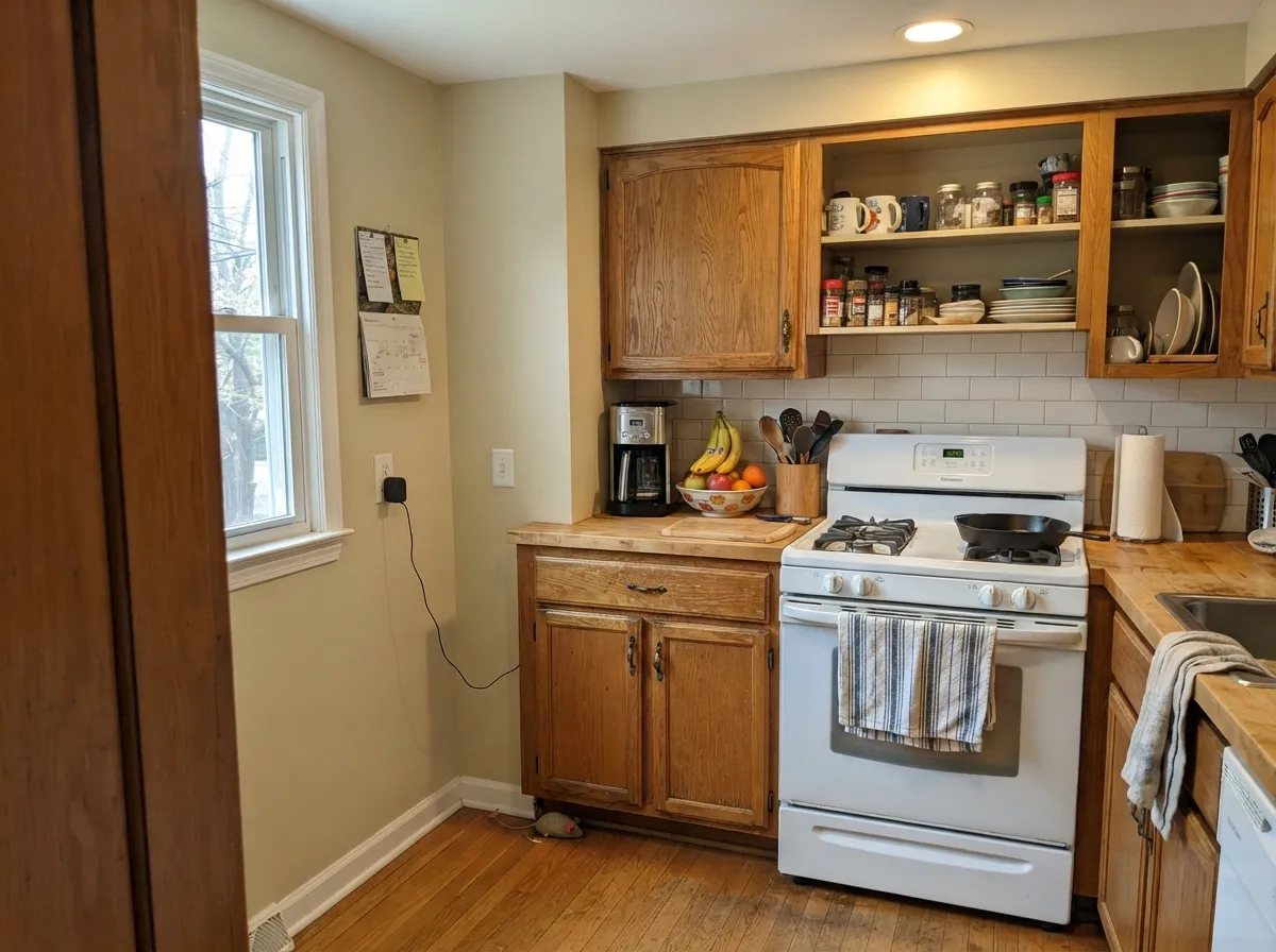
Warm wood cabinets, butcher block and brass hardware sit comfortably next to it. Cool gray or blue-veined marble counters push it toward looking slightly dull; warm-toned quartz or granite is the safer match.
With warm-toned or neutral tile it is an easy, low-drama wall color. With pink, rose or mauve-leaning tile, the green undertone starts to fight the tile instead of complementing it — sample first.
PPG offers this color in a dedicated exterior satin, and it holds up as a light, warm siding color in full sun. Pair it with a darker trim for contrast rather than a bright white, which will make the body color look tired next to it.
Your Light Is the Risk
South or west sun lets the yellow base show through the green whisper — a soft, honest beige, exactly what the chip promises.
Cool daylight pulls the green forward and drains the warmth, leaving a flat, slightly minty gray-beige. Sample here first.
Warmer and tanner at the sun hours, quieter and grayer once the direct light passes. A normal, gentle shift.
2700K bulbs push it toward a soft tan. Cool LEDs flatten it back toward gray-green — swap the bulbs before you swap the paint.
Most complaints about Oyster Cracker are a light mismatch. Upload a photo of your actual room and see it on your walls — then ask for the same wall in north light or evening lamps before you buy a single sample.
Need It From Another Brand?
Any paint counter can custom-tint PPG / Glidden PPG1108-1 directly. If you would rather stay in one brand's own deck, these are the closest stock matches, measured as ΔE2000. Under 2 is a difference you will not see on the wall.
| Brand | Closest color | ΔE | LRV | |
|---|---|---|---|---|
| Sherwin-Williams | Yellow BeamSW 7123 · Sherwin-Williams | 3.5 | 86 | Color page → |
| Behr | Creme Brulee360E-1 · Behr | 2.1 | 85 | Color page → |
| Benjamin Moore | Vanilla Cookie372 · Benjamin Moore | 1.8 | 83 | Color page → |
| Valspar | Yellow Bliss3008-4C · Valspar | 3.4 | 85.7 | Color page → |
| Glidden | Oyster CrackerPPG1108-1 · Glidden | 0.6 | 86 | Color page → |
| Dutch Boy | Pithed Lemon122-1DB · Dutch Boy | 1.9 | 83 | Color page → |
Similar PPG / Glidden Colors
The nearest shades to Oyster Cracker within PPG / Glidden's own range, ranked by perceptual color distance — useful when you want the same look a touch lighter, darker, or warmer.
WCAG 2.1: AA is 4.5 : 1 for normal text, 3 : 1 for large text, AAA is 7 : 1.
Oyster Cracker vs the Colors You're Also Considering
Every Oyster Cracker sample board has the same rivals on it. The numbers show the real lightness gap — then it comes down to which risk you would rather live with.
Pick this if you want PPG's version with its own faint green instead of BM's flatter warm cream.
Benjamin Moore OC-23 · LRV 73Bone WhitePick this if your painter only stocks Benjamin Moore — it sits at the same LRV and does the same quiet job.
Pick this for the lighter, more yellow-based version of the same idea.
Sherwin-Williams SW 7637 · LRV 72Oyster WhitePick this if you want more greige weight — it leans warmer and grayer than a true white despite the name.
Oyster Cracker (PPG1085-2, LRV 73) lives in a tight family of warm PPG creams, and the differences are subtle but real on a wall.
At The Beach (PPG12-28, LRV 70) and Deserted Beach (PPG1104-3, LRV 71) are close cousins. Both are a hair deeper, so they feel slightly more sandy and grounded, while Oyster Cracker stays a touch lighter and reads closer to a soft white. If you want the color to disappear into brightness, Oyster Cracker wins; if you want a little more presence, the beaches do.
Irresistible (PPG1094-1, LRV 72) is nearly the same lightness but leans a little cleaner and less gold, so it is a good swap if Oyster Cracker looks too yellow in your light. Sandcastle Symphony (PPG12-32, LRV 69) is the warmest and deepest of the group, better as a full wall color than as trim. Sample two or three side by side, since photos flatten these distinctions.
Oyster Cracker Coordinating Colors
The rule for coordinating with this color is simple: keep trim and accents on the warm-to-neutral side, and be cautious with anything rosy or pink. It pairs cleanly with true whites, warm woods, and near-black accents, and it argues with pink-leaning stone and tile. These are the partners that keep it looking intentional rather than accidental:
Oyster Cracker on Exteriors
This is one of the less common off-whites that is genuinely sold and used outside the house rather than only marketed that way: PPG offers it as a dedicated exterior satin alongside the interior finishes. In full sun it reads a touch brighter and cleaner than it does indoors, and the green whisper that shows up in cool interior light is far less noticeable against open sky.
The pairing decision matters as much outside as in. A darker trim — a near-black or a deep charcoal-greige — gives the body color clean contrast and keeps it from looking washed out against a bright sky. A brighter white trim tends to make the beige siding look slightly tired by comparison, the same effect it has indoors.
Oyster Cracker With Wood Tones and Floors
Warm wood is this color's easiest company: oak, walnut and honey-toned floors all sit comfortably against it because both the wall and the floor are working from the same warm-yellow starting point. It does not amplify orange-leaning builder oak the way a cooler off-white can, which makes it a practical choice over floors nobody plans to replace.
The one flooring pairing that needs a sample first is anything with a rosy or pink cast — pink-toned engineered wood, some LVP lines, and rose-veined stone. The color's green undertone is subtle on its own but becomes obvious next to pink, and neither the floor nor the wall benefits from the contrast.
Three Ready Palettes Built on Oyster Cracker
A color is never alone on the wall. These are complete combinations in the 60-30-10 pattern, with the reason each one holds together. Every one opens in the visualizer.
A close-value trim keeps the handoff soft instead of stark, which flatters this color's beige better than a bright white would. The near-black door supplies the one dark note the scheme needs without fighting the green undertone.
Try this palette in your roomBeige walls at LRV 86 let a genuinely bright cabinet white stand out instead of competing with it, and the charcoal-greige island grounds the room without arguing with the green undertone the way a cooler gray might.
Try this palette in your roomThe classic flip formula: a safe warm beige on every wall, a crisp bright trim white for contrast, and one navy front door for curb appeal. Nothing here asks a buyer to have an opinion.
Try this palette in your roomOyster Cracker FAQ
Is Oyster Cracker warm or cool?
Warm at the base — it starts from a yellow-white and PPG grays it with a real whisper of green. It never reads pink and never reads blue; in cool light the green comes forward and it can look flat or slightly minty.
Is it a white or a beige?
A beige. At LRV 86 it reflects a good amount of light, but put it next to an actual white and the color shows immediately. Buyers expecting a near-white are the ones most likely to be disappointed.
What trim white goes with it?
A genuinely bright white — Sherwin-Williams Extra White or a similar sharp trim white gives it clean contrast without fighting the beige. A soft warm white close to its own value will blend the wall and trim into one quiet plane instead.
Will it look green in a north-facing room?
It can. Cool north daylight pulls the green undertone forward and drains the yellow warmth, leaving a flatter, slightly minty gray-beige than the chip shows. Sample a large piece of poster board in the actual room before painting.
Does it work with pink or rose-toned tile?
Not well. Green sits opposite pink on the color wheel, so rosy marble, blush tile or warm-pink flooring will argue with the undertone and both sides can look muddy. Sample against the actual tile first.
Can I use it outside?
Yes — it is sold as a dedicated exterior satin, not just an interior color, and it works as a light, warm siding color in full sun. Pair it with a darker trim rather than a bright white for the cleanest contrast.
Have you painted with Oyster Cracker?
Rate it — one tap helps the next reader decide.
Ask a Question