Color of the Year: Every Brand's Pick, Year by Year
The 2026 colors of the year from Sherwin-Williams, Benjamin Moore, Behr, Valspar, PPG, Glidden and Pantone, the first 2027 pick, the 2022 line-up everyone still searches for, and a year-by-year table back to 2020 — with the exact names, codes and LRVs.

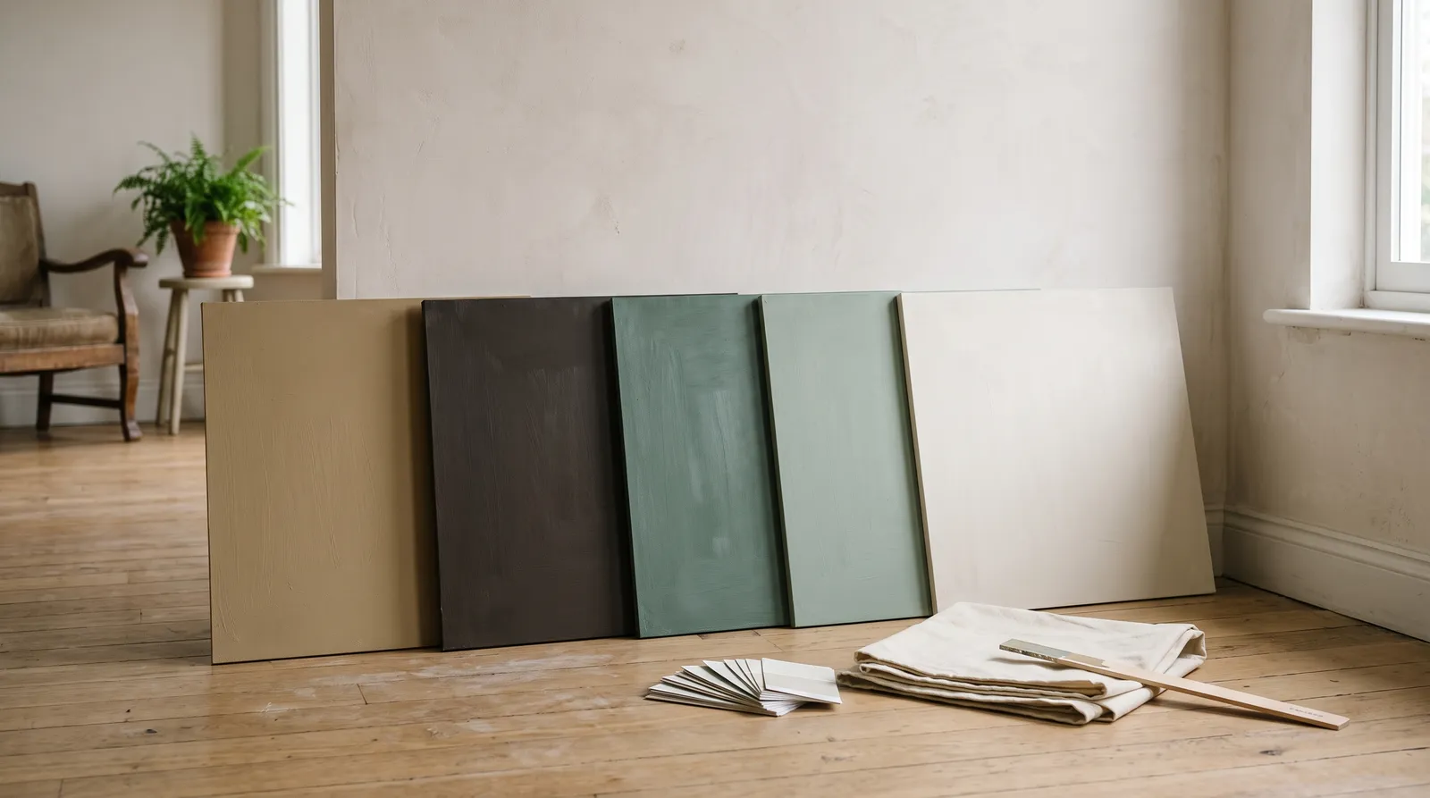
There is no single color of the year. Every paint brand names its own, they almost never agree, and 2026 is the clearest example yet — Pantone picked an off-white, Benjamin Moore picked an espresso brown, and Behr picked a smoky jade green. Below is every 2026 pick with its exact code, the first 2027 announcement, the 2022 line-up that people still search for more than any other year, and a table back to 2020.
Here is the verdict up front. The most useful 2026 pick for the most homes is Sherwin-Williams Universal Khaki (SW 6150). It is a mid-tone warm tan at LRV 40, it works in almost any light, and it does not date. The most interesting is Behr Hidden Gem (N430-6A) — a smoky jade that earns a real room rather than an accent wall. The one I would skip for a main living space is Benjamin Moore Silhouette (AF-655) unless you have big windows and a plan for the trim.
What a Color of the Year Actually Is
It is a forecast, published by a company that sells the thing it is forecasting. That is not a criticism — it is just the accurate description, and it tells you how much weight to give it.
Each brand runs a small trend team. They watch fashion, film, travel and materials, and they also watch something the press releases rarely mention: their own sales data. A color that has been quietly climbing in the deck for two years makes a safer pick than a color nobody has bought. That is why these picks so often feel familiar rather than new. Evergreen Fog was already selling well before Sherwin-Williams named it in 2022.
Pantone is the odd one out. It is a color-matching system for print, plastics and textiles, not a paint company, so its pick is aimed at the whole design world. You cannot buy a gallon of Pantone, but any paint counter will tint a close match.
What you do get from a color of the year is real: a color the brand has stocked heavily, built a coordinating palette around, and tested across its product lines. The trim white and the ceiling white are already chosen for you. The year on the label is the part you can ignore.
The 2026 Colors of the Year
Nine picks, one per brand, in the order most people search for them. Each one is a real, buyable color.
Pantone Cloud Dancer (11-4201)
Hex: #F0EEE9 · LRV: approximately 86 · Undertone: soft neutral off-white, barely warm
The first white Pantone has ever named, and the pick that set the tone for the whole year. Cloud Dancer is a lofty off-white sold as an antidote to an overstimulated culture — a reset rather than a statement. On a wall it is a genuinely good high-LRV white: warm enough not to go blue under lamplight, restrained enough not to read cream. The trade-off is that above LRV 85 a white throws glare back at you in a bright room and shows every drywall flaw under raking light. Buy it for a dim room. Skip it if you already get strong direct sun.
Since Pantone is not paint, use the matches: Sherwin-Williams Pure White (SW 7005), Behr White Mink (PWN-53), or Farrow and Ball Wevet (No. 273). Our shades of white guide has the wider shortlist.
Sherwin-Williams Universal Khaki (SW 6150)
Top pick of the whole 2026 field. Universal Khaki is an earthy mid-tone tan that behaves like a neutral without being beige-boring, and at LRV 40 it sits in the band where a wall stops competing with your furniture and starts holding it together. It wins on versatility: it works in north light, it works in west light, and it does not turn orange under a warm bulb the way most tans do. It falls short on drama, and it needs warm wood or brass nearby — against cold chrome and grey flooring it can read dusty.
Trim and ceiling: Sherwin-Williams Pure White (SW 7005) in satin on the trim, same color flat on the ceiling. Sold at Sherwin-Williams stores.
Benjamin Moore Silhouette (AF-655)
The most confident pick of the year. Silhouette is a rich espresso with charcoal in it, drawn from tailoring rather than nature, and in a dining room, a study or a set of built-ins it is superb — deep enough to disappear at the edges, warm enough never to feel like a black box.
It is also the pick most likely to go wrong. At LRV 10 it needs real daylight and at least two lamps, it magnifies every bad corner and cheap trim profile, and in a small north-facing room it collapses into flat brown-grey. Buy it if you have a big window and good millwork. Skip it if this is your only living space or you are selling within the year.
Trim and ceiling: Benjamin Moore White Dove (OC-17) in satin on the trim, same color flat on the ceiling. Sold at Benjamin Moore independent dealers.
Behr Hidden Gem (N430-6A)
The most interesting color in the 2026 line-up, and the one that has split designers most. Hidden Gem is a deep, slightly dusty jade with enough warmth to stay cozy and enough blue to stay serious. On kitchen cabinets it is excellent — it reads custom rather than trend-led, and it takes brass, unlacquered nickel and warm oak without a fight. It wins on depth and falls short on flexibility: in a dim room it slides toward slate and the green you paid for goes missing. Most rooms are better served by cabinets or a built-in than by four walls of it.
Trim and ceiling: Behr Blank Canvas (DC-003) in satin on the trim, same color flat on the ceiling. Sold at Home Depot.
Valspar Warm Eucalyptus (8004-28F)
The quiet workhorse. Warm Eucalyptus is a muted mid-deep green-grey with a vintage feel, and it is the most livable of the darker 2026 picks — dark enough to feel considered, light enough at LRV 21 that it does not swallow a normal room. On a bedroom wall or a mudroom it is hard to beat for the money.
The catch is Valspar’s split retail. The 8004-28F version is a Lowe’s exclusive; independent Valspar retailers carry Sage Slate (V143-5) as the equivalent shade. Same look, different code, so bring the right one to the counter.
Trim and ceiling: Valspar Du Jour (7002-6) in satin on the trim, same color flat on the ceiling. Sold at Lowe’s.
PPG Secret Safari (PPG1110-4)
The riskiest pick on this list, and the one I would sample hardest. Secret Safari is a soft yellow-green in the dry-grass family — energetic, warm, and completely unlike the muted greens everyone else chose. In the right room it is genuinely fresh: a sunroom, a hallway with a skylight, a laundry. In the wrong room it goes chartreuse fast. At LRV 48 it bounces a strong color cast onto ceilings and faces, and under 4000K bulbs it reads acidic. Buy it for a specific, well-lit small room. Skip it as a whole-house neutral.
Trim and ceiling: PPG Delicate White (PPG1001-1) in satin on the trim, same color flat on the ceiling. Sold at PPG stores and independent dealers.
Glidden Warm Mahogany
Code PPG1060-7. Glidden went further than anyone in 2026 — a deep mahogany red pitched at dining rooms, libraries and bedrooms, where the depth creates intimacy without going black. It is a better color than the description suggests: the brown in it keeps the red from reading fire-engine, and under lamplight it turns genuinely handsome. It is a specialist, though. At LRV 8 it needs a warm bulb to look its best, and it is a repaint problem for the next owner. One room, done properly, is the right dose.
Trim and ceiling: Glidden Delicate White (PPG1001-1) in satin on the trim, same color flat on the ceiling. Sold at Home Depot.
Dutch Boy Melodious Ivory (313-2DB)
The softest pick of the year. Melodious Ivory is a warm, creamy ivory that sits well above the neutral line — it is a color, not a white, and it reads that way on a wall. In a bedroom or a north-facing room it does the thing pale greys cannot: it puts warmth back into cold light. Be honest about the peach, though. In evening light it reads distinctly warm, and if you wanted a neutral you will notice. Sample it against your trim white first.
Trim and ceiling: a clean neutral white in satin on the trim, same white flat on the ceiling. Sold at Menards and independent Dutch Boy dealers.
Dunn-Edwards Midnight Garden (DE5657)
The best deep green of the 2026 group if you want olive rather than jade. Midnight Garden is grounded and matte-looking even in eggshell, and it is the pick I would choose for exterior shutters, a front door, or a garden room. Against limestone, terracotta and unfinished oak it looks like it grew there. Same warning as every LRV 14 color: indoors, give it a window. Outdoors it holds up better than most greens, because the grey in it resists the yellowing that kills brighter olives.
Trim and ceiling: Dunn-Edwards Whisper (DEW340) in satin on the trim, same color flat on the ceiling. Sold at Dunn-Edwards stores.
C2 Paint Epernay (C2-639)
The under-the-radar pick. Epernay is a champagne gold — warmer and more saturated than a beige, more restrained than a true yellow. C2’s pigment loads are heavy, so it reads with more depth on a wall than the chip suggests, which is the whole argument for the brand. It is a sunlight color: in a dim room it flattens to plain tan. Availability is the other trade-off, since C2 is independent-dealer only.
Trim and ceiling: a soft warm white in satin on the trim, same color flat on the ceiling. Sold at C2 independent dealers.
The 2027 Colors of the Year So Far
The 2027 season opened on August 5, 2026, and as of early August only one brand has announced.
Valspar Cottage Door (8004-38E)
Valspar goes first every year, and Cottage Door is a smart opening move: a mid-tone blue that blends warm and cool undertones, pitched as an antidote to curated perfection. At LRV 26 it is a real wall color rather than an accent — deep enough to feel intentional, light enough for a bedroom or a bathroom without extra lighting.
Valspar pairs it with Moon Shot (8005-2B), a soft warm grey, and Apricot Blush (8003-8A), a muted creamy pink. Sold at Lowe’s and at independent Valspar retailers.
The rest of the calendar runs like this. Behr, Dutch Boy and Glidden usually announce through late August. Sherwin-Williams, Benjamin Moore, C2, Dunn-Edwards and the UK brands land September through October. Pantone closes the season in the first week of December. So the 2027 picture is roughly complete by Halloween, with one December surprise.
The 2022 Colors of the Year
2022 is the year people still search for more than any other, and the reason is simple: two of its picks became permanent best-sellers rather than a season’s trend.
Sherwin-Williams Evergreen Fog (SW 9130)
The most successful color of the year any brand has named this decade. Evergreen Fog is a grey-green that reads as a neutral in bright light and as a soft sage in dim light, and four years on it is still one of the most-specified greens in the country. It works in almost any orientation and it does not go minty under LED, which is where cheaper sages fail.
Benjamin Moore October Mist (1495)
The lighter sibling to Evergreen Fog and the safer choice of the two. At LRV 47 October Mist is bright enough for a whole room in average light, and it is one of the few sages that never tips green enough to look like a color decision. It has aged extremely well.
Behr Breezeway (MQ3-21)
The palest of the 2022 greens, and the one that has dated most. Breezeway is a light sea-glass tint that looked fresh in 2022 and now reads a touch cool and hospital-adjacent in weak light. It still earns a bathroom or a laundry, where the coolness is an asset.
PPG Olive Sprig (PPG1125-4)
The quietest 2022 pick and an underrated one. Olive Sprig is close in feel to October Mist but with more olive warmth, which makes it a better partner for oak and rattan. It has aged as well as anything from that year.
Pantone’s 2022 pick was Very Peri (17-3938), a blue-violet the company invented specifically for the announcement — the only time it has ever created a new color for the honor. It made almost no impact on paint. That gap between what the color world announces and what people actually put on walls is the most useful thing 2022 teaches.
Color of the Year by Year, 2020 to 2026
| Year | Pantone | Sherwin-Williams | Benjamin Moore | Behr |
|---|---|---|---|---|
| 2026 | Cloud Dancer 11-4201 | Universal Khaki SW 6150 | Silhouette AF-655 | Hidden Gem N430-6A |
| 2025 | Mocha Mousse 17-1230 | Color Capsule, 9 colors | Cinnamon Slate 2113-40 | Rumors MQ1-15 |
| 2024 | Peach Fuzz 13-1023 | Upward SW 6239 | Blue Nova 825 | Cracked Pepper PPU18-01 |
| 2023 | Viva Magenta 18-1750 | Redend Point SW 9081 | Raspberry Blush 2008-30 | Blank Canvas DC-003 |
| 2022 | Very Peri 17-3938 | Evergreen Fog SW 9130 | October Mist 1495 | Breezeway MQ3-21 |
| 2021 | Ultimate Gray 17-5104 and Illuminating 13-0647 | Urbane Bronze SW 7048 | Aegean Teal 2136-40 | Canyon Dusk S210-4 |
| 2020 | Classic Blue 19-4052 | Naval SW 6244 | First Light 2102-70 | Back to Nature S340-4 |
Two things stand out reading down the columns. First, the picks almost never match — in seven years, no two of these four brands have named the same color family in the same year more than by accident. Second, the neutrals survive and the statements do not. Urbane Bronze, Evergreen Fog, October Mist and Blank Canvas are all still in heavy use. Viva Magenta, Peach Fuzz and Very Peri went straight into the archive.
How to Actually Use a Color of the Year
Start by ignoring the year and asking the same question you would ask about any chip: what does this do in my light, in this room, next to my floor?
Use the palette, not just the color. Every brand publishes coordinating colors alongside the headline pick, and that is the part with real value. Valspar pairs Cottage Door with Moon Shot and Apricot Blush. Benjamin Moore ships Silhouette inside a seven-color trend palette. Somebody has already solved the trim, the ceiling and the accent for you.
Dose the bold ones. The deep 2026 picks — Silhouette, Warm Mahogany, Hidden Gem, Midnight Garden — are all better as one room, one set of cabinets, or one built-in than as a whole floor. A dining room, a powder room, a study, an office nook, a front door, the inside of a bookcase. That is where a strong color pays for itself and stays easy to undo.
Let the neutrals go everywhere. Universal Khaki, Melodious Ivory and a Cloud Dancer match are whole-house colors. Wrap them, and use the year’s bold pick as the accent inside that shell.
Sample properly, three times a day. Two coats on a poster board, not the wall. Look at it at 9am, at 3pm, and at 8pm with only lamps on. Move it to each wall of the room. Light direction changes these colors more than the brand difference between any two of them, and the deep 2026 picks are the least forgiving colors on that front. Peel-and-stick samples from the samples page are the fastest version of this.
Check the numbers, not the adjectives. Press releases describe colors as grounding, energizing and timeless. LRV tells you what will actually happen to your room. Anything under LRV 20 needs real daylight plus lamps. Anything over LRV 80 needs the room to be dim or you get glare. The 40-to-60 band is where most rooms are happiest.
Which 2026 Pick Should You Actually Buy?
If you want one color for most of the house, Universal Khaki. If you want a green with depth and you have light, Hidden Gem for cabinets or Warm Eucalyptus for walls. If you want a dark, formal room and you have the windows for it, Silhouette. If you want an olive for outside, Midnight Garden. If you want the year’s off-white, buy a paint version of Cloud Dancer rather than chasing the Pantone number.
And if you want to see any of them on your own wall before you spend anything, upload a photo of the room to the visualizer and try the shortlist. Colors of the year are chosen to photograph well in a press image. Your living room at 4pm in November is a harder test, and it is the one that counts.
Ask a Question