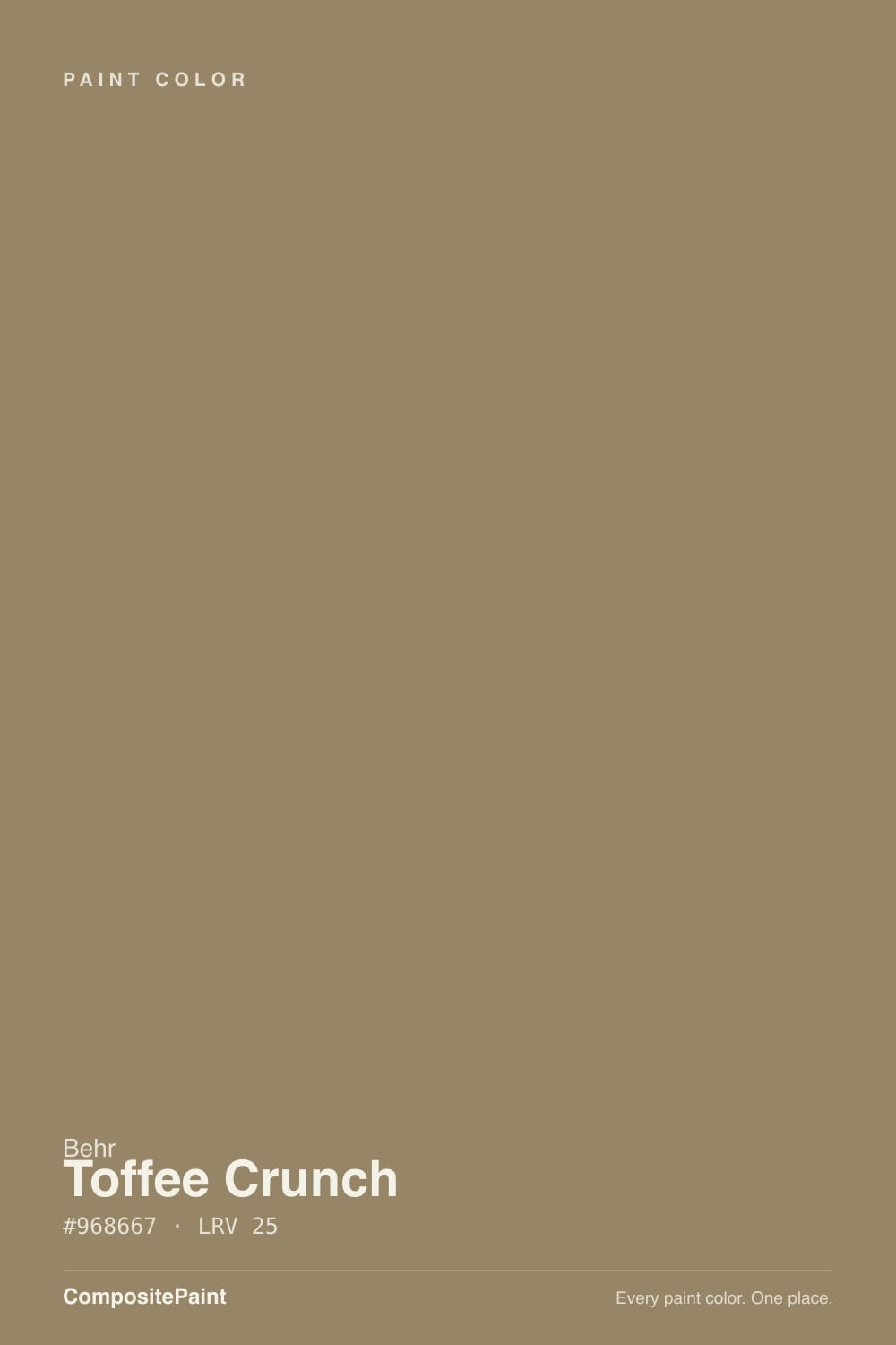
Toffee Crunch
The caramel-brown Behr sells for every job — cabinets, front doors, whole exteriors — reviewed honestly: where it glows, where it reads milk-chocolate-dark, and what to pick instead.

Jessica has spec'd whites and neutrals for more than 300 rooms and keeps a sample wall of painted drawdowns in her studio. Every color review is checked against real reader rooms in the comments and re-tested when a formula changes. About the testing process →
- 1Turkish Coffee5
- 2Porpoise13
- 3Toffee Crunch26
- 4Camel Train31
The Fast Verdict
Toffee Crunch is a medium-dark warm tan-brown — genuine caramel, not gray-taupe pretending to be brown. At LRV 25 it holds real color in any light instead of washing out, and Behr backs that up by selling it everywhere: flat exterior paint, matte interior walls, and semi-gloss cabinet-door-trim enamel. That range is the tell. This is a color built to be a front door, a cabinet run, or a whole facade — not a shy accent, and for most buyers, not a full room of walls either.
Front doors and cabinets that want real color · full exterior siding with warm wood or stone trim · powder rooms and small rooms that can take depth · anyone who wants brown, not a gray-brown compromise
You actually want a taupe or greige, not brown · your room is small, north-facing, and dim · your stone or LVP floor is cool gray · you want a full room of walls to still feel bright
- Genuine warm caramel-brown, not a gray-taupe pretending to be brown
- Holds its color in bright light instead of washing out at LRV 25
- Sold across exterior, interior wall, and cabinet-enamel product lines — a real crossover color
- Excellent one-coat coverage in multiple owner reviews
- Reads rich and expensive on a front door or kitchen island
- Common complaint: reads darker on the wall than the chip suggested — near milk chocolate
- Can feel closing-in in a small or dim room
- Clashes with cool gray stone, LVP, or chrome hardware
- Too much brown for most buyers to want on every wall in an open floor plan
What Color Is Toffee Crunch, Really?
A warm, medium-dark tan-brown with a caramel-golden cast — closer to toffee candy than to a builder-beige stretched darker. Behr's own hex for it runs slightly more golden-orange than our synced deck value, but both land in the same family: brown first, with gold underneath, never gray and never red. That warmth is what separates it from the taupe-and-greige crowd — this is a color that commits to being brown.
At LRV 25 it sits in real mid-tone-dark territory, the same range as a milk chocolate bar. That depth is a feature on a front door or a cabinet run, where you want the color to actually show up against white trim. On four walls in a smaller room it is a different story: reviewers who bought it for interior walls describe it landing noticeably darker than the paint chip suggested, and a couple of them note the room needed to be a decent size before the color stopped feeling closed-in.
Undertone in one line: golden-caramel brown, not gray, not red. If it reads muddy or flat, the room's light is cool and north-facing — this color needs warm daylight or warm bulbs to show its gold instead of just going dark.
Where It Shines
Behr sells Toffee Crunch across an unusually wide product spread — Premium Plus flat exterior, Ultra exterior, Marquee interior walls, and Premium semi-gloss/satin enamel built specifically for cabinets, doors and trim — and that range points to its real strength: it is a workhorse color for the parts of a house that are supposed to have color, not the parts that are supposed to recede. On a front door, a kitchen island, or full exterior siding, warm daylight brings the gold forward and the coverage reviews are consistently strong, with more than one owner noting it looked right with a single coat.
Where It Fails
The regret stories about Toffee Crunch cluster around three predictable mismatches, and none of them are the paint's fault — they are the paint used somewhere it was never built for.
More than one buyer painted a full wall and reported it reading noticeably darker and richer than the sample chip suggested — close to milk chocolate rather than a soft caramel. Depth multiplies on a wall the way it does not on a two-inch swatch. If you want the lighter version you pictured, sample a full poster-size swatch before committing four walls.
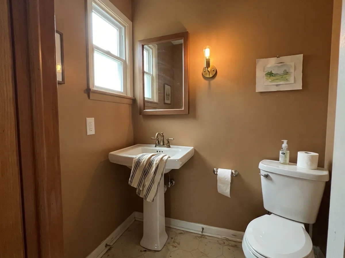
At LRV 25 it eats light rather than bouncing it back. In a large, well-lit room that reads cozy and rich; in a small bedroom or a windowless powder room with weak fixtures, it can feel like the walls are closing in. Save it for rooms with either real size or real daylight.
Toffee Crunch is unapologetically warm and golden. Set it against cool gray porcelain tile, gray-washed LVP flooring, or brushed-chrome hardware and the two fight instead of coordinating — the brown looks muddy and the gray looks dingy. Warm woods, brass, and iron are its real partners.
Room by Room
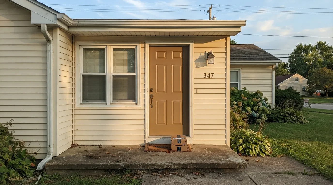
Semi-gloss enamel Toffee Crunch on an entry door reads rich and expensive against a cream or white body color, and it holds its warmth in full sun. This is the use Behr's own coordinated palettes point to first.
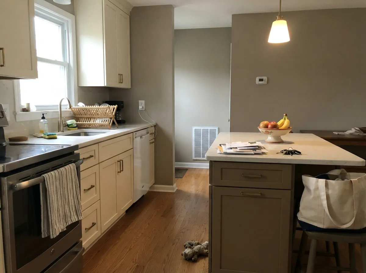
As an island or lower-cabinet color under lighter perimeter cabinets, it gives a kitchen one confident warm note without committing the whole room. Behr sells a satin cabinet-door-trim enamel in this exact shade for a reason. Skip it as an all-cabinet color over cool countertops.
Full sun brings out the caramel-gold and one Home Depot reviewer specifically praised how it looked on their backyard exterior. Pair with a warm cream trim and a near-black door or shutters for the classic craftsman look.
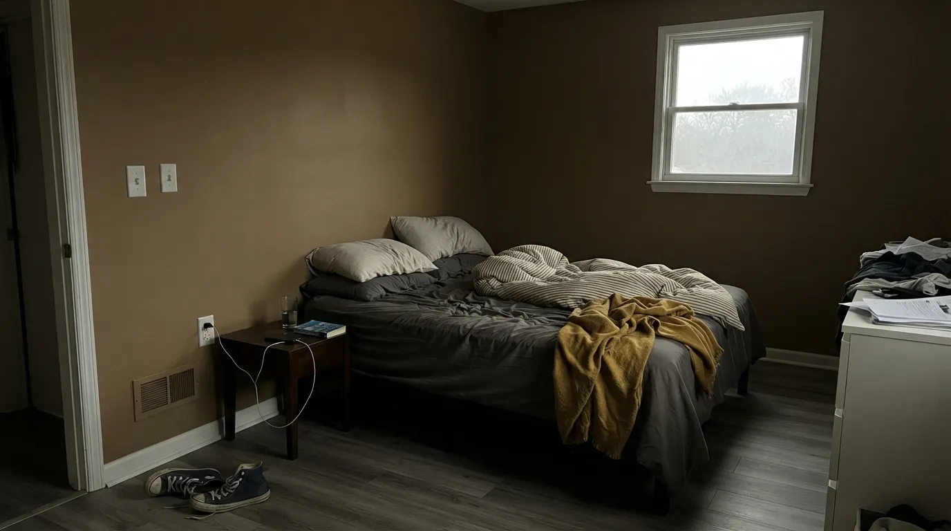
A small room with good daylight or warm lamps can carry this depth beautifully — it is the classic "go dark in the small room" move. A windowless powder room with only a cool ceiling fixture is the wrong candidate.
It can work as a warm, cocooning accent wall behind a bed with brass sconces and cream bedding, but a full bedroom of Toffee Crunch walls needs genuine daylight and a decent room size or it reads heavy rather than cozy.
This is a trim-and-accent color wearing a wall-paint label. Most buyers who love the front door or the cabinets would not want the same brown running floor-to-ceiling through a whole open floor plan.
Your Light Is the Risk
The gold in the caramel comes forward and the color reads rich, not muddy — the light this color and Behr's own exterior lines are built for.
Cool, weak daylight flattens the gold and leaves a dense, muddy brown that can feel heavier than intended. Test a large sample here first.
Golden and glowing at the sun hours, quieter and more neutral-brown the rest of the day. On a front door this shift is part of the appeal.
2700K warm bulbs deepen the caramel and keep it cozy. Cool white LEDs push it toward flat, dull brown — swap the bulbs before you blame the paint.
Most complaints about Toffee Crunch are a light mismatch. Upload a photo of your actual room and see it on your walls — then ask for the same wall in north light or evening lamps before you buy a single sample.
Need It From Another Brand?
Any paint counter can custom-tint Behr 700D-5 directly. If you would rather stay in one brand's own deck, these are the closest stock matches, measured as ΔE2000. Under 2 is a difference you will not see on the wall.
| Brand | Closest color | ΔE | LRV | |
|---|---|---|---|---|
| Sherwin-Williams | SawdustSW 6158 · Sherwin-Williams | 3.5 | 26 | Color page → |
| Benjamin Moore | Woodacres1020 · Benjamin Moore | 2.0 | 26 | Color page → |
| Valspar | Delta Sandbar2005-9C · Valspar | 4.2 | 26.3 | Color page → |
| PPG / Glidden | Iced CappuccinoPPG1099-6 · PPG / Glidden | 4.8 | 26 | Color page → |
| Glidden | Dark Legacy Gold20YY 24/177 · Glidden | 2.4 | 24 | Color page → |
| HGTV Home by Sherwin-Williams | Lodgepole PineHGSW 3213 · HGTV Home by Sherwin-Williams | 3.5 | 26 | Color page → |
Similar Behr Colors
The nearest shades to Toffee Crunch within Behr's own range, ranked by perceptual color distance — useful when you want the same look a touch lighter, darker, or warmer.
WCAG 2.1: AA is 4.5 : 1 for normal text, 3 : 1 for large text, AAA is 7 : 1.
Toffee Crunch vs the Colors You're Also Considering
Every Toffee Crunch sample board has the same rivals on it. The numbers show the real lightness gap — then it comes down to which risk you would rather live with.
Pick this for the more committed, unambiguous brown — Stone Hearth can drift green, Toffee Crunch never does.
Benjamin Moore 984 · LRV 30Stone HearthPick this for a slightly lighter earth tone with a green flip to watch for, if you want less straight caramel.
Pick this when you want real depth and real brown, not a pale taupe with a pink cast.
Behr PPU5-13 · LRV 52Creamy MushroomPick this for a much lighter, pinker taupe that still stays in the Behr deck if straight brown feels like too much.
In the Behr deck, Collectible (PPU7-04) at LRV 24 and hex #9B8368 is slightly redder and a shade deeper, so it reads more like true toffee. Dry Pasture (PPU8-03) at LRV 25 and #948972 holds more blue, which makes it grayer and softer. Urban Safari (PPU8-04) at LRV 26 and #968B6F has the highest green value of the group and reads most clearly olive.
Across brands, Sherwin-Williams Renwick Olive (SW 2815) at LRV 25 has a deltaE of 1.32 and Benjamin Moore Elk Horn (AF-105) at LRV 25 sits at 1.39, so both are visually identical to Toffee Crunch in normal room light. Farrow and Ball Drab (No. 41) at LRV 26 comes in at deltaE 1.84, the same story with a fraction more light back.
Valspar Ramblin' Man (T590) at LRV 23.8 is deltaE 2.41 and Dutch Boy Pine Moss (321-6DB) at LRV 25 is 2.48, both very close but worth sampling first. Dunn-Edwards Wilderness (DE6236) at LRV 23 and deltaE 4.2 is close but visibly different side by side, reading greener and darker.
Toffee Crunch Coordinating Colors
The rule with Toffee Crunch is simple: keep everything else warm, and let it carry the depth. It pairs cleanly with warm creams, near-blacks, and other earth tones — and it fights cool grays and blues. These are the partners that keep showing up in the color's own coordinated palettes and in rooms that actually work:
Why Behr Sells This Color Everywhere
Most colors live in one or two product lines. Toffee Crunch spans an unusually wide range: Premium Plus and Ultra flat exterior paint, Marquee one-coat-hide interior walls, Premium semi-gloss and satin enamel built specifically for cabinets, doors and trim, and even a DECKplus solid-color exterior wood stain. That spread is the clearest signal of what this color is actually for — a utility caramel-brown meant to show up wherever a house needs one confident warm surface, not a wall color competing for the whole room's attention.
That also explains the split in owner reactions: reviewers who used it where Behr built it for — a front door, a full exterior, a cabinet run — report strong results and easy coverage. Reviewers who used it as an interior wall color are the ones who report it running darker and heavier than expected. Match the use to the product line and the color performs exactly as advertised.
Toffee Crunch With Wood Tones and Floors
This color wants warm company. Golden oak, honey pine, and reclaimed barnwood all sit comfortably next to it because they share the same warm base — none of the orange-versus-brown fight that happens with cooler paint colors. Walnut and espresso floors work too, reading as a tonal, deliberate pairing rather than a clash.
The floor that argues with Toffee Crunch is anything cool: gray-washed LVP, gray-toned porcelain tile, or polished chrome fixtures. The warmth in the paint has nothing to agree with, and both the floor and the wall end up looking slightly off. If a cool floor is staying, keep Toffee Crunch to a door or an island rather than a full room of walls.
Three Ready Palettes Built on Toffee Crunch
A color is never alone on the wall. These are complete combinations in the 60-30-10 pattern, with the reason each one holds together. Every one opens in the visualizer.
A warm cream body lets the caramel door read rich instead of muddy, and one near-black note on the shutters keeps the whole facade from feeling like a single brown wash.
Try this palette in your roomCream perimeter cabinets keep the kitchen bright while the toffee island does the color work; one soft black note on the pantry door grounds the warmth without adding a second competing hue.
Try this palette in your roomThe classic caramel-and-cream craftsman formula: warm brown siding, cream trim to keep the architecture legible, and one near-black door for the single dark accent the eye needs.
Try this palette in your roomToffee Crunch FAQ
Is Toffee Crunch a brown or a taupe?
Brown, clearly — the golden-caramel cast is unmistakable even in cooler light. If you were hoping for a gray-leaning taupe, look at something like Behr Creamy Mushroom instead; Toffee Crunch never reads gray.
Will it look darker than the paint chip?
Often, yes. Several buyers who painted full walls describe it reading closer to milk chocolate than the sample suggested. Depth intensifies on a wall the way it never does on a two-inch chip — sample a large swatch before committing a whole room.
Is it good for exterior siding?
Yes — Behr sells it specifically as a flat exterior paint and primer in more than one product line, and owner feedback on full-exterior use has been strongly positive. Full sun brings out the gold; pair with a cream trim and a dark door or shutters.
Can I use it on kitchen cabinets?
Yes, and Behr makes a satin and a semi-gloss enamel specifically built for cabinets, doors and trim in this color. It works best as an island or lower-cabinet accent under lighter perimeter cabinets, not as the color for every cabinet in the room.
What trim or wall color goes with Toffee Crunch?
A warm cream or off-white — Behr's own coordinated palette points to Swiss Coffee. A stark, cool white will make the caramel look muddy by comparison; stay warm.
Does it work with gray floors or countertops?
Not comfortably. Toffee Crunch is a committed warm color, and cool gray stone, LVP, or chrome hardware next to it reads as a clash rather than a coordination — the brown looks muddy and the gray looks dull. Warm wood, brass, and iron are the better partners.
Have you painted with Toffee Crunch?
Rate it — one tap helps the next reader decide.
Ask a Question