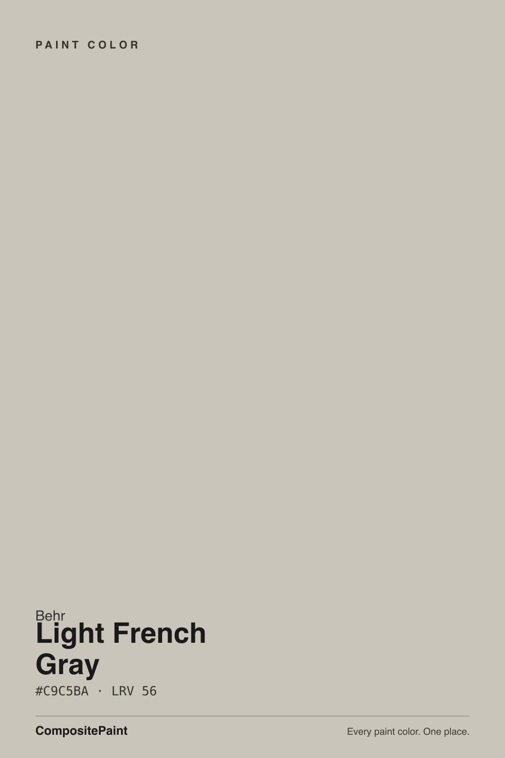
Light French Gray
Behr's palest 'gray' reviewed honestly: it's actually a cool blue-green that reads aqua on the wall, where it glows, the light that flattens it, and what to pick instead.

Jessica has spec'd whites and neutrals for more than 300 rooms and keeps a sample wall of painted drawdowns in her studio. Every color review is checked against real reader rooms in the comments and re-tested when a formula changes. About the testing process →
- 1Stardew43
- 2Sea Salt63
- 3Light French Gray69
- 4Spring Thaw83
The Fast Verdict
Ignore the name. Light French Gray is a pale, cool blue-green — closer to a washed seafoam or a muted Tiffany blue than to any neutral gray. At LRV 69 it reflects a lot of light, so it never goes dark or moody; it just quietly commits to color instead of staying neutral. In a bright bathroom or nursery it glows. In a dim room, or against warm gold wood, it goes flat and cold fast.
Bathrooms and powder rooms with white tile · nurseries and sunrooms with real daylight · porch ceilings in the classic haint-blue tradition · anyone who wants a blue-green without fully committing to "blue"
You actually want a neutral gray · your room is dim and north-facing · your floors and trim run honey-oak warm · you're trying to match it to Sherwin-Williams' own, very different "Light French Gray"
- A genuine pale blue-green, not another beige-gray in disguise
- LRV 69 keeps rooms bright even while committing to real color
- Reads like a ready-made haint-blue for porch ceilings
- Clean with white trim, brass, matte black, and quartz
- Sold across nearly every Behr product line, so the sheen you need exists
- Not actually gray, despite the name — expect blue-green
- Goes flat and cold fast in dim, north-facing light
- Fights honey oak floors and warm gold trim
- Easy to confuse with Sherwin-Williams' unrelated "Light French Gray"
What Color Is Light French Gray, Really?
Behr files this under gray, but on the wall it reads as a pale, cool blue-green — the kind of color design bloggers nickname "muted Tiffany blue" because it drifts toward aqua and seafoam more often than it sits still as gray. Behr sells the exact hex 720E-2 across nearly its whole catalog — Marquee exterior, Premium Plus interior, even a textured anti-slip porch-and-patio floor enamel — which tells you the company sees it as a workhorse color, not a niche accent.
At LRV 69 it reflects most of the light that reaches it, so it behaves like a light color even though it carries real blue-green pigment. Set it beside Benjamin Moore's Glacier Blue (LRV 70) and the two are nearly twins — same brightness, same quiet blue-green lean. That is the useful comparison to hold onto: this is not a whisper-of-color neutral, it is a genuine pale blue-green wearing a gray name tag.
Undertone in one line: cool blue-green, never warm, never truly neutral. If your sample looks like plain gray, you are seeing it in flat, overcast light — that is the color drained of its color, not a different chip. And a specific warning worth its own sentence: Sherwin-Williams sells a completely different color under the same name, SW 55 Light French Gray, which is a warm-leaning true gray at LRV 53. Same words on the fan deck, two unrelated colors — do not swatch one and buy the other.
Where It Shines
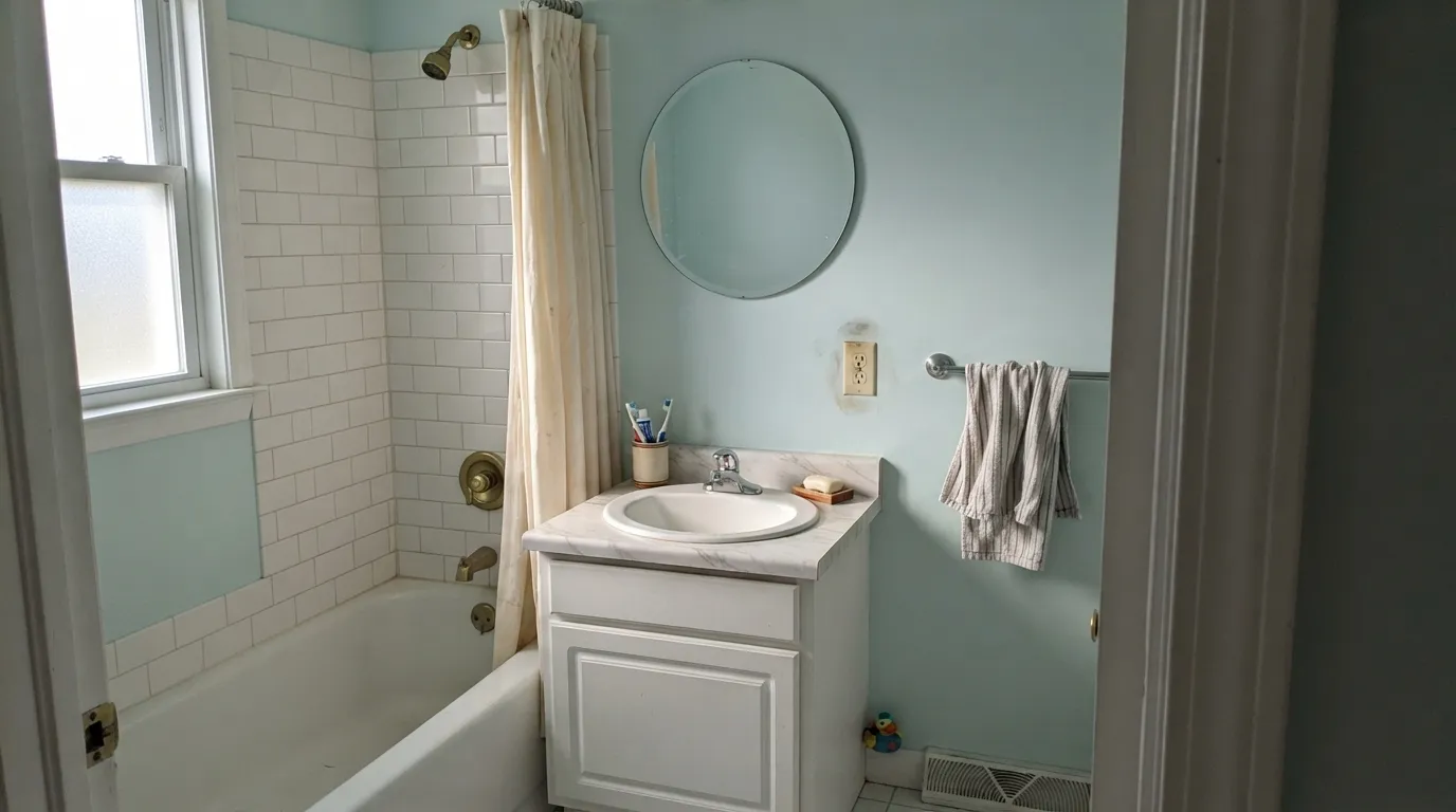
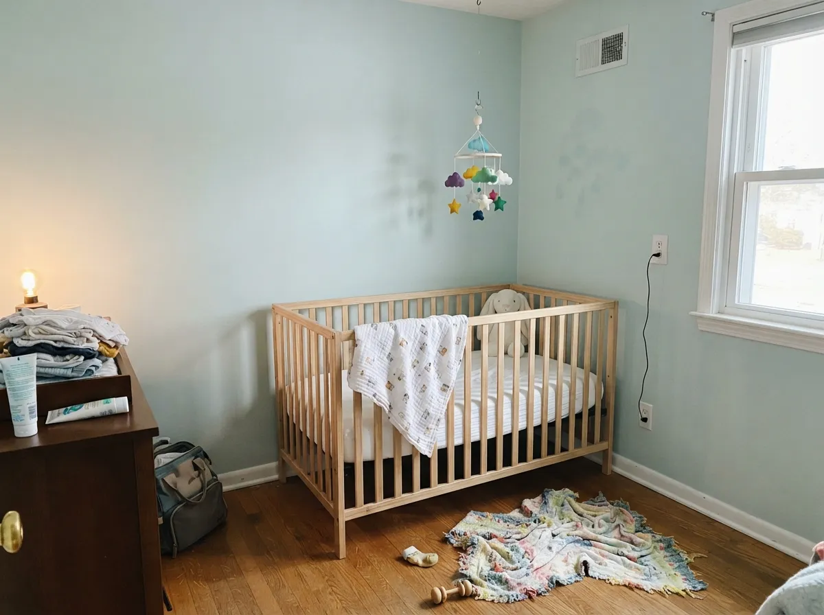
Give it real daylight and it earns the "French" half of its name — soft, watery, a little coastal. Bathrooms are its best room: with white tile, brass or matte-black fixtures and a bright window, it reads like a spa upgrade rather than a paint swatch. Nurseries and sunrooms are close behind — the color is calm without being sleepy, and gender-neutral enough that it shows up constantly in nursery mood boards. Its other natural home is a porch ceiling, in the old Southern haint-blue tradition of painting the underside of a porch a pale sky-blue-green.
Where It Fails
Almost every disappointed review of Light French Gray comes from one of three mismatches, and all three are predictable before the first coat dries. None of them are the paint's fault — but if your room matches one, this is not your color.
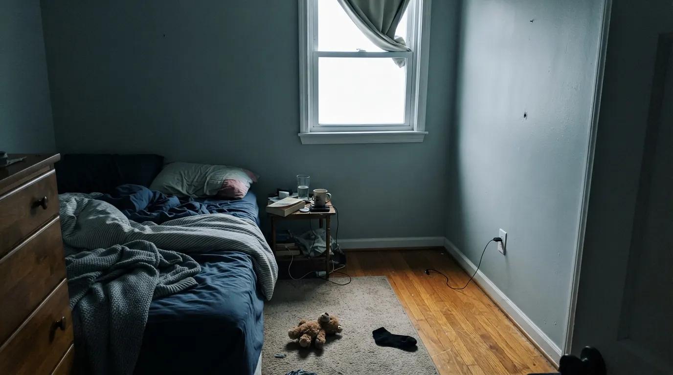
Cool light on a cool color is a bad combination twice over. Without direct sun the blue-green drains to a flat, slightly cold gray that readers describe as "blah" or "institutional." The color did not fail; the light did. Add warm lamps or move it to a brighter room.
The name promises neutral; the wall delivers aqua. On a small chip it can pass for gray, but at full wall size the blue-green is unmistakable. If "gray, not blue" is the actual goal, look at a true neutral instead — this is the wrong color for that brief no matter how many coats go on.
Cool blue-green and warm gold-orange sit on opposite sides of the wheel. Next to honey oak the wall looks colder and the floor looks more orange — both sides lose. It wants white oak, walnut, or painted trim, not builder-grade orange oak.
Room by Room
With white subway tile, a quartz or marble-look counter, and brass or matte-black fixtures it reads like a genuine spa refresh. Satin or semi-gloss for the moisture; keep the mirror frame and hardware simple so the wall color stays the star.
Pale enough to stay calm, saturated enough to feel decorated. Pairs cleanly with white trim, a natural wood crib, and soft neutral bedding. One of the few colors that works for a nursery before anyone knows if it's a boy or a girl.
South or east exposure keeps it soothing and just barely blue. In a dim or north-facing bedroom it turns flat fast; add warm 2700K lamps or pick a warmer neutral instead.
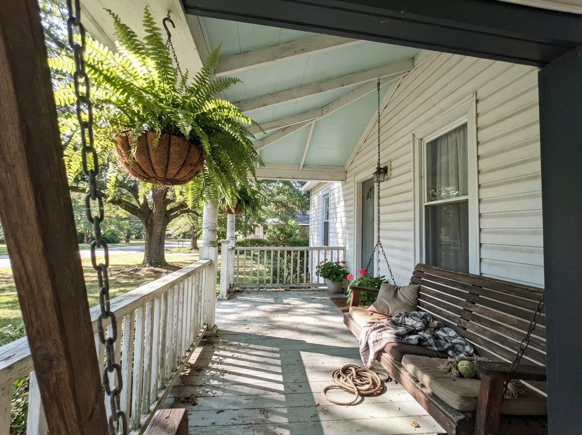
In flat sheen overhead it does exactly what a porch ceiling blue is supposed to do: read like sky and water, not paint. On siding, pair it with a white body and it photographs as crisp coastal trim rather than a color statement.
Gorgeous on an island or a breakfast-nook accent wall against white cabinets and quartz. A full kitchen of it fights warm wood cabinetry and butcher block, so keep it to one surface unless the whole kitchen is already cool-toned.
In a closed room with white trim and cool-toned furniture it is a calm, unusual neutral. In an open floor plan it has to negotiate with every adjoining room's undertone, and warm neighboring rooms will make it look bluer and colder than it does alone.
Your Light Is the Risk
Direct daylight brings out the aqua/seafoam glow at its cleanest — this is the color people picture when they buy it.
Cool, indirect daylight flattens it toward a dull, cold gray-blue. Test a large sample before committing a whole room.
Warmer and bluer at the sun hours, quieter and grayer the rest of the day. Most owners describe the shift as pleasant, not a problem.
2700K bulbs keep it soft and just barely blue at night. Cool LEDs push it toward a colder, flatter gray-blue — swap the bulb before you swap the paint.
Most complaints about Light French Gray are a light mismatch. Upload a photo of your actual room and see it on your walls — then ask for the same wall in north light or evening lamps before you buy a single sample.
Need It From Another Brand?
Any paint counter can custom-tint Behr 720E-2 directly. If you would rather stay in one brand's own deck, these are the closest stock matches, measured as ΔE2000. Under 2 is a difference you will not see on the wall.
| Brand | Closest color | ΔE | LRV | |
|---|---|---|---|---|
| Sherwin-Williams | Open AirSW 6491 · Sherwin-Williams | 2.3 | 70 | Color page → |
| Benjamin Moore | Iced Green673 · Benjamin Moore | 1.8 | 68 | Color page → |
| Valspar | Snow in JuneV102-1 · Valspar | 1.0 | 68.5 | Color page → |
| PPG / Glidden | Cosmic RaysPPG1148-3 · PPG / Glidden | 1.8 | 68 | Color page → |
| Glidden | Julep GreenPPG1146-3 · Glidden | 0.6 | 68 | Color page → |
| Dutch Boy | Delectable Aqua233-2DB · Dutch Boy | 2.6 | 69 | Color page → |
Similar Behr Colors
The nearest shades to Light French Gray within Behr's own range, ranked by perceptual color distance — useful when you want the same look a touch lighter, darker, or warmer.
WCAG 2.1: AA is 4.5 : 1 for normal text, 3 : 1 for large text, AAA is 7 : 1.
Light French Gray vs the Colors You're Also Considering
Every Light French Gray sample board has the same rivals on it. The numbers show the real lightness gap — then it comes down to which risk you would rather live with.
Pick this for the bluer, less-hyped version of the same watery calm.
Sherwin-Williams SW 6204 · LRV 63Sea SaltPick this if you want the famous, greener version everyone already recognizes from Pinterest.
Pick this for a paler, quieter version at nearly the same watery mood.
Sherwin-Williams SW 6211 · LRV 59RainwashedPick this for a bolder, more clearly blue-green wall that isn't hiding behind a gray name.
Behr Titanium (PPU24-16) shares the same LRV of 56 but is a truer, cooler gray with almost no warm cast. Side by side, Light French Gray looks softer and slightly tan while Titanium looks cleaner and more modern. Pick Titanium for cool-toned rooms with black, chrome, or blue accents; pick Light French Gray where wood floors and warm textiles dominate.
Wheat Bread (720C-3), also LRV 56, tips further toward beige. The two are close enough to confuse on a small chip, but on a full wall Wheat Bread reads as a light tan while Light French Gray keeps one foot in gray. Choose Wheat Bread if you want cozier, more obviously warm walls.
Vintage Pewter (DC-009), again LRV 56, is nearly a twin with a similar warm-gray balance. Since brightness is identical across all three, the decision comes down purely to how much warmth you want, so sample the contenders on the same wall.
Light French Gray Coordinating Colors
The rule for coordinating with Light French Gray is simple: stay cool and let it be the color in the room. It flatters bright whites, matte black, brass, and other muted blue-greens — and it argues with warm creams and honey wood tones. These are the partners that keep showing up in rooms that work:
Two Paints Named "Light French Gray" — and They're Not the Same Color
This is worth its own section because it causes real returns: Behr and Sherwin-Williams both sell a color called Light French Gray, and they are not interchangeable. Sherwin-Williams' SW 55 sits at LRV 53, leans warm, and stays a true gray with only an occasional violet flash in cool light. Behr's 720E-2 sits at LRV 69, leans cool, and reads as a pale blue-green far more often than it reads as gray.
If a designer, a paint chip wall, or a Pinterest board says "Light French Gray" without a brand, check the SKU before you buy five gallons. The two colors do not photograph alike, do not behave alike in the same light, and will not match if you're trying to touch up one with the other.
Light French Gray on Porches and Exteriors
Painting a porch ceiling pale blue is a genuine Southern tradition — "haint blue" — meant to read like open sky and, in the old folklore, to keep spirits from nesting in the rafters. Light French Gray is close to an ideal modern stand-in: pale enough to stay airy, blue-green enough to do the job, and sold by Behr in a flat exterior finish built for exactly this use.
On siding it works best as a supporting player rather than the star: a white or very light body color with Light French Gray reserved for the porch ceiling, shutters, or a secondary accent keeps the facade from reading as an all-over color statement. Full sun brings out more blue than the same paint shows indoors, so sample it on the actual exterior wall, not just a chip held up to the house.
Three Ready Palettes Built on Light French Gray
A color is never alone on the wall. These are complete combinations in the 60-30-10 pattern, with the reason each one holds together. Every one opens in the visualizer.
White Dove trim keeps the room feeling bright even at a bathroom's smaller window, and Wrought Iron on the mirror and hardware gives the pale blue-green one grounding dark note so it reads finished, not tentative.
Try this palette in your roomSimply White keeps the room bright for a space that needs to feel airy, while Evergreen Fog on one accent wall or a bookshelf adds depth without introducing a second undertone family to argue with the blue-green.
Try this palette in your roomWhite siding lets the porch ceiling do the classic haint-blue trick of reading like open sky, and Iron Ore shutters and door give the facade the one deep, confident note that keeps the pale blue-green from looking washed out from the street.
Try this palette in your roomLight French Gray FAQ
Is Behr Light French Gray actually gray?
Not really. On the wall it reads as a pale, cool blue-green — closer to seafoam or a muted aqua than to any neutral gray. The name is the single most common source of disappointed reviews; go in expecting color, not neutral.
Is it the same as Sherwin-Williams' Light French Gray?
No — despite sharing a name, they are unrelated colors. Sherwin-Williams SW 55 Light French Gray is a warm-leaning true gray at LRV 53. Behr's 720E-2 is a cooler, lighter blue-green at LRV 69. Never swatch one expecting the other.
Is it a light or dark color?
Light — LRV 69 means it reflects most of the light that hits it. It will never read dark or moody; even at its most saturated it stays a pale color.
Is it good for a bathroom?
One of its best rooms. With white tile, brass or matte-black fixtures and a bright window it reads like a genuine spa refresh rather than an accent color.
Does it work on a porch ceiling?
Yes — it sits squarely in the classic Southern haint-blue tradition of pale sky-blue-green porch ceilings, and Behr sells it in a flat exterior finish built for exactly that use.
What trim white goes with it?
A clean, bright white — White Dove or Simply White — keeps the room feeling airy. Avoid warm, creamy whites, which can make the blue-green look colder by contrast rather than complementing it.
Have you painted with Light French Gray?
Rate it — one tap helps the next reader decide.
Ask a Question