Dragonfly
Behr's smoky blue-green reviewed honestly: where the teal glows, where it goes flat gray-green, and the small rooms it was actually built for.

Jessica has spec'd whites and neutrals for more than 300 rooms and keeps a sample wall of painted drawdowns in her studio. Every color review is checked against real reader rooms in the comments and re-tested when a formula changes. About the testing process →
- 1Salamander6
- 2Hidden Gem14
- 3Dragonfly25
- 4Van Courtland Blue31
- 5Wythe Blue48
The Fast Verdict
Dragonfly is Behr's answer to "is it blue or is it green" — and the honest answer is both, depending on the hour. A heavy gray cast keeps it from ever going candy-teal, which is exactly why it works as hard as it does on a small vanity, a kitchen island, or a pair of exterior shutters. It is not a whole-house color and was never meant to be one: at LRV 25 it needs real daylight to earn its keep, and it goes quietly murky the moment the light does.
Bathroom vanities and powder rooms · kitchen islands and cabinetry · exterior trim, shutters, and doors · dens and offices with real daylight
You want one fixed color, not a blue-green that shifts with the light · your room has no real window · you're painting a whole open-plan main floor · you want something bright and airy
- Genuinely reads as both blue and green depending on the light — versatile rather than confused
- The gray base keeps it sophisticated instead of candy-teal
- Excellent depth for bathroom vanities, kitchen islands, and cabinetry
- Holds its color outdoors on trim, shutters, and doors better than most muted blue-greens
- Pairs cleanly with warm whites, brass, and near-black without a fight
- Low LRV (25) goes flat and murky in a room with no real daylight
- Shifts between blue and green with the light — not a fixed, predictable hue
- Too dark and mood-dependent to trust as a whole-house wall color
- Online swatches and in-store lighting read inconsistently blue vs. green — sample it at home
What Color Is Dragonfly, Really?
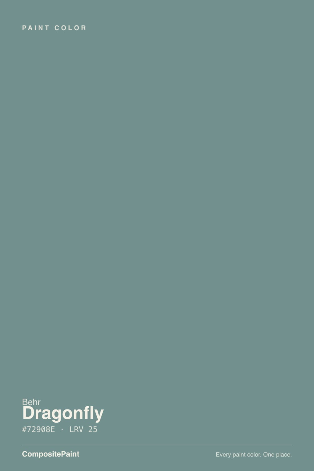
Dragonfly is a muted blue-green built on a heavy dose of smoky gray — the gray is doing most of the work. Strip it out and you would have a fairly ordinary teal; leave it in and the color reads as something harder to name, which is the whole appeal. Behr itself files the color loosely between its blue and green families, and that ambiguity is not a labeling error — it is the point. Shoppers who search for it looking for a clean teal or a clean sage both find something that is neither, and most end up happy about it.
At LRV 25 it sits medium-dark and absorbs a real amount of light. That gives it visual weight on a wall — enough to anchor a small room without turning it into a cave — but it means the color depends entirely on what light you give it. In a room with a real window it holds a legible blue-green all day. In a windowless bathroom or a hallway lit only by an overhead can light, it sinks toward a flat, muddy charcoal-green with none of the character the chip promised.
Undertone in one line: gray-softened blue-green — never pure teal, never pure slate. If your sample reads flat charcoal, that is a room starved of daylight; if it flashes a clean, bright teal, that is strong daylight doing exactly what this color was built to do.
Where It Shines
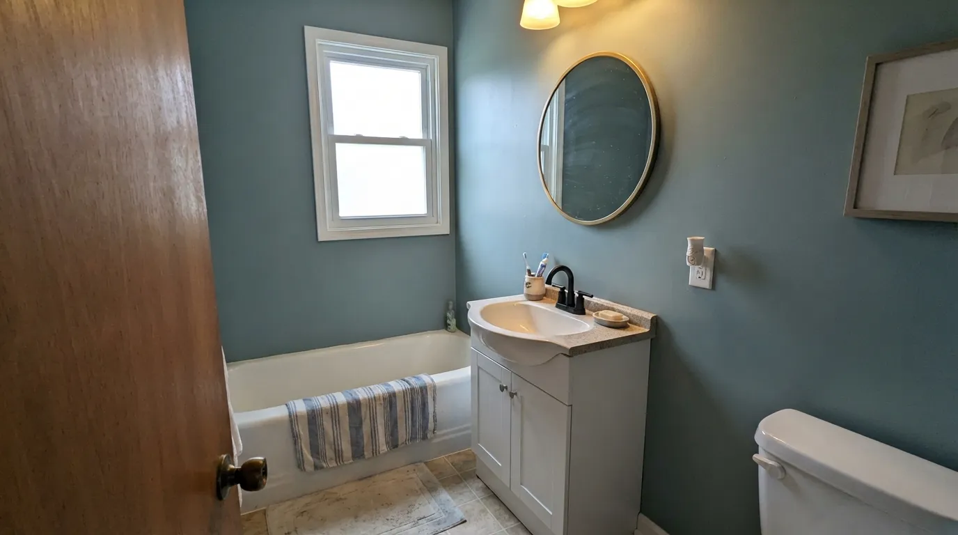
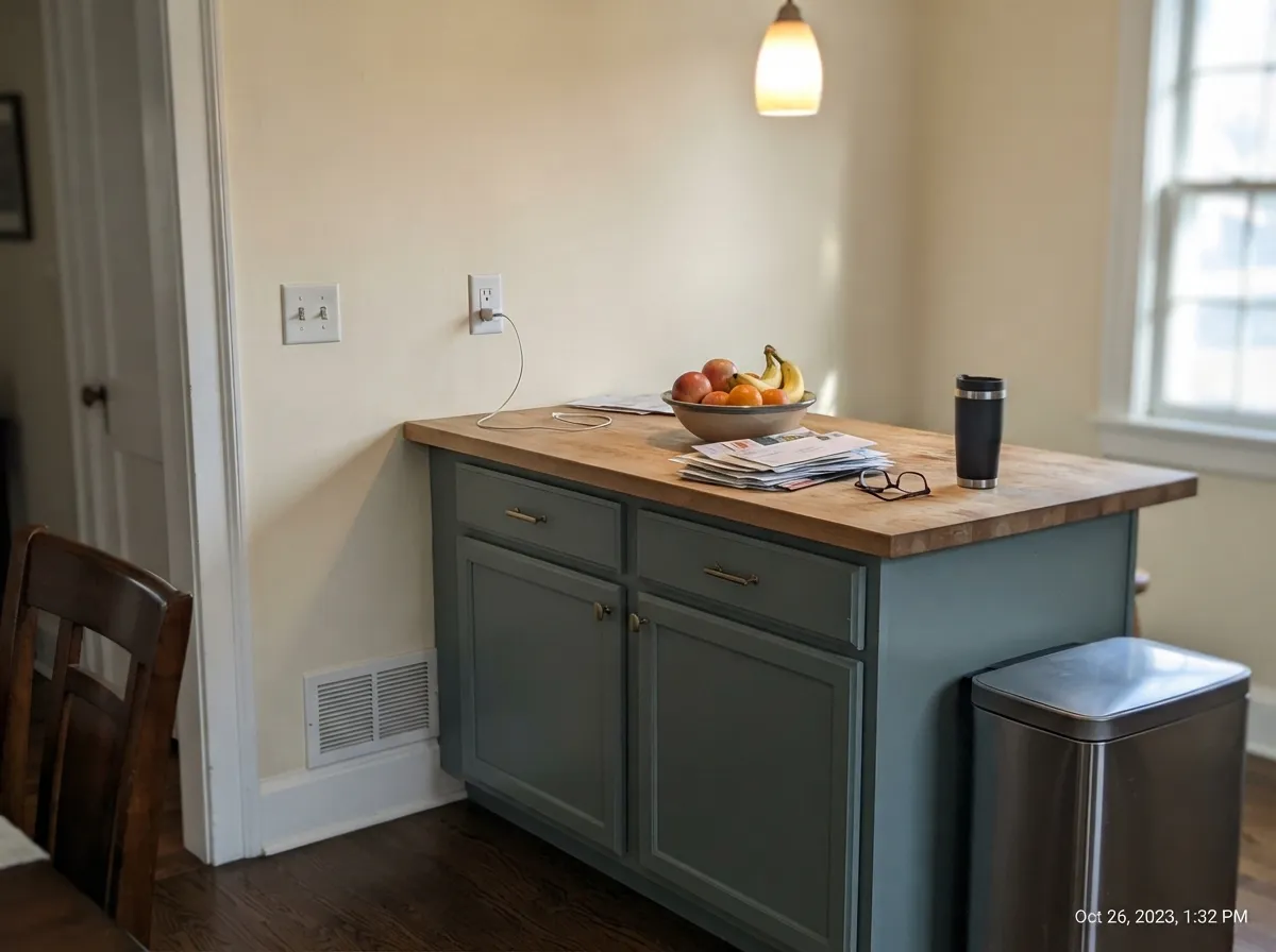
Bright daylight is the whole trick — put Dragonfly where the sun actually reaches and the smoky gray steps back just enough for real teal to come through. That makes it a natural for a small, windowed bathroom done wall-to-wall, or for a kitchen island under a skylight or a bank of windows, where the depth reads as a deliberate design choice rather than a dark corner. Outdoors it holds its color through full sun better than most muted blue-greens, which is why it shows up so often on shutters, exterior trim, and front doors rather than whole facades.

Where It Fails
Almost every disappointed review of Dragonfly comes back to one of three mismatches, and all three are visible before you buy the gallon. None of them are the paint's fault — but if your project matches one, this is not your color, and a bigger sample will only confirm it.
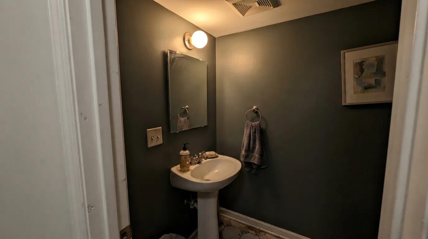
Low LRV plus a heavy gray base is a bad combination once real daylight disappears. An interior powder room lit only by a vanity bulb, or a hallway with no window, pulls Dragonfly toward a flat, muddy charcoal-green that has none of the teal shown on the chip. If the room has no window, sample it under your actual bulbs before you commit — do not trust the paint-store lighting.
Dragonfly is built to straddle blue and green, and it does that by shifting with the light rather than picking a side. Buyers who want a paint that looks the same at 9am and 9pm find that disorienting; buyers who like a color with some atmosphere to it call it the best feature. Know which one you are before you buy the gallon.
This is a focal-point color, not a workhorse neutral. At LRV 25 it reads dramatically different in an open floor plan than it does on one contained wall, and running it across a great room usually ends with the far corners looking dark and heavy rather than cozy. Keep it to one room, one wall, or the cabinetry, and let a lighter neutral carry the rest of the house.
Room by Room
A small, sunlit bathroom done wall-to-wall in Dragonfly is the color's showcase: matte or eggshell on the walls, satin on the vanity, black or brass fixtures. Without a real window, keep it to the vanity only and paint the walls a light neutral instead.
On an island or a run of lower cabinets under light walls, Dragonfly reads custom and expensive without a full commitment. A whole kitchen of Dragonfly cabinetry is a much bigger bet, and it needs strong, consistent daylight to pull off — sample it on the actual cabinet doors first.
This is where the color quietly does its best work. Full sun keeps the teal legible rather than washing it flat, and against a soft off-white or light-gray body it reads as an intentional, grown-up accent on shutters, window trim, or a front door. Use an exterior-rated enamel and expect the shaded side of the house to read noticeably grayer than the sunny side.
A closed room you sit in during the day, with a window feeding it real light, is a good match — the depth reads calm and grounded rather than dark. Pair with walnut or leather furniture and warm brass for the best result; skip it if the room is lit only by an overhead fixture.
One wall behind the headboard, tested under your actual bulbs, works well and gives the room a quiet focal point. Four full walls in a bedroom with limited daylight is a common regret story — the color needs more light than a typical bedroom window provides once the sun goes down.
Too dark, too mood-dependent, and too easy for the far corners of an open floor plan to go flat and murky. If you love the color, bring it in on cabinetry, trim, or one contained room instead of the whole main floor.
Your Light Is the Risk
Direct sun or a strong window brings the teal forward and the gray steps back. This is the light the color was built for.
A windowless bath or a dim interior room drains the color to a flat, muddy charcoal-green. Test under your actual bulbs first.
Cloudy days mute it toward gray-green; bright sun clarifies the teal. The same wall looks like two different colors across one week.
Warm 2700K bulbs pull it into a soft, earthy gray-green. Cool LEDs sharpen the blue-teal edge but can read a touch cold — test both before committing to fixtures.
Most complaints about Dragonfly are a light mismatch. Upload a photo of your actual room and see it on your walls — then ask for the same wall in north light or evening lamps before you buy a single sample.
Need It From Another Brand?
Any paint counter can custom-tint Behr PPU12-03 directly. If you would rather stay in one brand's own deck, these are the closest stock matches, measured as ΔE2000. Under 2 is a difference you will not see on the wall.
| Brand | Closest color | ΔE | LRV | |
|---|---|---|---|---|
| Sherwin-Williams | Moody BlueSW 6221 · Sherwin-Williams | 3.1 | 27 | Color page → |
| Benjamin Moore | Fort Pierce Green712 · Benjamin Moore | 0.8 | 26 | Color page → |
| Valspar | Tidepool WonderM333 · Valspar | 2.0 | 26.5 | Color page → |
| PPG / Glidden | Pine RidgePPG1138-5 · PPG / Glidden | 4.5 | 25 | Color page → |
| Glidden | Northern Green Woods30GG 24/118 · Glidden | 2.9 | 24 | Color page → |
| Dutch Boy | Mapped Blue429-5DB · Dutch Boy | 3.1 | 27 | Color page → |
Similar Behr Colors
The nearest shades to Dragonfly within Behr's own range, ranked by perceptual color distance — useful when you want the same look a touch lighter, darker, or warmer.
WCAG 2.1: AA is 4.5 : 1 for normal text, 3 : 1 for large text, AAA is 7 : 1.
Dragonfly vs the Colors You're Also Considering
Every Dragonfly sample board has the same rivals on it. The numbers show the real lightness gap — then it comes down to which risk you would rather live with.
Pick this for the lighter, more genuinely blue-green version at roughly the same Behr counter.
Behr N430-6A · LRV 14Hidden GemPick this if you want it darker and greener — Hidden Gem drops toward deep green-blue and commits harder than Dragonfly does.
Pick this when you want the gray holding the color back — Dragonfly is the quieter, more neutral read of the same LRV.
Behr BXC-36 · LRV 25Aegean BluePick this at the exact same depth, if you want the gray gone and a clearer, more confident teal-blue.
Benjamin Moore Fort Pierce Green 712 at LRV 26 is the closest match at 0.8, which means the same color once it is on a wall. Valspar Tidepool Wonder M333 at LRV 26.5 measures 2.01, so it looks visually identical in normal room light with a fraction more lightness.
Glidden Northern Green Woods 30GG 24/118 at LRV 24 is 2.93 away and Sherwin-Williams Moody Blue SW 6221 at LRV 27 is 3.07, both very close but worth sampling first. Northern Green Woods is the greener and slightly darker of the two, while Moody Blue is a touch lighter and reads bluer.
Farrow and Ball Berrington Blue No. 14 at LRV 27 sits at 3.62 and PPG Pine Ridge PPG1138-5 at LRV 25 at 4.48, so both are close but visibly different side by side. Berrington Blue leans clearly blue, Pine Ridge clearly green. Within Behr, Magnetic Gray N500-5 at LRV 26 is the quieter, grayer alternative.
Dragonfly Coordinating Colors
The rule for coordinating with Dragonfly is simple: warm whites, near-black, and quieter green-grays all sit comfortably next to it, while bright cool colors fight the smoky gray that makes it work. Behr's own coordinated palette for this color pairs it with a plain white on trim, which is a good starting instinct — the crisp edge keeps the moody wall from reading dark and unfinished. These are the partners that keep showing up in rooms that work:
Dragonfly on Exterior Trim and Shutters
This is a color that behaves better outdoors than its moody indoor reputation suggests. Full sun keeps the blue-green legible in a way that dim, artificial-only interiors cannot — the same reason it goes murky in a windowless bathroom is exactly why it holds up so well on a sun-exposed shutter or door. It shows up most often on trim, shutters, and front doors rather than whole facades, which suits the color: a little goes a long way, and against a light body it reads as one deliberate accent instead of a dark house.
The shaded side of a house will read noticeably grayer and flatter than the sunny side, so walk the sample around the whole exterior before committing — the same caution that applies indoors applies outside, just with the sun instead of a window as the deciding factor.
Dragonfly With Wood Tones and Floors
Walnut, aged leather, and matte black hardware are the color's natural company — the dark warmth of the wood keeps the blue-green from feeling cold, and the near-black grounds it the way it grounds most muted colors. Butcher block and lighter oak work fine in small doses, like an island counter, where the warmth balances the cool wall or cabinet color next to it.
There is no strong clash to warn about here the way there is with a warm honey oak against a violet or a cool gray against a yellow-based cream — Dragonfly's gray base is neutral enough to sit next to most wood tones without a fight. The bigger variable is still light, not floor: a dim room will mute the color regardless of what is underfoot.
Three Ready Palettes Built on Dragonfly
A color is never alone on the wall. These are complete combinations in the 60-30-10 pattern, with the reason each one holds together. Every one opens in the visualizer.
A small room takes the deep color well and a real window keeps it from going murky. Crisp white trim defines the edges, and the near-black accent echoes matte-black fixtures instead of competing with the wall color.
Try this palette in your roomWarm cream walls keep the kitchen bright while the island carries all the color, so the room never feels dark even on a cloudy day. Brass hardware and butcher block warm the cool blue-green right back up.
Try this palette in your roomA soft off-white body lets the shutters and trim carry the color without a fight, and full sun keeps Dragonfly's teal legible outdoors far better than it reads indoors. The near-black door adds one more deliberate dark note so the whole facade reads planned, not random.
Try this palette in your roomDragonfly FAQ
Is behr dragonfly more blue or more green?
Genuinely both, depending on the light. A heavy gray base keeps it from committing fully to either — bright daylight pulls the teal forward, while dim or warm artificial light pushes it toward a muted gray-green. That shift is the color's whole character, not a defect.
What is the LRV of behr dragonfly?
25. That is medium-dark: the color absorbs a real amount of light, gives a wall genuine visual weight, and needs a room with actual daylight to avoid going flat and murky.
Is dragonfly good for a bathroom vanity?
Yes — it is one of its best jobs. Behr sells it in cabinet-and-trim-ready enamel lines built for kitchens, baths, and cabinetry. Use a satin or semi-gloss finish on the vanity itself; if the bathroom has no window, keep the color to the vanity rather than the walls.
Can I paint a whole room in behr dragonfly, not just an accent?
Yes, if the room has a real window and gets genuine daylight — a small, sunlit bathroom or den handles it beautifully wall-to-wall. Without daylight, a whole room in this color tends to go dark and muddy; keep it to cabinetry, trim, or one wall instead.
What white trim goes with dragonfly?
A clean, simple white — Behr's own coordinated palette for the color pairs it with Behr White (52) on trim and ceilings. Swiss Coffee works well too if you want a warmer, creamier companion instead of a crisp white.
Does dragonfly work on an exterior door or shutters?
Yes, and it is one of its strongest uses. Full outdoor sun keeps the blue-green legible rather than washing it flat the way low indoor light can. Pair it with an off-white or light-gray body, and consider a near-black front door if you want a second dark accent in the scheme.
Have you painted with Dragonfly?
Rate it — one tap helps the next reader decide.
Ask a Question